


![]() Brendy Melville Logo PNG
Brendy Melville Logo PNG
The designers created a sophisticated and romantic Brendy Melville logo to express the company’s concept. The emblem reflects Italian elegance, lightness, and sophistication, the qualities that are embodied in youth clothing and accessories.
Brandy Melville is an Italian casual womenswear brand whose story began in the early 1980s. Founder Silvio Marsan opened the first store in Rome with his son Stephan, who later became CEO. Before launching the brand, Silvio had worked in Italy’s textile industry since the late 1970s, producing clothing for well-known designers and learning the mechanics of fast, low-cost apparel production.
The name came from a fictional romance between an American girl named Brandy and a British man named Melville, whom she met in Italy. By the time the company entered the United States, it had about 40 stores in Italy, many of which later closed. In 2009, Brandy Melville opened its first American store in Westwood, Los Angeles, near the UCLA campus.
The brand grew through Instagram rather than traditional advertising. Photos of customers and young influencers shaped its image. At the same time, Kendall Jenner and Kaia Gerber were seen wearing its clothes without formal ad deals. In 2014, a Piper Jaffray survey named Brandy Melville the fastest-rising brand among American teen girls. Its low-priced baby tees, denim mini skirts, fitted thermals, and micro shorts competed in a space shared with Forever 21 and Abercrombie & Fitch.
The brand later drew criticism for its “one size fits all” policy, later renamed “one size fits most,” with sizing close to XS or S. In 2016, Forever 21 sued Brandy Melville over alleged copyright infringement. In 2019, the company entered the Chinese market, where Xiaohongshu users popularized the “BM style.” In 2021, Business Insider published Kate Taylor’s investigation, which included allegations from former employees. In 2024, HBO released Eva Orner’s documentary “Brandy Hellville & the Cult of Fast Fashion.” By 2024, the chain had 94 stores worldwide, including 36 in the United States. In 2025, it opened a store in Seongsu-dong, Seoul.
Meaning and History
![]()
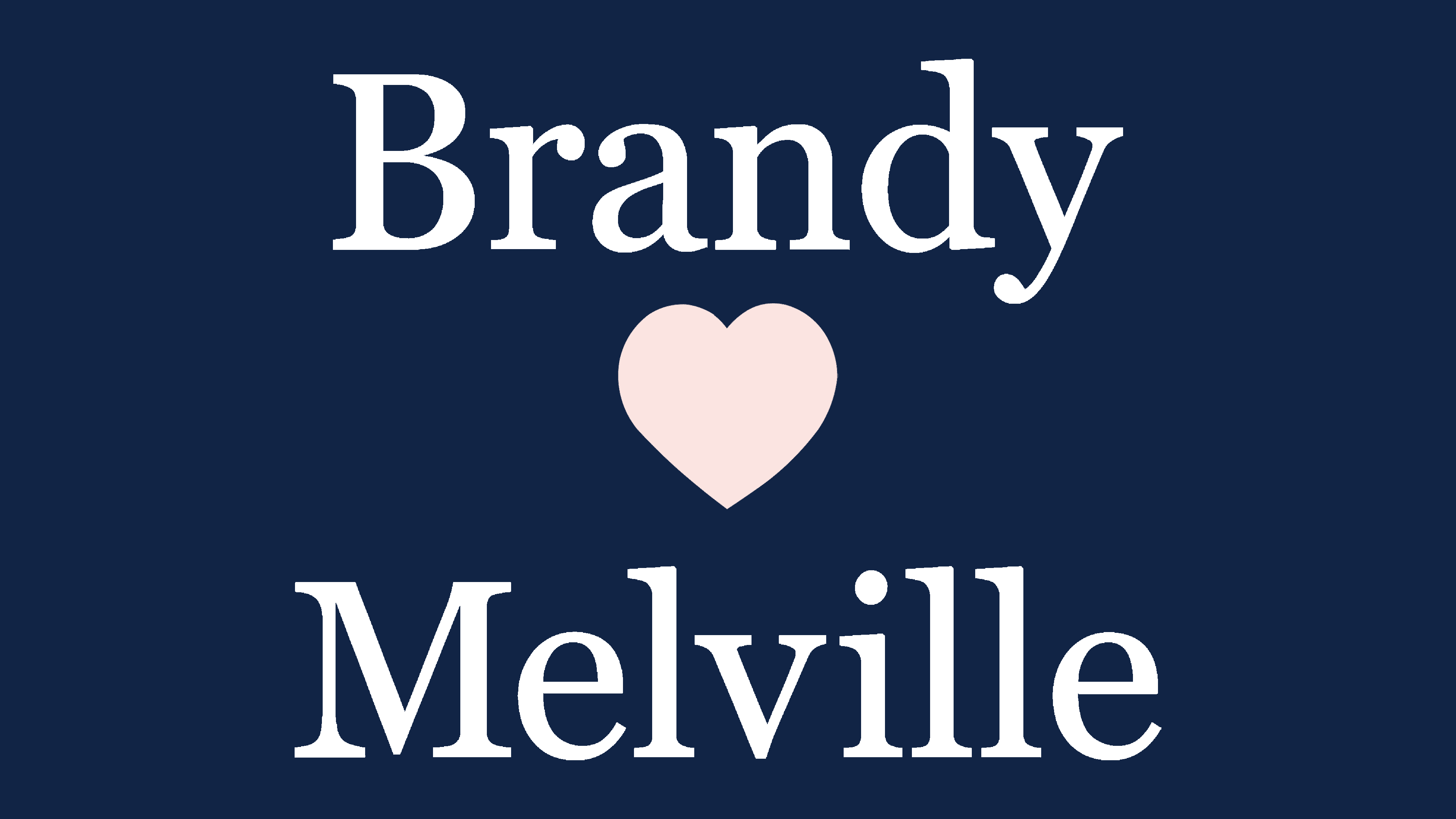
The brand’s emblem has remained virtually unchanged over the years: two names and a heart between them. It is associated with several words:
- Love.
- Comfort and coziness.
- Pair.
- Attraction and touch.
This conveys the company’s style and spirit as much as possible.
The Brendy Melville logo is a love story of a young American woman and a handsome Englishman. Meeting on the streets of Italy, full of romance and stories of Romeo and Juliet, they fell in love. Only their fairy tale happened not in Venice but in Rome (the place where the company was founded). The girl’s name was Brendy, and the boy’s name was Melville. And their names are used as the company’s visual sign.
Both characters are fictional. However, the story seems very romantic and appeals to the teenage girls the firm targets. Even for market research and the search for new clothing solutions, a dedicated team works, averaging 15 years of experience among its members. The main themes of this age are beauty and love. And they’re both affected by Brandy Melville.
The logo is centered on the theme of partnership and relationships built on positive emotions: sympathy, friendship, and support. It is a reflection not only of an invented love story. But it represents everything that happens in the company.
- The two names in the logo indicate the brand’s two factories. Initially, the firm’s clothing division produced only knitwear. But other things were needed to complete the product line. Therefore, a partner factory was found for sewing skirts and jeans. Each has been given a name. The first is Brandy, and the second is Melville. They complement each other and work as a team.
- The couple symbol in the logo reflects the company’s overall marketing direction. It has to do with human contact. The company does not use conventional advertising. Only affiliate programs and social networks, where information is transferred from person to person.
- The company itself is a family. A father and son founded it. It is now run by her son, Stephan Marson, and his children and wife. One of the sons designs models, the second oversees their tailoring, and the wife designs the brand’s stores.
The logo shows that the brand’s products are love at first sight and touch. For tailoring, natural, pleasant-to-the-body fabrics are used. Products are affordable. All things are very well combined. Along with clothes, exclusive yet inexpensive jewelry is sold. Everything is filled with the idea of “couple, attraction, contact, and love.”
The heart in the emblem also reflects the brand’s design style in its Italian stores. They have a lot of hearts and pink color. In other countries, the style is more restrained. The heart’s muted color also aligns with the brand’s color policy. There are no flashy, bright things in the collections. Everything is done in very calm colors.
What is Brandy Melville?
This American-Italian youth clothing concept stands out for its versatile approach and signature California style. The range includes casual women’s apparel, such as mini-skirts, high-waisted jeans, oversized sweaters, and crop tops, capturing the carefree spirit of young women. A distinctive feature is its marketing strategy, which relies on a strong social media presence and creates a sense of exclusivity, with stores designed in a minimalist aesthetic and featuring vintage elements.
before 2013
![]()
The logo has a dark grey inscription, “BRENDY MELVILLE,” divided into two parts by a small pink heart. It is not only a symbol of love between the brand’s two fictional characters but also an expression of warm feelings toward customers. This is how the company shows that it does everything with tenderness and love to please its customers. Nevertheless, the clothing manufacturer’s name is typed in capital letters, which seems harsh and imposing. The situation is saved only by soft rounding. The font chosen reminds us of Bebas Regular by Flat-it.
2013 – today
![]()
The Brendy Melville logo is still associated with youth, fashion, and style. But now all glyphs except the initial ones have been converted to lowercase, making the lettering friendlier. The letters now have long, thin serifs, which have increased the visual dynamics. A contrasting typeface with different line thicknesses began to be used for the same purpose. It is roughly similar to the Bienetre social Regular by ClaudeP. The pink heart has become very light, so the black brand name dominates the emblem.
Font and Colors

The black-and-pale pink palette used in the modern version of the Brandy Melville logo has symbolic meaning. Black is associated with elegance, strength, and authority, while pale pink is associated with tenderness and softness.
The use of pale pink in the heart symbol found in the logo can reflect values associated with love, empathy, and affection. The black color emphasizes the brand’s confidence and authority, suggesting that Brandy Melville knows what it is doing and holds a strong position in the fashion market.
Using these colors in the company’s logo can create associations with fashionable, stylish clothing that combines femininity and strength while maintaining simplicity and elegance. These colors can evoke an emotional connection to the brand, appealing to Brandy Melville’s predominantly female youth audience.
The font used in the modern version of the Brandy Melville logo is called Georgia Pro Regular. Georgia Pro Regular is a new version of the Georgia font, modernized and improved. The font has become more modern and easier to read, with beautiful rounded shapes, smooth lines, and subtle, elegant features that complement a simple, minimal logo design. Its use helps to create a concise yet memorable brand image.
Overall, Georgia Pro Regular is a great choice for a Brandy Melville logo, as it favors simplicity and minimalism.