


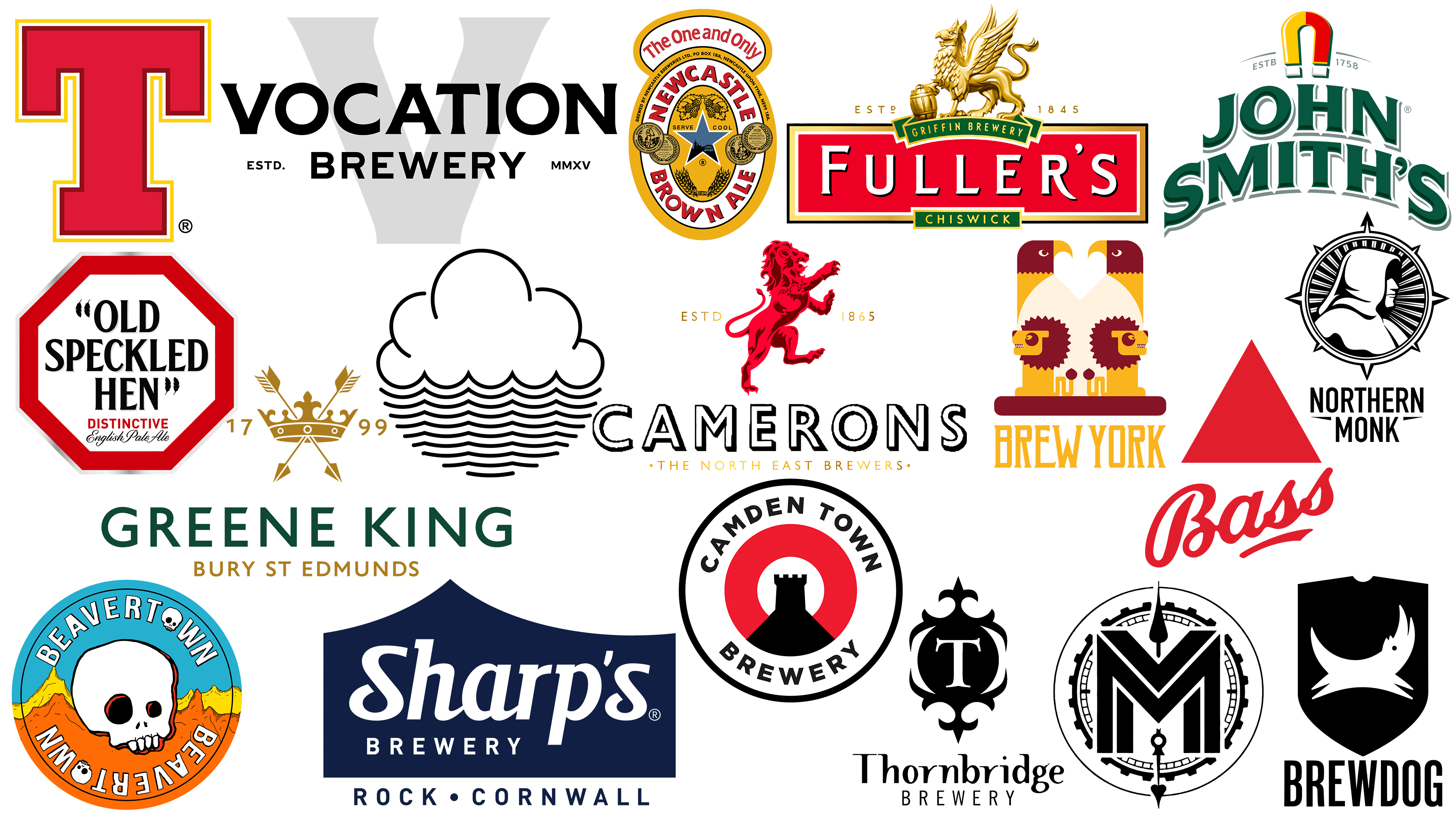
British breweries have captured the world’s attention with their top-notch beers. Names like Brewdog, Buxton Brewery, and Newcastle Brown Ale are synonymous with quality and innovation in the beer world. Brewdog, a pioneer in craft beer, has set the bar high for its contemporaries. In addition, there are traditional beers such as Buxton Brewery and Newcastle Brown Ale that have delighted customers for decades.
Brand identity plays a vital role in the success of these UK beer companies. Each unique style is carefully crafted to appeal to a specific audience. From minimalist design elements to intricate works of art, logos are a crucial marketing strategy. These visual symbols capture consumers’ attention and convey the beer’s character and values.
Exploring some of Britain’s most memorable beers provides insight into the strategies behind their iconic logos. Whether it’s the rebellious atmosphere of Brewdog or the traditional comfort of Newcastle Brown Ale, the logo serves as a visual symbol of what the customer can expect from each sip.
The emphasis on strong branding has paid off, helping these British breweries stand out in a crowded market. Their branding efforts extend beyond the bottle to social media campaigns, merchandise, and even brewery tours. It’s not just about creating a product; it’s about creating an experience that is aligned across multiple touchpoints. This integrated approach has allowed British beer brands to take a unique place on the global beer scene, undoubtedly flavored by the culture and traditions of the United Kingdom.
Bass
![]()
Founded in 1777 in Staffordshire, England, by William Bass, Bass Brewery began its journey, producing the famous Bass Pale Ale, which later became one of the UK’s best-selling beers.
Within a hundred years of its founding, the brewery had already celebrated a significant milestone. By 1877, its rapid growth and increasing demand for pale ales had made it recognized as the world’s largest brewery, with an impressive annual output of 1 million barrels. This pale ale found its audience not only in the UK; its appeal spread across borders, finding fans in many different parts of the vast British Empire.
Bass’s path in the brewing industry was not without strategic moves. Over time, the company absorbed many other breweries, exponentially expanding its brewing capacity and sphere of influence. A major event in the brewery’s history was its 1960s merger with Charrington United Breweries Company. This merger strengthened the company’s position, making it the leading brewing brand in the UK. Bass has diversified its beverage range, with draught Bass and Bass Ale standing out.
Beavertown
![]()
The Beavertown brewery, based in the UK, despite the similarity of its name to its Ohio location, has steadily taken the lead among British beer brands. The story behind its founding is as intriguing as the brand itself. In 2011, Logan Plant, a descendant of Robert Plant, the legendary lead singer of Led Zeppelin, decided to get into brewing, which led to the creation of Beavertown Brewery.
The brewery specializes in creating an eclectic mix of “craft” beers, mostly IPAs. However, the range is not limited to just IPAs. Beavertown offers a diverse selection of seasonal beers, ensuring that aficionados can always find something new to try. Demonstrating its commitment to growing and expanding its audience, the brewery made a significant leap in 2020. A new facility with an impressive 500,000 hectoliters capacity was inaugurated.
Brew York
![]()
In the historic city of York, UK, Brew York, a start-up craft beer company created by Lee Grabham and Wayne Smith, was founded in 2016. Their shared passion and friendship led to the creation of a brand that today resonates around the world in pubs and on store shelves. Every drop of Brew York beer is a testament to its roots, as all of it is made in York itself, some even in the heart of the city, in the original brewery in the city center.
One of the things that sets Brew York apart from its contemporaries is its commitment to innovation and variety. This dynamic brewery doesn’t just stick to a certain palette; it’s constantly exploring new flavor horizons. From beers inspired by iconic personalities like Judi Dench, resulting in the playful “Judi Quench,” to nods to legendary artists like Barbra Streisand with “Rhubarbra Streisand,” Brew York’s creative spirit is evident.
Brewdog
![]()
Originally from Scotland, BrewDog is a titan in the craft beer industry, with an influence that extends not only to its homeland but around the world. Its fame as an international brewery and pub chain has cemented its place among the UK’s famous beer brands. Its Scottish origins are sometimes the occasion for discussions about the intertwined identities of the UK and Scotland.
This illustrious brand boasts a wide range of ales and lagers, and one of its star products, Punk IPA, was named the UK’s best-selling craft beer in 2019. But it’s not just the quality of the drinks that sets BrewDog apart. Noteworthy is the brand’s commitment to sustainability through its pursuit of carbon-negative production. This approach speaks to environmental concerns and aligns with consumers’ growing awareness of sustainability.
Camden Town
![]()
Camden Town Brewery, located in the vibrant London borough of Camden, was founded in 2010, marking a new wave of brewing in the city. Over time, its merits attracted the attention of beer titan Anheuser-Busch InBev Corporation, which subsequently acquired it, creating a fusion of local craft production and global scale.
The origin story of Camden Town Brewery is intriguing and deeply rooted in brewing. The creator of this venture, Jasper Cuppage, was no newcomer to the world of brewing. Brewing flows in his veins. His grandfather, Laurie McLaughlin, once ran McLaughlin Brewery in Australia and created beers that have become world-renowned.
The brewery has something for every taste in its vast selection of beers that grace bars and store shelves throughout the year. The famous Hell’s Lager is undoubtedly a beacon for the brand and is loved by many. But that’s just the tip of the iceberg. Adventurous beer lovers can try such unusual brews as Flue Faker Lager or Inner City Green Lager. For those who crave something special and unusual, the brewery periodically releases limited batches, each crafted with care and a share of creativity.
The logo of Camden Town Brewery reflects its essence in the best possible way. The top of the chimney, familiar to Camden, is elegantly incorporated into a round icon that silently tells the story of the brewery’s roots and dedication to its hometown. The choice of colors – red and white – is not just aesthetic; it conveys deeper values. Red symbolizes the unwavering passion with which each beer is crafted, while white represents the impeccable quality and integrity of the product.
Camerons
![]()
In the heart of Hartlepool, County Durham, a brewing tradition was born in 1865 when John William Cameron founded Cameron’s Brewery. This venerable establishment is the North East of England’s leading independent brewer and has witnessed over a century and a half of beer creation.
A Hartlepool landmark, Cameron’s Brewery is a testament to more than just its longevity and scale. With a staggering capacity of around 1.4 million hectoliters, it remains one of the area’s most important industrial enterprises and contributes significantly to local employment.
Cameron’s Brewery produces an impressive range of beverages, from cask-aged ales to draught and keg beers. Among the famous varieties, Strongarm beer has received special recognition, and since 1955, it has been synonymous with Cameron’s name. Other popular brews, such as Trophy Special and Bullion Gold, have also entered the annals of beer connoisseurs.
When you look at Cameron’s brand, what immediately catches your eye is the symbolic red lion, a symbol that resonates deeply with England’s rich heritage. It’s not just a brand choice but a nod to the country’s glorious past.
Cloudwater
![]()
Cloudwater Brew Co. emerged on the vibrant scene of Manchester, England, and in a relatively short time, has carved out a niche for itself in the vast world of craft brewing. Originating in 2014, the company began producing beer the very next year. Since its inception, the brand has become synonymous with top-tier brewing and has firmly established its place in the industry.
In just a few years of operation, the quality and innovation of the company’s products have not gone unnoticed. In 2017 and 2018, Cloudwater Brew Co. solidified its position among the global brewing elite by being recognized as one of the world’s best breweries.
Award-winning beers set the tone for the brand’s brewing, but Cloudwater doesn’t limit itself to alcoholic beverages. They have expanded their product range to include non-alcoholic sodas to appeal to a wider audience. In addition to its signature drinks, Cloudwater Brew Co is expanding its presence with brewery rooms in strategic locations in London and Manchester. This, along with the annual beer festivals, allows fans to fully experience the brand’s essence.
A large part of Cloudwater’s identity is encapsulated in its logo. The company’s logo, with its minimalism, elegantly combines elements of a cloud and wavy lines, symbolizing water.
Fuller’s Brewery
![]()
With roots dating back to 1845, Fuller’s Brewery began in west London as a family-run business. Over the course of 174 years, its dedication to its family has made it a cornerstone of the British brewing industry. However, in 2019, this iconic business became part of the global beverage colossus, Asahi.
Fuller’s Brewery’s unwavering commitment to quality and flavor has created many sought-after British beers. One of the most colorful creations, London Pride, has become synonymous with British beer. Fuller’s internationally recognized beers have fans in about 80 countries.
Some of the brand’s products have been widely recognized and praised. A testament to the brewers’ craftsmanship is Fuller’s London Porter, which has been awarded the title of “World’s Best Standard Porter.” Another noteworthy variety is Fuller’s 1845, which won the prestigious CAMRA Champion Bottle Beer award in 1998.
The distinctive bottle design is something that many consumers identify with and appreciate. These bottles are not just containers but canvases that reflect the brewery’s heritage and craftsmanship. At the head of Fuller’s branding elements is an emblematic golden griffin clutching a keg of the finest beer. Located on the Fuller’s trademark, this symbol embodies the brand’s rich heritage and unwavering commitment to brewing excellence.
Greene King
![]()
Greene King, a well-respected retailer and brewer, traces its history back to 1799. Based in Bury St. Edmunds, Suffolk, England, it is more than just a well-known British beer brand. It incorporates various businesses, including hotels, restaurants, and brothels.
The brainchild of Benjamin Greene, the outstanding Greene King Brewery, has been at the forefront of producing delicious beverages for many years. These beverages are available not only in their establishments but also at various third-party outlets. Among their wonderful lineup of beverages, Greene King Abbot Ale is particularly notable. Greene King IPA, IPA Export, and St. Edmund’s Golden Ale can also be mentioned.
The brand, with a rich history and tradition, features a minimalist yet expressive logo. The emblem, depicting a crown intertwined with two crossed arrows, speaks to the brand’s royal character.
John Smith’s
![]()
John Smith’s was born in 1852 and is one of the most famous brands in British brewing. For decades, this iconic brand has been at the helm of creating various beers. One such variety, John Smith’s Bitters, has not only gained immense popularity but has held the title of the best-selling bitter in the UK since the mid-1990s.
The eponymous founder of the company, John Smith’s, created these beers with extreme precision, and as a result, their flavor has captivated many palates. Among their varieties, the extra-smooth variant stands out. Known for its unique brewing formula, it offers consumers a distinct texture with every sip, setting it apart in a crowded market. This product alone contributes significantly to the brand’s sales volume.
Tadcaster Brewery, located in Tadcaster, is the center of John Smith’s ultra-soft and original beers. With its deep tradition, the brewery also produces several Heineken beers, emphasizing its importance to the entire brewing community.
The John Smith’s logo is characterized by simplicity. The brand name shimmers elegantly on a bright red magnet, a design element that pays homage to the company’s history. More than just a decorative addition, the magnet is a reference to one of the earliest beers released under John Smith’s banner.
Meantime
![]()
Meantime Brewing Company, located in the heart of Greenwich, London, England, is a gem in the world of beer and is now under the umbrella of the vast Asahi Brewing Corporation. The company’s emergence in 1999, thanks to Alastair Hook, was the beginning of the journey to making the brand known throughout the UK.
Alastair Hook’s brewing prowess has not gone unnoticed, and in 2015, he was named Brewer of the Year, a testament to his dedication and the quality of Meantime’s beers.
With a range of 12 beers, the company prides itself on revisiting and refining traditional British and European brews. The Meantime collection offers beer lovers an exciting journey – from the rich flavor of porter and pale ale to the crisp taste of lager and India pale ale. Their unique bottle selection sets them apart from the rest, turning each drink into a visual delight even before the first sip.
The Meantime Brewing Company logo is inspired by Harrison’s clock at the Royal Observatory. It is centered around a strikingly bold letter “M,” often rendered in a radiant color. This clock-inspired motif subtly evokes the UK’s Greenwich Mean Time reference point, seamlessly intertwining the brand’s essence with that of its location.
Newcastle Brown Ale
![]()
Newcastle Brown Ale, hailing from the English city of Newcastle-upon-Tyne, stands as a beacon in the vast tapestry of British brewing. Colonel Jim Porter, the mastermind behind this legendary beer, brought it to market in 1927 after an intensive three-year laborious creation and development process. Almost immediately, the beer carved out a niche for itself, becoming widely recognized throughout the UK.
During the 1980s and 1990s, Newcastle Brown Ale enjoyed a resurgence in popularity, particularly amongst the student population. This iconic beer was often characterized as a working-class drink, reflecting the industrial sentiment of its place of origin. In other parts of the world, Newcastle Brown Ale is perceived differently. It is perceived as a trendy drink, gaining popularity, especially among young people.
The logo features a star surrounded by a carefully drawn image of the famous Newcastle Bridge. Around this image is a bold white oval, in which the company name is elegantly inscribed in bright red. The combination of these elements resonates with its modern fans.
Northern Monk
![]()
Located in the heart of Holbeck, Leeds, Northern Monk is a beacon of independent brewing. Drawing inspiration from its northern roots and the rich tapestry of ‘monastic’ brewing traditions developed over centuries in the region, the brewery aims to bridge the gap between ancient and modern brewing techniques.
At the heart of the company’s ethos is a careful respect for some of the time-honored brewing techniques integral to Britain’s brewing heritage. This reverence for tradition and a touch of modern innovation has allowed Northern Monk to create a range of unique beers. The company offers a range of flavors, from hop-forward IPAs to tart sours infused with various berries and exotic fruits.
Northern Monk’s logo reflects its name. At its center is the silhouette of a hooded monk, enclosed within a circle resembling a compass. The northern arrow of the compass is emphasized, symbolizing the brewing company’s geographical origin and core principles.
Old Speckled Hen
![]()
Morland Brewery, founded in 1711, is best known for its premium bitter, Old Speckled Hen, which has written its name in the annals of British brewing. Morland Brewery is now managed by Greene King, and its rich heritage has made a significant contribution to British brewing history.
The introduction of Old Speckled Hen beer to the picturesque surroundings of Oxfordshire in 1979 marked a double celebration. It was a new feather in Morland Brewery’s cap and a tribute to the golden jubilee of the venerable MG car factory. Brewed for over half a century of automotive excellence, this beer quickly gained popularity among connoisseurs.
As a well-respected brewery, Morland Brewery boasts an extensive range of beers. Beers such as Monarch, Viking, and Fergusons are a testament to the brewery’s long tradition of brewing excellence and innovation.
Old Speckled Hen continues the legacy of the Morland name. The beer’s logo, in a classic serif font, echoes elegance and time-honored tradition. This sophisticated design conveys the beer’s sophistication and the rich heritage of the Morland Brewery. Combining history and flavor, Old Speckled Hen remains a favorite for those seeking authentic British brewing.
Sharp’s Brewery
![]()
Sharp’s Brewery, located in the picturesque lowlands of St. Minver in Cornwall, was founded in 1994 by its owner, Bill Sharp. When the sands of time shifted, the baton of ownership was passed to Molson Coors. The brewery’s legacy has remained intact, and its flagship ale, Doom Bar, has gained immense popularity. This favorite brew is on the menus of many British pubs and restaurants. While the dominance of Doom Bar is obvious, accounting for a staggering 90% of the brewery’s sales, Sharp’s Brewery is by no means a one-trick pony. They produce a range of delicious ales, notable among them Sea Fury and Cornish Coaster. Demonstrating its deep influence on British culture, Doom Bar Bitter proudly sponsored the prestigious Cambridge and Oxford boat races from 2008 to 2012.
A brand’s personality is often embodied in its logo, and Sharp’s Brewery is no exception. Featured on their top beers, including the iconic Doom Bar, Sharp’s emblem stands out with an elegant serif wordmark. The design features crisp edges and a flawless white font. Its simplicity radiates sophistication, which is just right for a brand that has carved out a significant niche in the competitive beer world.
Thornbridge
![]()
In 2005, Thornbridge Brewery was born in Derbyshire within the historic walls of Thornbridge Hall, witnessing the birth of an innovative brewer. Despite being relatively new to the beer industry, Thornbridge has left an indelible mark on the craft brewing scene.
Thornbridge has won a staggering number of awards, over 350 of them, which is a testament to their professionalism. Among the glittering accolades, the brewery’s Gold Medal win for the world’s best black IPA at the World Beer Awards in 2012 and 2013 stands out.
Thornbridge’s offerings are not limited to awards: its range of beers has won fans around the world. Jaipur IPA, one of their outstanding creations, is a testament to the brewers’ craftsmanship. Thanks to their innovative methods and distinct flavors, Thornbridge Brewery is often referred to as the progenitor of the British craft beer movement. The brewery has found fans in over 30 countries worldwide, a testament to the global appeal of its beverages.
Branding plays an important role in shaping a product’s identity, and Thornbridge understands this. Their logo is an example of understated elegance without excessive embellishments. A clear sans-serif font displays the brand’s name, complemented by a minimalistic but impactful “T” monogram. For all its simplicity, this design, like the company’s beers, carries an air of class and distinction.
Vocation
![]()
Vocation Brewery, located in the heart of Yorkshire, UK, was founded in 2008 by John Hickling, who once worked as an IT specialist in the banking sector.
Since its inception, Vocation has earned numerous awards. This recognition has seen Vocation beer hit the shelves of various supermarkets and retailers across the UK, allowing consumers to enjoy its unique taste.
Vocation Brewery, which opened in 2015, started with a modest staff and a converted chicken shed. In a relatively short period, it has achieved significant growth. The company boasts an impressive production volume of about 10 million cans per year, supported by a dedicated team of about 60 professionals.
The distinctive Vocation logo is one of the first things that catches the consumer’s eye. It stands out in bold, capital letters. The logo uses a bespoke Hebden typeface inspired by traditional signage at Yorkshire train stations, signifying the brand’s regional roots.
Wellpark Brewery
![]()
Wellpark Brewery, located in the Duke Street area of Glasgow, Scotland, is a testament to the region’s rich brewing heritage. Founded in 1740 by Robert and Hugh Tennent, it was established along the historic Molendinar Burn watercourse. Witnessing centuries of history, the brewery is now under the auspices of the C&C Group.
Tennent’s Lager, the Wellpark Brewery’s flagship product, has firmly established itself as Scotland’s premier light beer. The variety dominates the Scottish market and enjoys a wide consumer audience across the UK, making it universally accepted.
Wellpark was originally called Drygate Brewery, but its brewing prowess has made it one of the leading exporters of bottled beer on the world stage. While Tennent’s Lager may be the best-known beer, the brewery’s range is extensive and varied. Among the extensive range are Tennent’s Ember and Tennent’s Light Ale, each with a unique flavor profile.
The company’s logo is a prominent “T” in rich red and gold hues, symbolizing the Tennent name and the legacy left by its founders. This emblem, which represents the brand and its founding family, has become synonymous with the brewery’s high-quality beer.
Meaning of British beer company logos
The UK beer industry is a testament to a rich brewing tradition dating back centuries and includes many brands, each with its own flavor and history. For budding brewers looking for inspiration, exploring these brands is a treasure trove of ideas and insights.
The emblems, which include elements such as the company name and the date of its founding, create a sense of tradition and longevity. These subtle details are a tribute to the brand’s history and a strategic signal to potential consumers of reliability and quality.
Not all brands are rooted in the past. A wave of modern breweries has emerged, challenging the status quo with innovative approaches to logo design. Rejecting traditional motifs, these brewers often favor bright colors, abstract patterns, and unconventional geometric shapes. This fresh approach is attracting a new generation of beer drinkers seeking brands with distinct flavors and presentations.
The British beer industry is an amazing mix of old and new. Whether it’s logos that tell the story of time-honored traditions or logos that reflect the dynamics of modern brewing, each has its own unique story to inspire a new generation of brewers.