


The British automobile industry is one of the world’s oldest and most famous for its luxury cars. The second area in which it has also excelled is the production of quality motorcycles. Its rise came in the early thirties of the last century. In the face of constant competition with world leaders in this field, British manufacturers staked their claim on vintage models. This direction became especially popular among motorcycle collectors and members of the world’s richest families. They, acquiring such models, indulged their sublime aesthetic tastes.
What are British motorcycle brands?
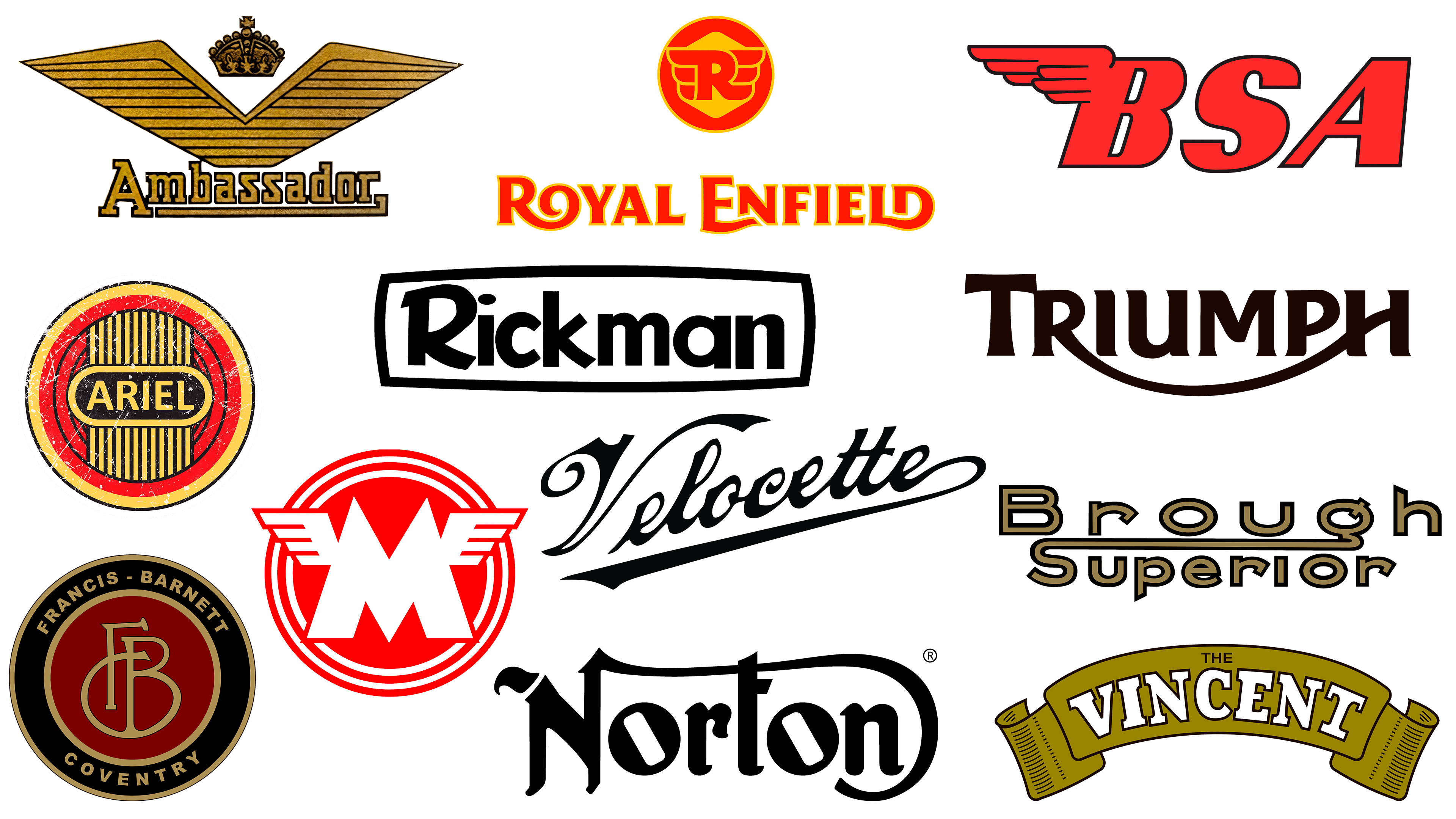
This is a list of the most famous brands representing the British motorcycle industry. These include Triumph, Royal Enfield, Brough Superior, Birmingham Small Arms (BSA), and many others.
During the general industrial decline in Europe from 1939 to 1945, the British motorcycle industry stood with dignity. And by the fifties, it had already reached pre-war levels. Although British motorcycle athletes ceded the laurels to the Italians in the sixties, the production of two- and three-wheeled machines continued to grow, giving rise to the first famous British brands on the world stage: Triumph Bonneville and Ariel Square Four. In the 70s, some famous British brands fell by the wayside. However, even today, many representatives of this trend remain and continue their legendary procession.
Ambassador
![]()
In 1946, the British motorcycle brand Ambassador appeared, founded by British racer Kaye Don, the champion of the twenties. The basis of production was light motorcycles. The company lasted until 1963, when it was headquartered in Ascot, Berkshire, and was absorbed by rival DMW. In 1965, it was closed down. In 2016, an attempt was made to reform the brand – 2017 saw the launch of Ambassador Supreme in a vintage “café racer.” In 2021, the Ambassador 400, in a classic version, “saw the light.”
The brand logo is presented in two variants, depending on the location. The first is a text variant. This is the brand’s name, made in gold with a dark border for each letter. The second is the capital letter of the name, along with several important elements that have forever defined the brand’s style and visual identity: spread wings and a royal crown. The wings symbolize movement, speed, and the feeling of flight from riding the brand’s motorcycles. The crown is a tribute to the heraldry of the past. But its presence, together with the gold color, indicated the presence of a claim to royal status in the manufacturers of this type of transport.
Ariel
![]()
The oldest British brand, Ariel, has been known to cycling fans since 1870. At that time, the company’s founders, James Starley and William Hillman, began assembling penny-farthing bicycles with 48-inch wheels. In 1902, a motorcycle with a Kerry engine was introduced. Innovative in many ways, the company never became the largest in British motorcycle history. Its notable products include the SuperSport, Red Hunter, HF 4, and Arrow. The brand ceased to exist in the 1970s.
The brand name of the model range was simple and concise – a regular oval containing the name in lowercase letters. It was used on all Ariel appliances’ signs and emblems. The most common variant was a circle with a thin black border, and several circles inscribed sequentially to reduce the diameter. The first was yellow, and the other four were red, separated by a black border. The interior had a stylized image of a radiator, with nine stripes inscribed along the radius of the third red circle, set within a yellow-black border. On top of it was an oval with the brand’s name in the center of the whole emblem. The text was executed in the same yellow color, characteristic of the whole emblem, on a black field and an oval border.
Brough Superior
![]()
The world-famous British motorcycle brand Brough Superior began its history in the 19th year of the last century. Its first flagship model, SS100, appeared in 1924. Unlike mass producers of the same type of equipment, the son of the company’s founder, George Brough, relied on individual production of each new motorcycle to meet the customers’ requirements. These were “Rolls-Royces” on two wheels, in terms of production level and price. However, the start of the war led to a mandatory reorientation of production toward military needs. After its end, the brand could not restore the previous production volume.
The brand’s emblem was also distinctive in design. Practically excluding from its symbolic graphic elements, except for the oval, which appears in one of the variants, the creators of the emblem directed all their creativity to the development of the text. The brand name, Brough Superior, becomes its main and unique emblem. The font has become a central element, easily associated with various advertising campaigns and blending perfectly with any design. The connection between Q and S creates a visually effective symmetry, allowing the logo to be seen as an option rather than as tied to the traditional “top” or “bottom.”
BSA
![]()
BSA’s history dates back to 1863, when the company began manufacturing guns in Birmingham. It would become a motorcycle brand in 1910 with the production of its first motorcycle. During the First and Second World Wars, the company actively specialized in producing two-wheeled equipment for the Ministry of Defense of Great Britain. However, in the 50s and 60s of the last century, marketing errors led to a drop in demand for obsolete models as new developments were absent. In 1973, the company was absorbed by Norton-Villiers.
The brand’s logo was characterized by brevity and a few words, typical of many brands in this area. One of its elements was a wing widely used by car and motorcycle manufacturers. The logo consisted of the company’s abbreviation in large lowercase letters, with the word MOTORCYCLES below it in a smaller font, aligned with the outermost letter of the logo. The font is slanted to the right, symbolizing acceleration and striving. The letter “B” has a wing extending from the top, and its line creates the illusion of high-speed wind action. The bright red sign enhanced its impact, perceptibility, and memorability.
Francis Barnett
![]()
This is the oldest motorcycle brand, founded in 1919 by Gordon Francis and Arthur Barnett. The brand’s first models were motorcycles with Villiers and AMC two-stroke engines. They had a displacement of 125cc. The company’s office was on Lower Ford Street, Coventry, England. Their Cruiser motorcycle was the first to include a rider’s mud and oil guard. In 1947, Associated Motor Cycles was absorbed by the more successful Associated Motor Cycles. But in 1966, they announced their closure. The brand’s first models were motorcycles powered by Villiers and AMC two-stroke engines. They had a displacement of 125cc. The company’s office was on Lower Ford Street, Coventry, England. Their Cruiser motorcycle was the first to include a rider’s mud and oil guard. In 1947, Associated Motor Cycles was absorbed by the more successful Associated Motor Cycles. But in 1966, the company announced its closure.
Today, there is an attempt to revive Francis Barnett under their brand name, creating machinery equipped with the most modern components and units. At the same time, the emblem’s classic color scheme is preserved: warm bronze, which, when paired with black, lends the brand an air of aristocracy and luxury. The company logo was a name with a unifying arc that enclosed the text at the bottom. Its modern design took the form of a circle within a circle, with the circles in warm bronze. The margin between the large and small circles is filled with black. The central one is burgundy, on which the bronze monogram of the company is placed, consisting of the first two letters of the name “F” and “B,” connected by a semicircular arc.
Matchless
![]()
1899 is the year when Matchless, the world’s oldest English brand, began fitting engines to its bicycles. The company was founded in 1878 by Henry Herbert Collier as a bicycle manufacturer and was headquartered in London. The first production model appeared in 1901. Four years later, the first two-cylinder version was already in production. The company’s historical fame was due to the Silver Hawk, the world’s first dry-sump V4, which ceased production in 1966. An attempt by Les Harris to revive the brand in 1987 was unsuccessful.
The brand’s logo was among the first to feature a winged symbol on its products. They were located on both sides at the top of the trademark – the letter “M,” made on a dark red background of a small circle encompassing two semicircles. The wings had a stylized heraldic pattern and went beyond the circle. The logo’s semantic meaning was to convey the essence of the brand’s existence: creating two-wheeled vehicles (two rims) and providing high-speed, flight-wings. The red contrasted effectively with the badge metal and rims, making the emblem especially memorable.
Norton
![]()
Like most of the oldest British motorcycle companies, Lansdowne Norton was founded in the late 19th century. Its first motorcycle was produced in 1902. This brand’s light motorcycles are known for their best-in-class popularity, speed, and handling. In addition, their design was considered particularly sexy. The Norton Commando, produced from 1969 to 1977, was the world’s first and best superbike. Subsequent changes in ownership led to the company’s closure in 1995.
The company’s classic logo was the brand name in Gothic script with monograms. The spirit of the Middle Ages was strengthened by highlighting the upper end of the leg of the letter “N” in ornate ornamentation. The letters “O,” formed as screw heads with slits angled to the left, created an original dissonance in visual perception. A curved line from the upper part of the second leg of the letter “N” covered the entire text and ended at the bottom between the last two letters. The monochrome design suggested that the emblem could be painted in metallic, bronze, gold, or silver.
Rickman
![]()
Famous in the 1950s as motocross and scrambling athletes, brothers Don and Derek Rickman decided to express their dissatisfaction with the quality of the British motorcycle industry by creating a car they believed would meet the expectations of real bikers. In 1959, their model, equipped with a new racing frame, conquered the championship and captured the hearts of motorcycle enthusiasts worldwide. But in 1980, the brothers sold their assets and closed the business. However, in 1982, Pat French acquired the rights to the brand. In the crisis of the ’90s, he teamed up with enthusiast Jerry Lisi, who helped ensure the production of the legendary Rickman continues to this day.
Throughout the brand’s existence, it has changed its emblem only slightly. Its background, closer to light olive, was the color of the Rickman brothers’ uniform. The absence of additional graphic elements, aside from the frame with arc-shaped upper and lower parts, did not distract the viewer from the overall visual perception of the name. The font had an individual graphic design. The roundness of the letters suggested the shape of a race track. The font style, characteristic of the mid-50s, has been retained.
Royal Enfield
![]()
Founded in 1901, Royal Enfield produced its first motorcycle the following year. But two years later, the fascination with automobiles led to a reorientation of production. However, success in this area was not achieved, and motorcycle production resumed in 1910. The brand successfully presented its technique in the 30s of the last century. During the war, it created light paratrooper motorcycles. However, post-war difficulties and stagnation of the fifties led to the company’s sale to Indian Madras Motors, where the brand’s history continued in Chennai.
The emblem is made up of the original combination of the bright red-orange of the font and elements that soften the warm, deep, light yellow of their contours. The mark is inscribed in a circle and represents the first letter of the name with wings on both sides. The company name is executed in a modified Medin Medin font, with original transitions symbolizing the curves of rails – the foot of the letter “R” smoothly forms the letter “O.” The lower line of the letter “E” with a curve overlaps the leg of the letter “N” as another level of the track. The connection of the two letters “L” and “D” into a single joint reinforces this impression. The overall visual perception refers the viewer to the smooth curves and beauty of the brand’s products.
Triumph
![]()
The Triumph brand is very serious and strict about the appearance of its logo and the shape of its motorcycle designs. Since 1937, the brand has produced some of the most elegant models in the world, which will hold this palm until the emergence of stylish “Japanese.” In the sixties, the brand became part of BSA, which had already disintegrated by 1972. The history of Triumph ended in 1983, when the company, already owned by the enterprise’s workers under the new name Meriden Co-Op, announced its closure, becoming a victim of creditors. However, the enterprising John Bloor, a lover of the brand, gradually bought up all the company’s remnants and the brand’s rights, and in 1991 produced two lines of three-seat motorcycles.
When you trace the history of British brand development, you notice many similarities in the formation of their emblems. Emblem Triumph has a basic element for all its sign types: the name text. Its accent element is the lower arch, found in other motorcycle manufacturers in one form or another. It joins the stem of the “R” and continues along the centerline of the last letter of the name “H.”
Velocette
![]()
Founded in 1905 by John Goodman (Gutgemann) and William Gue, originally as Taylor, Gue Ltd., the company that later became the famous British motorcycle brand Velocette Motorcycles produced the first Velocette motorcycles. A year later, their name became a brand, forming the basis for renaming the company Veloce Ltd. In 1913, a fundamentally new model, called Velocette, was released. It was so successful that it overshadowed the manufacturer’s name itself. As a result, it became necessary to change the brand name again to Velocette Motorcycles. Roadster racing models became the backbone of the brand’s production until the early 50s. The beginning of the production depression of the 60s led to the brand’s closure in 1970.
An interesting decision was the choice of the brand’s original logo. Traditionally, it represented the company’s full name, Velocette. Its important advantages were its stylishness and memorability. Executed in a handwritten, gold- or bronze-colored uppercase font, it created an impression of aristocracy and luxury. The final monogram, a stroke after the signature, seemed to certify quality, stability, and high technical characteristics.
Vincent
![]()
The history of the British brand Vincent begins in 1917 in a German prison, where the future founder of the company, Howard Raymond Davies, a British Air Force pilot in the First World War, found himself. At the war’s end, together with E. J. Massey, he assembled several models under the name HRD. However, the 1928 crisis led to the sale of the brand, along with all its facilities, to Ernest Humphreys of OK-Supreme Motors, who immediately resold it using Phil Vincent’s drawings and new designs. From then on, Vincent HRD Co., Ltd. appeared with the “Vincent” TM, with the HRD mark removed from the logo in 1949. The brand was closed in 1955.
Its logo is very memorable and original. It’s probably because Phil Vincent was an American. The badge is completely different from the traditional British emblems. In the form of an arched ribbon with rounded edges, like ancient scrolls, on its main field, in gold, it bore the brand name “Vincent.” It was in pure white with a black border for each letter. The font was simple, without additional elements, monograms, or scrolls. Its curve was the same as the shape of the ribbon. Above the name, the preposition “THE” was printed in a small black font – a tribute to the English language rules.
FAQ
What motorbikes are made in the UK?
The UK has a long tradition of motorcycle manufacturing, and some well-known brands still operate there:
- Triumph Motorcycles: Produces both classic and modern motorcycles. The Triumph Bonneville is known for its design and cultural influence, appearing in films and TV shows such as Grey’s Anatomy and Harry Potter.
- Royal Enfield: Originally a British brand, it now manufactures most of its bikes in India. She is known for producing durable bikes with a classic style.
- Brough Superior: Famous for its luxury motorcycles, sometimes called the “Rolls-Royce of motorcycles.” The brand continues manufacturing in the UK, offering high-quality, bespoke bikes that appeal to enthusiasts.
- Norton Motorcycles: Known for the Norton Commando. Despite ups and downs, the company continues to assemble its bikes in the UK.
- Ariel Motorcycles: Known for manufacturing automobiles, Ariel Motorcycles produces the Ariel Ace in Somerset, England. This bike comes with customizable features and high performance.
What is the most popular motorcycle in the UK?
Japanese motorcycle brands like Honda and Yamaha are extremely popular in the UK. Honda leads the market with its reliable motorcycles that suit a variety of riding styles. Yamaha offers a wide range of motorcycles, from sports to cruisers.
Honda and Yamaha’s success in the UK is due to their reputations for producing high-quality, value-for-money motorcycles. British riders value bikes that perform well, are reliable, and offer strong after-sales support, qualities both brands consistently provide.
How many British motorcycle manufacturers were there?
Over a thousand motorcycle manufacturers, including established and defunct brands, have been in the UK. No fewer than 700 brands have been registered since the beginning of motorcycling. This large number is a testament to the UK’s strong history in motorcycle manufacturing. Many companies have started and gone out of business over the years. These brands have significantly impacted the domestic and international motorcycle markets through their creative designs and technological innovations.