


![]() Brooks Brothers Logo PNG
Brooks Brothers Logo PNG
Henry Brooks founded the oldest men’s clothing brand in New York. The brand’s uniqueness reflects its commitment to its history. The Brooks Brothers logo has its roots in ancient mythology, demonstrating the foundation of the brand’s success.
Brooks Brothers began on April 7, 1818, when Henry Sands Brooks opened a menswear shop at Catherine and Cherry Streets in Lower Manhattan under H. & D. H. Brooks & Co. His focus was on high-quality goods at fair prices. After he died in 1833, the business passed to his sons, who renamed it Brooks Brothers in 1850 and introduced the Golden Fleece emblem.
In 1849, during the California Gold Rush, the company launched ready-to-wear suits in standard sizes, replacing custom tailoring. By 1859, Carroll’s New York City Directory described the firm as a pioneer of this format. Brooks Brothers gained strong ties with US politics. Abraham Lincoln wore his coat at his 1865 inauguration, and later presidents, including Theodore Roosevelt, Franklin Roosevelt, and John F. Kennedy, followed.
In 1900, the brand introduced the Original Polo Button-Down Oxford after John E. Brooks observed buttoned collars at a polo match in 1896. In 1902, it released the rep tie with reversed stripes. The flagship moved to 346 Madison Avenue in 1915, where Ralph Lauren later worked before founding Polo Ralph Lauren.
In 1953, Brooks Brothers created the first non-iron shirt, followed by argyle socks in 1957. Marks & Spencer acquired the company in 1988, after which it lost focus. In 2001, Claudio Del Vecchio restored traditional production, including suits in Haverhill, Massachusetts. Bankruptcy followed in 2020, but the brand survived. In 2025, a new flagship opened in Lower Manhattan near its original site.
Meaning and History
![]()
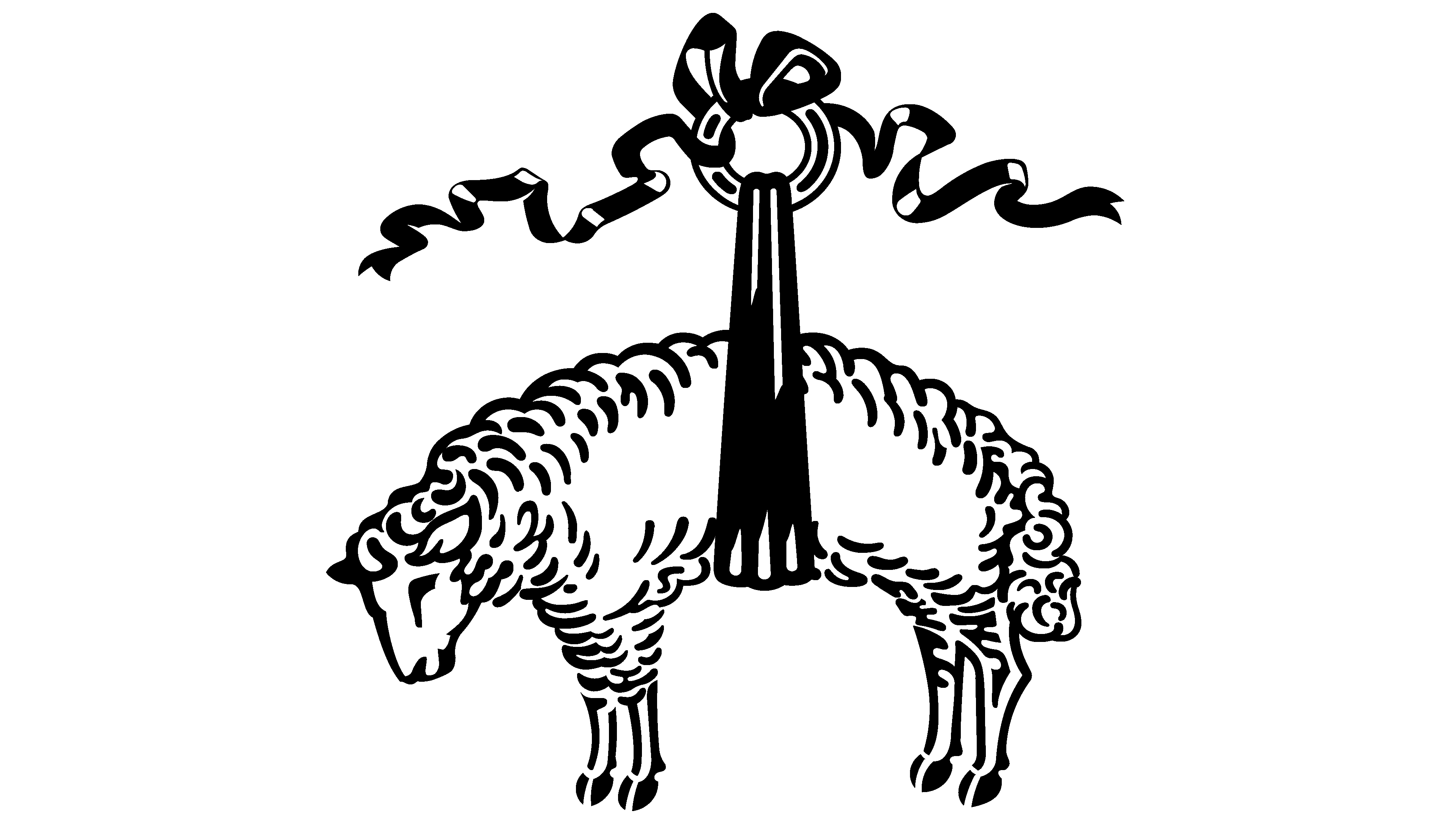
Despite the company’s considerable age (it has crossed the 200-year threshold), its logo is even older. It is rooted in ancient Greek mythology and associated with the Golden Fleece. The primary material used to make men’s clothing was sheep’s wool. This material was valuable to the owner of the family business because it generated a profit.
The company now also produces women’s clothing, but the emblem remains the same as it was at the beginning: a white sheep tied with a wide ribbon, reminiscent of sheep shearing. The company also offers a separate clothing line for Asian customers.
What is Brooks Brothers?
This is the oldest American tradition in menswear, embodying classic fashion and business sophistication. The range includes premium suits, shirts, accessories, and corporate and casual wear. Wool suits, button-down shirts, and striped ties hold a special place, having become staples in the wardrobes of American politicians, business leaders, and members of the creative elite. The high-end suit line, known as the “Golden Fleece,” showcases meticulous attention to detail and traditional tailoring techniques. In addition to the core collections, the brand offers women’s clothing and accessories, maintaining a conservative aesthetic and exceptional craftsmanship.
Font and Colors

Brooks Brothers chose a verbose logo that directly reflects its line of business. The famous Golden Fleece in ancient Greek myths was a coveted object of power, fought over, and a cause of war. The image of a sheepskin was widely used in many contexts. For example, the Argonauts sailed the sea for it, and in the 15th century, the image of a lamb on a ribbon was used as a symbol for the eponymous order. The Duke of Burgundy, nicknamed Philip the Good, established it and amassed a fortune through the cultivation of elite sheep wool varieties.
The sheep hanging on a ribbon is an ancient symbol of the brand’s visual identity. Henry Sands Brooks himself proposed this trademark. The idea came to him after a trip to London, where a whole pastoral culture exists, complete with talismans in the form of lambs and sheep. Their images indicated stores where one could buy the best woolen clothing. Noting this trend in the capital’s supermarkets, he ordered similar sheep to be drawn above the entrance to his store. The emblem has been used in its current form since 1850. It consists of two parts: a sheep on a wide stripe and the company’s name.
Originally, the phrase was handwritten in a retro style. The letters are slanted, sweeping, and confident, with connecting elements, except for the first symbols, which stand separately from the rest. All grammar rules are observed in the name, including capital letters. Thin spirals in the form of steep ram’s horns extend from the letter “B” to the right and left. This font resembles the Edwardian font Scr Alt ITC.
The Brooks Brothers logo typically features a dark blue color scheme on a white background. A mirror-opposite scheme is also used. There are also golden versions on a black base.