


![]() Brown University PNG
Brown University PNG
The graphic elements that make up the Brown University logo are linked to its past. This reflects more than 250 years of history, filled with studies and traditions, talismans, and heraldic symbols, all of which form the basis of the visual identity. From this perspective, the emblem is a tribute to the university’s origins.
Brown University began with a Baptist plan for higher education in New England. In late 1762, Reverend Morgan Edwards proposed creating a Baptist college, and Rhode Island became the favored location because of its Baptist population and lack of a college. In the summer of 1763, young pastor James Manning came to Newport and found local support for the idea.
The first charter draft by Ezra Stiles gave broad control to several denominations, but Baptists rejected it. A revised charter was approved by the Rhode Island General Assembly on March 2-3, 1764, creating the College in the English Colony of Rhode Island and Providence Plantations. Among the signers were John, Nicholas, and Moses Brown, whose family name later became attached to the university.
Manning became the first president, and in 1765, the college opened in Warren, Rhode Island, with Manning as its only teacher. The first commencement took place in 1769. The charter allowed admission regardless of religious belief, a rare rule among colonial colleges at the time. In 1770, the college moved to College Hill in Providence, where University Hall later served as a barracks and hospital during the American Revolution.
In 1804, the school became Brown University after a major gift from Nicholas Brown Jr. Francis Wayland, president from 1827 to 1855, expanded electives, modern languages, laboratories, and engineering. In 1847, Brown opened an engineering program, the oldest among schools later grouped in the Ivy League. Women entered through the Women’s College in 1891, later Pembroke College, which merged with Brown in 1971 after the 1969 New Curriculum replaced fixed core requirements with open course choice.
Meaning and History
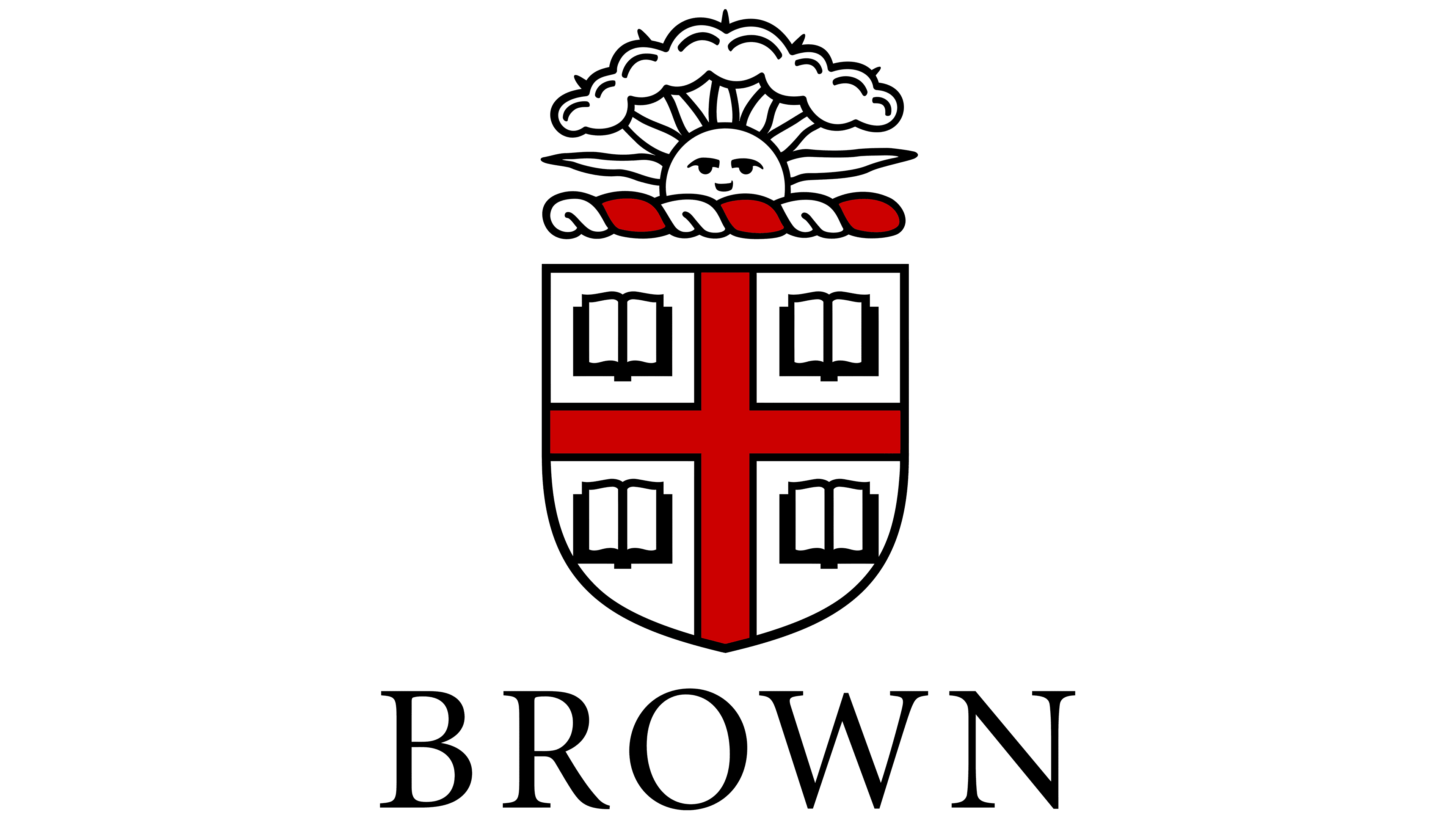
For almost 250 years, only one university logo has been known. It consists of the logo and the Brown lettering in fine serif capital letters.
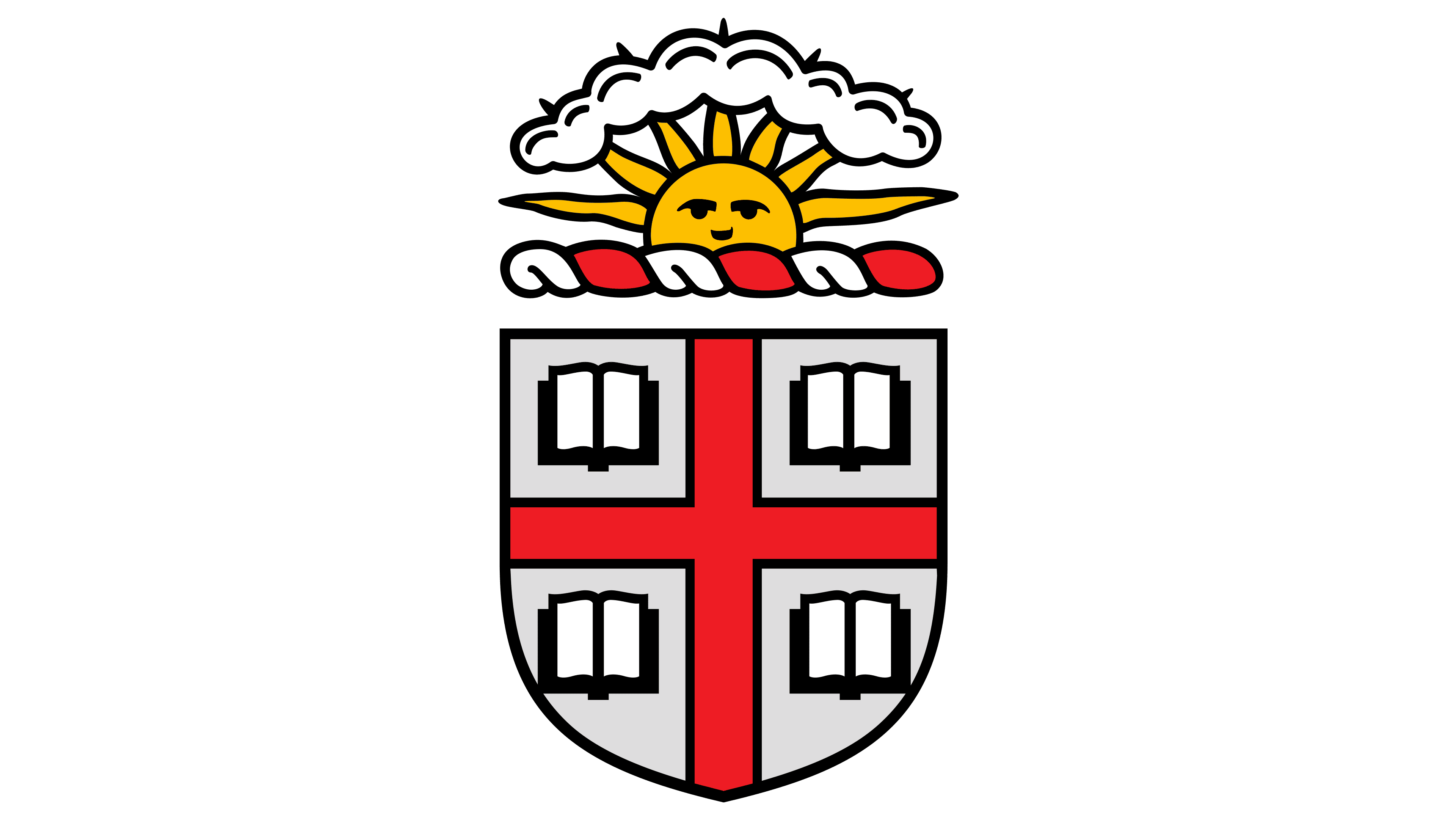
The emblem is a heraldic shield. In shape, it corresponds to the shield of Great Britain. In its center is a red St. George’s Cross on a white background, as part of the British flag. Rhode Island was originally one of the English colonies in North America. Therefore, its roots are closely connected to the United Kingdom, as the logo suggests.
What is Brown University?
This is a distinguished private research university located in Providence, Rhode Island, and a member of the prestigious Ivy League. The university is known for its unique open curriculum, which allows students to design their educational paths without mandatory core courses. The historic College Hill campus features over 230 buildings, many of which are architectural landmarks. The university prides itself on strong programs in computer science, engineering, medicine, and the humanities. A distinctive focus on social justice, an interdisciplinary approach, and close ties to the local community set this institution apart. Student life here is exceptionally dynamic, with over 400 student clubs, the Bears’ athletic teams, and a vibrant cultural program.
The red cross is the symbol of Saint George. He is considered the English patron saint, especially among warriors and cattle breeders. Most of the settlers in Rhode Island were farmers. Therefore, the George Cross in the logo represents the state’s community and the saint’s patronage of them and their university.
![]()
There are four books in each cell between the cross. They are a symbol of knowledge. And their fourfold use corresponds to the four areas of study planned for college: mathematics, languages, history, and geography. At a modern university, books are assigned to three academic departments: college, graduate school, and medicine. The fourth book is military education, which students receive under an agreement with other city institutions while studying.
Books are also a symbol of choice: Brown University has a unique program in which students choose their own disciplines, with no compulsory subjects. They also demonstrate equal rights and opportunities for children of different faiths: Catholics, Protestants, and Orthodox. Such an approach was radical for the time of the university’s founding.
The book shield itself resembles a building with windows. The university is the home of the sciences.
Above the shield is a twisted red-and-white ribbon reminiscent of the sea’s waves. From it, as from an ocean of knowledge, the sun rises and, like a sword, breaks through the clouds of ignorance with its rays.
The logo indicates that the university teaches students about various sciences using books. And the more they learn, the faster knowledge dispels ignorance and stupidity. This helps the colony’s inhabitants “rise to the sun,” develop industry and crafts, and improve the region’s life.
The name on the emblem is placed after the visual sign. This restores historical consistency. The college was founded when the colonies were left behind. In 1790, the state became part of America; the educational institution changed its name.
The word “Brown” in the logo is not only the university’s name but also a reference to the university’s patrons, the Brown family, in whose honor the institution was renamed in 1804. They donated considerable sums to its development.
Font and Colors
The university’s logo is bicolor.
- Red: passion, love of learning, diligence, the fire of knowledge. Red brick buildings like red stripes surround the university, demarcating the logo’s white cells.
- White: these are the pages of books, learning from scratch, nurturing positive character traits.
The colors are considered primary for the UK. White, red, and brown are also considered the university’s base colors.
The inscription font is refined and elite Book Antiqua.