Budget Insurance: Brand overview
In 1996, Budget Insurance emerged on the UK financial market as an initiative of BGL Group. Aiming to meet the needs of the budget segment of the market, the company initially focused on car insurance. In the 2000s, Budget Insurance expanded its horizons by introducing a range of products from home and van insurance to homeowners and life insurance.
A major milestone in the company’s journey was the launch of its online platform in 2007. Budget Insurance sought to carve out a niche for itself in the growing insurance price comparison arena by offering online quotes and policy purchases. Within two years, the company’s strategic efforts had already borne fruit: its customer base had grown to half a million people, both by utilizing the Internet and traditional methods such as phone and fax.
In 2010, there was a change of management: Budget Insurance moved to Towergate, one of the UK’s leading independent insurance intermediaries. But the essence of Budget Insurance remained unchanged. Moreover, under Towergate’s umbrella, the company’s growth trajectory has only accelerated, with online and call center services playing a key role.
Today, Budget Insurance is a beacon for benefit-oriented consumers and offers its diverse insurance solutions to over one million customers in the UK. Based in Peterborough, England, Budget Insurance remains unchanged in its mission: to offer premium insurance solutions without high prices.
Meaning and History
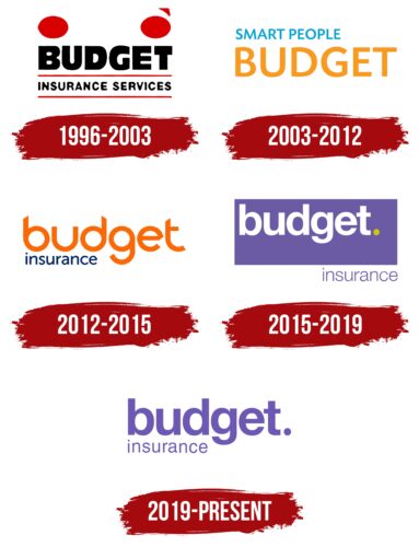
1996 – 2003
2003 – 2012
2012 – 2015
2015 – 2019
2019 – today
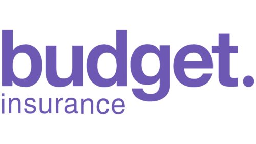
The logo of this insurance company is designed in a minimalist style and contains only the name. The name is arranged in two rows, both aligned on the left edge. The text is colored in a unique shade of purple, symbolizing the desire for growth, openness to change, and creativity. The letters in the first row are large, and the letters in the second row are small, so the word here only reaches the letter “d.” The upper part uses a font reminiscent of Sequel Sans Disp Semi Bold, while the lower part uses a standard font identical to Nimbus Sans L Regular.
The purple color gives the simple design a touch of creativity. The difference in letter size between the two rows gives it a somewhat playful look, making you wonder what is written in the small font. Using two different fonts is like changing the tone of voice in a conversation: it adds texture without complicating the design.
Budget Insurance color codes
| Slate Blue | Hex color: | #6c59b3 |
|---|---|---|
| RGB: | 108 89 179 | |
| CMYK: | 40 50 0 30 | |
| Pantone: | PMS 2725 C |
