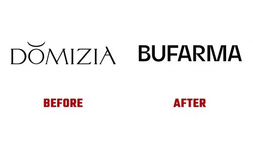
BUFARMA, a pharmaceutical and medical services industry leader, recently introduced a new logo as part of a larger rebranding effort. This update aligns with the company’s shift towards modernity and innovation while maintaining the trust and reliability it has built over the years. The rebrand aims to reflect the company’s forward-thinking approach to healthcare solutions.
The previous logo, Domizia, featured an elegant design with thin lines and decorative elements, emphasizing the letter “O” with a unique symbol. While the old logo’s serif font conveyed a sense of luxury and sophistication, it didn’t fully represent the company’s focus on pharmaceutical solutions or innovation in healthcare.
The new logo adopts a simpler, cleaner approach. Gone are the decorative elements, replaced by a bold, straightforward design. The updated typography is more direct, projecting professionalism, confidence, and reliability. This change emphasizes BUFARMA’s core values of trust, quality, and accessibility. The black color scheme reinforces a sense of stability and competence, positioning the company as a global leader in the pharmaceutical industry.
One significant change is the shift from the name “Domizia” to a more straightforward and mission-aligned identity. This decision strengthens the brand’s connection to its core business, making it more relatable and easier for clients to associate with pharmaceutical services. The new name reflects a focus on clearer communication with customers and a stronger presence in the healthcare sector.
In addition to the logo update, the company has revamped its packaging to align with its eco-conscious approach. Inspired by aluminum milk urns, the packaging highlights BUFARMA’s commitment to sustainability. Designed by SoreThumbStudio, the recyclable, single-material pump system enhances the brand’s environmental credentials. The packaging is eco-friendly and sleek, helping the company stand out in the competitive pharmaceutical market.
The updated logo and branding reflect BUFARMA’s modern ambitions, positioning it for continued growth while staying true to its reputation. This rebrand strengthens the company’s ability to meet the evolving needs of its customers in the healthcare industry.


