


![]() Buffalo Wild Wings Logo PNG
Buffalo Wild Wings Logo PNG
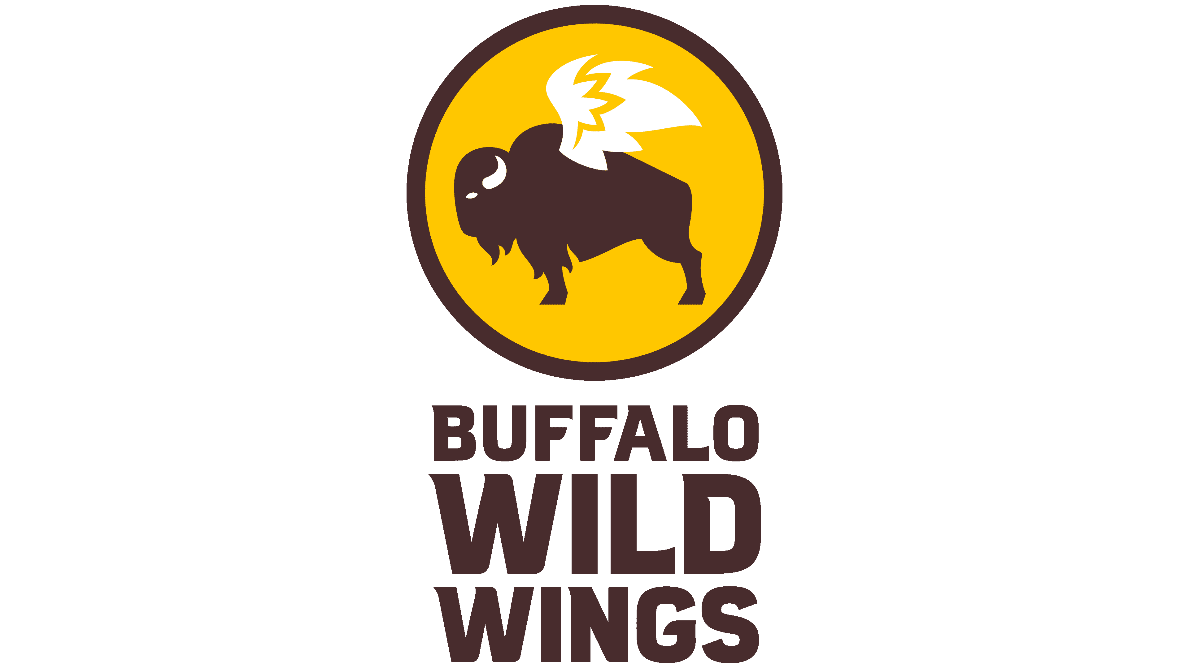
Endurance, strength, and indestructibility are the main principles the Buffalo Wild Wings logo conveys with a bison at sports bars. But it is decorated in a combined style: a powerful dark animal and light wings. The emphasis on the wings is intentional because they are the main dish on the signature menu.
Buffalo Wild Wings began in 1982 in Columbus, Ohio, when friends Jim Disbrow and Scott Lowery opened a restaurant built around Buffalo-style chicken wings, beer, and sports. They wanted a place where fans could watch games, meet friends, and eat wings in a bar setting rather than in a standard fast-food or casual-dining format.
The first location quickly found an audience among residents and students. Fried wings, seasoned fries, and a growing list of sauces became the core of the menu. The sports-bar atmosphere, with screens, game-day energy, and group seating, gave the brand a clear position in a crowded restaurant market.
Franchising drove the next stage. In 1992, the chain had 7 locations. By 2003, it had 211 and went public, raising the company’s capital for expansion. During the 2000s and 2010s, Buffalo Wild Wings spread across the United States and entered international markets. By 2015, the chain had passed 1,000 restaurants.
The menu later grew beyond traditional wings. Buffalo Wild Wings added boneless wings, burgers, sandwiches, salads, desserts, and loyalty features while keeping sauces and live sports at the center of the experience. In 2017, Arby’s Restaurant Group acquired the company for about $2.9 billion. Today, the brand operates more than 1,200 locations in over 10 countries and remains built around wings, sauces, beer, and sports viewing.
Meanings and History
![]()
Starting with serving snacks and beer to fans at various championships and games, founders James Disbrow and Scott Lowry, who met by chance at an amateur figure skating competition in Kent, Ohio, in 1980, thought about the possibility of creating a more comfortable environment for watching sports programs and food intake at that moment. After two years, their first restaurant opened in Columbus, and a year later, sports fans could enjoy the organizers’ signature dish at the Westerville restaurant, drinking wings with beer while watching sports broadcasts, connecting with friends and colleagues who shared similar interests, and reminiscing and exchanging opinions about specific matches.
The chain received its first name, Buffalo Wild Wings & Weck, because of the special love and respect of the leading sports team owners from the city of the same name in upstate New York, as well as the main dish offered to visitors. The company rented its main office in Cincinnati. The two restaurants did not generate large profits, but they helped drive a significant increase in popularity among sports fans. This led the creators to begin work on the franchising system. The result exceeded all expectations, prompting a reconsideration of the company’s name. In 1998, it became Buffalo Wild Wings Grill & Bar. The new name required a new image. This year, a logo was created, which was positively assessed by almost all visitors to the institution.

In 2015, the company had 485 sports bars and 585 franchises covering all American states.
The company’s development allowed 210 to open several of its restaurants in Canada. Today, it is already a well-known brand and a popular franchise with a network of restaurants in 10 countries.
What is Buffalo Wild Wings?
This is a chain of American sports bars and a fast-food restaurant franchise with a casual atmosphere that serves chicken wings in Buffalo sauce. Therefore, each of the nearly 1,300 dots is adorned with the signature Buffalo Wild Wings logo – a winged bison. The company was founded in 1982 by businessmen Jim Disbrow and Scott Lowery in Columbus, Ohio. Inspire Brands now owns it.
1982 – 1998
![]()
The company’s first logo did not stand out in any way. It was round and applied to coasters. It featured the outline of a buffalo in a small black circle, with the company’s abbreviation “bw-3” written in lowercase red and the number 3 denoting the three “W”s that made up the brand’s name. Along the contour of a small circle, the full name was applied from its outer side in the upper part, with capital letters highlighted in red; below was the inscription The Real Wing.
1998 – 2012
![]()
The 1998 name change necessitated a change to the brand name. From that moment on, it acquired a more recognizable form, the basis of which has been preserved to this day. The circle space highlighted with a black border is filled with a light yellow. It contains a black buffalo silhouette, on the back of which a chicken wing is depicted, made in white with black edging. It is somewhat out of the circle. The buffalo stands confidently on a black plate that covers the lower part of the circle and, in size, extends beyond the circle’s diameter on both sides. Inside the plate, the main name is drawn in white capital letters, and below it, the inscription “Grill & Bar” is made in thin capital letters, to the left and right of which two yellow comets are drawn, bringing them closer to the text.
During the same period, the company began conducting market research to study its visitors’ opinions and demands. Due to the limited budget, it was decided to use social networks for these purposes, including Facebook. The task was to increase interest in the company, meaning higher sales during the off-season, from May to July, when sports battles end, and visitor activity decreases. This approach paid off, demonstrating that sports fans have a roughly equal attitude towards sports and BWW offerings. Moreover, in some cases, wings with 19 sauces were more in demand than interest in sporting events. In turn, these data will play an important role in owners’ refusal to make special changes to their logos.
As a result of such research, the company applied a marketing ploy by introducing several profitable offers of discounts and bonuses, significantly increasing its presence in social networks, creating original topics for disputes and communications regarding the menu, and offering several original solutions that forced people to visit the bar during the summer sports off-season.
In 2011 alone, from May to July, wings were sold twice as often as in the previous period, indicating a twofold increase in restaurant and franchise sales.
2012 – 2018
![]()
The success of the marketing campaign and the increase in economic growth led the owners to want to use their own visual identity to demonstrate the enterprise’s success and new direction. Some changes were also made to the company logo, which will, in the future, show that the founders are inherently conservative, primarily about their image. There have been no cardinal changes to the emblem until today. The new logo retains the same design as the main elements: a circle and a winged bison. Only the bison is already fully placed in this circle. The black plate has been removed. Only the full name of the company, placed to the left of the circle, has been retained from the text. The text is written in black capital letters, each word printed under the other. The first one is in a smaller type than the others. The middle one, Wild, is the largest, and Wings is smaller than the previous one.
2018 – today
![]()
The latest version of the brand mark differs from the previous one in several ways. It was the result of consultations held with professional web designers. The development of the logo was driven more by the need to ensure a high-quality visual experience online. Advances in modern technology have enabled new requirements for self-promotion, as seen in the Buffalo Wild Wings emblem today.
Font and Colors
The new logo remains true to the tradition that started in 1998. In its composition, it is a complete repetition of the 2012-2018 version. However, some changes are immediately noticeable. The black color on all elements is replaced by brown. Bison somewhat “changed” his position. Now it seems to be preparing to take off. The white wings have lost their contours, making them difficult to see against the light-yellow background of the circular field. The new font used in this emblem is in the same sequence and on the same side as the previous logo. Its use has improved readability and clarity, especially when placing an image online.
The Buffalo Wild Wings logo stands out with its bold, large lettering in a custom font with triangular serifs at the end of each letter. This font, significantly modified from similar types such as ITC Mixage Std Black or Brickton Regular, is tailored to match the brand’s unique style.
Buffalo Wild Wings’s color scheme features yellow and brown with white highlights, creating a warm and inviting look. Yellow adds a sense of energy, brown brings warmth and appeals to the taste, and white reflects the brand’s commitment to customer loyalty and reliability. The combination of colors captures Buffalo Wild Wings’ essence and helps attract and retain customers, boosting the brand’s appeal.
FAQ
What is Buffalo Wild Wing’s motto?
Buffalo Wild Wings’ slogan, “Wings. Beers. Sports.” sums up what they’re all about. It highlights their focus on serving great chicken wings, offering a variety of beers, and broadcasting live sports. This makes it a popular place to enjoy good times with friends, bonding over favorite foods, drinks, and sports games. This motto has positioned Buffalo Wild Wings as a top choice for anyone looking to catch a game or just enjoy a fun outing, thanks to its lively, welcoming vibe.
Is the Buffalo Wild Wings logo a bison?
The Buffalo Wild Wings logo does feature a buffalo or bison, but interestingly, this has nothing to do with the food they serve. The buffalo in the logo is about creating a strong brand identity, not about what’s in their dishes. The “Buffalo” in their name refers to the Buffalo, New York-style chicken wings known for their spicy and tangy sauce. So, the bison in the logo is just for looks and to make the brand stand out, without suggesting that bison is an ingredient in their wings.
What do the three stand for in Buffalo Wild Wings?
The “3” in Buffalo Wild Wings, or BW-3, comes from the restaurant’s original name, Buffalo Wild Wings & Weck, which started in 1982. “Weck” refers to kimmelweck, a type of Kaiser roll sprinkled with caraway seeds and coarse salt, and it is included on their first menu alongside their famous wings. Although the restaurant now focuses more on wings and a sports-bar vibe, the BW-3 nickname sticks around as an homage to its original menu and origins, highlighting the unique Kimmelweck bread once served there.
What does B dubs mean?
B-Dubs is the catchy nickname for the restaurant chain Buffalo Wild Wings. It originated from shortening the initials BWW to something easier to say: “bee-double-you,” which was further shortened to “bee-dubs.” Buffalo Wild Wings liked this nickname so much that they officially registered it on October 2, 2007. It’s become a popular way for fans and customers to refer to the restaurant, adding a fun twist to the brand’s identity.
What is the meaning of the Buffalo Wild Wings Logo?
The Buffalo Wild Wings logo is more than just the face of the restaurant; it pays tribute to the story of Buffalo-style chicken wings. These wings, which were once overlooked, became a beloved dish thanks to creative culinary innovation. The story goes back around 60 years, when African Americans played a key role in making chicken wings a popular meal.
Teressa Bellissimo, who owned the Anchor Bar in Buffalo, New York, is often credited with creating the modern Buffalo wing. She devised the idea of deep-frying chicken wings, coating them in hot sauce, and serving them as a snack with celery and blue cheese. This invention turned chicken wings into a highly desired food.
The bison in the logo symbolizes two things: the adventurous revival of a once-overlooked part of the chicken and the roots of Buffalo Wild Wings, which trace back to Buffalo, New York, where these famous wings originated. Essentially, the logo tells the story of Buffalo Wings’ humble beginnings and their journey to becoming a celebrated part of American cuisine while nodding to the city where it all began.
What does the logo symbolize, Buffalo Wild Wings Logo?
The Buffalo Wild Wings logo showcases a relaxed, sports-loving vibe, highlighting the fun and excitement of watching games at their locations. The logo features an American bison, often called a buffalo in the US, symbolizing strength, freedom, and the wildness of the chain’s famous chicken wings. By merging a bison with wings, the logo creatively represents the chain’s commitment to bold flavors and to being a place for sports fans to gather. This symbol emphasizes the adventurous eating experience Buffalo Wild Wings provides, where customers can enjoy sports and delicious food in an energetic atmosphere.
Did Buffalo Wild Wings change their logo?
Buffalo Wild Wings has refreshed its logo three times, making subtle changes each time. Despite these updates, the logo remains similar to the original, maintaining the iconic winged bison inside a yellow circle with a black border as its core image. These updates happened in 1998, 2012, and most recently in 2018. The main adjustments were to the bison’s style and how the text was arranged around the logo. This strategy kept the brand’s identity consistent, ensuring customers could still recognize it while giving it a fresh look.
Why did Buffalo Wild Wings change their name?
Buffalo Wild Wings changed its name in 1998, dropping the “& Weck” from “Buffalo Wild Wings & Weck” because it no longer served the “Weck,” a roast beef on a kummelweck roll that had been a menu staple. After removing “Weck,” they added “Grill & Bar” to show they offered more than wings. Eventually, they also dropped “Grill & Bar,” opting for the simpler name we recognize today. The brand’s logo reflects this change, using an abbreviation for ease. The nickname “B-Dubs” comes from a fun take on the BWW initials, pronounced as “bee-double-you” and then shortened to “bee-dubs.” This nickname, alongside “BW3,” which nods to the original name, has become a popular way for fans to refer to the restaurant.
Why does Buffalo Wild Wings have a bison?
The Buffalo Wild Wings logo features a bison for a few important reasons:
- The bison is common in North America, where the brand originated, linking the logo to its origins.
- People in the U.S. often call bison “buffalo,” which matches the brand’s name, Buffalo Wild Wings, making the bison a perfect symbol for the chain.
- Bison are seen as strong and resilient animals, reflecting the sports bar’s atmosphere of excitement and strength.
These factors combine to make the bison a great symbol for Buffalo Wild Wings, capturing the essence of the brand’s American roots, its connection to sports, and its powerful customer experience.
What is the B-Dubs slogan?
The slogan “Wings. Beers. Sports.” gets to the heart of what Buffalo Wild Wings, or B-Dubs as it’s often called, is all about. It’s a simple way to tell people they can find great chicken wings, a variety of beers, and live sports in one place.
First, wings are a big deal at Buffalo Wild Wings. They’re known for offering a wide range of flavors and sauces, making wings tasty and fun to share with friends and family. It’s a place where people come together to enjoy good food.
Next, beer is a key part of the experience. With a wide selection ranging from local crafts to international favorites, there’s something for everyone. It sets a relaxed vibe where guests can chill and have a good time.
Sports are the final piece of the puzzle. The restaurants have many TVs showing live sports, making it an exciting spot for sports fans to watch games while enjoying their meals and drinks.
“Wings. Beers. Sports.” isn’t just a catchy slogan. It perfectly captures what Buffalo Wild Wings offers: tasty wings, a great beer selection, and a fun place to watch sports. This combo draws in all kinds of people, from groups of friends to families, looking for a good time.