


![]() Bullet Club Logo PNG
Bullet Club Logo PNG
A sports show has a hypnotic effect on the fans. Every element of the identity, including the Bullet Club logo, conveys it. The powerful tool of sports has become an equally powerful tool of advertising, offering a spectacle that tickles the nerves. The atmosphere of peak tension is perfectly embodied in the wrestling association’s badge.
Bullet Club was formed on May 3, 2013, at NJPW’s Wrestling Dontaku in Fukuoka. Prince Devitt turned on his Apollo 55 partner Ryusuke Taguchi, then joined Bad Luck Fale, Karl Anderson, and Tama Tonga. The four foreign wrestlers built a heel faction around interference, attacks, and open disrespect for Japanese ring customs.
Devitt created the name. “Bullet” referred to his finger-gun pose and “Real Shooter” image, while “Club” echoed Anderson’s “Machine Gun” nickname. By late 2013, “The Young Bucks” and “Doc Gallows” had joined, Bullet Club Latinoamerica appeared in CMLL, and the group held both junior titles while winning three of NJPW’s five major tournaments that year.
In April 2014, Devitt left NJPW and later became Finn Bálor in WWE. AJ Styles replaced him as leader and quickly won the IWGP Heavyweight Championship from Kazuchicka Okada. By summer 2014, Bullet Club held all four heavyweight titles in NJPW. Kenny Omega joined in November 2014 as “The Cleaner.”
In 2016, Styles, Anderson, and Gallows left for WWE, and Omega became the leader. With The Young Bucks, he formed The Elite and launched Being the Elite, which helped expand the group’s audience. Cody Rhodes joined in 2017, while Hot Topic sold Bullet Club shirts in hundreds of stores. The Elite split away in 2018 and later founded All Elite Wrestling. Jay White became the leader in late 2018, won the IWGP title in 2022, and was replaced in 2023 by David Finlay, who launched the War Dogs era.
Meaning and History
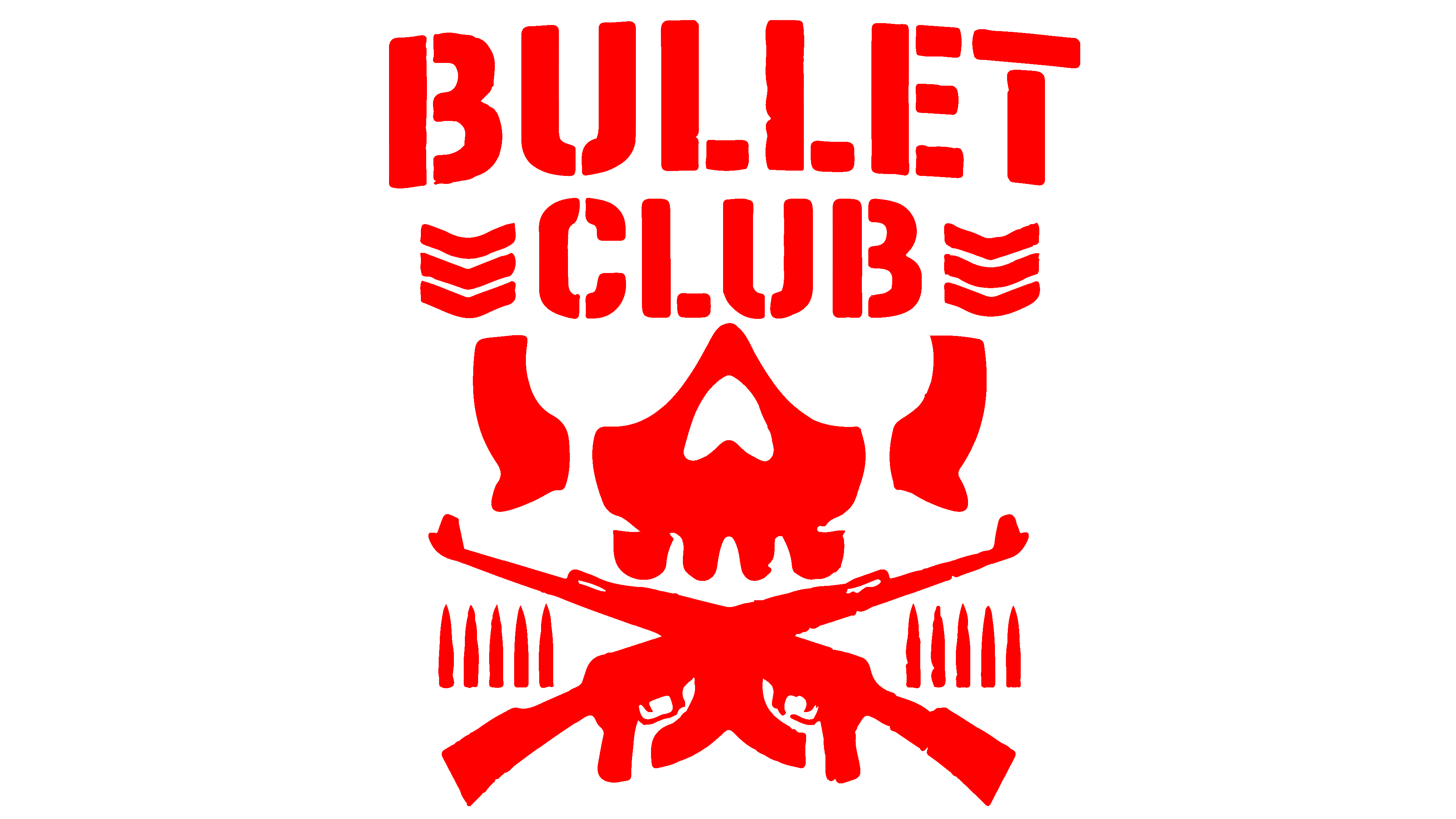
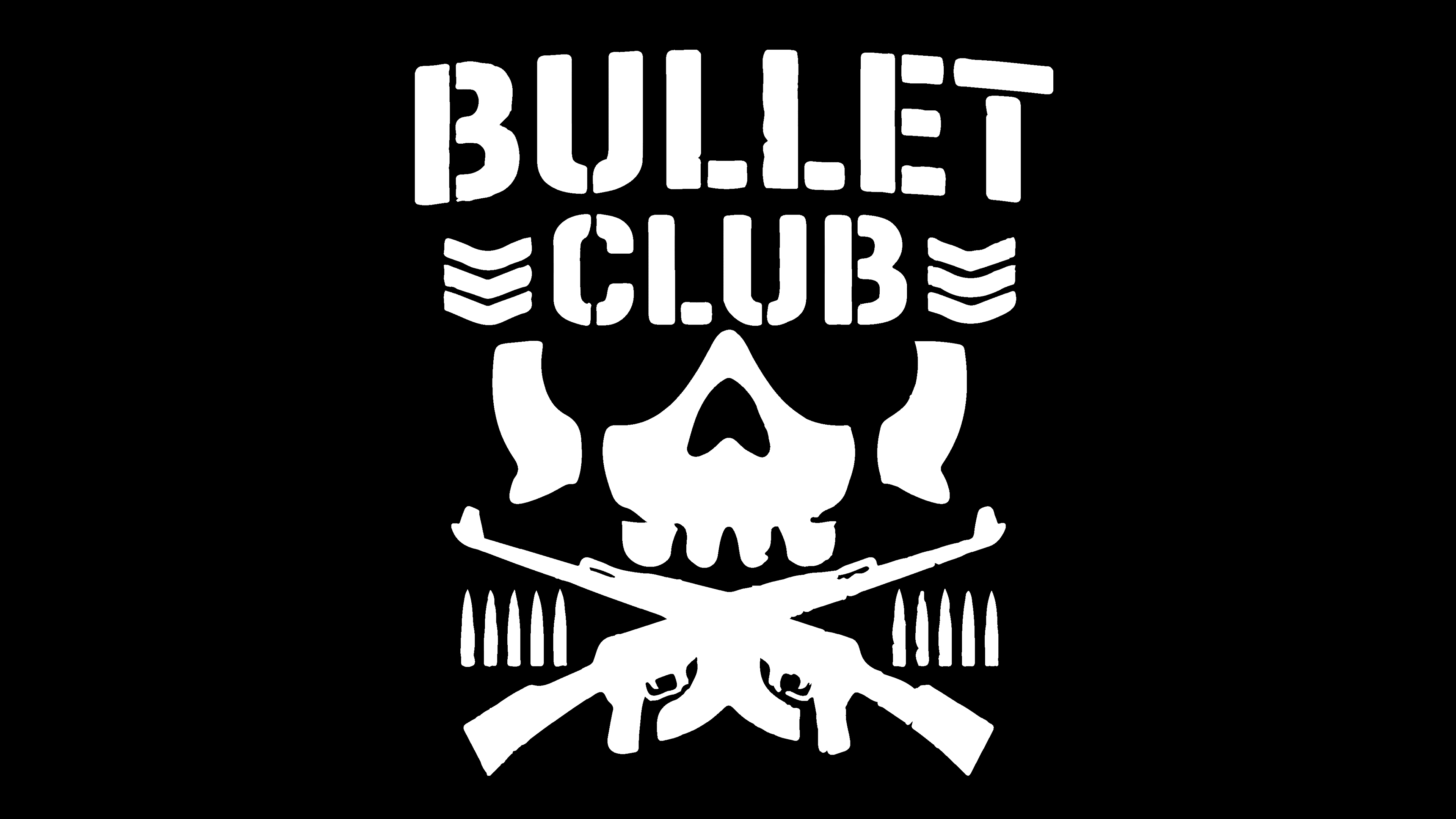
Visual recognition of the association’s logo is quite high among professional wrestling fans. Since the Bullet Club’s establishment, its logo has not changed because it conveys the characteristics of combat athletes. The team’s emblem consists of two elements: the brand name and the image below it. The lettering is in a classic, bold sans-serif style. The lettering style is quite unusual, as each symbol has empty spaces, which only adds to the mystery. To the right and left are three downward-pointing arrows. They resemble chevrons with U.S. Army ranks.
The image is a “Bone Soldier” mask, with two crossed machine guns beneath it. Five bullets are displayed to the right and left of the machine guns.
What is Bullet Club?
This is one of the most famous groups in wrestling, which has performed for about ten years in the sport’s biggest promotions. They stand out for their unconventional appearance and aggressive style.
Bullet Club representatives did not choose the logo image by chance. It should be associated with an imaginary fighter, a terrifying character, who should be wary of all team opponents. Among the group representatives, Mitsuhide Hirasawa, who became famous for performing in Japanese promotions but later decided to try his hand outside Asia, stands out.
It should be noted that, in minimalist images, the emblem is sometimes removed from the logo. Only the team name remains. If the user has no connection to wrestling, he may think this logo belongs to a sports team rather than a military unit. Perhaps that was the purpose behind the aggressive black-and-white Bullet Club logo. The athletes decided to demonstrate their potential and ambition in this way, noting that their opponents would not be easy in the ring. The black-and-white color scheme was not chosen by chance. The brevity and lack of bright colors indicate that this organization is serious and willing to do whatever it takes to win.
Font and Colors
A classic, bold font was chosen for the lettering on the Bullet Club logo. However, the lettering style sets it apart from most logos. The shape of the letters is interesting and mesmerizing. Due to the space, each symbol is divided into several parts. This demonstrates that the association has secrets that the audience will soon learn.
The Bullet Club team’s color palette is black and white. However, depending on the background, the logo’s color can be changed from white to a subtle shade of yellow. Strict and aged colors look very harmonious without contrasting with each other. The black background and the skull are associated with anger and belligerence, which is what the target audience of a wrestling show demands.