


![]() Burberry Logo PNG
Burberry Logo PNG
Burberry is a representative of the fashion industry with a rich history, a British company whose logo pays tribute to its past. The Burberry logo symbolizes the aspiration to defend its interests, emphasizing the aesthetics and luxury of its offerings.
Burberry started in 1856, when Thomas Burberry opened an outerwear shop in Basingstoke after training as a draper. He focused on protection from rain, reacting to heavy rubberized coats.
In 1879, he developed gabardine, a fabric treated before weaving. It combined water resistance and breathability and was patented in 1888. It was used by Fridtjof Nansen in 1893, Ernest Shackleton in 1914–1917, and George Mallory in 1924.
In 1891, a London store opened on Haymarket. In 1901, the equestrian knight logo with the motto “Prorsum” was adopted. In 1912, the Tielocken coat was patented, later forming the trench coat.
During World War I, the British War Office ordered officer raincoats. The trench included epaulets, D-rings, storm flaps, and a back vent. After the war, it moved into civilian use. In the 1920s, the check lining became a registered trademark.
In 1934, Burberry introduced same-day delivery in London. In 1937, pilots completed a long-distance flight in their clothing. In 1955, the brand received a Royal Warrant from Queen Elizabeth II, later from the Prince of Wales. By 1965, one in five exported British coats was Burberry.
In 1955, Great Universal Stores acquired the company. In 1972, it bought a factory in Castleford. By the 1990s, widespread counterfeits using the check pattern weakened its market position.
In 1997, CEO Rose Marie Bravo began restructuring. In 1999, the name changed to Burberry. In 2000, a flagship opened on Bond Street, and Christopher Bailey led design until 2018. In 2010, the brand streamed a runway show, and in 2012, it published a collection on Twitter, ahead of Mulberry and Ralph Lauren.
Meaning and History
![]()
Over many years, the appearance of a knight on a galloping horse has been associated with the luxury fashion house. Throughout its existence, the iconic emblem remained virtually unchanged until 2018, when the horse knight disappeared. However, he remains an integral part of the trademark, which Fabien Baron developed. The company had several logos.
Why is Burberry?
This British luxury brand has become a symbol of sophistication and elegant English style thanks to its iconic trench coats and signature check pattern. The company offers a wide range of premium products, including clothing, accessories, cosmetics, and fragrances. Still, it is renowned for its gabardine trench coats, favored by royalty, celebrities, and business professionals. Its collections are regularly showcased at London Fashion Week, reaffirming the brand’s status as a leader in the global luxury market.
1901 – 1968
![]()
The debut version appeared in 1901 when the fashion house was called Burberry. The drawn image of a knight on horseback occupied the entire logo space. The rider was fully armored, holding a shield and a spear with a flag that read “Prorsum.”
Also, the symbolic representation of the letter “B,” signifying the manufacturer’s name, was present everywhere. Its expanded version was located under the rider galloping on a horse. It was typed in bold serif font. The horse’s tail, the flag, and the feather on the helmet were fluttering, so it seemed that the knight was charging forward at full speed.
1968 – 1999
![]()
In 1968, the text part began to dominate, so the rider was reduced to a miniature size. Only schematic outlines of him remained. The knight was placed above the inscription, in the area of the protruding “t” leg, over which the horse was jumping.
The symbols in the logo are lowercase, with the first letter capitalized. Under the fashion house’s name is a miniature inscription “Of London.” It is executed in the same font as the main word. The difference between them is only in size.
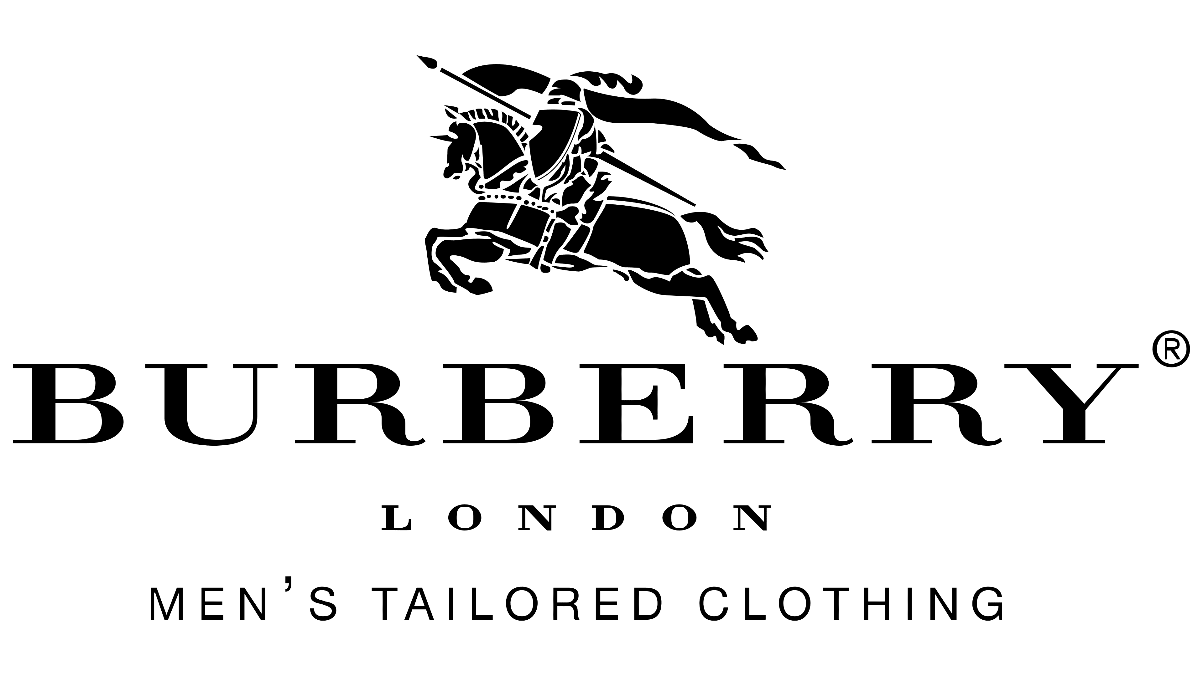
1999 – 2018
![]()
The 1999 redesign balanced all elements of the logo. This was the result of rebranding, associated with the company’s abandonment of the letter “s” in its name. At the same time, the entire Burberry branding package was reimagined.
From then on, the graphic and verbal parts became comparable in size. The artists returned the knight, horse, and armor to their details, executed in white on dark backgrounds. They removed the article “Of” from the lower inscription, emphasizing the word “London.” This was necessary for the visual clarity of a small label or tag, where all details must be visible.
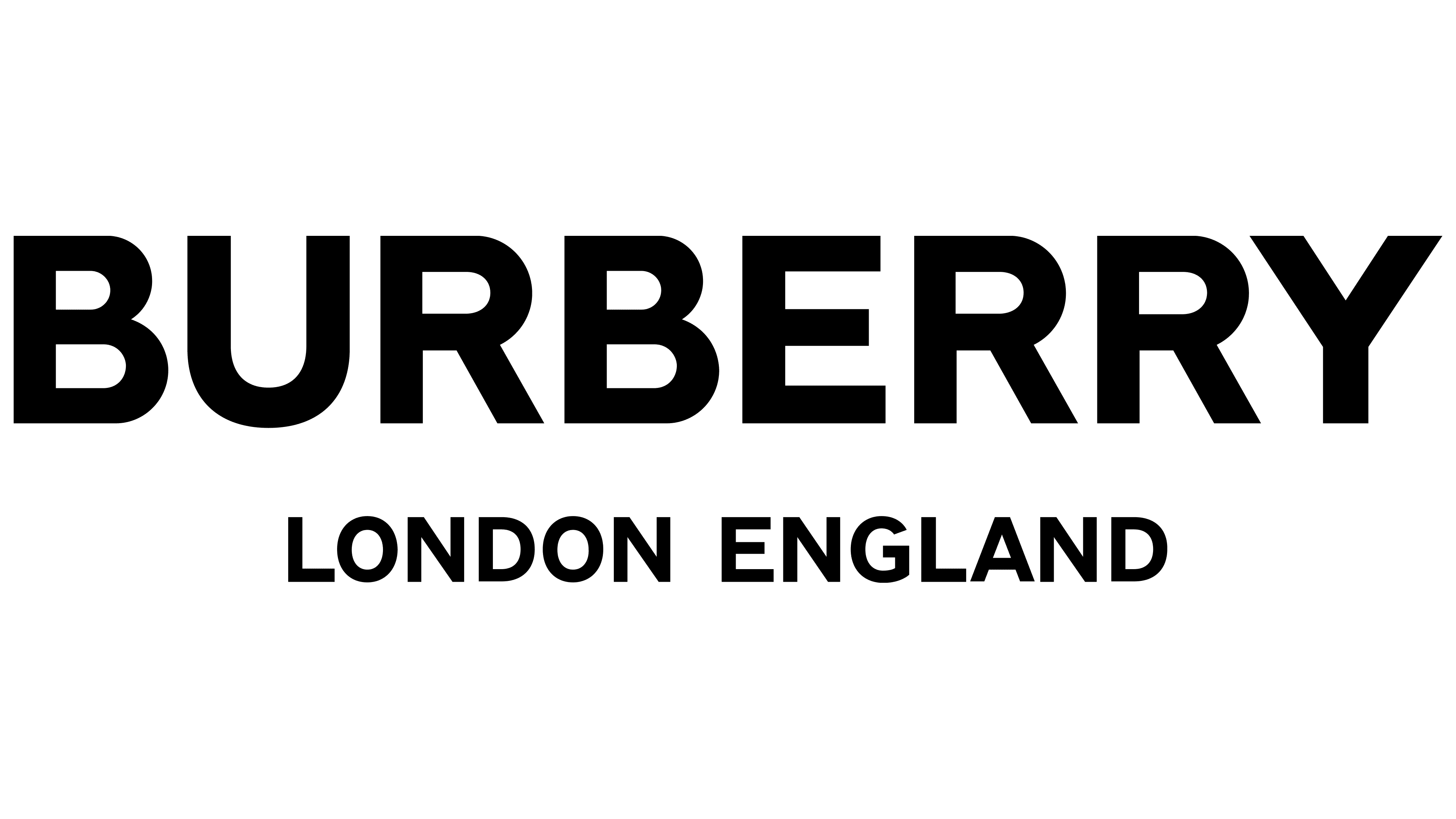
2018 – 2023
![]()
The modern version of the British fashion house’s visual identity was proposed in 2018 by designer Fabien Baron. The martial horse rider remained only on tags, patterns, accessories, and the company’s packaging. But he disappeared from the logo. The word “Burberry” is used both independently and in combination with the phrase “London, England,” written in elegant italics.
There is a version with the knight, who occupies a large part of the logo, with the company name below in small letters. Below is the fashion house’s founding date: “Established 1856.”
2023 – today
![]()
Font and Colors
The rider and his horse are depicted in armor as if they are performing at a knight’s tournament or participating in a battle. The rider’s head is adorned with a helmet bearing a large feather, and he holds a spear and a shield. Together, they symbolize fearlessness, confidence, determination, aspiration to protect, pride, honor, and nobility.
Various versions of the logo use several font styles. One of them is Urania Extra Bold, developed by Dieter Hofrichter. It is a stylish modification of the old-school sans-serif font with straight, neat, thick lines, angles, and clean cuts. In another version (1999), the font resembles the Bodoni group, with thin serifs and complex, smooth strokes.
The emblem is executed in black and white, except for the debut version, when it was dark red. According to the company owner, monochrome perfectly emphasizes the elegance, quality, power, and durability of the fashion house.
FAQ
What does the Burberry logo mean?
The original Burberry logo depicts a knight with a shield in one hand and a spear in the other. It signifies the fashion house founder’s aspiration to defend his interests. It also conveys nobility, chivalry, grandeur, pride, and sincerity.
What happened to the Burberry logo?
In 2018, the Burberry logo underwent a redesign: it was updated for the first time in 20 years and designed by Peter Saville. The designer removed the horse knight image from the emblem, so it is radically different from previous versions.
Why is the Burberry logo TB?
TB is the abbreviation of the brand’s founder’s name, Thomas Burberry. The initials have been used since 1908.