![]() Burton Logo PNG
Burton Logo PNG
Simple and minimalist, the Burton logo focuses on the brand name, widely known among male fashion connoisseurs. It emphasizes the company’s focus on quality clothing and universal style. The absence of superfluous details makes the emblem memorable and important for the marketing strategy.
Burton began with Meshe David Osinsky, a Lithuanian Jewish emigrant born in Kurkliai in 1885. He arrived in Britain around 1900 after fleeing pogroms in the Russian Empire, with no money and no English. In Manchester, he started as a street trader, then borrowed £100 and opened Cross-Tailoring Company in Chesterfield in 1903. Soon he took the name Montague Maurice Burton.
The first shop sold ready-made men’s suits bought from Leeds wholesalers. Burton’s offer, “the five-guinea suit for 55 shillings,” made tailored-looking clothing reachable for factory and mine workers. By 1906, he had a deal with a small Leeds workshop, and by 1913 the business had five shops. In 1917, it became Montague Burton Ltd., helped by uniform orders during the First World War.
In 1921, Burton began building the Hudson Road factory in Leeds. By the mid-20th century, it employed over 10,000 people and produced up to 30,000 suits a week. The company joined the London Stock Exchange in 1929 with about 400 shops, factories, and mills. Burton stores became known for Art Deco fronts, oak interiors, and made-to-measure service. During the Second World War, the factory returned to military uniforms. It later made demobilization suits, linked by one version to the phrase “the full Monty.”
Montague Burton died in 1952, when the company had 616 shops. In 1953, it merged with Jackson the Tailor. Burton later dressed England’s 1966 World Cup team, bought Peter Robinson, and added Dorothy Perkins. Production ended in 1981. In 1998, the group became Arcadia Group. After Arcadia collapsed in 2020, Boohoo bought Burton, Dorothy Perkins, and Wallis in 2021. Burton now operates online under Debenhams Group.
Meaning and History
![]()
The history of Burton logos can be traced through the labels inside the clothing. They most often contained the company name in various fonts. Initially, these were ornate inscriptions with curls and serifs, but over time, minimalist grotesque came into fashion. It is difficult to determine the exact timelines of the emblems, as the manufacturer often used old labels until they ran out.
What is Burton?
This leading global manufacturer of snowboarding gear and equipment has become a symbol of the sport. From professional snowboards and bindings to specialized apparel and accessories, the brand offers a wide range of products for both seasoned riders and beginners. Its support for major tournaments and partnerships with elite athletes strengthens its connection to snowboarding culture, enabling equipment development based on their expertise. Additionally, the brand produces a line of casual mountain-style clothing that appeals to active lifestyle enthusiasts, and its stores have become hubs for the snowboarding community worldwide.
1903
Burton was founded in 1903. Clothing from that period has not survived, so no one knows what the original logo looked like. It was probably related to the name of the men’s clothing manufacturer, Cross Tailoring Company.
In 1909, Sir Montague Maurice Burton married and renamed his business Burton & Burton. A company letterhead from that time has survived, on which this name is written in capital letters against the backdrop of rising sun rays.
From about the 1920s to 1936, the company was called Montague Burton: The Tailor of Taste Ltd. The classic emblem contained the word “BURTON” with an ornate letter “B,” across which was a small plaque with the inscription “MONTAGUE.” The rest of the name was at the bottom, inside a parallelogram. In 1936, the company was renamed Montague Burton Ltd, The Tailor of Taste, after which the designation “Ltd” disappeared from the label.
1950s – 1960s
![]()
At the turn of the decades, a logo with the inscription “BURTON” was used. It looked elegant and minimalist due to the serif capital font. The letters were contrastive, meaning the main and auxiliary strokes differed in thickness. A similar design is seen in fonts like Bodoni and Didot. This emblem is often found on labels of vintage jackets from the 1950s, and in the 1960s, it was almost not used.
1960s – 1970s
![]()
In the new logo, the font of the word “BURTON” looked similar to that of the 1930s. It featured botanical motifs: for example, sharp thorns on the “U” and long curls on the “B” and “R.” A twisted line stretching from the “R” wrapped around the vertical stroke of the “T.” The oval gap inside the “O” was diagonally tilted, making it seem as though the letter was lying on its side. Two horizontal lines underlined the inscription. One of them reached only to the “N,” while the other extended to the end of the line.
1970s
![]()
There was another version of the emblem with a bold font very similar to Apud Black by DSType. All letters, except the first, were in lowercase, which was unprecedented before. The slanted serifs indicated the fashion brand’s uniqueness and creativity.
1970s – 1980s
![]()
Designers gave the letters volume by outlining each with multiple thin lines. In some places, the multilayered contour merged into a single bold stripe, further enhancing the 3D effect, as some sections appeared illuminated and others darkened. The logo creators used a simple, sans-serif font to avoid overburdening the inscription.
1980s – 1990s
![]()
The company name was designed in a thin, slanted, grotesque font. This was one of the emblems actively used in the 1980s.
1990s – 2002
![]()
The word “BURTON” was complemented with the inscription “MENSWEAR,” located below at a small distance. The elegant serif font emphasized the clothing’s sophisticated style. Usually, the text was placed on a rectangular burgundy label, with the top line in gold and the bottom in white. Inside the rectangle, set back a bit from the edge, was a thin orange line. Another version of the logo featured the light beige brand name on a dark beige background.
2002 – 2018
![]()
In 2002, Philip Green became the owner of the company. After that, a simple emblem appeared with the black word “BURTON.” It was set in uppercase letters, where all the strokes roughly matched in thickness. A characteristic feature of the font was the combination of straight angles and curves. This design resembled Venus Rising Regular and Bitsumishi Pro Medium but had some differences. First, the upper part of the “B” was smaller than the lower. Second, the horizontal stroke of the “R” did not reach the end, so the internal letter space was open.
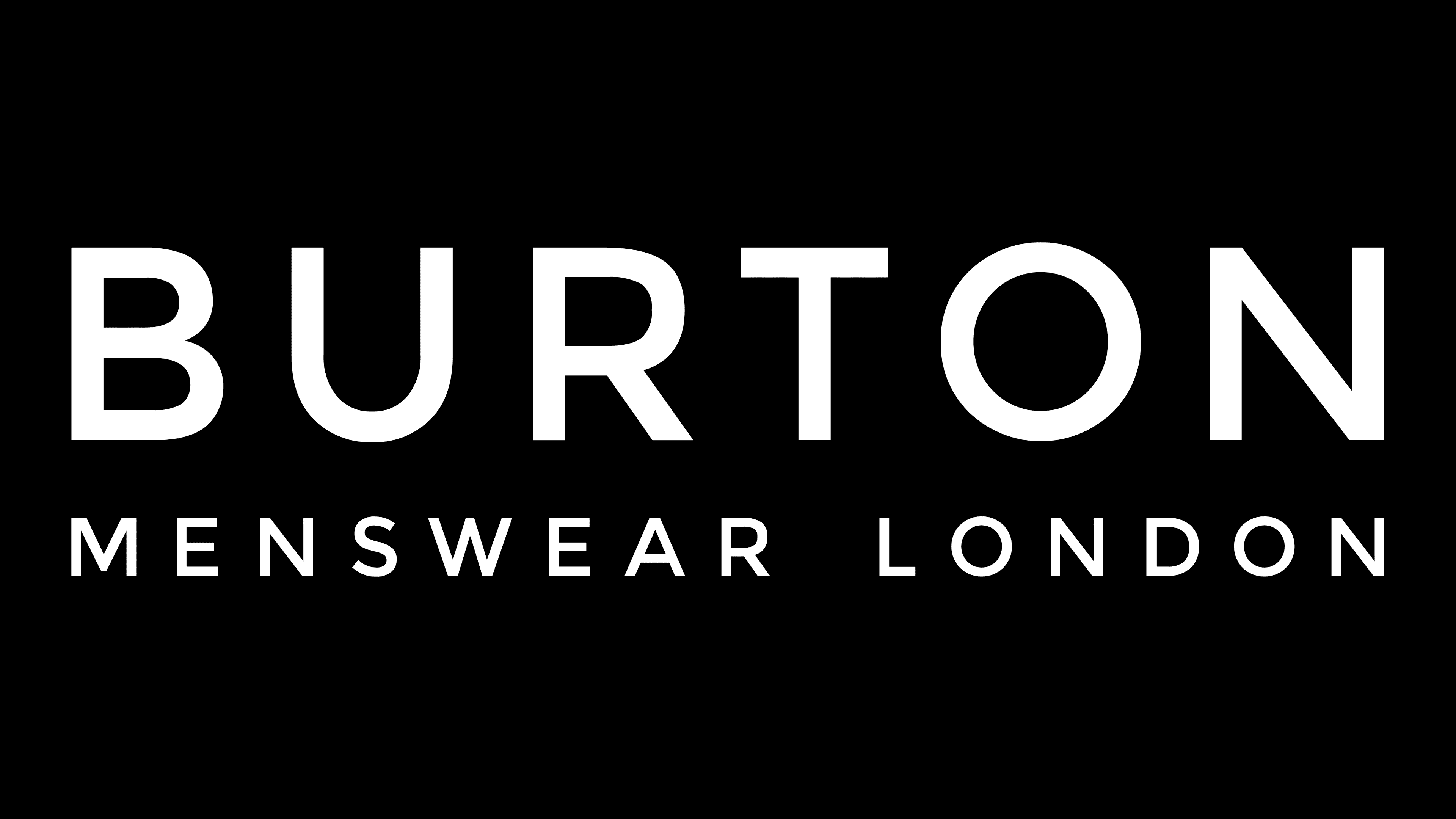
2018 – today
![]()
The redesign changed the inscription’s style, making the letter shapes standard, like a regular bold grotesque. An additional line was added at the bottom, specifying the company’s field of activity and location: “MENSWEAR LONDON.” This logo was created in 2018 and continued to be used after Boohoo.com acquired the clothing brand and closed all its stores.
Font and Colors
Burton’s word mark conveys confidence, simplicity, and stability. The uppercase letters have a balanced shape, ensuring high clarity of the inscription in any size. The minimalist font appears standard; it has many analogs: Phi Caps by Cas van de Goor, Montserrat Regular by Julieta Ulanovsky, Canaro Medium by Rene Bieder, and Nutmeg Regular by W Foundry, among others.
The logo’s color palette includes black and white. This combination is associated with classic men’s fashion, given the brand’s British origin.