![]() Calvin Klein Logo PNG
Calvin Klein Logo PNG
The sophistication, aesthetics, and modernity embodied by the Calvin Klein logo, a fashion leader, are paramount. The brand’s signature style and minimalism are the main symbols of the fashion house’s identity. The emblem embodies purity, elegance, and grace.
The history of Calvin Klein begins in 1942 in the Bronx, where Calvin Richard Klein was born. After graduating from the Fashion Institute of Technology in 1962, he worked for New York manufacturers. In 1968, with $10,000 borrowed from Barry Schwartz, he opened a small studio in the York Hotel, where he produced coats and dresses.
A breakthrough came when a Bonwit Teller buyer accidentally entered his showroom and placed a $50,000 order. Within a year, sales reached about $1 million. In 1973, Klein received his first Coty Award and later entered the Coty Hall of Fame. By the late 1970s, the brand expanded into menswear and sportswear.
In 1978, Calvin Klein launched designer jeans, competing with Levi’s and Gloria Vanderbilt. A 1980 campaign with Brooke Shields was banned on several channels but drove sales of 200,000 pairs in a week. In 1982, the brand introduced men’s underwear with logo waistbands, reshaping advertising standards.
In 1985, the fragrance Obsession strengthened the business, followed by CK One in 1994, one of the first major unisex perfumes. That same year, a controversial jeans campaign prompted an FBI review and was later withdrawn.
In 2002, Klein and Schwartz sold the company to Phillips-Van Heusen for $430 million plus royalties. In 2017, Raf Simons became creative director but left in 2018 after commercial difficulties, leading to the closure of key runway lines.
Meaning and History
![]()
Like any other fashion brand, the brand pays special attention to its logo. Thus, it approached the development of its signature style with utmost responsibility. The minimalist version has existed since the brand’s launch. Its creator is Jeffrey Banks, a renowned designer from Wales. Initially, the label was placed only on jeans (in the back pocket), but it was later transferred to other products.
Throughout the fashion house’s existence, it has had four emblems. In early 1979, Bruce Weber used a version close to the current one. Until 1982, the verbal form predominated without a graphic sign, with thin, elongated letters. The 1984-1992 logo is of immense significance and widely regarded as legendary.
What is Calvin Klein?
Calvin Klein is a fashion brand, fashion house, and online store owned by the eponymous American designer Calvin Richard Klein. He founded his trademark in 1968 and turned it into a style icon, offering clothing, jewelry, fragrances, and watches.
1968 – 1975
![]()
The Calvin Klein logo, created in 1968, was executed in capital letters with a thin, stylish font.
1975 – 1992
![]()
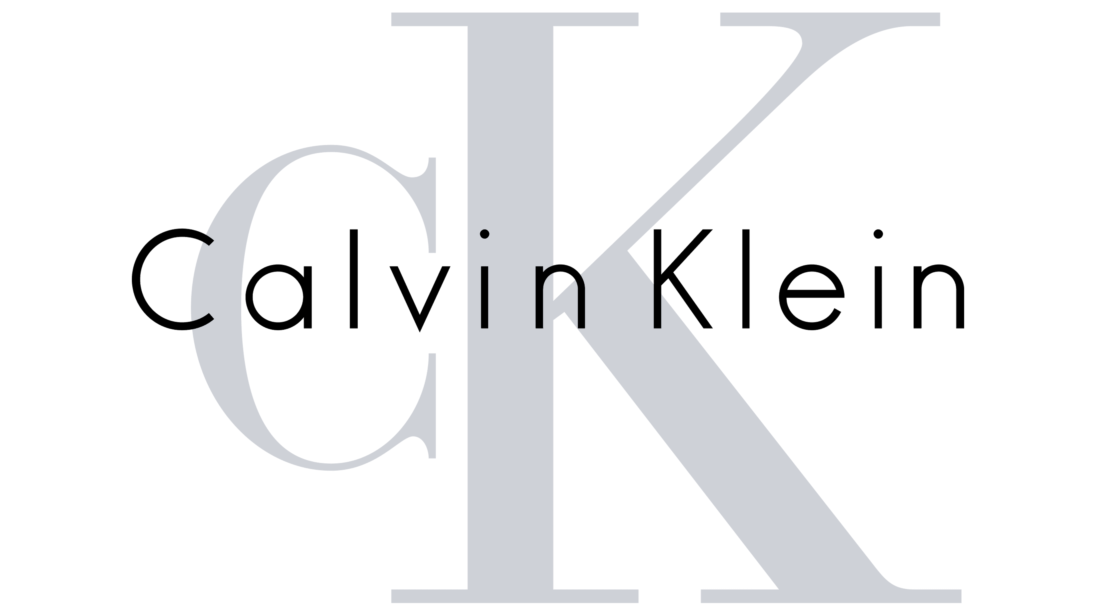
During this time, an updated logo was introduced, built solely on the founder’s name and surname, the owner, and the designer. The font is exquisite, simple, and stylish. The letters have no serifs but look practically and luxuriously American. The heights of the lowercase “i,” “l,” and uppercase “C” and “K” are identical.
1992 – 2017
![]()
In this period, the letters became thinner. Although the style changed, the font remained the same. Another difference from the previous version is the dot over the “i” instead of a rectangle. Moreover, it’s removed from the main part, so all signs are visually the same height.
2017 – 2020
![]()
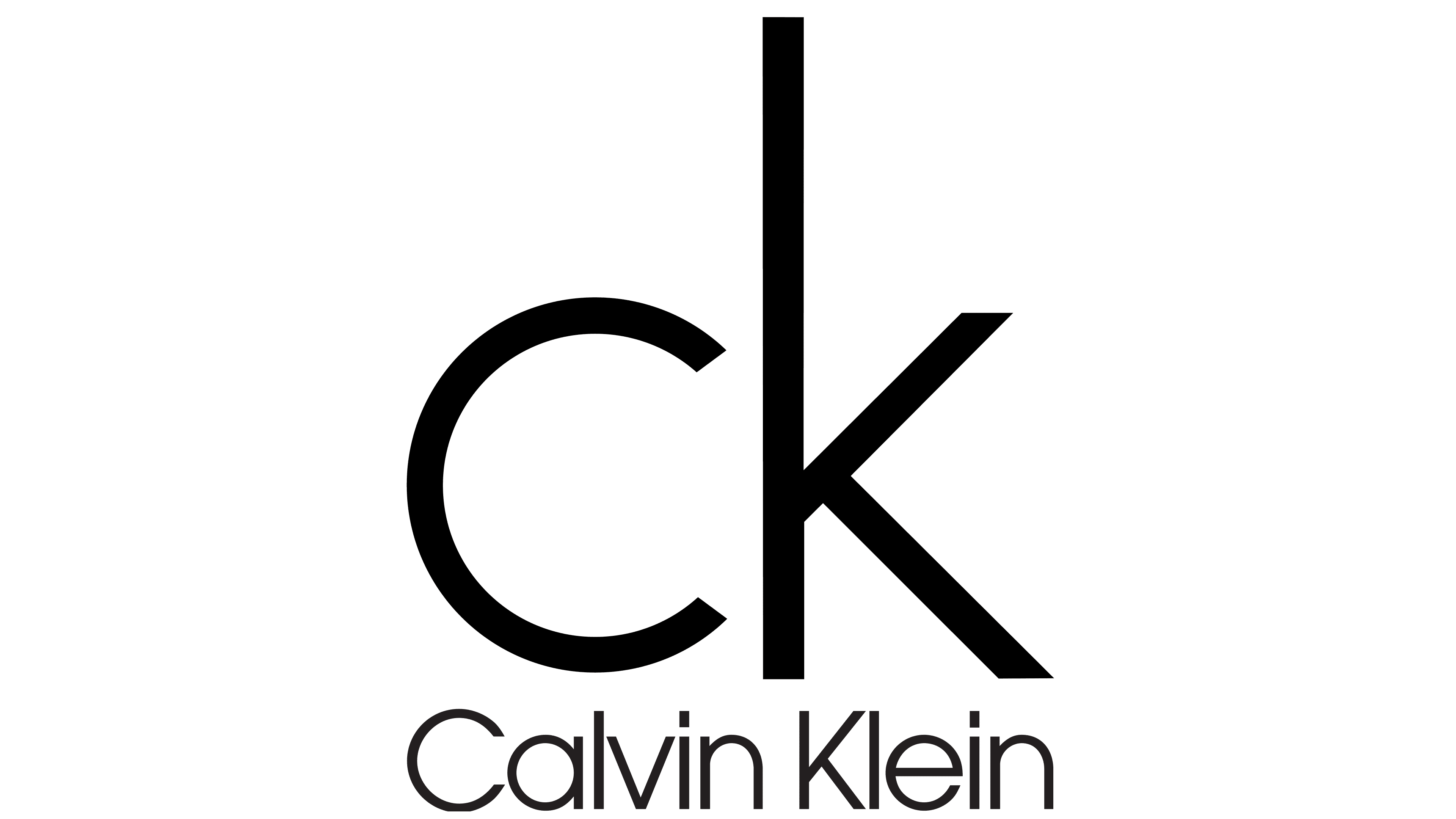
In 2017, the fashion house refreshed its branding design. The everyday life incorporated a new font and the abbreviation “CK,” formed from Calvin Klein’s initials. Now, all letters are in uppercase, except for the separate “c” and “k.”
The company introduced this version on its Instagram account. The author of the altered graphic sign is Peter Saville. According to the developers, it’s a return to the spirit of the original from the 1968-1975 period. The primary palette is black-and-white.
The brand uses a logo based on the founder’s first and last names. It’s an individual font with elongated, thin letters that emphasize the absence of unnecessary details. It has no serifs or graphic signs. Jeffrey Banks writes them. The minimalist style continues in the color palette: the black-and-white combination creates a striking contrast, evoking a classic feel.
The main concept of the Calvin Klein logo is minimalism. It’s evident in the symbolism of all the well-known figures in the fashion industry. There is no accumulation of details, no small specifics, and no glamour; only succinctness is welcomed. The signature colors are white (in the sports line), black (in the Haute Couture series), and gray (in general clothing models). They embody purity, elegance, and grace.
2020 – today
![]()
To rekindle interest in the “stagnant” brand, Calvin Klein’s owners updated the logo again in 2020. It resembles the 1975-1992 version but with some distinctions. Firstly, the dots above the letter “i” are now square rather than rectangular. Secondly, the spacing between the letters has slightly increased, making the inscription easier to read.
If you compare the current text character with the previous one, the only change concerns the letters. After the redesign, only the first letters, “C” and “K,” became capital, while the rest of the glyphs are lowercase. This logo is clean and simple: the American fashion house has maintained its core concept of “black letters on a white background.”
Font and Colors
The modern Calvin Klein logo inherited the font from the wordmark introduced in 1975. It’s a strict sans-serif Futura Light, roughly similar to the ITC Avant-Garde Gothic Pro Book or OL Round Gothic-Bold. The spacing between the letters is very narrow, but this hasn’t affected the legibility of the inscription. Designers combined uppercase and lowercase glyphs to balance the text. The black brand name looks striking on a white background. It appears as a classic contrast, characteristic of the emblems of many fashion houses.