Campbell’s logo on canned food is creative and iconic, as the brand is linked to the graphic artist Warhol, who made it famous. However, the emblem’s style is not innovative; it is classic. The designers used an italic font with an imitation of handwritten text, and a rich shade of red helped to add catchiness.
Campbell’s: Brand overview
Campbell’s is an American canned food company. This brand is legendary in the local market, as the company was founded over 150 years ago in 1869. Its creator is Joseph Campbell, after whom the company was named. Interestingly, the famous artist Andy Warhol played an important role in promoting the brand. For some of the paintings, he used Campbell’s tags.
Founded in 1869 in Camden, New Jersey, by Joseph A. Campbell and Abraham Anderson, Campbell’s Soup Company has been a part of American kitchens for over 150 years. Initially selling canned tomatoes and vegetables, the company soon became a staple in homes with its high-quality and convenient food products.
The real game-changer came in 1897 when Campbell’s introduced canned soups, starting with a tomato soup recipe that became a household favorite. As the company grew, it added more soup varieties, like Cream of Celery and Chicken Gumbo, enriching its range and taste.
Campbell’s became a cultural icon with its “Mmm! Mmm! Good!” slogan and the red and white label, a design introduced in the 1920s that remains largely unchanged. The brand’s commitment to quality and comfort food was recognized globally, and in the 1960s, Andy Warhol’s art featuring Campbell’s cans elevated its status in American pop culture.
Over the years, Campbell’s expanded its offerings with products like Chunky and Homestyle soups. They acquired brands like Pepperidge Farm and Bolthouse Farms, adapting to changing tastes and emphasizing health and wellness.
Meaning and History
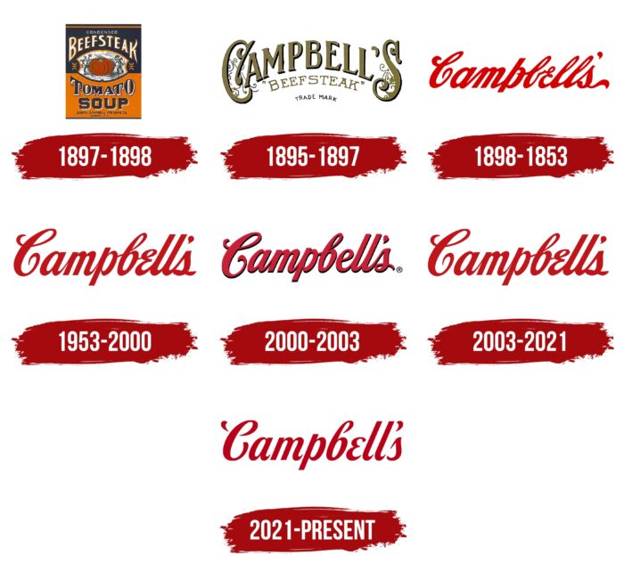
The company’s logo has changed six times throughout its operation in the canned food market. At the same time, it has remained virtually unchanged since 1898, ensuring the brand’s visual recognition at the highest level.
What is Campbell’s?
These are high-quality canned food produced according to recipes with a long history. The company is popular in the US market and far beyond its borders.
1895 – 1897
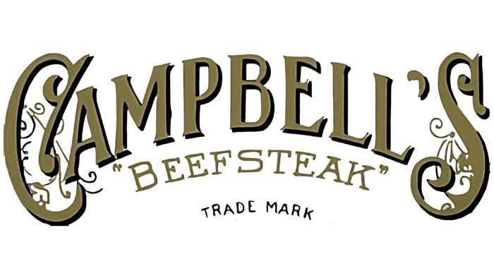
Campbell’s introduced the first logo in 1895. It looked extremely modern and elegant at the end of the 19th century. The name was made as an arched inscription using a unique and non-standard font. At the same time, the first and last characters had an interesting background, depicting an attractive ornament. Thus, when acquainted with the logo, potential buyers should have had positive emotions and an Art Deco mood. The color palette consisted of a dark shade of yellow.
Even though no officially documented information has survived to this day, according to the company’s archive, the Sinnickson Chew & Sons Company created the first logo.
1897 – 1898
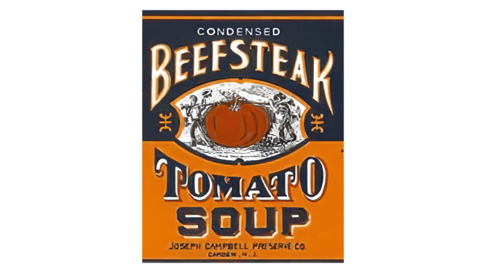
The new version of the logo became less elegant and attractive, but at the same time, it conveyed the essence and specialization of the company in the market. At the same time, the words “Beefsteak” and “Tomato” were executed under a small arc about the company’s client, and “Soup” with a solid horizontal line, a little lower under “Tomato.” Two men are depicted carrying a large tomato between these two verbal inscriptions. An explanation of the features of this logo can be found on the company’s website, where it is said that a large tomato is a reference to the fact that it is present in every can of the company’s canned food. The word “Beefsteak” is light yellow, while “Tomato Soup” is dark grey.
1898 – 1953
The red inscription we know today first appeared in 1898. This variation lasted 55 years, raising the brand’s visual recognition to the highest level. The company’s name is drawn, not written, and looks modern and elegant. In addition to this feature, it is also necessary to note the long and thick lines in the letters, which have rounded corners. Small contours made the logo harmonious.
1953 – 2000
Even though the 1953 logo redesign made minor changes to the previous version, it is considered the most successful. There is a nicer shade of red and easy-to-read characters, even though they are also drawn. The red color palette can be associated with both the tomato and passion, the company’s approach to its work.
2000 – 2003
2000 brought small changes. For example, they relate to a more pronounced red color and the presence of a shadow that creates a sense of three-dimensionality. The new color palette looks more impressive and interesting.
2003 – 2021
The company returned to the iconic 1953 logo at this stage, making no additional changes. This choice is directly related to the fact that this logo format looks interesting on any background. As a result, a return to the “origins” allowed this option to be used for another 18 years.
2021 – today
The most popular version of the logo continued to be used in 2021. At the same time, some changes were made to it, which may not be immediately noticeable to buyers. For example, the decision was to darken red using a burgundy shade. The lines in the letters were somewhat shortened, and the outlines in the letters were also removed. Even though the letters are still drawn, they no longer have lines in common. As a result, the logo looks lighter and nicer. The greatest changes occurred in the first letter, “C,” which became more readable.
Font and Colors
According to official information, modern logo versions almost completely repeat the signature of the company’s founder, Joseph Campbell. A unique typeface using drawn letters refers to homemakers writing down recipes on paper. Thus, canned food with a painted name gave a feeling of home comfort. Such feelings were most likely to appear in buyers who did not have a family, such as unmarried men. Indeed, with the help of a jar of Campbell’s canned food, an imitation of that very comfort was created.
If we talk about the latest variations of the logo, then they all had a red color palette. Only the shades have changed. Associations were made with the color of the tomato and the passion that made the company stand out from the competition.
FAQ
Is Campbell an American company?
Campbell Soup Company, widely recognized as Campbell’s, is an established American brand with its roots and headquarters in the U.S. Famous initially for its canned soups that have become household favorites, Campbell’s has grown significantly. Through mergers and acquisitions, it has diversified, making it one of the biggest processed food companies in the U.S. Campbell’s offers products beyond traditional soups, including items from other popular brands like Pepperidge Farm, Snyder’s of Hanover, V8, and Swanson. This growth has enabled Campbell’s to meet a variety of consumer tastes and maintain a significant presence in the American food industry.
What snacks does Campbell’s make?
Campbell’s has expanded its reach beyond soups to offer various snacks, appealing to various preferences. Here’s a quick look at their snack lineup:
- Goldfish®: Loved by people of all ages, these crackers are famous for their unique shape and come in several flavors, making snack time enjoyable.
- Pepperidge Farm® Cookies: Offering everything from classic to rich flavors, these cookies cater to all cookie lovers and are known for their quality.
- Pace® Salsa & Sauces: Adding a zesty flavor to snacks and meals, Pace’s range of salsas and sauces is perfect for spicing their food.
- Pretzel Crisps®: A fresh take on the traditional pretzel, these thin, crispy snacks are great alone or paired with your favorite dips.
- Cape Cod®: These kettle-cooked potato chips are for those who love a crunchier snack, offering a heartier chip option.
- Snyder’s of Hanover®: With various pretzel styles and flavors, Snyder’s caters to enthusiasts looking for traditional or innovative options.
Campbell’s variety of snacks reflects the company’s dedication to providing tasty options for snack lovers.
Who designed the Campbell Soup label?
Andy Warhol’s 1962 art series “Campbell’s Soup Cans” brought widespread attention to the Campbell Soup Company’s iconic label design, featuring 32 paintings of different Campbell’s soup flavors. Although Warhol’s art did not design the label, it celebrated its visual identity, linking the brand indelibly with American pop culture. The label, known for its striking red and white color scheme, was developed by Campbell’s to stand out on grocery shelves, aiming for easy recognition and appeal. Warhol’s work underscored the label’s role as a piece of Americana, enhancing its cultural significance beyond just a consumer good. This fusion of art and branding highlighted the Campbell Soup label’s iconic status and enduring presence in the marketplace and the art world.
Can you eat Campbell from the can?
Campbell’s offers a line of Well Yes!® sipping soups perfect for on-the-go eating. These soups don’t require heating, making them convenient for busy days. You can enjoy them right out of the can at room temperature. Plus, flavors like Roasted Red Pepper & Tomato, Harvest Carrot & Ginger, and Tomato & Sweet Basil are also delicious when served cold. This versatility means these soups can be a quick snack or a light meal anytime, anywhere, without the need for preparation.
What is the meaning of the Campbell’s Logo?
The Campbell’s logo, featuring founder Joseph Campbell’s signature, signifies more than the company’s identity. It targets homemakers, assuring them of the product’s quality and the care put into its creation. This signature symbolizes a personal promise from the brand to its consumers, emphasizing trust and quality. The logo’s design aims to evoke feelings of warmth, comfort, and the coziness of home-cooked meals, suggesting Campbell’s products as essentials for satisfying homemade meals. It’s designed to stand out to shoppers, reassuring them about the brand’s commitment to quality. Essentially, the Campbell’s logo symbolizes comfort, a guarantee of quality, and a reminder of the joys of family meals.
What does the logo symbolize Campbell’s Logo?
The Campbell’s logo, known for its signature swirl and gentle lines, represents a sense of warmth and home. It paints a picture of a comforting and satisfied atmosphere, promising enjoyable, comforting meals. This logo goes beyond identifying the brand; it stands as a beacon of trust and assurance, conveying that delicious food will always be available. It instills confidence about the future, embracing the idea that there will always be meals to cherish. This logo signifies Campbell’s commitment to being a reliable provider of flavorful, comforting dishes that enhance everyday life.
Who made the Campbell logo?
The exact origins of Campbell’s logo are not recorded, leaving its initial designer unknown. Nonetheless, Andy Warhol thrust the logo into fame in 1962. Warhol’s “Campbell’s Soup Cans” series, showcasing 32 paintings of soup cans with the logo, highlighted the logo as a significant part of pop art and culture.
The logo itself was a group effort, with Herberton L. Williams proposing the color scheme and Joseph Campbell’s signature becoming a key element of its design. This collaboration resulted in a logo that goes beyond representing the company’s products; it’s a piece of American cultural history popularized by Warhol’s work.
How did Campbell’s get his name?
The Campbell’s brand, known for its canned soups and products, got its name from a simple start. In the late 1800s, two men, Abraham Anderson and Joseph Campbell, teamed up. Anderson knew a lot about canning and packing, while Campbell was good at finding quality vegetables and fruits. Together, they started Anderson & Campbell in 1869 in Camden, New Jersey. Their skills combined well, making their business successful.
After Anderson left in 1876, Campbell was renamed Joseph Campbell & Company. He focused more on making soups, which became very popular. Later, the company became the Campbell Soup Company, a name that shows its commitment to quality. With its special script, the Campbell’s logo made the brand easily recognized and a favorite in many homes.
Joseph Campbell’s work didn’t just create a company; it changed the food industry. Moving from Anderson & Campbell to the Campbell Soup Company shows how focusing on what they did best helped them grow. Today, Campbell’s is a global brand known for its quality canned soups and other products.
Why did Campbell change its label?
In 2021, Campbell’s updated its logo for the first time in 50 years to make it look more modern. They made the label simpler and cleaner by removing shadows and returning an old design for the letter ‘O’ in ‘Soup’ from 1898. This change was to attract a new generation of customers, especially since more people were cooking at home due to the coronavirus pandemic. Campbell’s wanted to keep the logo familiar and comforting while making it relevant for today’s cooks. They aimed to keep people’s trust and love for Campbell’s while updating its look to fit modern times.
What six colors are on the Campbell’s soup can?
The Campbell’s soup can is famous for its unique design, which mainly uses white and red. Over the years, the red has changed, including shades like scarlet, carnelian, raspberry, tomato, and carmine. Together with the white used in the logo and text, these make up six colors on the cans. These different reds keep the brand looking new but still classic. The mix of these colors makes the cans pop off the shelf and helps people remember the Campbell’s brand.
