


 Canada Goose Logo PNG
The warmth guarantee became the basis of the winter jacket manufacturer’s logo, called “Alaska,” so he chose the image accordingly. The Canada Goose logo features a bird, whose down serves as a heater, and the Arctic Ocean, where the meridians converge at the highest point. This sign suggests protection against the cold, even in Arctic frost.
Canada Goose began in 1957, when Sam Tick founded Metro Sportswear in Toronto. The company first made wool clothing, but its direction changed in the early 1970s after Tick’s son-in-law, David Reiss, took over. He shifted production toward warm workwear for Canadian rangers, police, and environmental workers, then renamed the business Snow Goose.
The brand gained serious credibility through cold-weather use. Its parkas became workwear for polar researchers and outdoor professionals due to their insulation. A major public moment came when Canadian climber Laurie Skreslet reached the summit of Everest after working with the company on a high-mountain jacket. That model later influenced the Skreslet parka released in 2011.
In Europe, the company faced a naming conflict, so it adopted the Canada Goose name for export markets in 1990. By 2000, the company had fully shifted to the Canada Goose identity to build global recognition. The jackets later appeared in films such as The Day After Tomorrow, where scientists wore the brand’s outerwear, helping connect it with extreme weather and expedition imagery.
As demand grew, counterfeits became a serious problem, especially online. In 2011, the company introduced a holographic code to protect original products. Canada Goose also expanded its European presence through a Stockholm office and the acquisition of Engineered. This company had long sold its products in Europe. The brand’s range expanded beyond parkas to include insulated jackets, vests, hats, gloves, and other cold-weather clothing.
Meaning and History
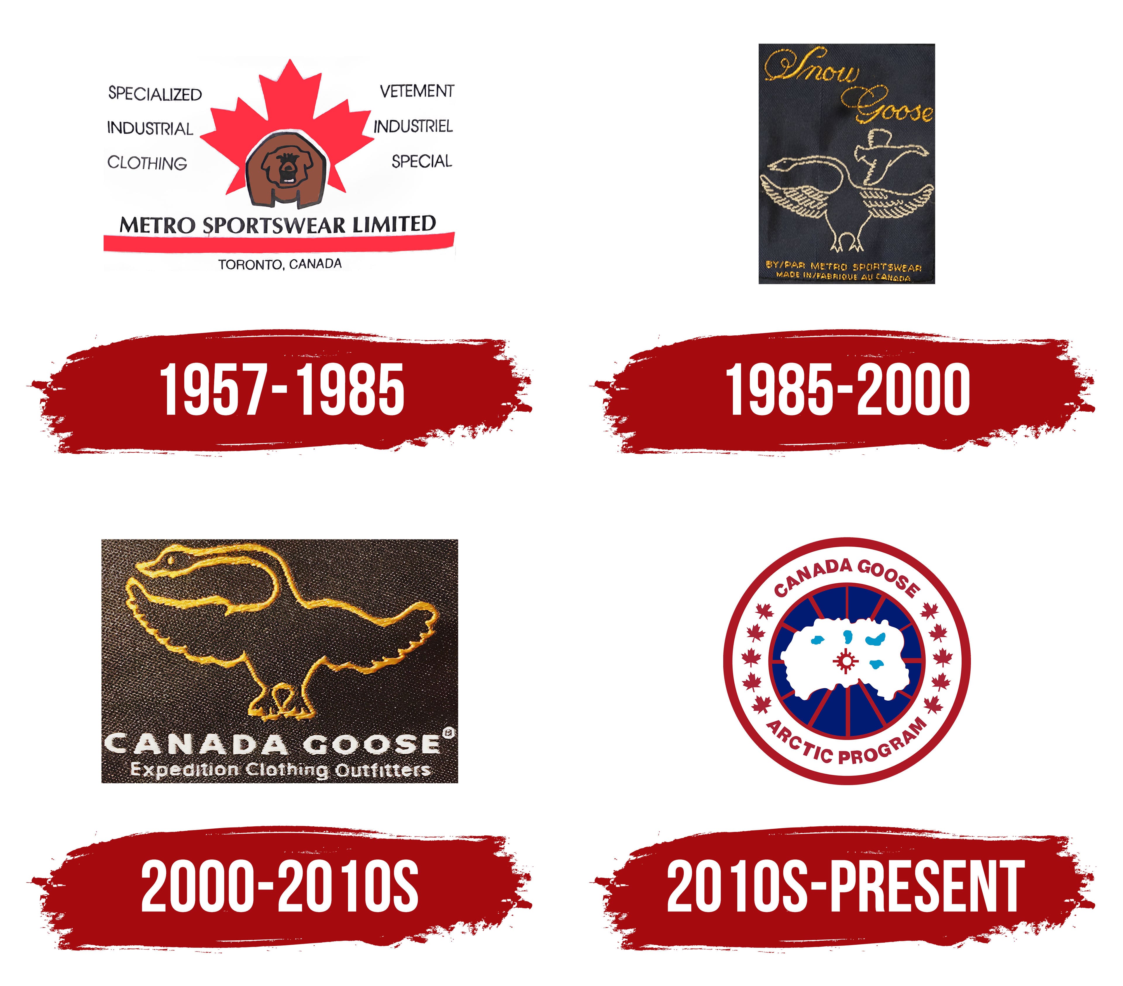
Beyond producing warm clothes, Canada Goose leads an active social life. It participates in and finances various activities to protect northern animals, organizes many charity events, and collects funds to support zoos. Today, the founder’s grandson, Dani Reis, runs the company. He completed the company’s evolution, creating a single global brand under the common European name “Canada Goose” and adding the inscription “Made in Canada” to the emblem. Thus, he patriotically announced that all the company’s products are manufactured in Canada.
The company sought to reflect the direction of its activities and the manufacturer’s nationality in its emblem, choosing each symbol for this purpose and creating a unique, recognizable brand worldwide.
What is Canada Goose?
This Canadian manufacturer of premium outerwear has gained global recognition for its high-quality parkas and down jackets designed to withstand extreme cold. The company produces a wide range of winter apparel, from expedition backpacks to urban coats and accessories. Each piece is handcrafted in Canada using carefully selected goose down and the finest materials. The brand’s reputation as a trusted producer of winter clothing was established early on, when participants in Arctic expeditions, oil rig workers, and polar researchers wore its jackets.
1957 – 1985

In 1957, Metro Sportswear Limited was born. The name appeared at the bottom of the logo, underlined by a long red line, beneath which was the phrase “TORONTO, CANADA.” The center featured a red maple leaf, and in front of it was a not-very-realistic brown bear. There were additional inscriptions on both sides of the emblem: on the left, “SPECIALIZED INDUSTRIAL CLOTHING,” and on the right, “VETEMENT INDUSTRIEL SPECIAL.” The words were lined up in a column.
1985 – 2000
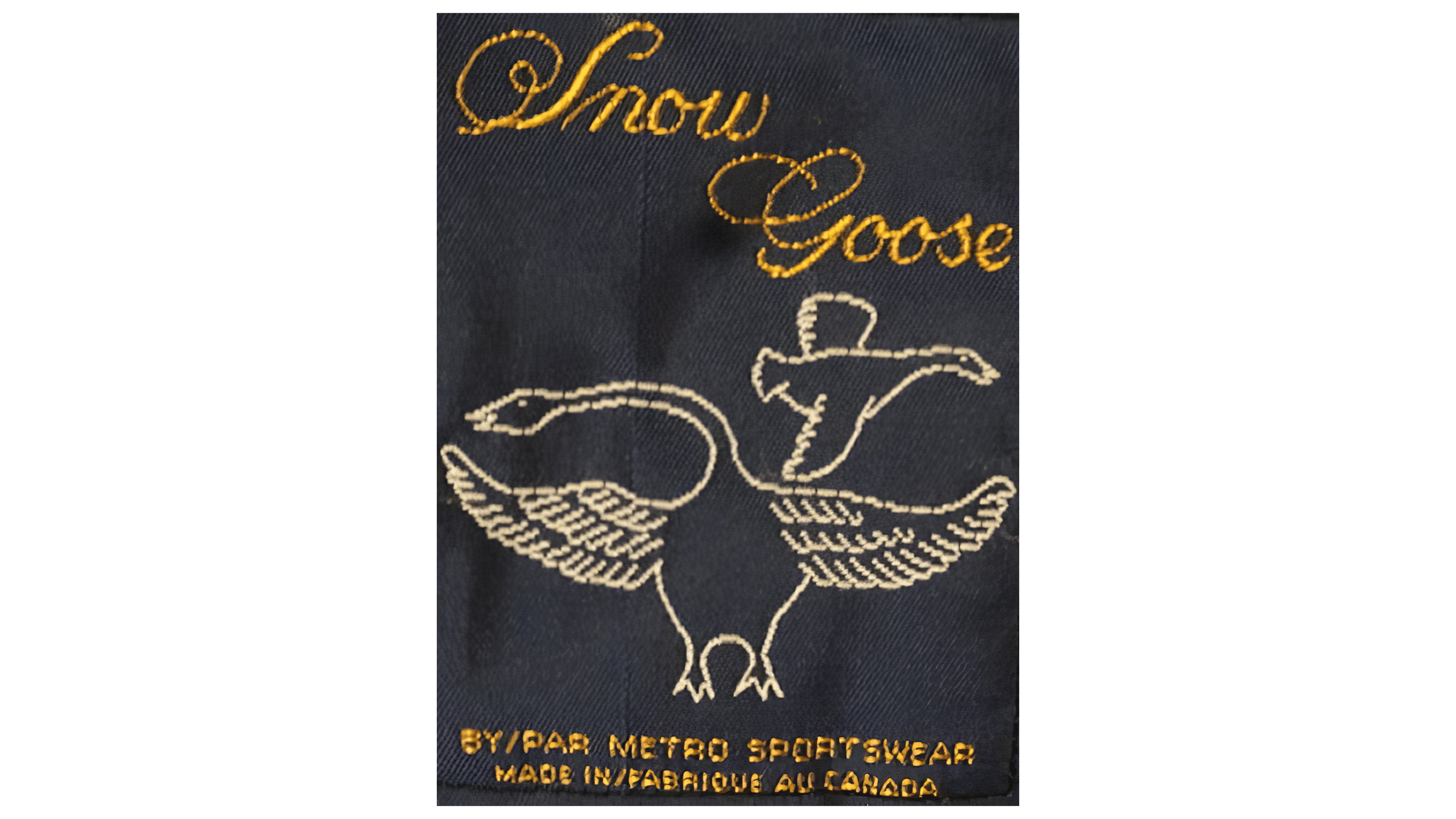
In 1972, David Reiss joined the company and immediately launched a new line of down coats and parkas called Snow Goose. Its logo depicted two geese: a large one standing and a small one flying. Below is the basic information about the brand: who owns it (“BY / PAR METRO SPORTSWEAR”) and where its production is located (“MADE IN / FABRIQUE AU CANADA”). At the top, the brand name appeared in calligraphic type with large swirls. On clothing tags, all the letters were embroidered with golden thread, while the outlines of the birds were light beige. In 1985, David Reiss bought a majority stake in Metro Sportswear Limited and renamed the company Snow Goose.
2000 – 2010s

When clothing manufacturer Snow Goose entered the European market in the 1990s, it turned out its name was already taken there. So, it began operating as Canada Goose in some countries. In 2000, Dani Reiss, David Reiss’s son, decided to permanently rename the company Canada Goose. This is how the logo appeared with the corresponding inscription. She was on the first line, and the second line read “Expedition Clothing Outfitters.” All letters were white, bold, and sans-serif. At the top was an image of a goose with a golden outline.
2010s – today

Contrary to expectations, the current Canada Goose logo does not represent Canada (as many people think) but rather depicts fragments of an inverted North Pole. Moreover, the big white figure is not land but the Arctic Ocean. The blue spots on it are islands. The central red circle marks the convergence point of all meridians, which are shown as red stripes on the emblem. Geographical elements sit within a blue circle and are framed in white with burgundy outlines. The outer ring contains 10 maple leaves, 5 on each side. They share the inscriptions “CANADA GOOSE” and “ARCTIC PROGRAM.” David Reiss created this emblem in the 1980s.
Font and Colors

Each of the company’s products differs in quality, even in small ways. This also applies to emblems. The company’s modern label is graphically clear, with high-quality color reproduction and detailed rendering of each element, for example, small maple leaves, the symbols of Canada. The new emblem is a circle with a bright red circumference. Its inner space has a white background, a smaller-diameter circle with a bright red circumference, and a dark blue background. Inside it, the contours of Canada are drawn and filled in white. Red rays depart evenly from its meridians, originating from a small red circle: a stylized star with four large rays radiating from the edge of the circle in 4 directions, perpendicular to each other, with 3 small rays between the right angles.

On the white field between the edge of the main circle and the middle circle in the upper part along the arc, the company name appears in the same bright red in capital letters. In the lower part, an inscription reads “ARCTIC PROGRAM”. Between these inscriptions on the sides, in the same field where the text is located, there is an image of the Canadian symbol, maple leaves, five pieces on each side, in the bright red colors of the Canadian flag.