


![]() Raising Cane’s Logo PNG
Raising Cane’s Logo PNG
The friendly Canes logo sets the tone for a pleasant atmosphere and tasty food. It is bright yet unobtrusive, indicating a visual balance between textual and graphic elements. Certainly, it exudes a passion for food and spicy and hot dishes.
Cane’s is a fast-food chain widespread in the USA, UAE, Saudi Arabia, Kuwait, and Bahrain. It offers a signature menu, including chicken fingers, soft drinks, French fries, coleslaw, Texas toast, and cane sauce. The story of Raising Cane’s began in 1996 when Todd Graves opened the first restaurant near Louisiana State University in Baton Rouge, despite initial skepticism from professors and banks about his simple chicken-fingers-only concept. To finance the startup, Graves worked as a fisherman in Alaska and at an oil refinery in California before securing funding through loans and support from friends and family. Inspired by his Labrador Retriever, “Raising Cane,” the restaurant’s limited menu of chicken fingers, crinkle-cut fries, Texas toast, and Cane’s sauce quickly became popular among LSU students, fueling steady growth. Graves emphasized product quality and workplace culture, leading to an initial expansion across Louisiana and later throughout the United States. Initially franchising but later focusing on corporate-owned locations, the company rapidly expanded into new markets, reaching milestones such as the 50th, 100th, and eventually the 600th locations, including international openings in the Middle East. By 2024, Raising Cane’s will operate over 700 restaurants in 35 states and abroad, maintaining its original commitment to simplicity, consistency, and customer satisfaction under Graves’s ongoing leadership.
Meaning and History
![]()
The founders of Raising Cane’s utilized a business plan and modest experience working in a similar service (Todd Graves was an employee of Guthrie’s Chicken Fingers). However, they used their savings and a bank loan because they had difficulty finding investors (the plan was constantly rejected). Later, Craig Silvey sold his share and left the business, leaving all responsibilities to Graves, including the restaurant’s design and identity. He named the establishment after his Labrador, incorporating the dog’s name into the logo. Since then, the dog has been considered the mascot. The emblem represents a harmonious combination of text and graphics.
What is Canes?
Canes (more precisely, Raising Cane’s) is a chain of American fast-food restaurants. It includes over 700 locations in the USA, UAE, Saudi Arabia, Kuwait, and Bahrain, serving a standard menu of chicken fingers, French fries, Texas toast, and coleslaw. Soft drinks and cane sauce are also offered. Todd Graves and Craig Silvey founded the company. It was established in 1996. The headquarters is located in Baton Rouge, Louisiana.
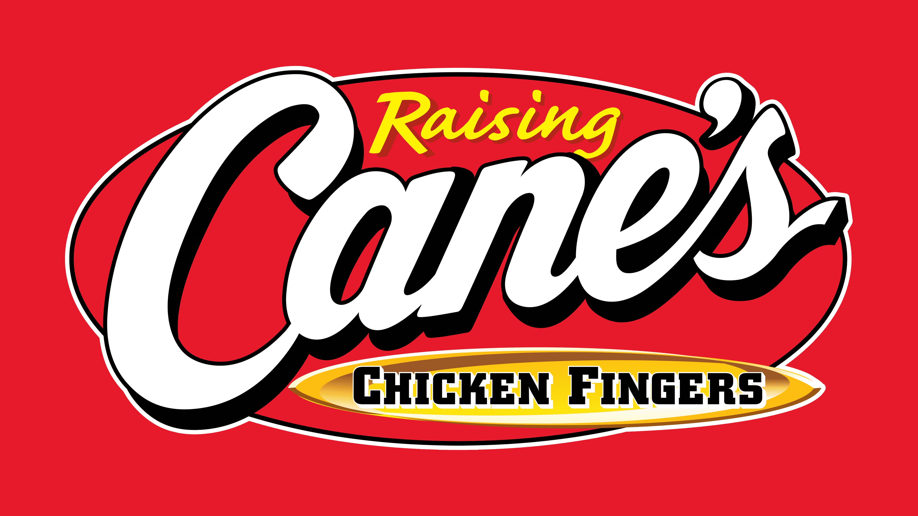
1996 – 2001
![]()
The Canes logo features the inscription “Raising Cane’s Chicken Fingers” arranged across several levels. The top line is occupied by the first word, rendered in a handwritten font. The glyphs are connected, neat, and calligraphic. They are colored in black and outlined in white to stand out clearly against a dark background. The first letter is much taller than the rest; being uppercase, it towers over the emblem. The middle row is essentially the name itself, short and expressive. It is in uppercase and set in massive characters with barely noticeable serifs resembling thickenings. The lower inscription includes the last two words: “Chicken Fingers.” They also have a handwritten style. The background is a regular-shaped black oval.
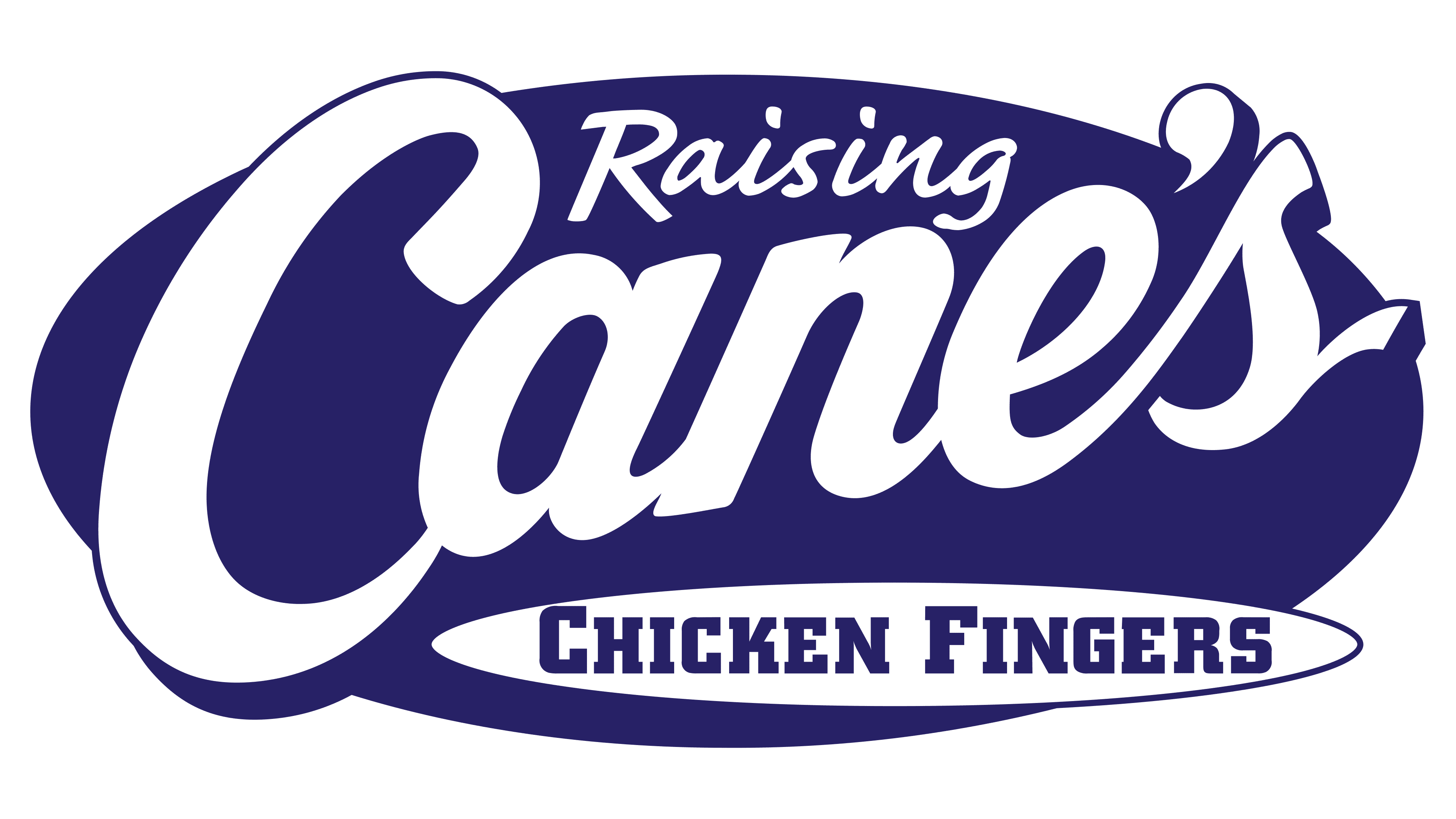
2001 – today
![]()
Designers modernized the style of the inscriptions: they made them italicized, leaving only the last row straight to visually separate it from the name. The yellow word “Raising” is set in a semi-connected font, with the characters split into two groups: letters connected in the syllables “ais” and “ing,” while “R” stands alone. It is uppercase, with an elongated top stroke extending to the left. The largest central line with “Cane’s” is massive and white, with a black outline and a right-side shadow on each glyph. The phrase “Chicken Fingers” is set in a geometric, strict serif font. The smooth black letters are distinctly visible against the yellow-beige background, surrounded by a white frame. Designers repainted the oval in red and ran a thin black line around the edge.
Font and Colors
The Raising Cane’s logo incorporates multiple typefaces, creating a lively and casual appearance. The first part of the name, “Raising,” is set in the bold, italic Laser font, which appears friendly and soft. The second part, “Cane’s,” uses Sydney Serial, a script-style font resembling handwriting, which gives the word a light, natural feel. For the phrase “Chicken Fingers,” designers chose Brush Script, a typeface that mimics hand lettering with smooth, slightly rounded strokes.
Raising Canes logo
Early logo versions were simpler, using basic black-and-white tones. Later, the design evolved with the addition of vibrant colors, deep red, and a soft golden hue. These new tones made the brand’s identity more dynamic, appealing, and memorable. The contrast between dark lettering and rich red and gold accents gives the visual style a festive and warm character, well-suited to the fast-casual restaurant format.