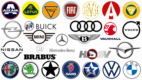
Automobile logos and their design have always been a subject of admiration. The circle is the dominant figure in the emblems of many brands among a huge number of shapes and motifs. But what exactly is the reason for the automotive industry’s predilection for circular logos?
From a functional point of view, the circle is harmoniously symmetrical and provides a balanced display from any angle. Their compactness fits perfectly into a variety of marketing platforms, whether it’s a billboard, business card, or car grille. This adaptability makes the circle a versatile choice for brands that want a consistent and easily recognizable identity across different mediums.
When thinking of automobiles, several circular elements come to mind, such as wheels, headlights, and sensors, which can be subtly hinted at in these logos. It is as if the circle serves as a subconscious reminder of the basic components that make up an automobile.
In many cultures and philosophies, the circle symbolizes completeness, unity, and infinity. These attributes resonate with concepts such as relentless innovation, comprehensive service, and lasting legacy – values that automotive brands might want to be associated with.
In psychology and human perception, circles are often perceived as friendly and welcoming. This can be crucial for automotive brands looking to establish trust and connect with potential customers.
While every car company strives for individuality, the frequent use of circles in logos is no accident. The practicality of the shape, its relevance to the anatomical structure of a vehicle, and its deep symbolic meaning make it a favorite option for depicting automotive brands.
Jeep
Recognizable around the world, the Jeep logo is a reflection of the brand’s rich history and global appeal. It is based on a central star, a symbolic design that evokes images of direction, leadership, and pioneering spirit. This star is encased in a circle, emphasizing the global reach and universal recognition of the Jeep brand, as well as the close-knit community of Jeep enthusiasts around the world.
Jeep’s heritage is deeply woven into the annals of history. Although the Jeep trademark is predominantly used on vehicles today, the circle and star symbol dates back to the turbulent times of World War II. This symbol was not just decorative but had strategic significance. Cars with this unique emblem were intended for export from the United States to various fronts of the war and to allied countries. The circle and star served as a distinguishing mark, ensuring easy identification and distribution of these rugged vehicles, designed for endurance and endurance according to strategic needs. After the war, the Jeep evolved from a military vehicle to a civilian favorite, embodying the spirit of adventure and freedom.
BMW
Widely recognized worldwide, the BMW emblem embodies a combination of elegance and minimalism, giving it a special place in the world of automotive logos. Its design features two concentric circles. The inner circle alternates between blue and white, creating a vibrant checkered pattern.
A wider outer ring encompasses this brightly colored inner pattern. This clear circle houses the brand’s name, with the letters “BMW” clearly and unmistakably visible. This design doesn’t just echo the company’s corporate identity; it reflects its roots.
Despite the seemingly simple design of the emblem, it is based on a rich and deep meaning. The blue and white segments in the emblem are not chosen by chance. They pay homage to the national colors of Bavaria, the birthplace of this iconic brand. In the emblem, the colors are reversed compared to the Bavarian flag. This subtle twist gives the logo a special character.
Mercedes Benz
The Mercedes-Benz brand, which has become a hallmark of the automotive world, boasts a logo that is as iconic as its name. The emblem is a three-pointed star elegantly encased in a circle, making it one of the most prominent circular logos in the automotive industry. This universally recognized emblem symbolizes the brand’s heritage and its commitment to luxury and innovation.
The three-pointed star has generated a lot of curiosity over the decades. While there are several interpretations, it is generally accepted that the three dots signify the brand’s commitment to creating transportation solutions for land, sea, and air. The outer ring surrounding the star emphasizes the brand’s global appeal and popularity. The star and the circle surrounding it epitomize the company’s aspirations and serve as a beacon of luxury, quality, and innovation in the automotive field.
Audi
Audi’s intertwined rings are unmistakably recognizable around the world. Since 1909, Audi has grown to become one of the world’s leading automobile manufacturers, and its symbolic logo reflects the brand’s rich history and ethos.
If you delve into the meaning of the symbol, you’ll find that the quartet of interlocking rings is more than just an artistic choice. They serve as a historical reference to the company’s origins. Originally, four separate companies specializing in different segments of the automotive market – from compact cars to two-wheelers – decided to merge. This union symbolized their strengths and mutual vision. The intertwined rings were the visual embodiment of this collaboration, representing the unity and integration of these four pioneering companies. The Audi logo serves as a reminder of the brand’s journey, its quest for unity, and its unwavering commitment to automotive excellence.
Nissan
With its iconic round design, the Nissan emblem is characterized by elegance and modernity. As automotive brands evolve, there is a constant desire to stay relevant and in tune with modern consumer preferences. For Nissan, this has meant adapting its brand to modern design principles.
The circle on the emblem reflects the global reach of the brand and its commitment to unity and cohesion. At the center of this circle is the Nissan name, typed in crisp sans-serif capital letters, evoking a sense of clarity and precision.
There are various variations of the Nissan emblem, but it is the circular version that has stuck with it in recent times. The choice to go for a flatter and more streamlined design shows the brand’s desire to be perceived as cutting-edge and in line with modern aesthetics. The updated look shows Nissan’s commitment to innovation while paying homage to its rich heritage at the same time.
Buick
Founded in 1899, Buick has been a cornerstone in the development of the American automotive industry. As a division of the renowned General Motors, Buick stands alongside the pioneers of automotive history in the United States and on the world stage. With its deep pedigree, Buick is also the umbrella of the prestigious Cadillac brand, reinforcing its credibility in the field of luxury automobiles.
The Buick logo captures the essence of the brand’s heritage and aspirations. Three distinctive shields are enclosed in a defined circle, each depicting white, red, and blue hues. These colors, reminiscent of the American flag, symbolize Buick’s proud origins and unwavering commitment to its homeland. While the shields have historical significance to the brand, the choice of colors further emphasizes its commitment to its American heritage.
The shields are positioned next to each other, emphasizing the unity and strength of the brand. Their placement reflects the brand’s movement through time and honors its distinguished past. The encompassing circle symbolizes continuity, unity, and the brand’s holistic approach to car manufacturing.
Buick has gone through different eras, constantly evolving but remaining true to its core principles. Its emblem, reflecting a combination of patriotism and pride, is a worthy confirmation of Buick’s status as an iconic brand in the automotive world.
Alfa Romeo
The Alfa Romeo emblem, despite its apparent simplicity, is replete with historical and cultural references, making it as intriguing as it is recognizable.
The emblem is based on a split shield, each half of which tells a different story. One half features the “Visconti” snake, also known as the Biscione. It is not just any snake – it is depicted with a crown, indicating royalty, and at the point of engulfing a human figure. This dramatic image is an old heraldic symbol of the Visconti family of Milan and dates back to medieval times.
In contrast to the complex serpent, the other half of the emblem shows a crisp and clear red cross on a silver background. This image is a reference to the flag of Milan, emphasizing the brand’s deep connection to its place of origin.
An outer circle surrounds these powerful symbols, emphasizing their unity. Inside it, the brand name “Alfa Romeo” is written in bold capital letters, emphasizing its powerful presence in the automotive sector. Each element within the circle harmonizes with the brand’s rich heritage, emphasizing its uniqueness in the automotive world.
Volvo
Originating from Sweden, the Volvo emblem stands out prominently among other automobile emblems due to its circular design. Numerous debates have arisen over its design.
The true inspiration for the Volvo emblem is rooted in alchemy. The emblem depicts iron, an element that symbolizes strength and endurance. These qualities blend seamlessly with Volvo’s signature style, which emphasizes durability and reliability.
The emblem itself is striking. In the center of the silver circle is an elegant arrow pointing up and to the right, located in the upper right quadrant of the circle. The arrow pointing forward symbolizes the brand’s commitment to progress, innovation, and vision for the future. The brand name – “Volvo” – is prominently displayed on a contrasting blue banner located in the center of the circle.
Volkswagen
Originating from Germany, the Volkswagen emblem is synonymous with automotive excellence and heritage. Its unmistakable circular design has firmly entered the annals of branding history. Over time, the design of the emblem has changed to reflect the changing times and the brand’s vision. However, its essence has always remained the same.
The emblem is not just a design; it is a story. It is based on the intertwined letters “V” and “W,” each of which has its own meaning. The letter “V” stands for “Volks,” which means “people” in German, and emphasizes that the company is focused on its customers. The letter “W” stands for “Wagen,” which means “car” in German and emphasizes the brand’s core products. Together, they reflect Volkswagen’s mission: to create cars for people.
The circle encapsulating these letters is not just a design choice. It signifies unity, cohesion, and a sense of community. It is a visual affirmation that the brand is inclusive and accepting of all comers and emphasizes its global appeal.
The emblem has been simplified to be more modern and minimalistic. This modern incarnation is in line with evolving design trends while remaining true to Volkswagen’s rich heritage.
Mini
The Mini Cooper, a name synonymous with compact sophistication, is firmly entrenched in the automotive world. Launched in 1959, the Mini quickly became an emblem of British automobile design, inspiring admiration and a firm foothold in the market.
Over the years, under the British Motor Corporation, the brand went through many evolutions. It wasn’t until 2000 that a significant shift occurred when it was acquired by the esteemed BMW Group. This transition marked a new chapter, combining Mini’s heritage with BMW’s innovative designs.
Mini’s distinctive appearance sets it apart in a world dominated by larger cars. Global sales figures confirm its widespread popularity and the continued demand for its combination of functionality and style.
The logo, central to the brand’s identity, embodies its essence in simplicity. Surrounded by a ring bearing the name “Mini,” it is decorated with symmetrically arranged lines on each side. These wing-like lines indicate the brand’s desire to soar, innovate, and be a category leader.
Bentley
In the pantheon of automotive logos, the Bentley emblem stands out for its original shape. Although it gravitates more towards an oval, elements of its design bear some resemblance to round logos. Created in 1919 by company founder Walter Owen Bentley, the emblem has since become synonymous with luxury and prestige.
At the heart of the emblem is the letter “B,” which stands for Bentley. This central figure is simply a letter and expresses the identity of the brand. Around the letter is a pair of hawk wings, symbolizing speed, freedom, and soaring dynamics – qualities for which Bentley cars are famous.
These elements are surrounded by a larger, three-dimensional shape that serves as a backdrop for the wings and the central motif. This layering of shapes gives the emblem depth and a sense of grandeur. In the automotive world, logos are more than just symbols. They tell the story of a brand’s journey, ethos, and aspirations. The Bentley emblem, with its meticulously crafted design, is exactly that.
Fiat
With a history dating back to July 1899, Fiat is a testament to the enduring appeal and resilience of automotive brands. Originally from Italy, the company has survived and thrived, recording more than a century of triumphs in the automotive industry. Fiat, an acronym for Fabbrica Italiana Automobili Torino, has become a global icon, reflecting the craftsmanship and engineering that Italian automakers are known for.
At first glance, the Fiat emblem does not have a pronounced circular motif like many of its other counterparts, but a closer look reveals the subtlety of its design. A smooth chrome circle frames the main element of the emblem – a rounded square painted in bright red color. This color, often associated with passion and energy, echoes the dynamic spirit of the brand and its Italian origins.
The central red field is dominated by bold, capitalized letters: “FIAT.” The typography has an assertive character, emphasizing the brand’s confidence in its heritage and vision for the future. It is a simple yet striking design, reflecting the brand’s commitment to simplicity, functionality, and elegance – traits that have defined Italian cars for decades.
In all its understated splendor, the logo offers a glimpse into the history of Fiat, from its origins in the bustling city of Turin to its transformation into one of the flagships of Italian automobile manufacturing.
Lotus
Founded in 1952, Lotus has carved out a special niche in the automotive world, especially in the sports and racing car sectors. The brand’s emblem is iconic and instantly recognizable thanks in large part to the bright yellow color that serves as the backdrop for its design. This bright color not only distinguishes the Lotus emblem from many other round car logos but also allows it to linger in the memory of those who see it.
The complexity of the emblem’s design is not limited to its bright color. In the center of the yellow circle is a dark green curved triangle. Inside this triangle, the name of the brand “Lotus” is printed in a clear and bold font. But there is another intriguing design element: the letters “A, C, B, and C” are intertwined above the brand name. These are not arbitrary letters thrown together for aesthetic appeal. These are not arbitrary letters thrown together for aesthetic appeal but an indication of the brand’s rich history, symbolized by the initials of the company’s founder.
The Lotus emblem is not just a branding tool; it is a fusion of history, personality, and design excellence. The combination of bright yellow and dark green colors, as well as intricate inscriptions, make this emblem a memorable element of the automotive industry.
Ariel
Located in the picturesque Somerset region of England, Ariel Motor Company has established itself as a niche player in the performance car sector. Unlike the giants of mass-produced automobile manufacturing, Ariel prides itself on its specialized, low-volume approach to production. This commitment to craftsmanship and innovation is most evident in one of the company’s flagship designs, the Ariel Atom. This car, characterized by its lightweight frame and exceptional performance, remains elusive to this day, appearing only occasionally in some corners of the world.
The Ariel emblem is both distinctive and symbolic. The central figure in the form of a bright red sphere represents a clever play on the letter “A.” However, a closer look reveals an artful depiction of an endlessly receding road into the horizon, symbolizing the limitless possibilities and journeys that Ariel cars offer. To add depth to this image, the traditional horizontal line across the capital “A” is replaced by a circle. Ariel Motor Company, through its unique offerings and distinct brand identity, shows a combination that has a passion for the automotive experience at its core.
Caterham
Caterham holds a special place in the hearts of car enthusiasts. Founded in the UK in 1973, Caterham has always been committed to building lightweight, finely tuned sports cars. The signature Caterham 7 model, introduced the same year the company was founded, is a testament to Caterham’s innovation and longevity. This model, a refined version of the Lotus 7 Series 3, demonstrates the brand’s skill in updating and refining car design without losing the essence of the original.
Taking a look at the Caterham emblem, one can understand what the brand’s personality is all about. A bright yellow circle dominates, which is emphasized by contrasting white and black outer borders. This choice of colors not only gives the design depth but also draws attention to it, reflecting the dynamic and energetic nature of the brand. Inside the primary circle is a secondary green sphere enclosed by a white perimeter. This layering creates a unique three-dimensional effect, reflecting the brand’s fine attention to detail in both design and functionality. The emblem’s color palette of yellow and green may hint at the brand’s British roots.
Brabus
Originating in Germany in 1977, Brabus may not have the global recognition that some of its peers have. However, it has certainly carved out a niche for itself in the field of high-performance tuning. Known for its expertise, Brabus specializes in improving the performance of specific brands of vehicles, particularly Maybach, Smart, and Mercedes-Benz. This specialization has allowed the company to create a unique identity that sets it apart from many in the automotive industry.
The Brabus logo is an example of minimalism combined with purposeful design. The emblem is dominated by a pronounced circle, and in its place is the capital letter “B.” This thoughtful design choice is not just an artistic decision. The bold letter “B” is a beacon, signifying the company’s name and embodying its essence. The circle around the letter “B” can be interpreted as a symbol of the brand’s global aspirations and its desire to provide a full cycle of car tuning services.
In an industry where pretentiousness often comes to the fore, the Brabus logo is based on the principle of “less is more.” The simplicity of the emblem allows it to remain memorable and easily identifiable. The unchanging “B” is a testament to the brand’s confidence in its name and heritage.
Devel Sixteen
Devel Sixteen, often abbreviated as DEVEL, epitomizes the fusion of luxury and high performance in the automotive industry. Launched in 2013 in Dubai, the brand represents the cutting edge of automotive innovation and splendor. With its roots in a city known for its extravagance and architectural marvels, the brand has unsurprisingly quickly carved a niche for itself in the global automotive market.
The famous hypercar concept instantly captured the imagination of car enthusiasts and industry experts alike. It was not just another luxury car but a testament to the leap in automotive technology, combining unrivaled speed with luxury. Although only a select few have had the honor of owning one of these magnificent machines, its reputation resonates in automotive circles around the world.
The Devel Sixteen emblem sheds light on the philosophy of the brand. The dominant emblem is a shining golden circle, symbolizing luxury and the eternal cycle of innovation. This main circle is embellished with smaller circles around its perimeter, hinting at the intricate details and precision with which each Devel product is created. Inside this circle is the brand’s name – “Devel.” However, it is not simply written – the font is made with a twist, which gives it a special look and reflects the brand’s commitment to uniqueness and innovation.
The emblem and cars symbolize Devel Sixteen’s desire to push boundaries, champion luxury, and redefine the possibilities of high-performance vehicles.
Haima
Founded in 1992, the Haima automobile company is synonymous with innovation and identity in the automotive sector. Its emblem is a harmonious fusion of two iconic design elements – the circle and the wing.
Haima is focused primarily on the corporate car segment; its emblem attracts the eye, even if it is not as widespread on the roads as other well-known brands, such as Fiat. The Haima emblem charms with its organic combination of minimalism and sophistication. A graceful bird in a shimmering silver hue elegantly spreads its wings, about to fly. The bird motif is superimposed on a polished chrome circle, creating a contrasting background that emphasizes the elegance of the bird.
The craftsmanship of this emblem is evident in the intricate detailing. Careful shading and gradient techniques were used to create the emblem, resulting in a three-dimensional effect that creates the illusion of depth and movement. The emblem serves as a reminder that Haima is not only about transportation but also a pioneering journey defined by elegance and a desire for excellence.
Ginetta
In 1958, Ginetta, born in the heart of West Yorkshire (UK), established a special place in the automotive industry. Founded by the Walklett brothers, this Leeds-based company established a reputation for building bespoke sports and racing cars to individual specifications.
The essence of Ginetta is not only evident in its specialized automotive offerings but also reflected in the brand’s visual identity. Many people recognize Ginetta by a single wordmark, but a closer look reveals an emblem that embodies the spirit and heritage of the brand. The emblem integrates the name “Ginetta” into a broader design structure, surrounded by a prominent and stylized “G.”
The emblem radiates energy and brightness against a background of a bright yellow sphere. The choice of yellow, which is often associated with optimism and enthusiasm, seems quite appropriate for a brand focused on innovation and individual development. An additional accent in the design is the border transitioning from white to gray, which gives the logo depth and dimensionality.
Ginetta’s circular emblem stands out in a market rife with generic emblems and subtly conveys the brand’s commitment to craftsmanship, heritage, and innovation. Through this emblem, you can get a glimpse of a company that was a humble venture of a group of brothers and has evolved into a recognized name in the world of sports and racing cars.
Aixam
The automotive industry in France has witnessed the rise of many brands over the years. Among them is Aixam-Mega, which debuted in 1983 to produce microcars. The venture was a continuation of the legacy left by Arola, which Aixam-Mega absorbed.
The brand’s identity has been embodied in its logos over the years. In the initial phase, the Aixam logo was a bold letter “A” set within a blue circle framed by a bright red border. This simple design effectively reflected the clear, direct, and unambiguous essence of the brand.
As businesses evolve, branding strategies change. When the brand switched to the name “Aixam Mega,” there was a noticeable change in the logo design. The new emblem became more three-dimensional while retaining the familiar round motif. The design originally combined the two letters “A” to form the letter “M,” symbolizing the merger of the two names. The circle, the universal symbol of continuity and integrity, is the perfect fit for this brand.
HSV
Holden Special Vehicles (HSV), commonly known as HSV, represents the pinnacle of excellence for the iconic Australian automaker Holden. Established in 1987 in Clayton, Victoria, this company has long been the embodiment of Holden’s racing spirit and its commitment to automotive excellence.
The HSV emblem is a masterclass in symbolism, embodying the brand’s rich heritage and passion for speed and precision. The centerpiece of the emblem is a circle located between the letters “H” and “S.” This circle, bordered by a double red border, serves as a stage for two striking figures – a figure in a racing helmet and a majestic big cat, perhaps evoking images of a panther or jaguar. The juxtaposition of these two figures emphasizes the man’s quest for racing glory and the raw power of nature that the predatory cat represents.
The black background of the circle creates a stark contrast, making the inner elements more vivid and ensuring their instant recognizability. The man in the racing helmet symbolizes the driver’s dedication, focus, and determination, while the large cat emphasizes the car’s inherent power, agility, and predatory nature on the track. The HSV emblem tells the story of how man and machine come together, driven by an innate desire to dominate the racetrack. It is an ode to the indomitable spirit of racing, the relentless pursuit of perfection, and the joy of being at the helm of a powerful beast.
Venucia
In 2020, Venucia, part of Dongfeng Nissan Passenger Company, became one of the most prominent brands. Venucia has consolidated its position as a specialized vehicle manufacturing company by separating itself from Dongfeng Nissan’s core brand.
The unique emblem of this brand combines classic and modern design elements. Dominates the blue circle, framed by a silver border, reminiscent of a shield. This gives the emblem an aura of strength and resilience and represents the brand as a guardian of quality and innovation in the automotive sector.
Inside this symbolic shield are three stars of different sizes superimposed on each other. But it is the five dots of these stars that have deep significance. Each dot signifies a commitment made by Venucia: maintaining quality, providing value, showing respect, and fostering creativity.
This design does more than just attract attention. It speaks to Venucia’s mission and vision, emphasizing that although the brand is new to the market, its core values are deeply rooted.
Saab
Saab, founded in the mid-20th century with a focus on aviation, moved into the automotive industry in the 1950s, drawing inspiration from its aerospace roots. The aviation influence has remained, with elements reminiscent of an airplane propeller in the logo, a testament to its rich past.
The Saab emblem is an elegant fusion of modern design and historical homage. The emblem, in a vibrant blue color with smooth silver frames, instantly grabs the attention. Central to the circular emblem is a majestic griffin in bold red, its presence imposing and regal, further emphasized by the brilliant golden crown it proudly wears. Beneath this heraldic creature is the brand name in elegant silver capital letters.
The combination of elements in the emblem speaks of Saab’s journey and evolution. From the birth of aviation to its position of honor in the automotive sector, the emblem is a silent narrative that reflects the rich history of the brand. With the emblem, Saab easily bridges the gap between its historical roots, creating a visual identity that resonates with automotive fans around the world.
Opel
Originally from Germany, Opel is a testament to the enduring appeal of the round emblem in the automotive world. As one of the leading divisions of the Stellantis conglomerate, Opel has firmly carved a niche for itself in the automotive industry. Its creation more than a century and a half ago, in the 1860s, cemented its status as one of the pioneers of the automotive industry.
The Opel emblem is a complex combination of tradition and modernity. The name of the brand, written in block letters sans-serif as “OPEL,” is located under a highlighted circle. However, this circle is no ordinary circle. It is intersected by a unique zigzag pattern reminiscent of a dynamic lightning bolt. It is a visual representation that captures the essence of a brand that has been gracefully coping with changing market trends and technological advances for more than a century.
Škoda
Born in 1925 in the Czech Republic, Škoda has become a world leader in the automotive sector. Present in more than 100 countries around the world, the brand’s cars are not only popular but are also often synonymous with reliability and innovation. This extensive global reach has led to significant growth for the company in recent times.
By 2017, the brand’s financial superiority was evident. Škoda had one of the world’s most enviable profit margins, a testament to its successful strategies and high consumer appeal.
The Škoda emblem is as much a symbol as the brand itself. It is enclosed in a black and silver ring with wings and symbolizes the company’s global aspirations and expansion. The wings, located in the center of the emblem, serve as a metaphor for technological progress and the company’s desire to always soar. The arrow pointing to the right symbolizes Škoda’s constant striving for progress and aspiration for the future.
The green shade used in some parts of the emblem gives it another meaning. It is not just a color; it shows Škoda’s environmental awareness and points to the sustainability and renewability of resources.
Vauxhall
Vauxhall is often mentioned when discussing car brands with round logos. The emblem representing this famous automobile brand contains intricate details.
In the center of the emblem is a bright red sphere in which a silver griffin is placed. This mythological creature, known for its mysterious aura, holds a flag on which the letter “V” is clearly visible. This letter undoubtedly symbolizes the name of the brand.
Inside the circle, a griffin’s wing is spread out. This design element is not just an aesthetic but a symbol. It conveys dynamism, innovation, and the brand’s constant desire to soar higher in the automotive sector.
Round Car Logos
Circles in car logos are not just a design choice; they carry a deeper meaning and historical significance to the automotive sector. Over time, many automotive brands have started using circular emblems, making them a common design trend.
In design psychology, the circle has long been associated with continuity, wholeness, and infinity. Their smooth, unbroken lines often evoke a sense of unity and harmony. When applied to the automotive industry, these meanings become even more multifaceted. For example, the circle’s resemblance to parts such as wheels or steering mechanisms subtly reminds viewers of the essence of mobility.
The circle shape also has a psychological impact. A circular car emblem can evoke a sense of trust and reliability. It can hint at a brand’s global presence, indicating its commitment to meeting the needs of customers around the world. The idea of global reach is complemented by the idea of the circle’s inclusiveness, suggesting that the brand values each member of its community.
The symbolic representation of the circle as unity and connection can be seen as an ode to family values, suggesting that the brand prioritizes safety and comfort as a family unit. The inclusive nature of this shape emphasizes the brand’s commitment to recognition, where every customer is valued, regardless of their background and needs.
Round car logos may seem like a simple design solution, but they carry a rich set of meanings and associations that resonate deeply with viewers, allowing them to remain a favorite design element in the automotive sector.
