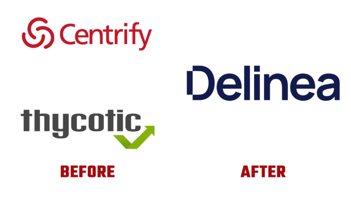
This year, two leading privileged access management solution providers, PAM, decided to combine their capabilities and efforts. Now security for hybrid enterprises has become even more hassle-free. The new alliance opens up a wide range of opportunities in the field of protection of critical data and electronic devices, code systems, and cloud infrastructure. This reduces risk dramatically, ensures full compliance, and simplifies security. Eliminating the complexity in this area, the brand defines the boundaries of access to thousands of users worldwide. Among the company’s clients are the largest financial institutions and small businesses, secret divisions, and special and intelligence services agencies, especially those who work with critical information data and infrastructure. To quickly adapt to its professional environment and inform users, the brand has developed its professional visual representation, presenting its new identity to users.
The decision to merge was made based on a deep analysis of the cybersecurity world, which led to an important conclusion – improvements in this direction are needed. As a result, the necessary flexibility was provided, the possibility of creating unique conditions on an individual basis. The entire data and access structure is based on the principle of binary switches in constant motion. The new visualization is based precisely on the understanding of these features.
To facilitate the visual perception of a rather complex brand, the entire construction of the image reflection was based on the observance of the modern trend – the minimalist style. A system of simple lines called “Sequences” was applied, which symbolizes all company decisions, connecting the monogram, sign, all typography, and digital space into one whole. Each line is made in the strict following from thick to thin, creating symbolic levels of security between actions available to users and areas closed to them. Such graphics ensured forming a new and flexible language for this simple visual form.
The effect is enhanced by a simple sans-serif typeface, which emphasizes the attractive execution of the capital “D” that serves as the starting point for each “sequence.” Adds appeal and animation of the logo in a diamond shape. With its help, the idea of expanding the sequence to its larger form is successfully revealed.


