


![]() Cheetos Logo PNG
Cheetos Logo PNG
The Cheetos logo is rendered in fiery orange tones that convey the product’s flavor: a spicy kick, a bold cheese accent, and a touch of attitude. The visual style is associated with intensity and energy. The brand is chosen by those who prefer expressive flavors. Chester Cheetah complements the brand image. He is agile, confident, and slightly mischievous. His character creates an atmosphere of freedom and light defiance that the audience approaches life with.
Cheetos is a snack brand made by PepsiCo. The crunchy, flaky corn snack originated in 1948 with the invention of Charles Elmer Doolin. Since then, it has been distributed actively in the United States and worldwide. Due to the product’s vast sales region, its taste varies by country, reflecting local populations’ cultural preferences. Therefore, the line now includes many branded chips. There are 21 varieties in North America alone.
The history of this brand began in an ordinary home kitchen. More precisely, Charles Elmer Doolin experimented with a cheese-flavored corn snack in a Dallas kitchen. The trial batch was successful and sold out quickly, but the entrepreneur lacked the capacity to set up large-scale production. He then partnered with Herman Lay and introduced Cheetos in 1948. After the merger of Frito-Lay (founded by Doolin and Lay) with Pepsi-Cola, these snacks became known far beyond North America.
In 1948, Charles and Elmer Doolin, founders of The Frito Company, invented Cheetos, transforming cornmeal and cheese powder into the popular snack we enjoy today. Initially available only in Texas as Crunchy Cheese, its quick popularity led to national distribution after Frito merged with H.W. Lay & Company in 1961 to become Frito-Lay, Inc.
The 1960s saw the introduction of new Cheetos products, such as Puffs, Twists, and cheese-flavored popcorn, establishing the brand’s signature bold cheese flavor. The arrival of Chester Cheetah as the brand’s mascot in 1971 further boosted its appeal. Over the decades, Cheetos continued to innovate, introducing lighter options like Cheetos Checkers and playful shapes like Paws.
The 1990s and 2000s marked a period of flavor expansion and international growth, including the wildly popular launch of Flamin’ Hot Cheetos. The brand also ventured into new food categories, partnering with Kraft Foods in 2012 to release Cheetos-flavored macaroni and cheese and opening The Spotted Cheetah, a themed pop-up restaurant, in 2018.
Cheetos has effectively used celebrity endorsements and tapped into pop culture, collaborating with rapper Bad Bunny in 2020. Now a global brand with billions in sales, Cheetos remains a leader in the snack industry, beloved in over 36 countries. With a commitment to innovation, fun, and flavor, Cheetos remains a source of joy and nostalgia for fans of all ages.
Meaning and History
![]()
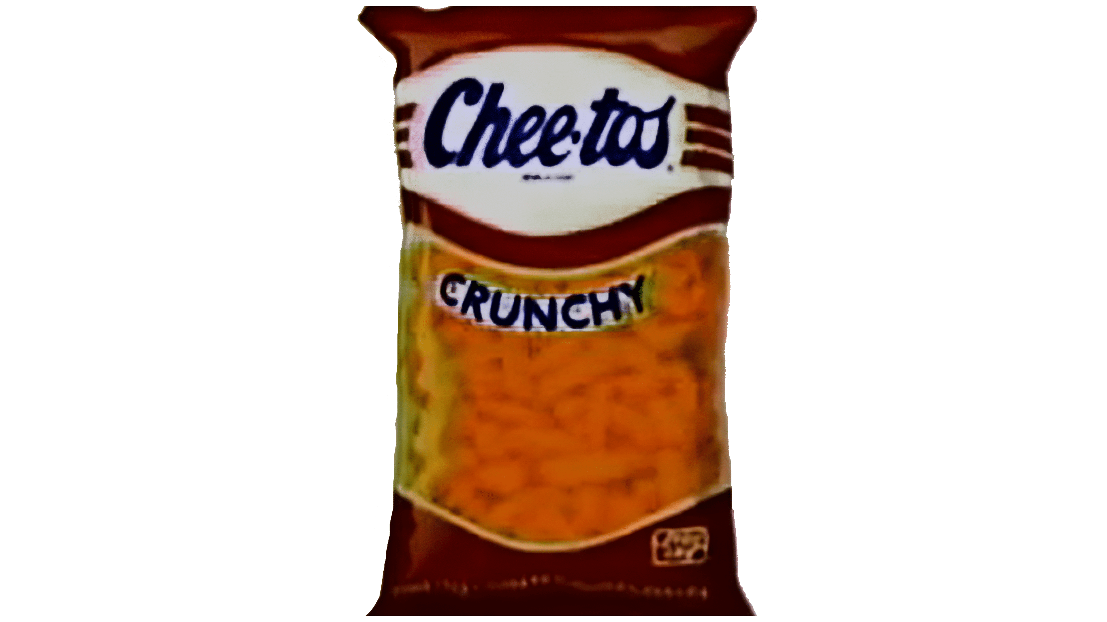
At first, the product was called Chee-tos, which was reflected on its label. Each pack of corn-and-cheese appetizers was adorned with a large inscription in imitation of individual handwriting. The letters were cursive, calligraphic, slanted, and rounded. There was a bold dot between the two parts of the title. Later, it was replaced by an en dash, then disappeared altogether. Consolidated spelling first appeared in 1996, and two years later, it was finally fixed in the identity. In total, this brand has seven emblems.
What is Cheetos?
Cheetos is an international grocery brand owned by PepsiCo Corporation through its subsidiary Frito-Lay. It is engaged in manufacturing and selling corn and cheese chips with various flavors. To date, 21 species are known, based on the national preferences of the countries for which these snacks are intended. They first appeared in 1948 when Charles Elmer Doolin developed them.
1948 – 1963
![]()
The neat inscription was on a red rectangle. The letters were white, wide, and connected, with smooth transitions. Such a logo looked like a short text made in individual handwriting. “C” was uppercase, and the other characters were lowercase. The “t” had an extension in the area of the upper crossbar: it went beyond the “o” and ended at the “s.”
1963 – 1981

During this period, the horizontal rectangle and the red background disappeared. The letters were stretched upward and narrowed. The connection between the glyphs was preserved, and the slope was made more distinct, as seen in the example of “s.” For the lettering, the designers chose blue.
1981 – 1995
The Cheetos logo used a white oval with bright blue lettering. The style has remained the same.
1995 – 1998
To diversify and modernize the emblem, the developers rotated it, changed the font, and added a red border. The logo was a black rectangle with a jagged edge that looked broken or gnawed. Also, the “C” was separated from the rest of the title, so the overall font was somewhat cohesive.
1996 – 1998
![]()
This version of the logo used a hook typeface. The letters were hastily written and far from smooth calligraphic handwriting. They were located at different heights, so they looked like they were jumping. Such unevenness introduced a hidden harmony into the text, as the glyphs resembled long, scattered snacks of various shapes. The thin red border line was shifted to the very edge of the letters, and the edge of the black rectangle was even more deformed, as if torn.
1998 – 2001
![]()
The designers streamlined the text, reconnecting the letters to make the inscription coherent. In addition, they expanded the lines, which caused the glyphs to grow in size. They kept the geometric figure’s uneven (torn) edge but lightened the background, using a muted shade of smoky black rather than ultra-black.
2001 – today
![]()
In 2001, the Cheetos brand changed its logo for the North American market, reinterpreting its familiar style. The updated mark later expanded to other countries, becoming the global face of the brand.
In the new style, the previous jumping letters were abandoned in favor of a wordmark that combines soft curves with sharp angles projecting to the left. The text was visually divided into two parts. The initial letters “Che” rise at an angle, while the second half, “etos,” is almost horizontal.
The brand name is rendered in yellow, evoking the product’s cheesy flavor. The large letters are surrounded by a wide black outline that visually adds depth and emphasizes the silhouette. The black fill extends beyond the yellow glyphs, creating a three-dimensional effect that makes the word appear to slightly protrude from the surface. Additional depth is created by the letters’ inner contours, which are lighter at the top and darker at the bottom.
The name is arranged in an arc with a gradual rightward rise, giving the mark a lively, dynamic appearance.
Font and Colors
Cheetos chips received a logo divided into periods: before 1996-1998 and after. The original version of the name contained a dash, which was an obligatory part of the brand’s visual identity. However, later management combined both fragments and removed the sign separating them. The result is a modern version of the emblem.
The Cheetos logo uses a unique identification font designed specifically for the brand, which lacks an official name. This typeface has been specifically designed to give the Cheetos logo a distinctive style and greater recognition. Now, these are wide letters with sharp protrusions at the top. They are painted yellow and complemented by a black background. In addition, red, white, and blue were present at different times.
The Cheetos emblem uses orange and yellow. Orange is a rich color that is associated with warmth, energy, fun, and optimism. Yellow is associated with the sun, joy, friendliness, and creativity. Both colors go well together, creating a memorable look.
These colors are important to the Cheetos brand because they help create a recognizable, identifiable brand image. Orange, in particular, has become a brand symbol and is associated with the product itself: orange Cheetos chips. In turn, yellow lends the logo a sense of energy and positivity.
For customers, bright colors create an impression of fun and joy, consistent with the associations of a light, tasty snack like Cheetos chips. In addition, orange can induce appetite and be associated with food.
FAQ
Who is the Cheetos brand character?
Chester Cheetah is the iconic mascot for Cheetos and Chester’s Snacks, which include flavored fries, popcorn, and puffcorn made by Frito-Lay. Known for his sunglasses and cool personality, Chester has become a key figure for the brand, appearing in ads and on packaging since his 1971 debut. He’s not just a character; he embodies Cheetos’s fun, playful spirit, contributing significantly to the brand’s image and appeal with his memorable slogans and relaxed vibe.
What is the new Cheetos flavor?
Cheetos recently introduced a new flavor, Crunchy Buffalo, inspired by the beloved game-day snack, Buffalo Wings. Known for being a crowd-pleaser at sports events and casual get-togethers, the distinctive, spicy, tangy taste of Buffalo wings is now available in Cheetos form. This new addition aims to bring the much-loved flavors of Buffalo wings to Cheetos fans, combining the kick of Buffalo sauce with the classic crunch of Cheetos.
What makes Cheetos so addictive?
The irresistible nature of Cheetos isn’t just because they melt in your mouth but also because of the sticky orange powder that coats them. Research by the marketing group NeuroFocus found that this powder significantly adds to their appeal. Interestingly, while people might seem annoyed by the messiness, it brings a secret enjoyment. This enjoyment from the mess and the unique melting texture of Cheetos creates a compelling experience that the brain finds delightful. It’s this mix of sensations that makes Cheetos so addictive.
How long have Cheetos been around?
Cheetos have been around since 1948, when they were launched in San Antonio, Texas, as Crunchy Cheetos. For the next 23 years, this was the only product they offered until 1971, when they introduced Cheetos Puffs, adding variety to their line. In 2004, they expanded their selection with Baked Cheetos, a healthier alternative to the original fried version. This history shows how Cheetos have grown from a single product into a wide range of products that satisfy diverse consumer preferences.
Why are Cheetos called Cheetos?
“Cheetos” originally started as “Chee-tos,” hinting at their cheesy taste and roots in the Fritos brand. The snack was crafted with ingredients similar to those in Fritos, leading to a playful name that highlights its cheesy nature and connection to Fritos. This name combines the snack’s distinctive, cheesy flavor with the familiar Fritos brand, underscoring its origin and main taste profile.
Do Cheetos use real cheese?
Cheetos include real cheese in their Simply Puffs White Cheddar Cheese Flavored Snacks. These are baked to perfection and seasoned with cheese for an authentic taste. Moreover, the Simply line is free from artificial flavors, preservatives, or colors, aligning with a more natural approach to snacking. This decision to use real cheese and avoid artificial additives demonstrates Cheetos’ dedication to offering tasty snacks that cater to modern consumers’ health and taste preferences.