


![]() Chicago Fire Logo PNG
Chicago Fire Logo PNG
The name and logo of Chicago Fire commemorate the city’s tragic yet heroic history. The emblem has a symbolic shape, though many fans are unaware of what exactly inspired the creation of their favorite football club’s identity. This sign harbors energy within it.
Chicago Fire is a professional football club based in Bridgeview, a southwestern suburb of Chicago. It’s a member of Major League Soccer (since 1998) and competes in the Eastern Conference (since 2002). It was founded by Anschutz Entertainment Group, the world’s largest owner of sports teams, which is also a co-founder of MLS and a leading investor.
The franchise’s founding date (October 8, 1997) coincided with the 126th anniversary of the Great Chicago Fire of 1871. From October 8-10, 1871, a fire destroyed 9 km2 of wooden sidewalks and tar-roofed homes. The team was named “Chicago Fire” as a tribute to the city’s past. That’s why the Chicago Fire emblem is highly symbolic – it replicates the shape of the fire department’s crest. The fiery name was chosen from among other options, such as Blues, Rhythm, and Wild. At the same time, the club’s general manager, Peter Wilt, stated that Chicagoans could take pride and rejoice in their city’s recovery.
On September 6, 2007, the franchise was sold to Andell Holdings, a private investment corporation based in Los Angeles, for $ 35 million. The club’s owner, Andrew Hauptman, became the chairman of Andell Holdings’ board of directors.
Nike, the equipment supplier for the Chicago Fire, intended to conduct a complete rebranding. They wanted to rename the team to “Chicago Rhythm,” change the color palette to turquoise, black, and green, and introduce a cobra as a key element of the emblem. However, the owners rejected this idea in favor of the Adrenalin concept.
Meaning and History
![]()
When the MLS was created in the 1990s, its participants sought to establish a unique image that would help them stand out in the sports arena. Chicago Fire was no exception. It became a global brand named after the great fire that devastated the city in the 19th century. According to one version, the tragedy was caused by a cow knocking over a burning lantern. However, there are no cows on the team’s logo. The original version was inspired by the fire department’s crest and its main symbol – the Florian Cross.
In 2019, the iconic sign was replaced by the so-called Fire Crown. Fans disliked the new emblem, prompting the Chicago Fire owners to continue their branding work. The team wanted a timeless logo containing the letter “C,” the Florian Cross, and a hint of the Chicago flag. They decided to forego the use of fire axes, lanterns, or water towers. The resulting graphic symbol reflects the club’s history and its iconic identity.
What is Chicago Fire?
Chicago Fire is a professional football team representing the Eastern Conference in MLS since 2002. The team is based in Chicago and became an expansion franchise in 1998. The team has won three US Open Cups (in 2000, 2003, and 2006) and secured the MLS Supporters’ Shield (in 2003). The team also boasts many other achievements.
1998 – 2019
![]()
Anschutz Entertainment Group approached the Adrenalin agency, specializing in sports branding, to develop a logo. The designers created an emblem that reflects the football club’s connection to the Great Chicago Fire of 1871. Peter Wilt admitted that thanks to Adrenalin, they acquired the most enviable logo in Major League Soccer.
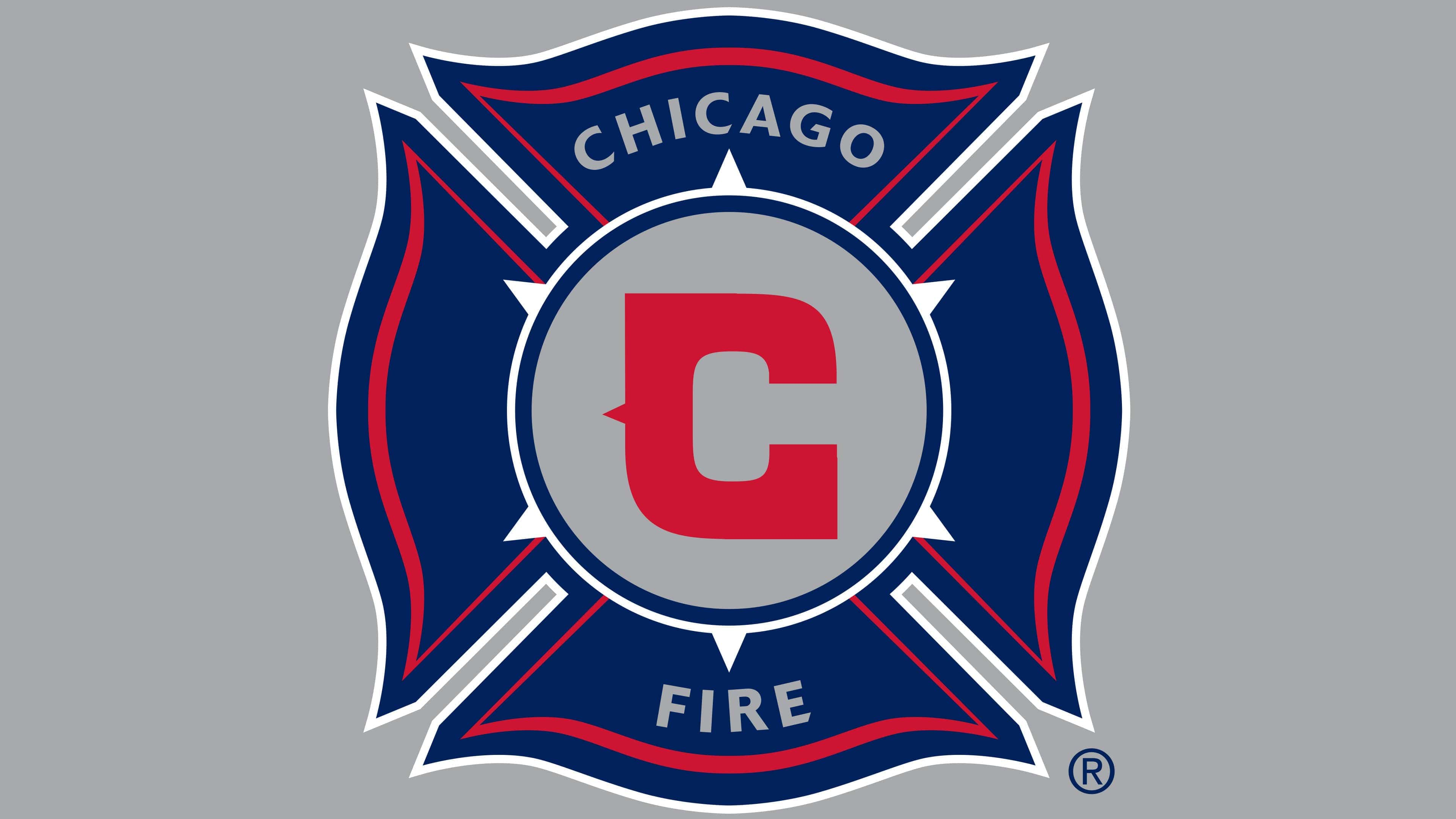
The Chicago Fire logo, like the team’s name, also alludes to the fire. Its central element is the St. Florian’s Cross, the patron saint of firefighters. The Chicago Fire Department’s emblem has a similar shape. St. Florian’s Cross is an eight-pointed cross with rounded edges. The arms, tapering towards the center, are navy blue. They are bordered by red wavy lines that follow the contour’s shape. The words “Chicago” and “Fire” are inscribed in gray font on the top and bottom arms, written in capital sans-serif letters.
At the center of the cross is a gray circle with a blue outline and a red letter “C” inside. The six white dots represent the four six-pointed stars on the municipal flag of Chicago. They symbolize monumental events in the city’s history, including the Great Chicago Fire of 1871. The red letter “C” obviously stands for “Chicago,” as in the Chicago Bears and Cubs, which use this symbol in their logos. It’s written in an angular font and adorned with an ear of corn on the left.
2019 – 2021
![]()
Critics deemed this logo the worst in the league’s history. They disliked the absence of significant symbols of the Chicago Fire. The base is a vertical navy blue oval with two thin burgundy oval rings inside. One ring is closer to the edge, and the other is closer to the center. Between them is a yellow inscription, “Chicago Fire FC,” executed in a rectangular font. In the center of the emblem are two geometric compositions resembling crowns with triangular protrusions. They look like mirror reflections of each other and differ only in color: red and yellow. The players wore this emblem on their uniform until the end of the 2021 season, while a new version was being developed.
2021 – today
![]()
When it became clear that fans were categorically refusing to accept the “Fire Crown,” the football club decided to change its identity again. Matthew Wolff, a well-known designer specializing in sports branding, was involved in the process, working alongside firms Studio/lab and rEvolution.
Firstly, specialists conducted a survey to determine which symbols football fans preferred. It turned out that most wanted to see the letter “C,” the Florian Cross, and elements from the Chicago city flag, including the six-pointed star. Wolff combined them into one. However, this doesn’t mean a return to the original logo. The design was completely reimagined to reflect significant moments in the football team’s history.
- The red letter “C” represents the city’s name. Its strict angular font inspires confidence, and a small triangular spike on the left associates with danger.
- The blue ring with four notches is reminiscent of the Florian Cross in shape and the stripes from the Chicago flag in color.
- The six-pointed star at the very center of the emblem is also taken from the Chicago flag.
- The round, dark blue frame visually balances the elements and softens the sharp angles.
Font and Colors
The graphic symbol of the Chicago Fire was adopted in 1998 and hasn’t changed since then. Nike’s only redesign attempt was immediately rejected. It wasn’t even considered as a temporary alternative. This is unsurprising, as the original team logo perfectly matches its nickname, which is linked to the Great Chicago Fire of 1871.
The current emblem fully conveys the theme of fire because it was created under the fire service’s emblem. They used it as a reference when choosing the logo’s shape. And they were right, as the eight-pointed St. Florian’s Cross, the patron saint of firefighters, fully matches the concept of the Chicago Fire.
The athletic club uses a font created on order. The official 2021 logo contains only one letter: a bold “C” that resembles a complex polygon due to its lack of rounding. Previous versions included inscriptions with various sans-serif fonts, but the minimalist design prevailed.
Although the official colors of the Chicago Fire are gold, blue, and red, the 2021 emblem reflects only two of these. The color scheme is close to the city’s flag: white (#FFFFFF), blue (#7CCDEF), and red (#FF0000). Dark blue (#141946) is used only for the ring’s outline.

The Chicago Fire logo uses two fonts. One is used for the large letter “C,” and the other for the club’s full name. The font used for the individual letter “C” resembles Agency FB Black Condensed. Designers worked on the letter’s design, adding two straight angles and a protruding triangular “spike” on the outer part. The font used for the words “Chicago Fire” is also unusual. It lacks serifs, but the inscription looks good without them, thanks to the diagonally cut ends of the letters “C,” “G,” and “E.”
The large stylized letter “C” in the central circle is the emblem’s main element. Designers emphasized this with color, making the letter red and the background behind it gray. The words “Chicago” and “Fire” are also painted in the same shade of gray. The protruding parts of the eight-pointed cross are navy blue. For brightness, red lines are added.