


![]() Chili’s Logo PNG
Chili’s Logo PNG
The Chili’s logo embodies the brand’s commitment to a lively and enjoyable dining experience with a Southwestern flair. Spices and hot chili are added to all dishes, making the food spicy. The emblem invites lovers of bold flavor sensations to enjoy the restaurant’s menu. Established in 1975 in Dallas, Texas, Chili’s started as a casual place to enjoy a great burger in a welcoming environment. The logo mirrors this inviting atmosphere, encouraging guests to try a varied menu that spans spicy Southwestern dishes to classic American favorites. Its bold lettering reflects the brand’s vibrant, energetic personality, known for its bold flavors and hearty hospitality. Chili’s aims to be where friends and family gather for meals and memories, a concept reinforced by its logo’s warm, friendly design.
Chili’s is an American fast-food restaurant chain with an informal Southwestern-style atmosphere and original cuisine for those who love spicy food. It appeared in 1975 thanks to Larry Lavine’s initiative. The first eatery was in a converted post office on Greenville Avenue in Dallas. It is now headquartered in Coppell, Texas, and is wholly owned by Brinker International.
In 1975, Larry Lavine launched Chili’s journey in Dallas, Texas, drawing inspiration from the region’s fondness for chili. This cozy eatery, formerly known as Chili’s Hamburger Grill & Bar, offered a simple yet inviting menu of burgers, chili, and tamales in a laid-back setting. This winning formula quickly gained popularity, prompting the first franchise to open in Houston in 1979, setting the stage for nationwide growth.
The 1980s saw Chili’s flourish under Norman Brinker’s ownership. The restaurant introduced menu additions such as fajitas and kids’ burgers and made significant operational improvements. The following decades marked a period of innovation and global expansion for Chili’s, which started serving healthier options and opened outlets in several countries.
In the 1990s, Chili’s expanded its brand portfolio but eventually chose to concentrate on its mainstay. By modernizing its spaces and simplifying its menu, Chili’s adapted to the digital era and changing tastes. Despite growing competition, Chili’s remained a go-to for easy, enjoyable dining.
Now, with over 1,600 outlets around the globe, Chili’s has cemented its place in the casual dining sector, celebrated for its wide-ranging menu that includes burgers, ribs, fajitas, and its famed margaritas. The Chili’s Tale is a classic American success story showcasing a knack for innovation and adaptability. Even as the food service landscape shifts, Chili’s is committed to evolving while staying true to what made it a hit. With its robust brand, dedicated customer base, and a history of innovation, Chili’s is poised to remain a dining favorite for years to come.
Meaning and History
![]()
Beginning as a small site in Dallas’ Vickery Meadows neighborhood, the restaurant gradually grew into a major culinary and food enterprise. In 1981, six years after opening, it moved to a new location in the same town. The second and final move was in 2007.
The founder’s business concept was simple: to create a relaxed atmosphere for visitors in a dining restaurant with comprehensive service. From the beginning, the menu featured several types of burgers at affordable prices. The business was profitable, and in the early 1980s, the company already had twenty-eight Southwestern-designed eateries of the same name.
The establishment proved to be in demand, and in 1983 it was bought from Larry Lavine by entrepreneur Norman E. Brinker, a member of the Pillsbury Group. In 1990, the fast-food chain significantly changed its menu. In addition to chili pepper dishes, other offerings included scrambled eggs, toast, waffles, pancakes, cereal, and bacon. The hours of operation were also changed, as fast-food outlets began opening at 6 a.m. However, in 2018, breakfast was removed from the menu, and opening times reverted to the previous schedule. It now serves American and Mexican cuisine.
Chili’s is very focused on advertising, preferring it as an effective marketing tool. That’s why the restaurant focuses on the logo. It serves a triple function: it is a sign of personal identity, serves as signage, and supports brand identity.
What is Chili’s?
Chili’s, a fast food restaurant in the USA, offers a mix of American and Mexican dishes to suit various tastes. Since its inception, Chili’s has grown significantly, establishing itself as a prominent restaurant chain in the United States and globally. Its diverse menu includes steaks, burgers, tostadas, and sizzling grill items, all flavored with the vibrant spices of Mexican cuisine. With competitive prices, Chili’s has garnered a dedicated following that enjoys hearty meals in a cozy setting. These establishments have a relaxed atmosphere with a Southwestern-style design.
1975
![]()
In 1975, Chili’s introduced its first logo to capture the casual, friendly vibe of the restaurant chain. The logo emphasized a setting where guests could enjoy good food and relaxed conversations. The logo featured the brand name in bold black, using a chili pepper as an apostrophe to highlight the menu’s signature item and inject a fun, cartoonish feel. This creative detail helped make the brand memorable and set it apart from competitors.
The inclusion of the acronym LOL (Laughing Out Loud) in the logo, unusual at the time, added a modern, playful touch that resonated with Chili’s carefree and festive atmosphere, helping make every guest feel welcome. Additionally, the two Ls in LOL subtly referenced the chain’s founder, Larry Lavine, adding a personal element to the logo that connected it more deeply with its history and creator.
1975 – 1983
![]()
The year Chili’s began refreshing its brand image, the company significantly updated its emblem, making it brighter and more engaging. This redesign aimed to reflect the restaurants’ casual, joyful atmosphere, known for its relaxed setting and great food.
A unique aspect of the new logo is the creative combination of the letters H and I, which together resemble a tongue. The foot of the “h” went beyond the lowercase and joined the adjacent “i.” This clever and distinctive detail captures attention and conveys guests’ reactions to Chili’s spicy menu, appealing to a broad audience of food enthusiasts.
The logo’s central feature is a red chili pepper, an iconic item from Chili’s menu that symbolizes the energy and passion the company invests in each dish. A miniature chili pepper was used instead of an apostrophe. This element highlights Chili’s variety of spices and underscores the restaurant’s vibrant, innovative culinary style.
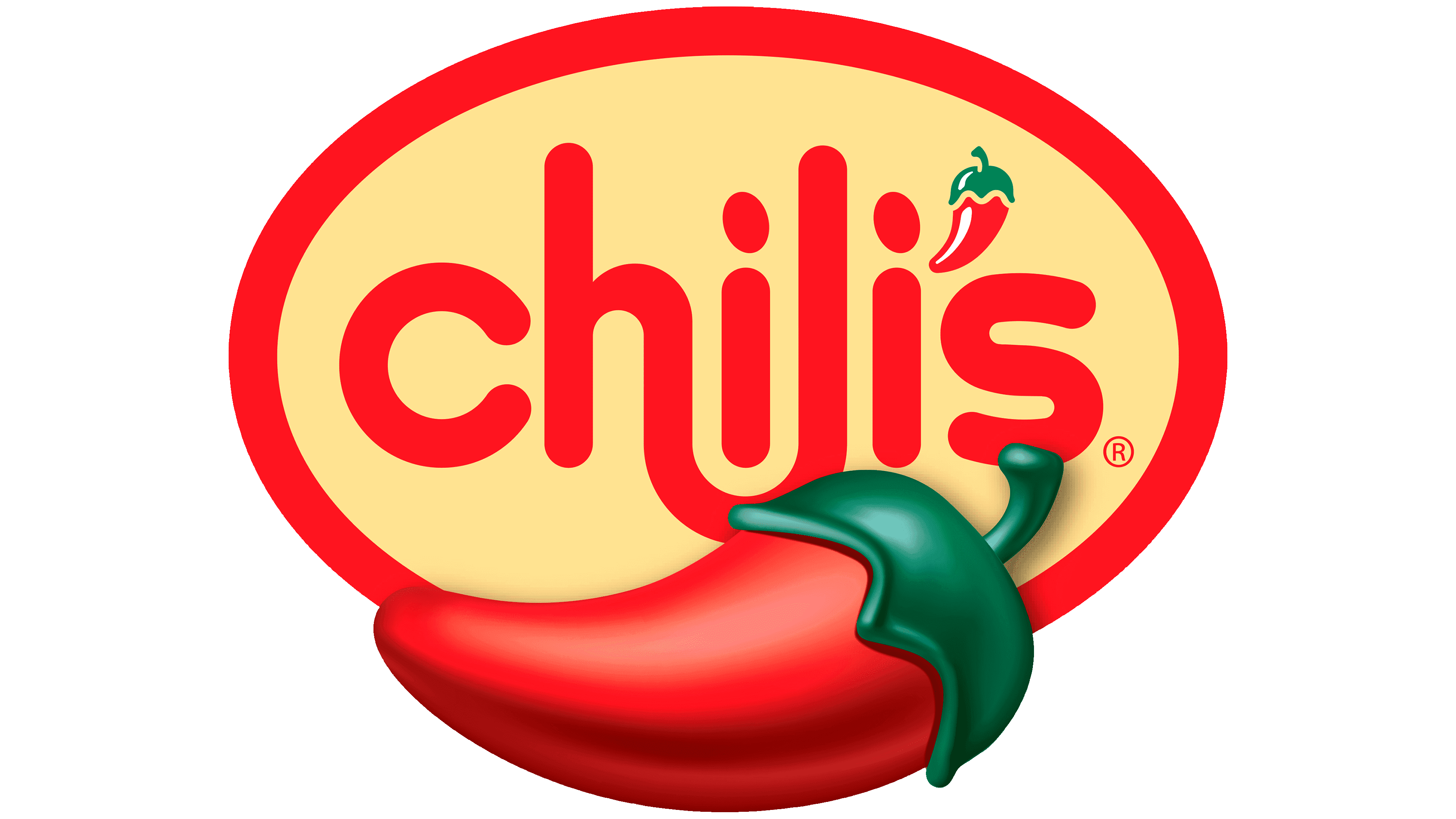
1983 – 2002
![]()
After transitioning to a new owner, the restaurant chain received a different logo. The lettering style was changed to a friendlier one, and the letters had no sharp corners. The lines were smooth and streamlined, and the “h” transitioned harmoniously into the “l.” The designers pushed the “s” close to the rest of the name but still left the pepper in between. At the bottom was an ellipse with the words “Grill & Bar.” They were spaced apart.
2002 – 2011
![]()
The subtitle “Grill & Bar” is gone, and the inter-letter space has increased. The dots above the “i” (or rather, the ovals) got bigger, and the chili pepper got a slight curve on the left side. The color scheme remained the same: a combination of green and red.
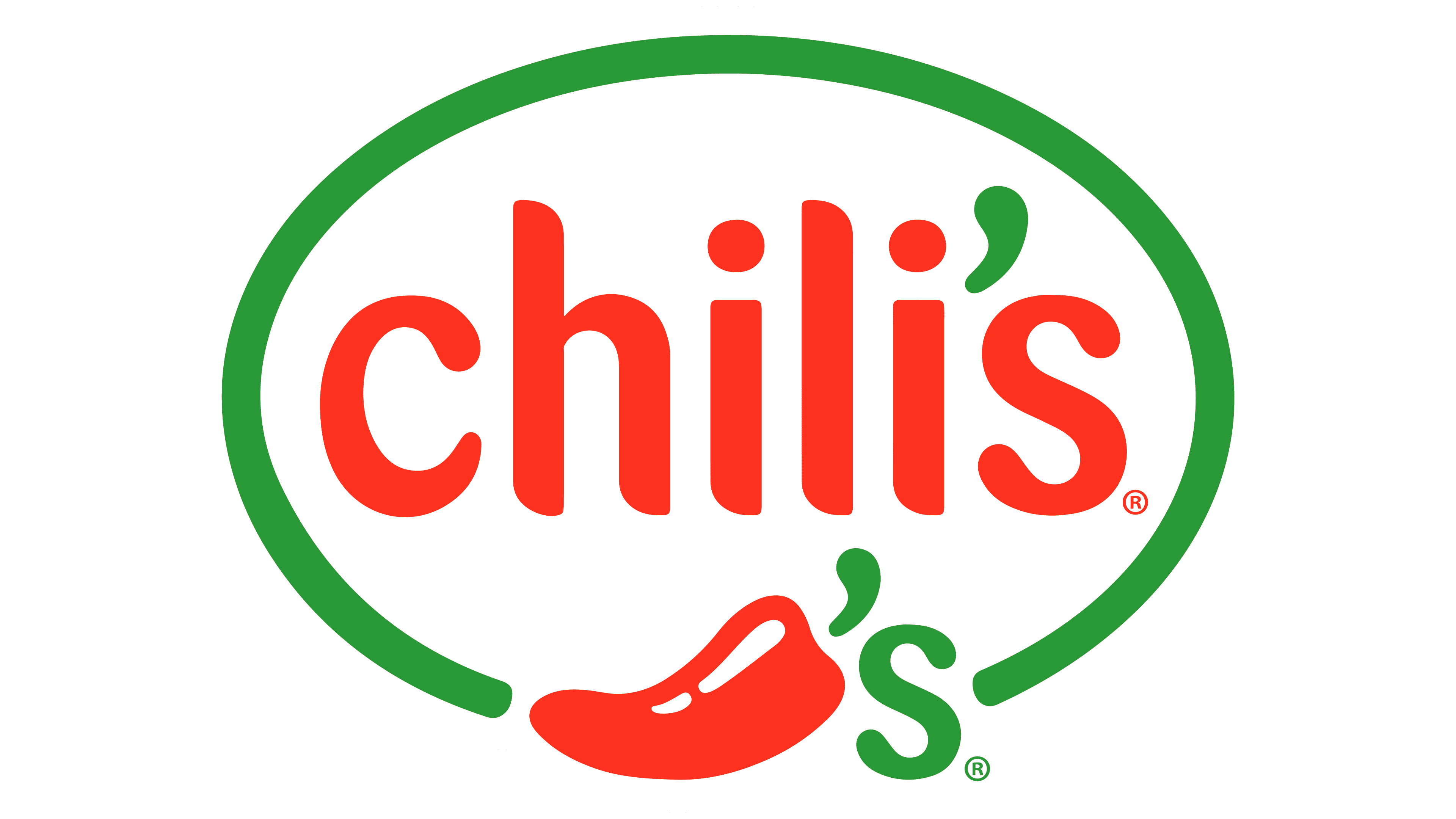
2011 – today
![]()
The agency Tesser Inc., which has experience with similar work, submitted the updated logo, having created the logo for Del Taco. The designers replaced the inscription “Chili” with an image of pepper and disguised the apostrophe with its stalk. In the end, only the letter “s” remained from the inscription. Gone, too, is the green top. This version is much more in line with the fast-food chain’s style and cuisine.
Font and Colors
The company only updated the logo design three times. With each new version, the chili pepper became more recognizable and distinct. So, gradually, there was a transition from the text designation to a graphic one.
The Chili’s Grill & Bar logo features a red chili pepper and a playful, sleek lowercase “s”. The “s” uses a modern, rounded sans-serif font, giving off a friendly and welcoming vibe. This design fits well with the restaurant’s casual dining atmosphere and friendly brand personality. The logo inscription is in Barmeno style, streamlined, rounded, and sans serif.
The font size and the chili pepper image are balanced and complement each other. The “s” has a distinctive, smooth curve that makes it memorable without being bold or italicized.
The font is easy to read, with its simple lines and the green color against the red chili pepper background. This clean, sans-serif font style ensures legibility in various settings, from large signs to digital displays.
The logo’s vibrant red is full of energy, matching the color of chili peppers and reflecting the lively dining experience at Chili’s. The green “s” suggests the use of fresh ingredients, enhancing the restaurant’s commitment to quality.
The logo’s simplicity and iconic chili pepper shape make it easy to recognize, helping establish a strong brand identity that customers remember.
The Chili’s logo’s color choices and font style effectively promote the brand’s promise of a warm, enjoyable meal made with fresh ingredients.
FAQ
Is Chili’s American or Mexican?
Chili’s Grill & Bar, launched by Larry Lavine in Texas in 1975, is a popular American chain known for its laid-back dining atmosphere. Lavine’s vision was to create a friendly spot where people could enjoy American classics with a Tex-Mex twist, like burgers, ribs, and chili. This mix of flavors quickly became Chili’s signature, setting it apart as an American eatery with a dash of Mexican taste. Owned by Brinker International, Chili’s has grown both in the U.S. and abroad, making it a favorite for those seeking a casual American meal with unique flavor.
What company owns Chili’s?
Brinker International, Inc. is the company behind Chili’s Grill & Bar. It’s a big name in the casual dining world and is publicly traded on the New York Stock Exchange with the symbol EAT. Besides Chili’s, Brinker International runs Maggiano’s Little Italy and the virtual brand It’s Just Wings. Founded by Norman Brinker in Dallas, Texas, the company has grown well beyond its original roots but stays true to its core principles. Owning these brands has made Brinker International a key player in casual dining, offering a range of options that appeal to a wide audience.
Do you always get free chips at Chili’s?
Chili’s has a cool program called Chili’s Regulars for people who eat there often. It’s their way of saying thanks by giving some nice perks. If you go to Chili’s often, this program lets you get free Chips and Salsa or a non-alcoholic drink every time you visit. The only catch is that you must have spent at least $5 at Chili’s in the last 45 days.
Here’s how to get the most out of being a Chili’s Regular:
- Make sure to visit Chili’s every 45 days for your free stuff.
- Use your free Chips and Salsa or drink with other deals to save even more money.
- Check whether Chili’s will offer these perks, as not all of them do.
- Keep up with any new program updates to ensure you don’t miss out on anything.
The idea behind Chili’s Regulars is to ensure people who go there feel appreciated. Getting something extra for free every time you visit is a nice touch and can make eating out even better. If you like going to Chili’s, this program is worth joining.
What is the meaning of the Chili’s Logo?
The Chili’s logo means much more than it might seem at first glance. It tells us what kind of food Chili’s serves, fits the look of their restaurants, and stands out as a symbol of their fast-food chain. Plus, it shows that Chili’s is all about food with big, bold flavors.
Here’s a simple breakdown:
- Food Type: The chili pepper in the logo indicates that Chili’s serves spicy, flavorful dishes. It’s a heads-up that you should expect some kick in your meal.
- Design and Atmosphere: The logo’s look and colors match the restaurant’s interior, inspired by Southeastern themes. It’s part of creating a warm and inviting place to eat, where the logo and decor go hand in hand.
- Brand Symbol: In the world of so many food places, the Chili’s logo helps the restaurant stand out. It makes it easy for people to recognize Chili’s, whether they’re just passing by or specifically looking for a place to eat.
- Flavor Promise: The logo isn’t just for show; it’s a promise you’re in for a tasty, well-seasoned meal at Chili’s. It’s for people who want more than just fast food; they want quality and flavor.
In short, the Chili’s logo packs a lot into a small package. It’s not just about a cool design. It’s about telling you what Chili’s is all about: spicy food, a nice place to hang out, a brand you can spot from far away, and a promise of a delicious meal.
What does the logo symbolize Chili’s Logo?
The chili pepper in Chili’s logo originally represented the restaurant’s focus on Mexican food full of flavor and spice. This logo shows the restaurant’s commitment to making food that is both tasty and lively, setting the tone for the atmosphere Chili’s wants to create.
But Chili’s didn’t just stick to Mexican food. Over time, they began adding American dishes such as burgers, steaks, and ribs. These new items aren’t always spicy but are meant to be hearty and comforting. Even though the menu changed, the chili pepper logo stayed the same. The well-known logo has come to mean more than just spicy food. Now, it represents a fun place to eat, a promise of good food (spicy or not), and shows that Chili’s has been around and will stick around in the competitive food business.
So, Chili’s logo isn’t just about Mexican food anymore. It’s about showing how Chili’s has grown to include a wide range of flavors for everyone. It’s a sign of the restaurant’s history and willingness to change and introduce new dishes while still keeping a sense of what made it special in the first place. This makes Chili’s stand out as a place that knows its roots but is also excited to try new things.
Why did Chilis change their logo?
In 2011, Chili’s changed its logo to make it look more modern and simple. The new logo still has the famous red chili pepper, but with a cool twist. The chili’s stem also looks like the apostrophe in Chili’s name. This change wasn’t just for looks. It was about keeping up with the times and ensuring people could easily spot Chili’s, even from far away.
The new logo is easily recognizable and fits in with today’s taste for simpler, cleaner designs. Plus, by keeping the chili pepper in the logo, Chili’s shows it’s still all about serving tasty, flavorful food. This update was a smart move. It helped Chili’s stay current and reminded everyone that they’re about good times and food. The new design mixes the old with the new, showing that Chili’s keeps up with the times while staying true to what it’s always been about.
When did Chilis change its logo?
Since its opening in 1975, Chili’s has updated its logo four times: in 1983, 2002, and in a major change in 2011. The first few minor tweaks kept the logo’s original feel while showing that Chili’s was evolving.
The 2011 update was a game-changer. Chili’s went for a total makeover, creating a simpler and more modern logo. They dropped the long inscription and kept the chili pepper, which now cleverly included the apostrophe in Chili’s name. This new, simpler design made the logo easier to spot and remember, which is important for standing out in the restaurant world.
This redesign was a smart move for Chili’s. It made the brand stronger and easier to recognize, aligning with the trend towards simpler, cleaner designs. It also showed that Chili’s was up to date, modern, and adaptable. The new logo retained the brand’s original feel while adding a unique twist that helped Chili’s stand out.
The 2011 logo refresh was a key move for Chili’s, helping to sharpen its brand and stand out in a competitive market. This new logo has become an important part of Chili’s identity, highlighting its commitment to being a friendly, delicious place to eat.
Why is chilis called chilis?
Chili’s restaurant got its name from a simple inspiration: chili. In 1967, Larry Lavine went to a chili cook-off in Texas and loved the taste and the excitement around chili. This experience led him to develop his chili recipe. By 1975, he opened his diner, featuring his chili in delicious hamburgers that quickly became favorites.
Naming the restaurant “Chili’s” was a way to honor the dish that inspired Lavine and connect with the Texan love for chili. The chili pepper in the restaurant’s logo highlights how important chili is to Chili’s, from its history to the tasty meals it serves. The name and logo aren’t just for show; they represent the heart of Chili’s: great flavor and hearty food.
What is Chili’s slogan?
Chili’s ads use two main slogans, “Like no place else” and “Fun. Fresh. Flavorful,” to show what makes the restaurant special. The first slogan tells customers that dining at Chili’s is a unique experience they won’t find anywhere else, thanks to its great atmosphere, service, and distinctive dishes. The second slogan highlights the kind of food and vibe Chili’s offers: enjoyable and laid-back, with a focus on fresh ingredients and tasty dishes.
These slogans don’t appear on the Chili’s logo, which only shows a red chili pepper. This simple logo points to the restaurant’s name and hints at the spicy, flavorful food Chili’s is known for, while the slogans add more detail about what to expect when you eat there. By using these slogans, Chili’s tells everyone it’s committed to providing an enjoyable dining experience filled with fresh, tasty food, setting itself apart in a busy market.
What is “Pepper” in the Chili’s logo?
Chili’s chili pepper logo is a big deal because it goes right to the heart of what the restaurant is all about. When Larry Lavine opened the first Chili’s, he was really into chili peppers – he loved their taste and how they were cooked. So, he made them a big part of his menu, turning dishes with chili peppers into the main attraction. It wasn’t just about throwing in a popular ingredient; Lavine wanted a dining experience that stood out for the unique taste and appearance of chili peppers.
This led to the idea of a restaurant devoted to chili peppers, from the food to the way the place presents itself. The chili pepper logo isn’t just for looks; it celebrates what got Lavine started and what makes Chili’s different. The logo, with its bright colors and chili pepper image, showcases the restaurant’s energy and bold flavors. It reminds everyone that Chili’s is dedicated to serving food that captures the special flavor and kick of chili peppers. So, the chili pepper in the logo isn’t just a picture; it’s a big part of what Chili’s is.