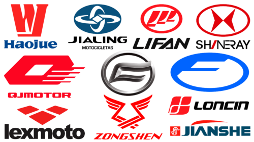
In today’s market, the Chinese industry has firmly established itself. This applies not only to economy-segment goods, with which China is usually associated but also to many other things. Among them are famous Chinese motorcycle brands and the concepts behind their logos. Each such logo is a miniature representation of the company’s message that it wants to convey to customers.
What are Chinese motorcycle brands?
This is an overview of the most famous motorcycle brands registered in China and manufactured in Chinese factories. Among them are CF Moto, Haojue, Jialing, Jianshe, Lexmoto, Lifan, Loncin, Qianjiang, Shineray, and Wuxi Futong.
CF Moto
The company recently celebrated its 30th anniversary in the motorcycle and ATV market. CF Moto is China’s most powerful exporter of these vehicles. Until two years ago, the company had around 2,700 showrooms worldwide.
Initially, the company specialized only in motorcycle production. Over ten years ago, it added ATVs to its assortment, which many extreme sports fans worldwide have appreciated.
When considering the company logo, the symbolism, made in the color “metallic,” immediately catches the eye. This is organic in this context because not-for-nothing motorcycles are often called “iron horses.” The symbol, enclosed in a horizontal oval, resembles a cross between the letters C and F. This is a very good design solution. Inclined letters evoke associations with dynamics and drive, which are characteristic of motorcycle riding.
At the bottom of the logo is the name of the company. The brand name looks fresh and stylish, and the soft outlines of the letters fit into the overall concept of the shapes of this logo.
Haojue
Haojue is a large, modern Chinese manufacturer that produces about 2 million units annually. It mainly serves the state’s domestic market.
The logo of this company looks very ambitious. The logo designers made a stylized crown from the two letters in the brand name. Such a decision is beneficial in several contexts at once:
- visual accent gives the logo expressiveness;
- the crown as a symbol carries a certain meaning – it reminds of prestige and status;
- red color visually strengthens this part of the logo.
Under the symbol itself is the company’s name, for which the blue color is chosen. This is a winning option in terms of balance. Blue tones in logos indicate the seriousness of the company and its deep and thoughtful approach to its business. Thus, the depth of blue balances some provocativeness of the red color. The logo is thoughtful and cute.
Jialing
The company’s peculiarity is that it is state-owned. Its history is solid and interesting, as it was founded in 1875. Initially, it produced military equipment and weapons. Changes in the company’s strategic course occurred much later—in 1979. It was during this period that the company started producing motorcycles.
The company logo uses white, black, and blue tones. The combination of white and black indicates concreteness and efficiency. The blue color, as in the previous logo, gives more depth. Soft shapes and smooth lines characterize the font and the image above it. The only exception is the isosceles rhombus within the visual form.
Jianshe
The history of the Jianshe brand is somewhat similar to that of Jialing. In 1889, it was founded as a firearms factory. For a long time, Jianshe played the role of a leading defense enterprise in the state. In 1980, the production of motorcycles began. In 2004, the company became the largest partner of Yamaha in China. This path shows the development and willingness to transform.
The company logo combines red, white, blue, and turquoise shades. If we analyze the stylistics, we can note that using blue and turquoise font shades combined with smooth outlines is a trend. The same can be said about how the letters that make up the company’s name are reflected in stylish visual forms. In this case, the symbol, which uses white and red colors, is enclosed in a red square. This makes the logo recognizable and effective. The calmer shades of the letters add harmony to the overall picture.
Lexmoto
Lexmoto is another popular Chinese motorcycle manufacturer. Among the priorities that the company focuses on with its target audience are fuel efficiency and driving pleasure. The company is a major importer of motorcycles. For example, Lexmoto motorcycles are the third most popular in the UK.
The logo uses black and red colors. Black font complements the symbol formed by three rhombuses in the overall composition. As in some other variants described earlier, geometric shapes are balanced by the smooth outlines of the font.
Lifan
Lifan is a powerful global exporter of motorcycles. By some estimates, the company is the most recognizable among those who export motorcycles in its segment. It is known for its large production volumes and successful sales of manufactured motorcycles, and its research department is responsible for developing modern production technologies. Thus, today, the company owns about 7,000 patents.
Again, we see black and red colors in the logo. The capital letter of the name is used three times in different sizes. This visual composition is enclosed in a horizontal oval. The brevity and catchiness of the red color make the logo bright. The name of the trademark is written in black letters with smoothed edges. All logo letters are located at an angle, providing stylistic unity. It is also important that the company presents itself through the logo without deviating from the general trends. It is about the oblique letters.
Loncin
The company is known for its production facilities and is one of the most popular in China. Not least, such a success of the company ensured cooperation with BMW, for which it produces 30 thousand engines per year. Loncin is one of the few companies that participated in international FIM competitions. And in MotoGP races, the company has shown that it is the only Chinese manufacturer whose motorcycles can compete at the level of such competitions.
The Loncin logo has the same slanted font with smoothed letter corners. Again, it combines red, white, and black colors. The slanted rhombus is divided into segments. In general, the logo concept looks stylistically unified and corresponds to the general trends inherent in the logos of Chinese motorcycle brands.
Qianjiang
Qianjiang is among the few brands that have successfully tapped the European market. It is not without reason that a special second name, Keeway, was even invented for export, making it more recognizable both in sound and meaning for the European audience.
Even though the company’s logo conveys the trends described above, it looks unique. Among the common solutions designers use are red color and oblique letters with “soft” edges. We can observe the same in the visual stylization of the first letter of the name. However, the very format of this stylization, when the letter Q is depicted as a key, makes it very recognizable. This is what makes this logo stand out among the others.
Shineray
A kind of “chip” of the company Shineray in the production process can be called that this is one of the few Chinese enterprises specializing in off-road vehicle production.
The brand’s logo uses black and red colors, which is no longer new. The same can be said about the visual symbolism enclosed in a horizontal oval, which has already been seen in the previously described logos. However, this logo has some unique solutions. For example, different colors of text are used in the brand name. Its interesting presentation is unique— some letters pass into others.
Wuxi Futong
The Wuxi Futong logo also uses a horizontal oval. However, it has a bright blue color applied to it. Interestingly, the letter F is “inscribed” in the logo, one part of which merges with part of the oval, and the other two lines go to the center.
On the one hand, the blue color symbolizes the depth of approach and seriousness; on the other hand, its bright and saturated shade conveys the idea of dynamism.
Although the company was registered in 2007, it has a long history. However, significant production volumes and car demand allow Wuxi Futong to confidently occupy its position in the market.
Zongshen
In the Zongshen logo, we again see the red color and italic font. However, distinctive features make this logo recognizable and interesting, such as the example of the Qianjiang brand. These are wings depicted by combining and crossing several tiers of red lines. The figure above the brand name looks very effective in the logo. It visually strengthens it.
As for the company’s history, its rapid rise to success largely reflects the idea behind the logo. In 1992, Master Zuo Zongshen founded a small workshop. Today, this man is one of the top 100 wealthiest in China, and his path is compared to the success of the founder of Honda.
A characteristic feature of the logos of Chinese motorcycle brands is that they often use similar visual techniques. These are black, red, white, and blue colors. It is also the stylization of letters to match the meanings conveyed by the company name. Another such feature is the use of geometric shapes, particularly ovals. And slanted fonts as if reminded of the movement to which the motorcycles of these companies “call.” At the same time, each logo conveys something unique that makes it recognizable among others.
FAQ
What brands of motorcycles are made in China?
Several leading brands manufacture motorcycles in China, significantly contributing to the global market. These include:
- Jiangmen Dachangjiang Group: A subsidiary of Haojue Holdings, producing a wide range of motorcycles under the Haojue brand.
- Lifan Group: Offers a variety of products, including motorcycles, automobiles, and engines, and is a key player in the motorcycle industry.
- Loncin: Known for quality and innovation, Loncin manufactures motorcycles and engines.
- Zongshen: One of the largest motorcycle manufacturers in China, producing a wide range of motorcycles and engines for global markets.
- Jialing Motors: Jialing Motors has a long history of producing reliable and affordable motorcycles and a strong presence in domestic and international markets.
- Jianshe: Known for producing durable and efficient motorcycles and engines, with a solid reputation in the industry.
- Qianjiang: This company produces motorcycles under the Keeway, QJmotor, Benelli, and MBP Moto brands. It has a broad portfolio and a significant international presence.
- Haojin: Specializes in affordable and reliable motorcycles for urban and rural markets.
- Shineray: Produces various motorcycles, ATVs, and engines known for innovative designs and reliability.
- Bashan: Manufactures motorcycles, ATVs, and other vehicles recognized for competitive prices and quality.
- Jonway: Specializes in motorcycles, scooters, and electric vehicles, catering to diverse consumer needs.
- Wuxi Futong: Produces a wide range of motorcycles and scooters known for their affordability and practical designs.
What is the most popular bike brand in China?
Haojue is the most popular motorcycle brand in China. For the past 17 years, it has been a leading brand with a strong presence in the market.
The standout model is the DR160 R. This bike has a good engine, effective brakes, and excellent handling. Its success is due to its high-quality bikes that meet the needs of many riders.
Besides the DR160 R, Haojue offers a variety of models to suit different riders. The brand has something for everyone, from sports to practical commuter bikes. This versatility and attention to customer needs have made Haojue the number-one motorcycle brand in China.
What motorbike brand is from Taiwan?
Taiwan has several motorcycle brands, including SYM (Sanyang Motor). SYM is a leading two-wheeler manufacturer in Taiwan, known for quality and innovation in the motorcycle industry. The brand produces a wide range of motorcycles, scooters, and ATVs.
The product line includes scooters such as the SYM Jet 14, which are praised for their stylish design, fuel efficiency, and user-friendly features. Another popular model is the SYM Cruisym 300i, valued for its comfort, performance, and advanced technology, making it a favorite among long-distance riders.
SYM motorcycles like the SYM NH-T 200 provide a smooth and powerful ride. This model is prized for its durability and rugged construction, making it suitable for urban and off-road use.
The brand has a strong international presence, exporting its vehicles to many countries. As a leading brand from Taiwan, it stands out in the motorcycle industry with its high-quality two-wheeled vehicles.
What is the best Chinese motorcycle brand?
Leading Chinese motorcycle brands include Benelli, Lexmoto, CFMoto, Zongshen, Zontes, Lifan, and Loncin. Each brand has unique strengths and has made significant contributions to the motorcycle industry.
- Benelli, originally an Italian company, is now owned by the Chinese holding company Zhejiang Qianjiang. Its production is based in China. Benelli combines Italian design with Chinese manufacturing efficiency and offers stylish, high-performance motorcycles.
- Lexmoto is known for making affordable and reliable motorcycles. The brand specializes in entry-level and commuter bikes, making motorcycling accessible to many.
- CFMoto stands out for its innovation and high-performance motorcycles. The brand invests heavily in research and development and produces bikes with advanced features.
- Zongshen is one of the largest motorcycle manufacturers in China, producing a wide range of motorcycles and engines.
- Zontes is a newer brand known for its modern design and innovative features. Zontes motorcycles attract young riders with their stylish appearance and advanced technology.
- Lifan and Loncin have established brands with solid reputations for producing reliable and affordable motorcycles. Lifan offers many products, including motorcycles, cars, and engines.
Who is the largest motorcycle manufacturer in China?
Da Changjiang is the largest motorcycle manufacturer in China, or Jiangmen Dachangjiang Group. This brand has been leading the country’s sales charts for many years. In 2020, Da Changjiang became the top seller in the Chinese motorcycle market, demonstrating its strong presence and popularity.
Da Changjiang is part of Haojue Holdings, a company known for producing high-quality motorcycles for many customers. Its models suit city dwellers and those looking for performance bikes.
The brand’s success stems from its focus on quality, innovation, and customer satisfaction. The company invests heavily in research and development to ensure that its motorcycles feature the latest technology. It exports motorcycles to many countries, expanding its presence worldwide.
