The Chipotle logo exemplifies the successful use of an authentic element. It skillfully combines marketing with the unique characteristics of these fast food dishes. It effectively promotes Mexican cuisine and makes it recognizable worldwide, promising delicious and satisfying meals. The emblem of the popular American restaurant chain Chipotle reflects burritos, tacos, and other dishes of Mexican cuisine. In its visual self-expression, the brand reflects its creation story, quality, and adherence to the concept of “Food with Integrity.”
Chipotle: Brand overview
Chipotle is the largest fast-food restaurant chain founded in 1993. Its restaurants serve mainly Mexican-American cuisine dishes, particularly tacos and burritos. The company strives to use only natural products, following the concept of Food with Integrity.
Back in 1993, in Denver, Colorado, Steve Ells, a chef who studied at the Culinary Institute of America, started Chipotle. He wanted to improve fast food by using high-quality, fresh ingredients and cooking meals right when ordering them. His first Chipotle near the University of Denver quickly became popular for its tasty burritos, tacos, bowls, and salads you could customize with different toppings. This new idea of making fast food with fresh ingredients on the spot was a big hit.
As more people in Denver loved Chipotle, Ells opened more locations in Colorado and nationwide. By 2005, there were more than 500 Chipotle restaurants. In 1998, McDonald’s invested in Chipotle, helping it grow even faster. However, by 2006, Chipotle and McDonald’s had gone their separate ways and had a very successful public stock offering.
Chipotle was also one of the first to focus on where its ingredients came from, using organic veggies and meat from animals that weren’t given hormones or antibiotics. The restaurants had an open kitchen where you could see your food being made, which showed how much they cared about quality.
However, Chipotle faced some tough times in 2015 and 2016, with food safety issues that made people sick. This hurt their sales and reputation, but they worked hard to make their food safer, train their employees better, and start new ads to win back customers.
Today, many still love Chipotle, which has over 2,500 restaurants worldwide. They continue to focus on making quality food, being good to the environment, and developing new ideas. Chipotle’s journey shows how a simple idea can change the food world, proving that a strong commitment to quality and innovation can keep you ahead even when things get tough.
Meaning and History
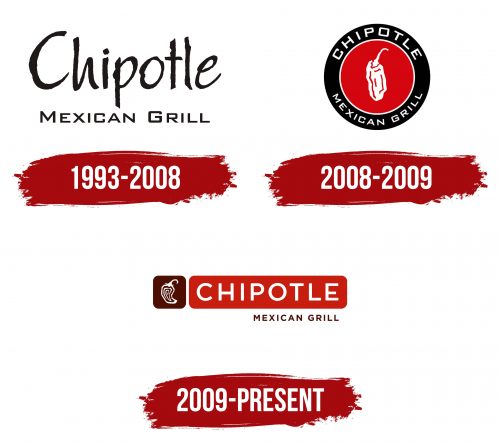
Chipotle’s original logo was simple black lettering. It resembled retro signs that adorned snack bars in the 1950s. The font looks handwritten and remotely resembles Papyrus.
Then, another version of the emblem appeared: multicolored concentric circles with the inscriptions “Chipotle” (at the top) and “Mexican Grille” (at the bottom). The letters were strict and geometric. A chili pepper occupied the most prominent place in the center of the rondel. It consisted of a large fruit and a long stem extending beyond the small circle.
This logo had two versions. The first one was simple, black and white. The second one had grey text, a red-black background, and a white pepper. In 2009, a new Chipotle trademark appeared, created by the design firm Sequence from San Francisco.
What is Chipotle?
Chipotle is a trademark of the company Chipotle Mexican Grill, Inc. It is one of the first fast-food restaurant chains. It was founded in 1993 and started with just 16 establishments. Currently, it owns more than 2,700 dining establishments.
1993 – 2008
The emblem from this period consists of two separate inscriptions: at the top is the word “Chipotle” (denoting the name of the fast-food chain), and at the bottom is “Mexican Grille” (denoting the main cuisine). The visual emphasis is on the first part, so the letters are individualized and elongated with uneven edges. The phrase beneath them, in contrast, is smooth, chopped, and even.
2008 – 2009
The world-renowned fast-food chain decided to focus on its Mexican roots, giving the Chipotle logo a vibrant Latin American authenticity. Its shape resembles traditional foods such as tacos, tortillas, and burritos—flatbreads wrapped around various fillings. These usually include stewed vegetables and meat enhanced with local spices. These dishes form the foundation of the restaurant’s menu.
This approach to visual identity emphasizes its brand alignment and makes it highly recognizable. At first glance, the emblem conveys that the company offers spicy, well-seasoned dishes. Therefore, the target logo immediately attracts potential customers.
- Its main element is the smoked jalapeño, a special variety of chili peppers grown exclusively in Mexico. This adds authentic context to the identity. The jalapeno’s name is linked to the city of Xalapa in the state of Veracruz, where it is widely used.
- Although jalapeño peppers are small and about 9 cm long, they are depicted largely in the logo to show the importance of this product for the Mexican fast-food chain. Essentially, they celebrate Mexican cuisine and are crucial for the brand, representing it well internationally.
The same goal is served by the red color—dark and rich, conveying the spiciness of the dishes. It also highlights the product, emphasizing its bold flavor. The other important color in the logo is white, chosen for contrast to make the jalapeño stand out clearly. White letters on a black background are highly readable and immediately draw attention to the brand. The font style is strict and geometric, with ample spacing between characters.
The dried pepper is depicted with curved lines, creating an impression of the product’s softness—prepared according to local methods and ready to eat. The lines are uneven: thick in some places and thin in others, making the logo dynamic and accurately representing the texture of wrinkled chili.
The fast-food chain also paid significant attention to its unique name. The text is arranged in a circle to highlight the round shape of a tortilla. The businesslike, sans-serif geometric font fits harmoniously with the image of unique Mexican cuisine. It draws customers’ attention to three key factors:
- Strict adherence to the recipe;
- Preservation of the unique shape of the dishes;
- High professionalism of the staff.
The circular text in the emblem appears clear and legible, with the white color adding clarity.
2009 – today
After rebranding a popular Mexican fast-food chain, Chipotle unveiled a new logo. The logo’s star remains the local chili pepper, a dried jalapeño. However, it has undergone a complete transformation: it is now drawn with broken lines of varying widths to convey the soft texture of this traditional national product. To achieve this, the tip of the pepper is slightly bent, and “wrinkles” are drawn inside to indicate that the chili is dried.
The jalapeño is separated from the text and placed in a square with rounded corners, without a border. This symbolizes the brand’s openness, willingness to experiment, and readiness to embrace modern dishes. The emblem was introduced following the expansion of the traditional menu, highlighting this transition. This is also evident in the change from a square font to a regular geometric sans-serif style. The new logo uses two colors:
- Crimson (the main shade of ripe chili peppers)
- Red bean color (a heavy, almost brown hue)
This clearly shows a connection to national themes, as beans are one of the key components of Mexican cuisine, which the brand promotes. It emphasizes authenticity, the choice of natural products, and the readiness to offer a hearty meal. Overall, the emblem perfectly reflects Chipotle’s values and corporate culture.
Chipotle: Interesting Facts
Chipotle Mexican Grill, or just Chipotle, is a popular restaurant in the United States that serves tacos and burritos. It started in Denver, Colorado, on July 13, 1993, by Steve Ells.
- Fresh Ingredients: From the beginning, Chipotle focused on using fresh and high-quality ingredients. They like to get their food from farms that grow food correctly, which has inspired other places to do the same.
- The First Store: The first Chipotle was in an old ice cream shop near the University of Denver. Steve Ells borrowed $85,000 from his dad to open it, hoping to make enough money to start a fancy restaurant later. But Chipotle turned out to be a big hit all on its own.
- Growing Big: McDonald’s initially helped Chipotle grow by investing in it, but they sold their part in 2006, and Chipotle has been on its own since then.
- Promise for Good Food: Chipotle promises to use the best ingredients, such as vegetables grown right and meat from animals treated well.
- Cultivate Festival: This is a free festival where people can learn about eating healthy and farming, which is good for the planet. There’s music, food, and talks about making better food choices.
- Simple Menu: Chipotle keeps its menu simple—just burritos, tacos, bowls, and salads. This allows them to make your food fast and just how you like it.
- Teaching People: Chipotle has made movies and shows to teach people about where their food comes from and why choosing food grown well is important.
- Ordering Online: They were one of the first to let you order your food online or through an app, making it easier for many more people to enjoy their food, even when they can’t go to the restaurant.
- Smart Hiring: Chipotle hires the best people for its jobs and has a special way of picking managers based on how well they do their jobs, not just how long they’ve been there.
Chipotle is not just about making tasty food; they also care a lot about how the food is grown and getting it to you well. They’ve helped change how we think about fast food by showing that it can be fresh, good for the planet, and still delicious.
Font and Colors
The current emblem is similar to the previous one. It also consists of two circles of different sizes, but this time, both are red, with narrow white outlines. The pepper is drawn more professionally – specialists carefully reworked it and made it fit into the small circle. The vegetable looks stylish and modern, and a small swirl in the center adds a special flair to the image.
The current trademark has two forms. The usual rondel is often used on products and in advertising. The second version is “laid out on the shelves”: the pepper is on the left in a square, and the name Chipotle is on the right in a horizontal rectangle. The corners of the geometric shapes are rounded. At the bottom is a reduced inscription, “Mexican Grille.” This version is usually seen on fast-food restaurant signs.
The emblem’s main elements relate to the Mexican theme. Shades of red are associated with spices and burning fire. The word “Chipotle” denotes a traditional Mexican seasoning—smoked jalapeños —and is the image in the center of the logo.
If the logo previously used a font similar to Papyrus, it now looks completely different. Specialists from Sequence reworked the logo and chose a modified version of the Gotham Bold font for the inscriptions. It’s a sans-serif typeface variation created by typographer Tobias Frere-Jones. The letters are rounded and executed without serifs. The median stroke in the letter E is slightly below the center. At the same level is the horizontal bar of the letter “H.”
The color palette is saturated. The designers chose brown and dark red (#A81612) for the background. For additional elements, they used white to create a favorable contrast. The logo also exists in a classic black-and-white version.
FAQ
Why is Chipotle so popular?
Chipotle is popular in the U.S. because it focuses on fresh, quality food that often comes from local sources. This helps local farmers and makes sure customers get great food. It’s also fast and reliable, perfect for people who need a quick but good meal. The atmosphere at Chipotle is relaxed and welcoming, making it a great spot for lunches, casual dinners, or family meals. Another big plus is how you can customize your meals with different toppings and fillings, so everyone gets exactly what they like. Lastly, Chipotle has changed its prices recently, showing they’re keeping up with what customers want and staying competitive. All these reasons make Chipotle a favorite for many people, offering a mix of quality, quick service, and a nice place to eat.
What font is the Chipotle logo?
The Chipotle logo has a special font inspired by the Gotham Bold typeface, which a famous font designer, Tobias Frere-Jones, created. What makes this font unique is how evenly thick the white letters, the circle around the logo, and the pepper outline are. This even thickness makes the logo look professional and polished. Choosing Gotham Bold for this custom font was smart because it’s clear and modern, which fits Chipotle’s image well. Paying close attention to these details helps make Chipotle’s logo stand out and be remembered in a crowded market.
What do Chipotle points get you?
Earning points at Chipotle is rewarding. When you collect enough points from buying your favorites, you can exchange them for cool stuff. This includes tasty items like burritos and guacamole, and it doesn’t end there. You can also donate to charities or grab some Chipotle-branded clothes. This rewards system adds a fun twist to every purchase, letting you choose from food, charity, or gear based on what you like best.
What does the Chipotle logo represent?
The Chipotle logo represents the chain named after a dried jalapeño, showing the brand’s love for Mexican flavors and traditions. The logo shows a small pepper, linking the brand directly to this key ingredient and Mexican cuisine’s authentic tastes. The color red in the logo highlights the spicy and bold flavors Chipotle is famous for, catching the eye and hinting at the vibrant, tasty, and slightly spicy food it serves. Essentially, the logo is more than just a picture; it reflects Chipotle’s identity, values, and celebration of Mexican culinary culture. It shows Chipotle’s commitment to sharing Mexican cuisine’s rich and spicy flavors with everyone in a straightforward yet impactful way.
Who designed the Chipotle logo?
Chipotle’s logos are usually made by their designers, who work to make the brand easily recognizable. However, Chipotle asked for help from outside for the latest update aimed at making the brand look more modern, especially on digital screens. They chose Sequence Studio for this job because of their skill in making modern brand designs that appeal to people today. By working with Sequence Studio, Chipotle aimed to ensure its brand stays up-to-date and improves customers’ experience online. This move shows Chipotle’s effort to keep up with new tech and what customers want, all while staying true to the brand’s core identity that people love.
What does the number 13 mean in Chipotle?
At Chipotle, the number 13 is more than just a number; it symbolizes the 13 important qualities they look for in potential employees. These qualities include reliability, ambition, smartness, honesty, and politeness. Chipotle believes these traits are crucial for anyone who wants to work there, as they help create a welcoming and positive place for customers and coworkers.
The emphasis on these 13 qualities shows Chipotle’s focus on a person’s character, not just their abilities. This approach helps ensure that the staff represents the company’s values, leading to a workplace where people work well together and respect each other. So, the number 13 reminds us of the well-rounded set of standards Chipotle uses to pick its team, aiming to mix professionalism with friendly and excellent service that makes dining at their restaurants special.
What pepper is depicted on the Chipotle logo?
The Chipotle logo features a red pepper to symbolize the dried jalapeño, which the brand is named after. “Chipotle” means smoked and dried jalapeño, a vital part of Mexican cuisine known for adding spicy and bold flavors to dishes. This red pepper in the logo connects the brand visually to its name and highlights the vibrant, tasty, and slightly spicy food Chipotle serves. It shows Chipotle’s focus on high-quality, flavorful ingredients and its dedication to offering food experiences deeply connected to Mexican cooking traditions.
What does the Chipotle Logo symbolize?
The Chipotle logo represents the brand’s promise to offer healthy food from natural ingredients inspired by traditional Mexican cooking. The logo features a smoked and dried jalapeño pepper, not just where Chipotle gets its name but also shows the brand’s focus on authentic, tasty ingredients. Choosing the jalapeño pepper points to Chipotle’s commitment to quality and connects the brand to Mexican culinary traditions.
The logo’s red color matches the natural color of chili peppers and adds deeper meaning, symbolizing love and energy. This reflects Chipotle’s passionate and energetic food-making approach, promising a lively and warm dining experience.
Overall, the logo powerfully expresses Chipotle’s values and mission. It highlights the brand’s commitment to authenticity, quality ingredients, and traditional cooking methods, capturing what makes the Chipotle experience unique and vibrant.
What does the word Chipotle mean?
“Chipotle” comes from Nahuatl, meaning “smoked chili.” It refers to smoking jalapeño peppers to boost their taste and keep them longer. Smoked jalapeños, which add a unique smoky flavor and a bit of heat, are essential in Mexican food. The Chipotle restaurant chain picked this name to show its dedication to using real Mexican flavors and cooking methods.
The Chipotle logo features a jalapeño pepper, linking the brand to traditional Mexican ingredients and emphasizing quality. The logo’s design, with broken lines, aims to show the smoked jalapeño’s texture and softness, underlining Chipotle’s focus on authentic tastes. With its name and logo, Chipotle tells customers it’s serious about offering genuine Mexican tastes and cooking traditions, making smoked chilies a key part of its dishes.
What is Chipotle’s company motto?
Chipotle’s first motto, “Food with Integrity,” reflects its commitment to ethical, sustainable food production. Introduced by founder Steve Ells, it highlights the importance of respectful food preparation practices, animal welfare, and organic, locally sourced ingredients. This motto underscores Chipotle’s aim to offer delicious food that supports the environment and community.
Later, Chipotle adopted the motto “Better for You. Better for People. Better for Our Planet.” This motto builds on the company’s values by focusing on customer health, fair treatment of workers and farmers, and reducing environmental impact. Together, these mottos show Chipotle’s goal to make fast food healthful and sustainable, benefiting everyone from farm to table.
What is Chipotle’s brand promise?
Chipotle promises to use only natural ingredients, follow traditional cooking methods, and respect food traditions. The company believes that how food is prepared can change the world, based on the idea that the taste of food depends on the quality of its ingredients. Chipotle is dedicated to using clean, ethically sourced ingredients.
Their goal goes beyond just serving delicious food; they aim to create a sustainable food system that benefits animal welfare and the health of the planet and its people. Chipotle sets high standards for how their food is made and where it comes from, striving to make the food industry more ethical.
The Chipotle logo symbolizes this commitment, showing the company’s dedication to natural and responsibly obtained ingredients. Through its logo and brand promise, Chipotle highlights the importance of natural ingredients and traditional cooking, believing this approach improves food taste and contributes to a better and more sustainable world.
What is the meaning behind the Chipotle logo?
The Chipotle logo stands for the company’s promise to serve healthy food. It shows their focus on using natural products, growing the right way, and making dishes following traditional methods. The logo features a jalapeño pepper, a key Mexican ingredient, showing Chipotle’s dedication to genuine Mexican flavors. This pepper isn’t just chosen randomly; it symbolizes Chipotle’s commitment to freshness, high-quality, and ethically sourced ingredients.
The jalapeño in the logo connects customers to Mexican food traditions, showing Chipotle’s respect for the environment and the people who produce their ingredients. By choosing natural and traditional ways to prepare their food, Chipotle’s logo tells a story of honesty, high standards, and care for the planet, inviting everyone to enjoy real Mexican tastes in a fast-food experience.
Why is Chipotle called Chipotle?
Steve Ells named his restaurant Chipotle to highlight its focus on natural, freshly prepared food. The name from the Nahuatl word for “smoked chili pepper” reflects the brand’s dedication to traditional Mexican cooking and ingredients. This approach means meals are cooked fresh when ordered, following age-old recipes. The choice of “chipotle” for the name points to the restaurant’s effort to offer authentic and high-quality Mexican dishes. The logo, featuring a smoked chili pepper, underlines Chipotle’s commitment to traditional Mexican flavors. Ells chose this name and logo to show the restaurant’s promise of fresh, natural food made in line with cultural traditions, a core part of Chipotle’s identity.
