The Chiquita logo, featuring the iconic blue sticker with Miss Chiquita, symbolizes the brand’s history as a top banana distributor. Miss Chiquita was introduced 1944 as an animated banana to help consumers learn how to ripen and use the then-exotic fruit. In 1987, she was redesigned as a woman to give the brand a more personal and dynamic image. This logo reflects Chiquita’s commitment to quality and freshness and honors its roots in Central America, where the company pioneered the banana industry. The emblem marks Chiquita’s quality and is a cultural icon, embodying the brand’s lively and friendly nature.
Chiquita: Brand overview
In 1871, Captain Lorenzo Baker and entrepreneur Andrew Preston started the Boston Fruit Company. They began by bringing bananas from Jamaica to the U.S. This was the start of something big that would later change how fruits were grown and sold worldwide.
By the end of the century, Boston Fruit Company joined forces with Minor Keith, who owned plantations, to create the United Fruit Company. This company grew fast, establishing large banana farms in Central America and the Caribbean. It became very important in the economies and politics of those regions.
The 1950s brought a new phase with the launch of the Chiquita brand and its famous “Miss Chiquita” logo. This move was about making Chiquita stand out in a market full of competition.
But the company’s journey wasn’t smooth. Its way of doing business, which sometimes hurt workers and messed with politics, led to much criticism. In the 1970s, it was even said to have played a part in a coup in Honduras.
In 1984, facing various challenges, the company changed its name to Chiquita Brands International. This was a big step in trying to fix its image and deal with problems like legal battles and accusations of paying terrorists in Colombia to protect its employees. This led to a hefty $25 million fine from the U.S. Department of Justice.
Chiquita has been working hard to improve its image and business practices. It focuses on being more sustainable and ethical and working with groups like the Rainforest Alliance to farm better and treat workers well.
Chiquita is a top name in the fruit business, known worldwide for its bananas and other fruits. It operates in more than 70 countries. Despite its past issues, people everywhere recognize its brand and logo.
Meaning and History
What is Chiquita?
Chiquita has become a leading brand in the global fruit industry, and it is known especially for its bananas. This American company has a vast reach, with extensive agricultural and distribution operations across Central and South America. Chiquita offers a variety of fruits, including apples, oranges, and pears, and promotes a healthy lifestyle through a nutritious diet.
old
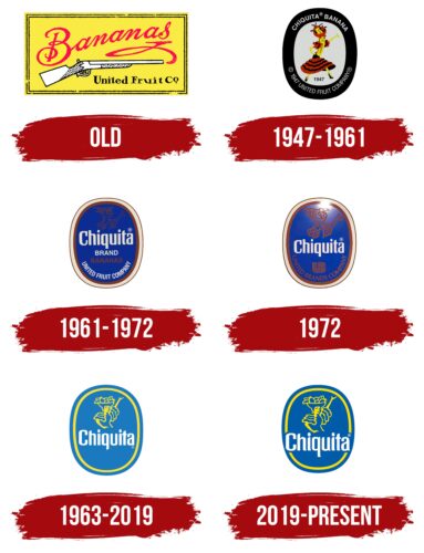
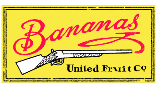
The original logo of Chiquita, derived from its predecessor, the United Fruit Company, is designed in a square shape resembling a classic sign, adding a traditional and recognizable touch. The emblem’s yellow color and main text focus on bananas, emphasizing their central role in the brand’s product line and history.
At first, the depiction of a rifle in the logo may appear unusual. Yet, considering the historical context of working on plantations, the need to protect crops from pests, and ensuring the safety of sea shipments, this element fits logically. Historically, the fruit trade faced numerous challenges, including pirate threats, which made weapons necessary to protect the company’s interests.
1947 – 1961
In 1947, the Chiquita brand underwent a significant transformation when it registered its trademark, introducing a new era in its marketing strategy and visual identity. The name “Chiquita,” which translates from Spanish to “little girl,” gave the brand a playful and light image, appealing to consumers.
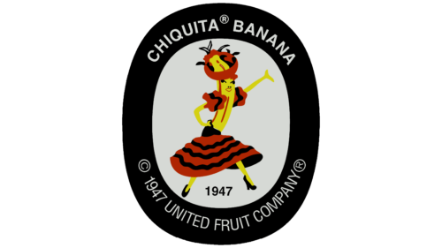
Chiquita began using “Chiquita Banana” in its advertising campaigns, focusing on the uniqueness of its products. The logo featured a dancing banana wearing a traditional Colombian female costume, drawing attention to the product’s cultural origin and making the brand more engaging by associating it with carnivals and joy.
The logo was designed with a wide black outline that made the vibrant image of the dancing banana stand out against any background, increasing its visibility and recognition. The dark outline, however, posed a challenge as it might seem too sad for products meant to convey freshness and naturalness.
Additionally, the logo included the brand’s name at the top and the founding year, along with the parent company’s name at the bottom. These elements added a sense of reliability and prestige, informing consumers about the brand’s heritage and reinforcing its reputation for quality and tradition.
1961 – 1972
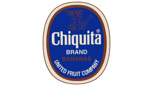
The updated color palette of the logo has made it more tranquil and harmonious. It features a blue background with white and brown outlines. This design communicates the company’s commitment to protecting its cargo effectively. The colors imply reliability and adherence to high standards in maintaining product quality during transport, reducing the risk of spoilage and damage.
Once a prominent element of the logo, the banana girl is now subtly outlined in brown at the top of the emblem. This redesign seeks to modernize the logo, but light brown makes these details nearly invisible, potentially impacting the logo’s recognition and appeal.
The new logo design centers on the brand name, prominently displayed in white against the blue background. This approach enhances readability and highlights the importance of the brand in the company’s identity. The sharp contrast between the white text and blue background makes the logo more striking and easier to recognize, helping it stand out to consumers.
1972
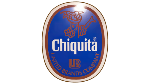
During a minor rebranding, the company addressed issues with the previous logo by enlarging the banana image, making it more noticeable. This change improved logo recognition and emphasized the banana’s key role in the brand’s product range and identity.
Originally brown, the text at the bottom of the logo was also redesigned to complement the updated banana image better. The continued use of brown links to earth, nature, and cinnamon enhances the logo’s natural and rich flavor associations. These updates made the logo more visually appealing and balanced.
1963 – 2019
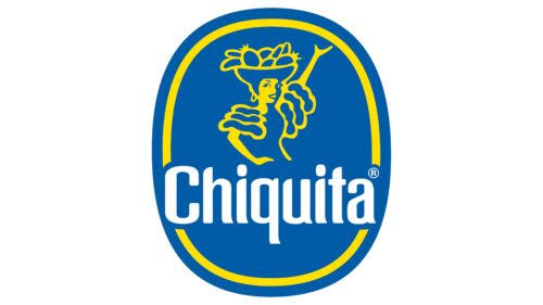
Before entering the European market, Chiquita refreshed its logo to reflect the vibrant cultures of the regions where its fruits are grown. The redesigned logo underscores the brand’s global reach and respect for local traditions.
The logo now depicts a woman in a dance pose, symbolizing Chiquita. She represents movement and energy, capturing the joy and warmth of the regions where Chiquita fruits originate. She wears a basket of fruits on her head, symbolizing hard work and hospitality, a familiar sight among plantation workers.
This dynamic, bright depiction of the woman enhances the logo’s visual and emotional appeal. It connects consumers and producers, building a sense of closeness and trust in the brand.
2019 – today
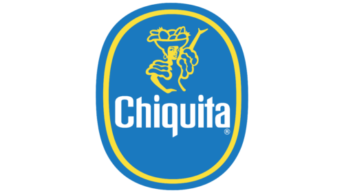
During the recent logo update, the company introduced a new color scheme that enriched the blue background and yellow elements, enhancing the logo’s visual appeal. The blue, associated with reliability and professionalism, and vibrant and energetic yellow, give the logo a dynamic and modern look. This change reflects the company’s innovative approach.
The improved contrast makes the logo more eye-catching and signifies the company’s products’ high quality and premium nature. The bright and rich colors emphasize the brand’s ambition to lead in the market, its uniqueness, and its capacity to differentiate itself from competitors.
Font and Colors
The Chiquita logo uses a bold sans-serif font that conveys confidence and clarity. This font features clean, strong lines of consistent thickness that enhance the logo’s visual impact.
The logo’s blue and yellow colors are vibrant, whereas blue represents reliability, and yellow adds brightness and energy, signaling the freshness and quality of Chiquita products.
The font is highly readable; its boldness and uncluttered design ensure the brand name is clear on various media, from print to digital. The straightforward horizontal placement of the font reinforces the stability and reliability conveyed by the logo design.
The font and color scheme communicate the brand’s identity and ensure its recognition in the global market.
FAQ
Why did Chiquita change the logo?
Chiquita updated its logo to reflect modern views and respond to critiques. Created in 1944, Miss Chiquita first appeared as a cartoon banana and later as a woman, aiming to make the brand appear friendly using a symbol associated with Latin America. However, this portrayal became seen as outdated and offensive, reinforcing stereotypes about Latin Americans and Latina women.
Recognizing the importance of accurately and respectfully representing cultures, Chiquita updated Miss Chiquita’s design. The goal was to align with contemporary perspectives and respect diverse cultures, moving away from stereotypes.
The update was significant. It addressed the issues of previous portrayals and aimed to make the brand more inclusive and respectful.
This effort is part of a larger trend where companies reevaluate their branding to ensure it aligns with modern values of equality and cultural respect. By refreshing its logo, Chiquita aims to maintain its beloved status while appealing positively to a global audience.
What is the Chiquita banana logo?
The Chiquita banana logo, “Miss Chiquita,” is a famous symbol of the Chiquita brand, a top distributor of bananas and other fruits worldwide. Created by Dik Browne, a well-known cartoonist for comics like Hi and Lois and Hägar the Horrible, in 1944, the logo initially featured a banana with a woman’s dress and legs. This made Chiquita stand out and helped people remember the brand.
Miss Chiquita was designed to introduce Americans to bananas, encouraging them to include more of this then-exotic fruit in their diets. She became a popular mascot, symbolizing Chiquita’s quality bananas and fruit expertise.
Over the years, Miss Chiquita’s appearance has been updated to match modern styles and values, but her role as the brand’s welcoming figure has remained unchanged. Nowadays, Miss Chiquita is depicted wearing a fruit hat, reminiscent of Carmen Miranda, the famous singer and actress, moving away from her original banana form. This change has kept her appeal and importance in Chiquita’s marketing efforts.
Over the years, Miss Chiquita’s design changes have showcased the brand’s rich history and significant role in the global fruit market. Miss Chiquita continues to represent the quality, freshness, and mission of Chiquita to bring the best tropical fruits to consumers worldwide.
Who is the Chiquita lady?
The Chiquita lady is often considered Carmen Miranda because of the famous fruit hat she wore. However, she’s a made-up character called Miss Chiquita, created by the Chiquita banana company. Carmen Miranda was a real entertainer from Portugal, raised in Brazil, who became famous worldwide as “The Brazilian Bombshell” and “The Chiquita Banana Girl.” From 1928 to 1955, she wowed audiences as a singer, dancer, and actress, known for her lively performances and unique fruit hats.
Carmen started her education in a convent but soon found her passion in entertainment. Her talent made her a star in Brazil and internationally, making her one of the first Latin American performers to become famous in English-speaking countries. While in Hollywood, she became a global icon, praised for her skills and criticized for promoting stereotypes of Latin Americans.
Even though Carmen Miranda isn’t the Chiquita lady, it’s easy to see why people connect the two. Miss Chiquita, first shown as a banana and later as a woman with a fruit hat in 1944, reminds many of Miranda’s look. Chiquita might not have meant to mix their identities, but the similarity brought Carmen Miranda to mind for many.
To summarize, Carmen Miranda, known for her entertainment career and iconic fruit hat, isn’t the same as the Chiquita lady, Miss Chiquita. But the visual link between them is strong. Miranda left a lasting impact as a trailblazing Latin American artist in Hollywood, a legacy beyond her connection to the Miss Chiquita character.
What colors are the Chiquita logo?
The Chiquita logo is famous worldwide for its bright blue and yellow colors. These colors do more than just catch your eye; they also mean something important for the brand.
Blue is the color behind the text, and the Miss Chiquita picture is in the logo. It stands for trust, reliability, and confidence, showing that Chiquita is dedicated to quality and wants to be a trusted name in the fruit world.
Yellow is used for the words and the outline of Miss Chiquita. It represents happiness, energy, and positivity. Yellow makes the logo pop, whether on the packaging, ads, or anywhere else Chiquita appears. This color matches the brand’s aim to be seen as lively and focused on offering products that make people happy.
Combining blue and yellow makes the Chiquita logo look good and tells you about the brand. These colors help Chiquita stand out in the busy fruit market and are used everywhere, from office decor to marketing, strengthening the brand’s image and leaving a lasting impression.
