


![]() Chivas Logo PNG
Chivas Logo PNG
The Chivas logo has historical value. It reflects the soccer team’s heritage and connection with its hometown and founder. Meanwhile, the emblem expresses the athletes’ leadership qualities and inexhaustible will to win.
Meaning and History
![]()
Until 1908, Chivas was called Union because the team had players of different nationalities. Then, it was renamed Club Deportivo Guadalajara and started recruiting only Mexicans. This defined the history of its subsequent logos. The first attempts to link sports identity to Guadalajara’s coat of arms date to before 1920. However, it was only in 1923 that the emblem acquired a recognizable form, the basis for all subsequent versions. The design has changed repeatedly, even including images of stars, reflecting victories in Mexican League championships.
What is Chivas (club)?
Chivas is a popular nickname for Club Deportivo Guadalajara. It’s a Mexican soccer team recognized as the most valuable in Liga MX. It has won many championships and has never been relegated. The club’s home stadium is Estadio Akron, and its owner is Grupo Omnilife.
1908 – 1911
![]()
Club de Futbol Union was founded in 1906, but its name was changed to Club Deportivo Guadalajara two years later. Around the same time, it adopted a logo featuring a red monogram, with a horizontally stretched “C” superimposed on a flattened “G.” Sharp spikes and ornate protrusions on the ends matched the font of that time. This emblem could only be worn by goalkeepers.
1911 – 1917
![]()
After the start of the Mexican Revolution, the team adopted a new red-and-white logo. The letter “G” resembled a stylized horseshoe, and “C” turned into a snake wrapping around it. The monogram was inside a circle, edged by a thin line.
1917 – 1923
![]()
In 1917, with the end of the Mexican Revolution, the soccer club fundamentally changed its emblem. It was a vertical rectangle divided into alternating stripes: five white and four red. In the center was a diamond with a sharp-angled letter “G.” Dark blue was used for central elements and outer contours.
1923 – 1984
![]()
In 1923, the round Chivas logo appeared, which became the basis for many subsequent versions. It contained vertical red-and-white stripes within a wide blue ring, with the white inscription “Guadalajara.” At the top was a stylized coat of arms of Guadalajara: a shield with two lions and a pine, a knight’s helmet, and drapery (lambrequins) hanging on both sides.
1984 – 1987
As the vertical lines narrowed, their number increased: red to five, white to six. The wide blue frame contained the inscription “CLUB DEPORTIVO GUADALAJARA A. C.” The city’s coat-of-arms elements, especially the lambrequins with elegant swirls, looked refined. The top of the helmet was adorned with a small red flag. The logo included eight stars, reflecting championship victories, arranged in a semi-circle at the bottom.
1987 – 1997
![]()
When the soccer club won another championship, the number of stars was increased to nine. Otherwise, the design remained unchanged: the emblem retained recognizable elements, including the vertical stripes and the Guadalajara coat of arms.
1997 – 2002
![]()
A tenth star was added to the logo to symbolize Chivas’s ongoing progress. It was earned after the team’s victory in El Torneo de Verano 1997 and served as a source of pride in the team’s sporting achievements.
2003 – 2006
![]()
This emblem appeared after Mexican businessman Jorge Vergara acquired the club. The design remained unchanged, but the colors became brighter and lighter. For the first time, the design featured a wide white frame, round at the bottom and shaped to match the helmet’s protruding parts and lambrequins at the top. The inscription in the blue ring read: “CLUB DEPORTIVO GUADALAJARA S. A. DE C. V.”
2006 – 2007
![]()
In 2006, Chivas became the leader of the Mexican League, winning eleven championships. Proudly, the club added an eleventh star to its logo, positioned at the very bottom and highlighted in red.
2007 – 2009
![]()
Designers made minor changes that hardly affected the emblem’s overall appearance. All the stars in the semi-circle looked identical: they were blue and matched in size. The wide white frame continued to be used.
2009 – 2010
![]()
This emblem was not well-received by fans because the traditional colors of the Guadalajara coat of arms were distorted: both lions, the tree, and the helmet turned white, while the shield was painted bright red. The two decorative spirals on the sides were simplified to no longer resemble lambrequins.
2010 – 2017
![]()
In 2010, the full-color version was restored and looked almost identical to the 2003 logo from the beginning of the Jorge Vergara era.
2017
![]()
In 2017, the team won its seventeenth championship title, so a new five-pointed star was added to the emblem. Designers made it red, outlined it with a wide strip, and placed it above the knight’s shield.
2018
![]()
In the official version, the twelfth star was not at the top but in the lower semicircle. It was the same blue as the other eleven stars and matched their size.
2019 – 2020
![]()
The soccer club remained proud of its hard-earned victories but removed the visual confirmation of a chain of twelve stars from its logo. This made the image simpler to use in digital spaces, as some small details that were not visible when resized were eliminated.
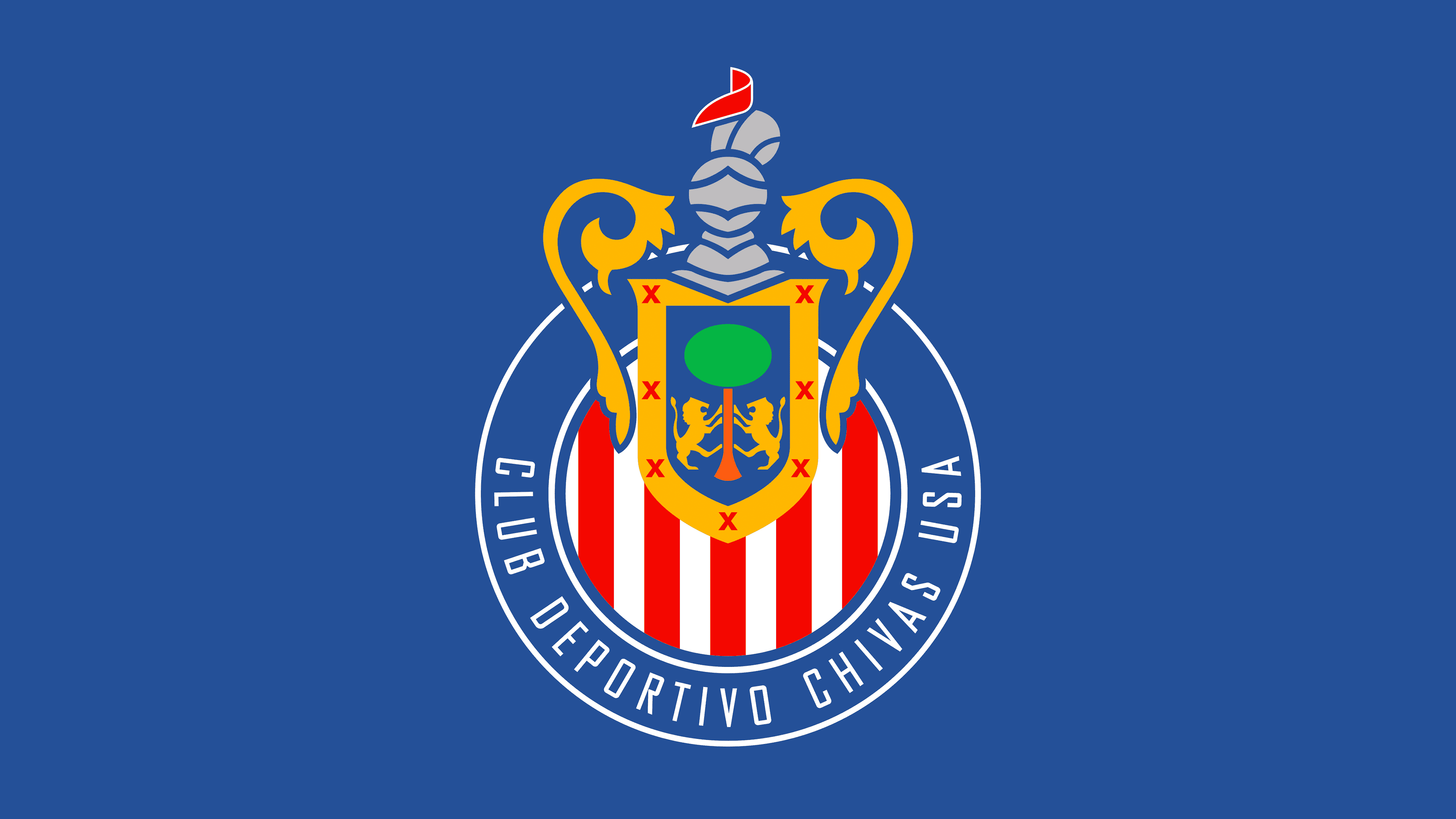
2020 – today
![]()
The inscription in the blue ring was shortened to “CLUB DEPORTIVO GUADALAJARA.” The emblem still includes elements from the city coat of arms of Guadalajara.
- Heraldic lions symbolize power and readiness to fight for victory.
- The pine with a green crown embodies nobility.
- The helmet, adorned with lambrequins, is associated with noble origins.
The vertical stripes refer to Chivas’s original form, which was inspired either by the old Club Brugge style or, according to another theory, by the French tricolor.
Font and Colors
The logo uses a custom sans-serif font. All letters are uppercase and semi-bold, keeping the inscription clear at any scale. The colors match the palette of the Guadalajara coat of arms: green, yellow, blue, gray, and red. White is also added, which, along with blue and red, links Chivas to the city of Bruges, the hometown of the team’s founder, Edgar Everaert.