


![]() Club America Logo PNG
Club America Logo PNG
Each Club America logo acknowledges the team’s love for football. The emblems are united by a spirit of sportsmanship and serve as a testament to the team’s determination. The team has gained fan recognition by never falling to a lower league, demonstrating impeccable skill and professionalism.
Club America is the abbreviated name of Club de Fútbol América SA de CV from Mexico. It competes in the country’s top football division and participates in Liga MX under the nickname The Eagles (Las Aguilas, since 1981). The team was formerly known as Los Millonetas (1959-1981), Los Canarios (1947-1959), Los Cremas (1921-1946), Club Centro Union (1919-1921), and Los Estudiantes (1916-1918). The athletes hold the most titles among all Mexican football representatives. Their home stadium is Azteca, the largest sports arena in Latin America and one of the largest in the world. The club was founded in 1916 and became a founder of the Primera División. Since 1959, it has been owned by the Mexican multimedia company Televisa. Its headquarters are located in Mexico City.
Club America, established in 1916 by a group of students in Mexico City, quickly outgrew its academic beginnings to become a giant in Mexican football. Celebrated for representing the spirit of the Americas, the club has played a crucial role in shaping football on the continent.
The club’s ascent to prominence began with its first league championship in 1959, marking the start of a golden era. In the following decades, particularly the 1980s, Club América dominated the scene, winning five league titles and showcasing its strength in Mexican football.
A notable milestone was Club America’s 1987 win of the Copa Interamericana, which set a precedent as the first Mexican team to secure this international accolade. The momentum continued through the 1990s, with the club adding three league titles and making a significant impact in the Copa Libertadores.
The 2000s and 2010s were no different. Club America maintained its elite status by winning more league titles and the Concacaf Champions League twice, reinforcing its position as a regional top team.
The rivalry with Guadalajara, known as El Súper Clásico, epitomizes Club America’s essence, drawing attention from fans everywhere and highlighting the club’s competitive spirit.
Club America has been home to legendary Mexican players like Cuauhtémoc Blanco and Guillermo Ochoa, whose contributions have solidified the club’s legacy. Today, Club América remains a central figure in Mexican and Latin American football, with the iconic Estadio Azteca as its home. With a vast fan base and a storied history of success, Club América symbolizes football’s enduring appeal and competitive spirit.
Meaning and History
![]()
In the early 20th century, football gained immense popularity in Mexico. The youth were particularly enthusiastic, leading students from two educational institutions in Mexico City (Colegio Mascarones and Colegio Marista de la Perpetua) to create the Record and Colon teams. In the fall of 1916, they merged. The football club needed a name. There were many versions, but the athletes chose the continent’s name because the new team was formed on October 12, when Christopher Columbus first set foot on these lands. The Day of the Discovery of America (Día del descubrimiento de América or Columbus Day) is widely celebrated in Latin American countries. One of the team players, Pedro “Cheto” Quintanilla, proposed this option.
The official colors were chosen by chance: Rafael Garza Gutiérrez (also a club member) came to training in dark blue pants and a yellow shirt, which his father had given him. The rest decided that their uniform would also look like this. The final logo was developed based on the name. From the beginning, North America and South America were centered, with the capital letters “C” and “A” positioned to the right and left. They represent the acronym of “Club America”. But the debut logo was textual.
What is Club America?
Club America is the short name for the professional Latin American sports association Club de Fútbol América SA de CV. It represents a Mexican football club, Las Aguilas (The Eagles), competing in Liga MX. Before 1981, it had several nicknames, including Los Millonetas, Los Canarios, Los Cremas, Club Centro Union, and Los Estudiantes. Its founding year was 1916. The current owner is the company Televisa. The headquarters is located in Mexico City.
1916
![]()
The emblem consists of a monogram formed from two ornate glyphs. The “C” and “A” overlap but are very readable because of the thin lines with which the capital letters are drawn. They are done in Old English, with thickenings, expansions, and spikes. Although small, they significantly alter the signs’ configuration, turning them into an elegant logo.
1917 – 1918
![]()
This symbol laid the foundation for a thematic visual identity in which all elements are harmoniously combined: graphics, name, location, font type, and colors. The designers used a thin ring to position the two American continents, North and South. Between them, on the equator line, they placed the initial letters of the merged teams’ names. The uppercase, bold, and dark glyphs stand out well on a light yellow background. The circle’s shape hints at a ball, and the map indicates the location of the football club.
1919
![]()
When the teams changed their nickname from Los Estudiantes to Club Centro Union, they adopted a new logo. Now, the monogram is back, but in an ancient Greek style. The geometric letters are intertwined. Their legs are elongated, forming a clear square with 90-degree angles in the center between them. The “C” is extended horizontally, and the “A” is inverted and stretched vertically. A common circle unites them.
1920 – 1921
![]()
In this version of the Club America logo, the designers attempted to squeeze a complex monogram of many letters into a small space. In the upper half of the circle, they placed the word “Centro,” and in the lower half, “Union.” To make the inscriptions compact, the developers turned the classic letters into geometric signs resembling the Aztec script.
1921 – 1938
![]()
Another rebranding effort led to a change in the football association’s nickname and an update to its emblem. As a result, the club Los Cremas adopted the old version of the 1917-1918 logo without changes.
1923
![]()
To emphasize Mexico, the players preferred a symbol in the colors of the national flag: green, white, and red. At the center now is the silhouette of a bird, presumably an eagle, the largest eagle, and a national symbol of Mexicans. The country’s name is indicated below.
1923 – 1925
![]()
Designers remade the 1921-1938 Club America logo by replacing the yellow continents with clear outlines with purple shapeless figures. They vaguely resemble North and South America. The club’s acronym, in massive dark blue letters, is preserved between them. The circle lost its frame but retained its beige background.
1925 – 1926
![]()
To show their authenticity and connection to the American continents, the players chose an updated emblem in the colors of the Mexican flag. The line on the left is green, the line on the right is red, and the line at the top is white. The lower part contains the country’s name in a blocky font. The letters “C” and “A” are moved closer to the center. North America has the outline of a dolphin. Both continents are ultramarine.
1926 – 1938
![]()
Designers removed the side stripes, enlarged the beige circle, and restored the continents to their original form, as seen in the 1923-1925 emblem.
1938 – 1946
![]()
The Club America logo of this period is fundamentally different from the others. It’s a triangle in a red frame. On a cobalt background, an eagle with raised wings is placed. The bird is depicted in profile, with its lower half obscured behind a circle that encompasses North and South America. The powerful claws of the feathered predator are visible at the bottom. The team’s initials are in an extra-bold font. The grotesque capital glyphs in ruby color are visible in the dark space.
1947 – 1949
![]()
The logo’s creators used its round shape and turned it into a soccer ball. To do this, they applied additional stripes, imitating the parallels and meridians on the globe. Both American continents remained but increased in size. The main colors of this period are yellow (background), black (earth, markings, frame), and red (letters). The team is renamed Los Canarios.
1959 – 1967
![]()
After rebranding, the football club received the nickname Los Millonetas and a new emblem. The emblem remains circular and resembles a ball. However, the depicted continents are so enlarged that only part of each fits within the circle, mainly the territory near the isthmus between North America and South America. The yellow color turned to beige, and black turned dark blue.
1981 – 1991
![]()
After becoming Las Aguilas, the Mexican team adopted a new logo. It has three versions: the home uniform, the away sports kit, and various equipment. The presence of a circle unifies them, resembling a ball, two continents, and the “CA” acronym, executed in a bold, uppercase, sans-serif font. This version depicts North America and South America with as much accuracy as possible, similar to an administrative map. The colors are bright, vivid, and close to neon. The third sign features a blue triangle with a red border.
1994 – 1999
![]()
Designers added a bold frame around the balls (previously, it was thin) and made the colors darker. Therefore, warm-spectrum yellow predominates in one version of the Club América logo, while the other features deep-sea blue. The lettering’s outline became single but more pronounced.
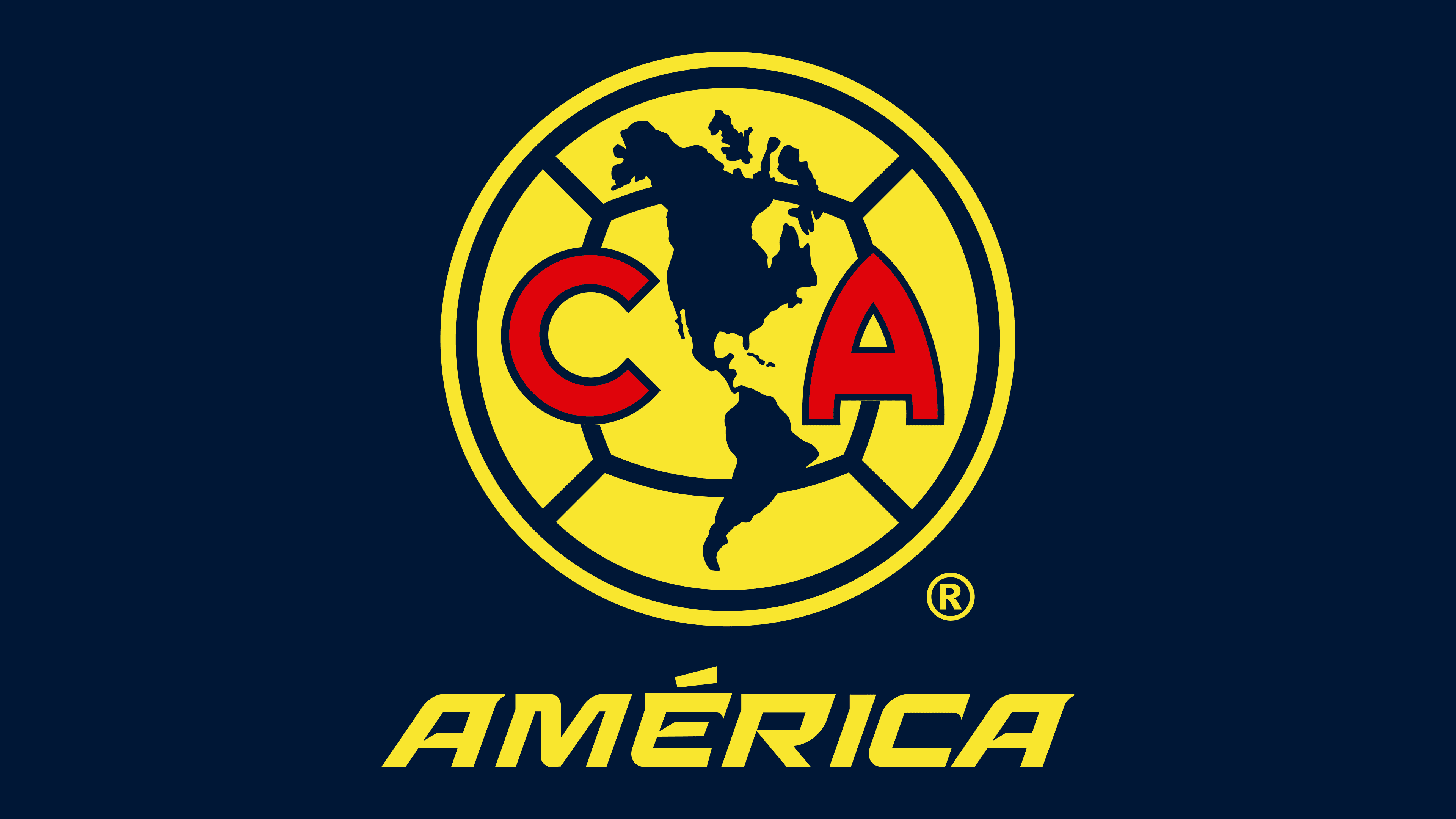
2017 – today
![]()
The continents feature thin outlines with small details, such as adjacent peninsulas and islands. Designers made the circular frame double, and the inner lines were bold. On the other hand, the outline of the letters “C” and “A” consists of narrow lines.
Font and Colors
The acronym in the Club America emblems is primarily set in the Nike Motto typeface, but in some versions the Terminator Cyr font prevails. In all cases, the letters are uppercase, bold, and in a sans-serif font.
The team’s colors are diverse: in addition to sun-yellow #FEEB00 and dark blue #2B375C, they include tomato-red #E63637, gray-olive #848335, and brownish-purple #80364B.