


![]() Coach Logo PNG
Coach Logo PNG
The Coach logo speaks of accessories in an official, simple style with elements of elegance and luxury. The company’s products will add a “zest” to businesspeople’s image. The emblem shows that the products fit well in any color scheme.
Coach began in 1941, when six leatherworkers opened a small workshop in a Manhattan loft on 34th Street, making wallets and billfolds by hand. In 1946, Miles Cahn and his wife, Lillian, joined the company. By 1950, Miles was running the business. His key idea came from baseball gloves: leather softened with use, so he developed a treatment that made Coach leather durable, flexible, and richly colored.
Lillian pushed the company beyond men’s accessories into women’s handbags. In 1961, the Cahns bought the business and hired designer Bonnie Cashin, who worked with Coach from 1962 to 1974. Cashin added side pockets, coin purses, brighter colors, and the turnlock clasp, inspired by her convertible car top. It became one of Coach’s signature details. In 1979, Lew Frankfort joined the company. In 1981, Coach opened its first retail store on Madison Avenue.
Sara Lee bought Coach Leatherware in 1985 for about $30 million. Frankfort became president, and by 1989, revenue had reached $100 million. In the 1990s, Reed Krakoff helped reshape Coach as an accessible luxury brand, competing below Louis Vuitton and Gucci. In 2001, he introduced bags with the interlocking C logo.
Coach went public under Sara Lee in 2000 and became fully independent in 2001. It expanded in Japan and launched coach.com in 1999. Michael Kors emerged as a strong US rival in the 2000s, and Coach’s sales fell sharply in 2014. Coach then bought Stuart Weitzman in 2015 and Kate Spade in 2017. On October 31, 2017, Coach Inc. became Tapestry Inc., while the Coach brand kept the Coach New York name.
Meaning and History
![]()
In 1941, a family of artisans teamed up to create handcrafted leather goods. The craftsmen named their mini-enterprise Manhattan Leather Bags and dealt exclusively in wallets for a long time. Over time, they expanded the business as new leather-processing methods allowed them to broaden their range. The sales volumes grew rapidly; the products were distributed overseas. By the time the brand had a chain of its boutiques, it was already known as Coach.
Its logo has become famous worldwide, a testament to high quality and elitism. Bonnie Cashin developed the first version of the logo. She joined the company in 1961 and served as its Creative Director for many years.
What is Coach?
Coach is a fashion brand known for bags of all kinds, watches, shoes, jewelry, and ready-to-wear. It is owned by Tapestry, Inc., which previously had the same name. Now the luxury brand occupies a leading position in the production of various accessories and owns almost 990 stores worldwide. The year of its foundation is 1941; the location is New York.
1941 – 2013
![]()
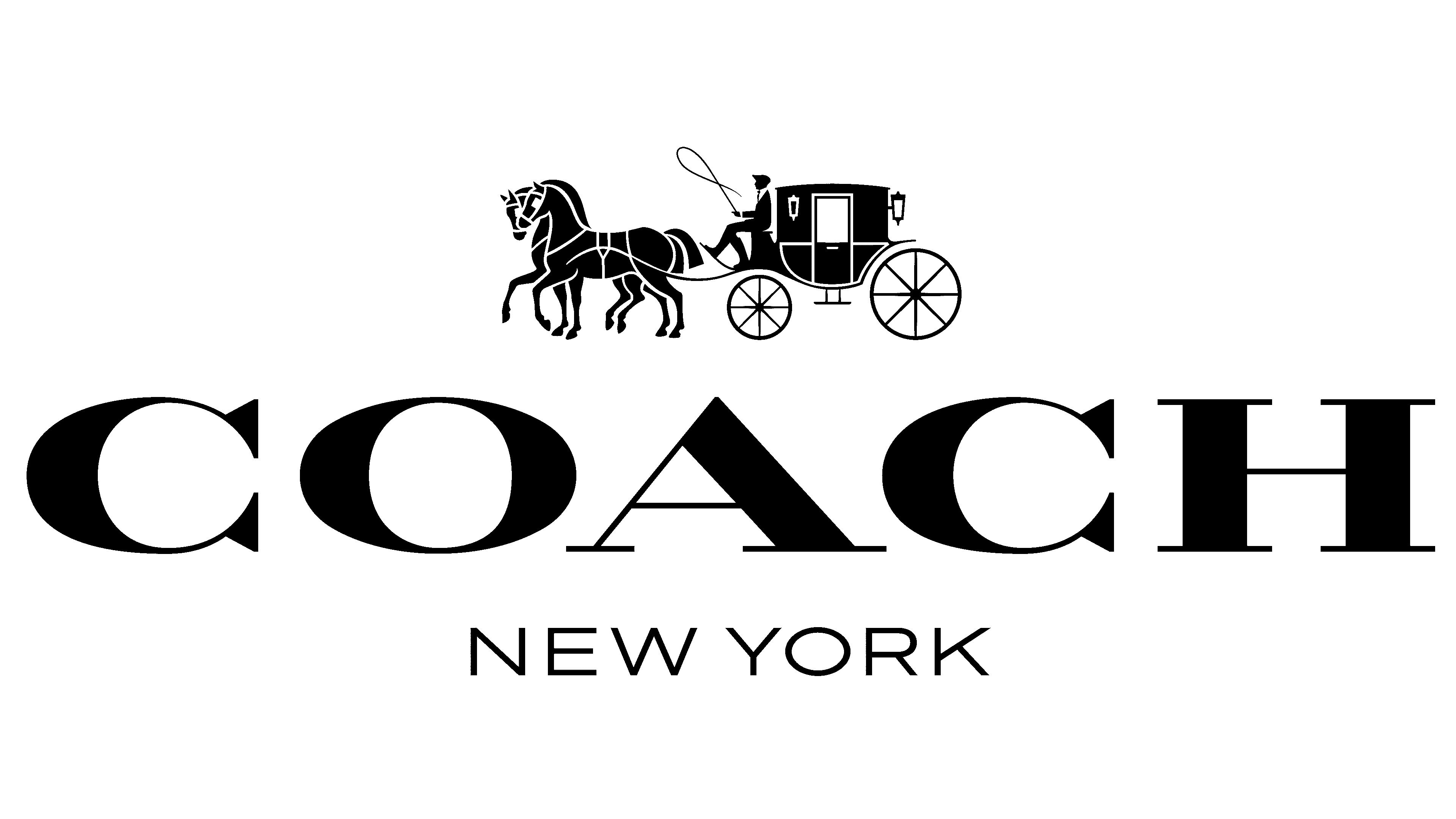
As a result of the rebranding, the organization received the new name Coach and the associated logo. This is a well-known image of a carriage, coachman, and two harnessed horses ready to hit the road. One horse shifts impatiently from foot to foot, and the other stands still, waiting for the command. The image of the coachman also has a dynamic: he holds a whip.
The second element of the composition is a rectangular plaque with cut corners. The brand’s name is written on it, and the designers used a font similar to the stencil. The letters are half black, half white. On the same plate, but slightly below, is the year Coach was founded. It is presented in an abbreviated format: “EST. 1941 “.
The third part of the logo is the city’s name, where the workshop was previously based, and where the fashion concern is now located. Like the rest of the lettering, the designers have centered the word combination “NEW YORK”. The font is similar to a sans-serif typeface.
2013 – today
![]()
The Coach emblem evolved in 2013. Upon closer examination, it is noticeable that the shape of the carriage, the horses’ details, and the coachman’s look have changed. The whip no longer hangs freely but bends into a loop, creating the illusion of movement. However, the design remains the same: the graphic element is completely black, with small splashes of white.
Below is the trademark name, this time without the year of foundation. It is written in one-color type with contrasting strokes and elongated serifs. The polygonal frame is gone, as is any mention of the city where Coach is based. But the plate is on the second logo. Inside it is the company’s name, set in a slightly different font. This is a modern interpretation of the old wordmark.
Font and Colors
Coach still uses the iconic classic emblem. A coachman, a carriage, and two horses are the most recognizable symbols of the brand, so no one is in a hurry to carry out a global redesign. The logo has proven itself well and has stood the test of time. Now, it adorns all the fashionable goods the New York manufacturer produces.
The old Coach font is similar to AZ Placid Regular or Ecuyer Dax, although the differences are noticeable. Long serifs unite them at the ends and a double color: dark contours are combined with the inner emptiness. In the new version, the inscription is completely black. The designers painted over the gaps and aligned the lines to make them look modern. The letterforms in the logo frame are unclear, and both “C”s are missing their bottom serifs.
The primary color remains black, and the secondary color is white. Such a seemingly simple combination symbolizes prestige, superiority, elitism, and a high level of the brand.
FAQ
What is the meaning of the Coach logo?
The logo symbolizes luxury, social status, and dignity. The classic, timeless design matches the brand’s reputation for fine leather goods and accessories.
The logo features a horse-drawn carriage known as a “coach,” directly referencing the brand’s name and origins. The horse and carriage signify travel, suggesting that product ownership is part of a lifestyle that seeks sophistication and higher social status.
The logo’s typography enhances its classic appeal. An elegant and discreet font complements the carriage’s image. The logo’s black-and-white color scheme emphasizes a sophisticated approach to luxury. The simplicity of the colors makes the carriage’s details stand out, making the logo easily recognizable and synonymous with high fashion.
Is Coach a luxury brand?
Yes, Coach is a luxury brand. Known as Coach New York, the American fashion house specializes in leather bags, luggage, accessories, and ready-to-wear. The company is known for its high-quality craftsmanship, exquisite designs, and premium materials.
The brand’s products include bags, suitcases, shoes, clothing, and accessories such as wallets, belts, and glasses. It maintains a presence in high-end retail outlets and operates flagship stores in major cities worldwide. These stores offer an exclusive shopping experience that reflects the brand’s upscale image. Collaborations with renowned designers and celebrities further strengthen the company’s position in the luxury goods market.
Is the C in Coach a horseshoe?
The “C” in the logo is shaped like a horseshoe, symbolizing its connection to equestrianism and traditional leather craftsmanship.
The horseshoe shape of the letter “C” serves several purposes:
- Equestrian connection
- Heritage and Craftsmanship
- Symbol of good luck and protection
- Brand recognition and personality
- Visual appeal and versatility
The horseshoe-shaped “C” in the logo emphasizes the brand’s connection to equestrian sports. This symbol reinforces the brand’s identity by emphasizing elegance, prestige, and reliability, and serves as a unique, recognizable visual branding element.
What is the symbol for Coach?
The luxury fashion house’s symbol is a carriage with a coachman and two horses. This iconic symbol represents the brand’s heritage and values, demonstrating sophistication, prestige, elegance, and luxury.
Images of horse-drawn carriages are rich in historical and cultural meaning:
- Symbol of high social status
- Sophistication and elegance
- Historical prestige
- Luxury and craftsmanship
- Ambitious lifestyle
- Timeless appeal
The symbol of a carriage with a coachman and two horses symbolizes high social status, sophistication, elegance, and luxury. It reflects the brand’s heritage of excellence and resonates with consumers who seek quality and a rich tradition of craftsmanship.
Do all Coach bags have the logo inside?
Yes, all original Coach bags have a logo tag inside. This tag contains the logo and serial number, which are important to verify the bag’s authenticity.
The logo tag inside the bag serves several important purposes:
- Authentication
- Brand identity
- Quality assurance
- Historical record
- Customer service
- Design integrity
This tag is critical for verifying authenticity, strengthening brand identity, ensuring quality, maintaining historical records, facilitating customer service, and maintaining design integrity.
Did Coach change their logo?
The brand updated its logo in 2013 as part of a comprehensive rebranding effort. The new logo is more elegant and sophisticated, reflecting a modern yet timeless look that matches the brand’s luxury image.
Several changes have been made:
- Clarification of the carriage and coachman
- Improvement of the horses
- Customizing the caption
- Balanced composition
- The modern yet timeless appeal
The logo update featured a more elegant design highlighting the coachman, carriage, and horses. The lettering was enlarged and converted to a serif font, creating a balanced and sophisticated logo.