The Rocky Mountains and a heraldic shield form the basis of the visual identity of the football club. The updated logo of Colorado Rapids accurately reflects the changes that have occurred and its location. A stylized ball emphasizes the club’s sports profile.
Colorado Rapids: Brand overview
| Founded: | June 6, 1995 |
| Founder: | Kroenke Sports & Entertainment |
| Headquarters: | Commerce City, Colorado, U.S. |
| Website: | coloradorapids.com |
The team’s name was approved in 1995. When it was announced that Colorado would have a soccer club, the organizers allowed local residents to choose the name themselves. As a result of the poll, “Rapids” won. It symbolized the high canyons and rapids of the Colorado River. Initially, the franchise’s official color was green. In 2003, it was changed to black and blue, and in 2007 to sky blue and burgundy.
Meaning and History
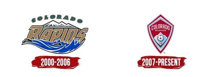
From 1996 to 1999, the owners of “Colorado Rapids” conducted two rebrandings that influenced the design of the emblem. Throughout its history, the team has had three main logos. Since 1996, one of them has been used as a secondary, but in 2002, it became the primary. The last chance for graphics was given when the team moved to Dick’s Sporting Goods Park.
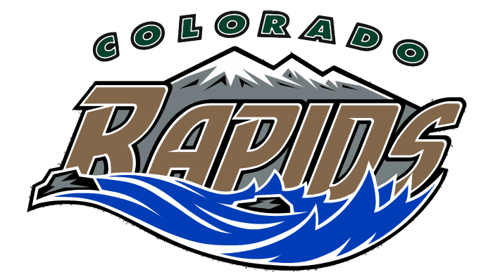
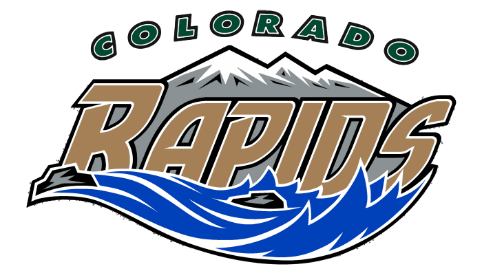
The debut emblem was dedicated to the inaugural MLS season. It depicts the Rocky Mountains of Colorado and copies the scene from the club’s headquarters window at the foot of the Rocky Mountains. In the eastern part of the ridge, rivers flow into the Atlantic Ocean, and in the western part, into the Pacific. The logo features a tide where a rapid stream washes the base of the peaks. As the team’s owners claimed, it was a class V rapid, common in Colorado.
“RAPIDS” (in uppercase, but “R” is the largest), done in light gray tones, is printed against a backdrop of gray mountains with snowy peaks. A stylized sans-serif italic is used. Above the landscape, the word “Colorado” is printed. The symbols are arranged in a semicircle, arching over the rocks. The main elements are outlined in black and white lines.
What is Colorado Rapids?
Colorado Rapids is a professional soccer team from the USA, competing in the Western Conference. It is one of the founders of MLS. The club was established in 1995 and played its first game in 1996. In 2010, the team won the Major League Soccer Cup. The team’s owner is Kroenke Sports & Entertainment.
2000 – 2006
In 2000, there were rearrangements in the team: the secondary emblem, made in 1996, became the primary, and the image of the mountain river took second place. The main emblem consists of concentric circles with a soccer ball inside a 16-point green star. The serrated geometric shape contrasts with the white background. The elements in the middle are surrounded by three rings – blue, white, and gold. Inside is printed “Colorado Rapids”. The golden letters are outlined with a white contour.
2007 – today
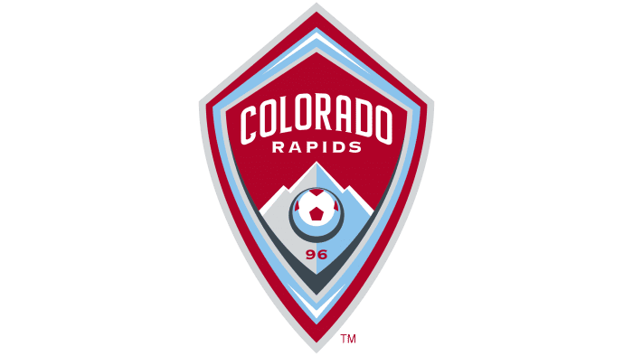
In 2007, a new era began for the club: it moved to Dick’s Sporting Goods Park and changed its symbolism to keep up with other teams of Kroenke Sports & Entertainment. The central symbol became a rhombic heraldic shield. It has slightly curved lower edges, while the upper ones are positioned at a right angle. Inside is another heraldic shield of a similar shape. It has the team’s name printed in large letters – the top line is “Colorado,” and the bottom is “Rapids.”
Beneath the letters are the peaks of the Rocky Mountains. A stylized version of a soccer ball contrasts against a background of blue-gray Rocky Mountains. Printed at the bottom is the number “96.” It symbolizes the franchise’s debut in MLS. The main colors of the emblem are sky blue and burgundy.
Colorado Rapids: Interesting Facts
The Colorado Rapids soccer team from the Denver area plays in Major League Soccer (MLS). They’ve been part of the league since it started in 1996.
- Starting Out: They were one of the first ten teams when MLS kicked off in 1996, which shows their importance to the league.
- Big Win: In 2010, they won their first major championship, the MLS Cup, by beating FC Dallas. This win was a huge deal for the team.
- Their Stadium: Since 2007, they’ve played at Dick’s Sporting Goods Park in Commerce City, Colorado. It can hold 18,000 fans and is part of a big soccer complex.
- Fans: The team has enthusiastic fan groups, like Centennial 38, who make games exciting with energy and cheers.
- First Trophy: Their first major win was the Lamar Hunt U.S. Open Cup in 1997 when they beat D.C. United. It’s a historic soccer tournament in the U.S.
- Rivals: They have a big rivalry with Real Salt Lake. The teams compete for the Rocky Mountain Cup, which fans started in 2005.
- Training Young Players: The Rapids work hard to train young players in their academy, some of whom play professionally for the team and elsewhere.
- Working with Other Teams: They’ve partnered with international teams like Arsenal from England to help develop players and grow their brand worldwide.
- Helping the Environment: The team and their stadium are part of efforts to be more environmentally friendly, like using solar power and recycling a lot.
- Famous Players: Players like Marcelo Balboa, Tim Howard, and Conor Casey have been important to the team. Conor Casey is the team’s top scorer.
The Colorado Rapids’ story is about growing soccer in the U.S., winning big games, and working to be a good team on and off the field.
Font and Colors
The core of the Colorado Rapids’ graphic symbol is the Rocky Mountains. They are directly related to the name of the soccer club, as the word “rapids” in this context denotes steep cliffs, deep canyons, and rapid streams of the Colorado River. That’s why, in the first version of the logo, the snowy mountain peaks were somewhat in the background, with blue water splashing in front of them.
When the team moved to a new stadium, designers removed the waves, and now the river is represented only by a blue diamond-shaped line. It precisely mirrors the shape of the heraldic shield, which gathers all elements of the logo. There are quite a few of them: apart from the mountains, artists depicted a multicolored soccer ball, the number 96 (1996 – the year of the debut of Colorado Rapids), and the full name of the club, divided into two lines.
The font of the word “COLORADO” resembles a modified Big Noodle Tilting with added small serifs. At least the letter “A” has a characteristic round shape and a similar position with a horizontal stroke. The inscriptions “RAPIDS” and “96” are done in Copperplate Gothic HV with increased spacing between letters.
The emblem of the professional soccer club reflects its official colors. Initially, it was a dark shade of green. It was combined with white, gray, blue, black, and light brown. In 2007, the team updated the palette, choosing burgundy and sky blue as the primary colors. However, white and gray did not disappear from the logo; they just took up less space.
Colorado Rapids color codes
| Vivid Burgundy | Hex color: | #960a2c |
|---|---|---|
| RGB: | 150 10 44 | |
| CMYK: | 0 93 71 41 | |
| Pantone: | PMS 7621 C |
| Baby Blue Eyes | Hex color: | #9cc2ea |
|---|---|---|
| RGB: | 227 212 173 | |
| CMYK: | 0 4 20 7 | |
| Pantone: | PMS 283 C |
| Light Gray | Hex color: | #d3d5d7 |
|---|---|---|
| RGB: | 211 213 215 | |
| CMYK: | 2 1 0 16 | |
| Pantone: | PMS 427 C |
| Charcoal | Hex color: | #424a52 |
|---|---|---|
| RGB: | 150 10 44 | |
| CMYK: | 0 93 71 41 | |
| Pantone: | PMS 432 C |

