


![]() Columbus Crew SC Logo PNG
Columbus Crew SC Logo PNG
The Columbus Crew SC logo symbolizes the team’s and fans’ unity, united by one goal: victory. It reflects pride in the city of Columbus and its sports traditions, conveying the spirit of the people and players who value perseverance and strength of character.
Columbus Crew SC is a professional soccer team from Columbus, Ohio, competing in the Eastern Conference of Major League Soccer. The team joined the league in 1996 but was founded two years earlier, in 1994, when MLS announced that the city would be home to one of the ten newly formed franchises.
In 1996, MLS investor Lamar Hunt and his son, Clark, became the owners of the “Columbus Crew.” On July 30, 2013, Anthony Precourt, who was interested in soccer, purchased the club for $ 68 million. Thus, Precourt Sports Ventures LLC became the team’s second investor-operator. On October 8, 2014, the new owner began rebranding. He changed the club’s name to Columbus Crew SC, focusing on its status as a soccer club.
As a result, the word “Crew” acquired a new meaning, as the city was no longer associated with the working class. It came to symbolize team spirit and unity between players and members of the fan sports community. Additionally, the rebranding included a logo change. Only the official colors, black and gold, remained unchanged. The marketing department collaborated with Adidas and Whole-Brain to develop a new concept. The Columbus Crew logo was unveiled in the fall of 2014 and debuted during the 2015 MLS campaign.
On October 17, 2017, Anthony Precourt announced the club’s possible relocation to Austin, Texas, if the city authorities did not build a new stadium. On March 5, 2018, Ohio Attorney General Mike DeWine and the city of Columbus filed a lawsuit against Precourt. They referred to a state law prohibiting sports teams using state facilities from relocating to another city without prior notice. Eventually, MLS allowed Precourt to establish a new franchise in Austin, while Crew SC remained based in Columbus.
The club got new owners. On January 1, 2019, control over the shares was officially transferred to the Haslam family (investment group Dee and Jimmy) and the team’s doctor, Dr. Pete Edwards. Subsequently, Pete Edwards became the club’s sole owner after concluding a deal with Precourt Sports Ventures LLC. He promised to keep the team in the city and build a new stadium.
Meaning and History
![]()
Originally, the club was named “Eclipse” in honor of a solar eclipse. But before the first season began, the franchise was renamed. The local newspaper, The Columbus Dispatch, held a citywide contest to name the team. The first suggestion, “Columbus Crew,” became a hit. It was meant to emphasize the persistence of Columbus, known for its “blue-collar” workers, people from the working class engaged in manual labor.
What is Columbus Crew?
It is a professional soccer club from Ohio, a member of Major League Soccer, and a participant in the Eastern Conference. The club was founded in 1994 but began playing in 1996 as one of the league’s charter teams. The club is managed by the Haslam family and former team doctor Pete Edwards.
1996 – 2014
![]()
The first Columbus Crew logo immerses the viewer in the working-class neighborhoods of Columbus, a city of industry and physical labor. The emblem is designed as a vertically elongated shield. In the upper area, there is a rectangular block in a yellow-gold tone bearing the club name. The short word THE is centered, while the heavy word CREW is placed below. The typography is bold, black, and sans serif, visually echoing Franklin Gothic and Impact.
The main focus of the emblem is on three male figures in workwear and construction helmets. The largest figure stands in the center with arms crossed over the chest. On both sides, slightly behind, are two smaller figures that create a sense of spatial hierarchy. The figures are rendered in a generalized manner, with emphasized outlines and a clear separation of light and shadow. Lighting from the left leaves the right side of the faces in shadow. The gray background enhances the sense of toughness associated with working professions.
The images depict Columbus residents engaged in physical labor, contributing to the city’s strength. The identity of the mark is built around the idea of worker brotherhood and collective unity, reflecting the team name’s meaning as an association of working people ready to stand together until the end.
The shield outline is closed with a thin black line that brings all elements into a single whole. The entire composition conveys unity, inner strength, and the pride of workers bound by a common goal and a competitive spirit.
2014 – 2021
![]()
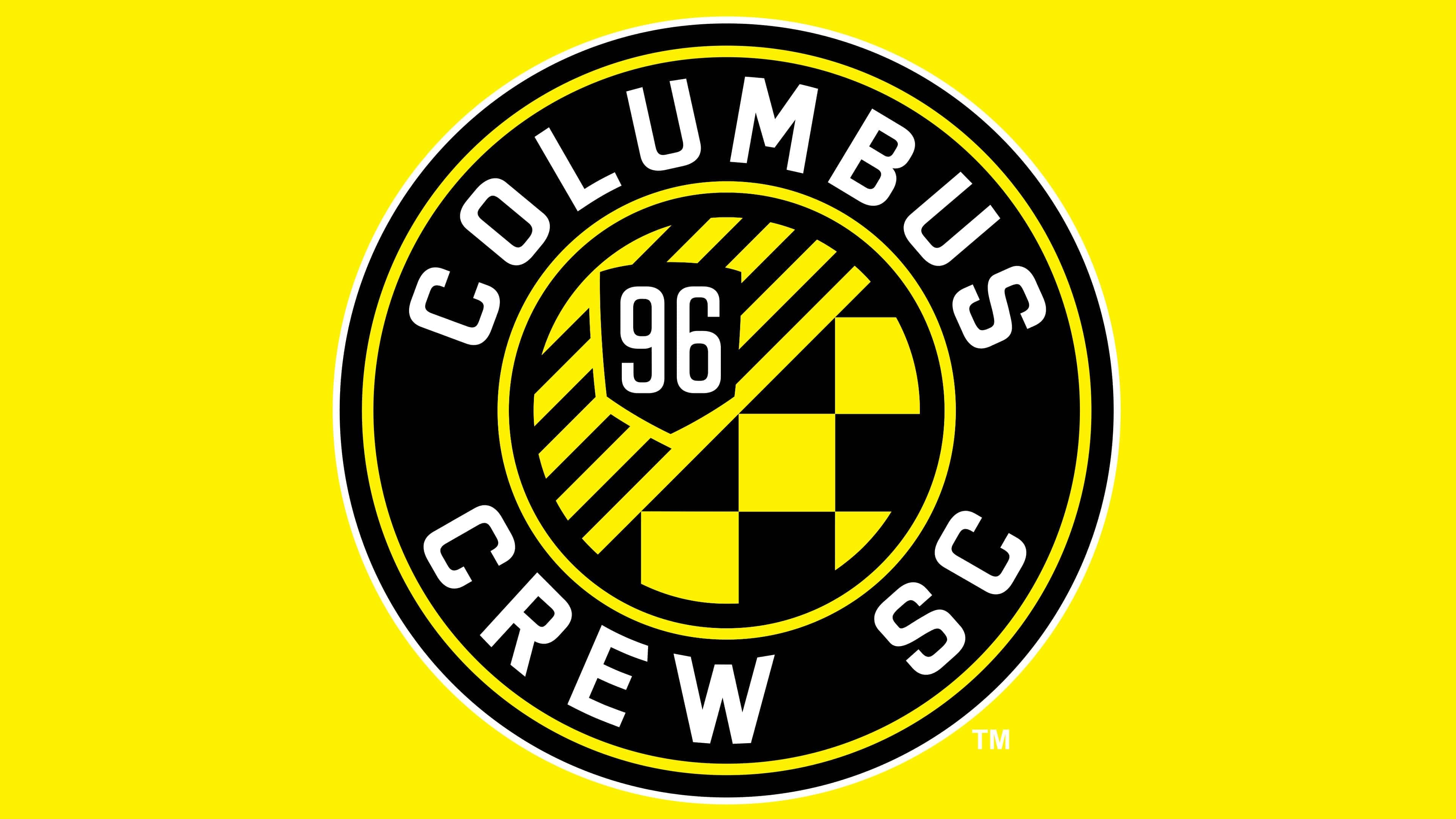
In October 2014, Columbus Crew SC entered a new period by updating its name and mark, reinforcing ties to city roots and local history. The club became known as Columbus Crew SC and introduced a new set of symbols that united players, staff, and supporters, emphasizing Columbus’s cultural environment. The circular emblem referred to the tradition of German football crests, creating a visual dialogue with the city’s German heritage, the local Oktoberfest, the Nordecke supporters section, and the German Village neighborhood.
The circular form is built from several concentric rings. At the center is a complex ornament of diagonal lines and square modules in a yellow-and-black color scheme. The upper-left area is filled with diagonal stripes, while the lower-right area features a checkerboard pattern associated with supporter loyalty to the club. At the center sits a small black shield with the number 96 in white, indicating 1996, the club’s founding year and its first MLS season.
The outer ring is black and contains the full team name set around the circumference. The upper section reads COLUMBUS, and the lower reads CREW SC. The text uses a sans serif typeface similar to Eurostile Bold and Bank Gothic, with slightly rounded corners that give the mark a more approachable feel.
The emblem border is finished with a thin yellow outline that separates the inner areas from the outer ring.
2021
![]()
On May 10, 2021, Columbus SC dropped the familiar Crew name and introduced an updated club mark. The visual style changed, and the emblem took on a shield shape reminiscent of the Ohio state flag’s silhouette.
The shield is vertically elongated. The lower area appears asymmetrical, with sharp side corners and a concave cut between them. The upper part widens, suggesting a pennant or flag edge. The main inner field is black, with a thin yellow line running around the perimeter.
Inside the shield is a large white letter C. Its form is built on angular lines and internal breaks. The outer edges appear cut off, reinforcing the image’s harsh, tense character.
The club name is placed above the shield and set in black uppercase letters. The typeface is dense, with minimal rounding and sharp angles. Below the shield is the abbreviation SC, rendered in the same style at a smaller scale.
The emblem creates a visual link to the Ohio flag, emphasizes the club’s local identity, and reflects a period of rethinking the image, aimed at closer ties with the city and the state.
2021 – today
![]()
Columbus Crew restored the Crew name following supporter feedback and unveiled an updated logo with minimal changes. The emblem remained the same in structure and proportions. The vertically elongated shield with an asymmetrical base continues to refer to the outline of the Ohio state flag.
The white letter C occupies a dominant position inside the shield. In the lower right corner, the number 96 was added, indicating the year the club was founded. The numerals are rendered in white.
Above the shield is the city name COLUMBUS. At the bottom of the shield, the word CREW reappeared, replacing the SC abbreviation and set in the same typeface at a reduced scale.
The return of the Crew name and the number 96 strengthens the connection to the club’s past, reflects supporter sentiment, and preserves continuity by linking the current visual style with historical context.
Font and Colors

The Columbus Crew SC logo has evolved along with its concept. Initially, the name was associated with the city’s working class, which had many so-called “blue collars” workers. It was they, the silhouettes of three men in construction helmets, depicted inside a quadrangular heraldic shield with a sharp base.
In 2014, the new franchise owner decided to redesign the emblem and complete a rebranding. He saw the Columbus Crew SC nickname as a symbol of unity and team spirit, so he considered the images of builders inappropriate. Whole-Brained and Adidas developed a modern, round graphic symbol for the club. This logo contains several symbolic elements: a small ring “O” on the Ohio flag, nine stripes inside it representing other Major League Soccer teams, and “96”, the year the franchise appeared.
In the first version of the emblem, two fonts were used: Sans Serif Grotesque for the article “THE” and an old-fashioned font for “CREW.” After the redesign, the inscriptions looked completely different. “COLUMBUS CREW SC” and the number 96 are done in a modified version of the sans-serif Copenhagen font. The most significant changes affected the letters “M,” “E,” and “W.”
Whole-Brained and Adidas developed a color scheme for the soccer team and attempted to incorporate it into the logo. The main palette includes black and yellow colors, with white as an additional color.