


 Comfort Inn Logo PNG
The modern Comfort Inn logo looks surprisingly simple and elegant. It combines two graphic elements and four shades, giving it a stylish, polished look. This suggests that, over many years, the Comfort Inn hotel chain has arrived at a harmonious, unified style that reflects its philosophy. However, this does not mean that previous logo versions were less memorable. On the contrary, each version had distinctive features that highlighted the company’s core values.
The brand’s identity has always featured symbolic elements set against expressive, solid backgrounds, conveying stability and comfort. This continues the tradition with a modern design approach. The Comfort Inn emblem belongs to Choice Hotels, one of the largest hospitality companies. With the updated logo, the hotel chain now includes over 1,600 hotels in the United States and more than 2,000 properties outside the country, offering quality accommodation at affordable prices.
The bright, memorable logo makes the brand recognizable, which is important to hotel guests worldwide.
Choice Hotels International, then operating as Quality Courts United, launched Comfort Inn in 1981 as a mid-priced hotel brand. Its first property opened in Paoli, Indiana, in 1982. During the 1980s, the chain expanded across the United States with a standardized offer built around clean rooms, comfortable beds, breakfast and consistent service for leisure and business travelers.
International expansion followed in the 1990s. After entering Canada, the brand moved into Europe, Australia and other markets. Comfort Suites launched in 1992, offering larger rooms at a similar price point. By the late 1990s, the network included hundreds of properties in the United States and a growing number of hotels abroad.
During the 2000s, Choice Hotels invested in room updates, bedding, and services for business guests. The 2006 “Your First Choice” campaign introduced revised service standards and renovated interiors. In 2010, the “New Look and Feel” program covered façades, lobbies, public areas, and guest rooms. A revised breakfast menu followed in 2012, and Choice Privileges launched in 2013 across Choice Hotels International properties.
A wider rebranding program began in 2016 under the name “Comfort in a New Light.” A new identity and logo appeared in 2018, and most North American renovations under Comfort Reimagined were completed by 2019. In 2020 and 2021, the chain expanded hygiene protocols and contactless services. The company upgraded its mobile booking tools in 2022. By 2023, the brand operated thousands of hotels worldwide after more than forty years of expansion.
Meaning and History
What is Comfort Inn?
This well-known hotel brand has established itself as the top choice for budget-conscious travelers, offering reliable accommodations in North America and beyond. It provides a consistent level of service, whether guests are in a bustling city or a quiet rural area, balancing price with basic amenities. The brand is famous for its complimentary hot breakfast, which attracts loyal customers. Modern conveniences like free Wi-Fi, flat-screen TVs, and comfortable bedding are standard, making it appealing to business travelers and vacationers. The brand is especially popular among road travelers and guests attending local events, thanks to its widespread presence along highways and in suburban areas.
1981 – 2004

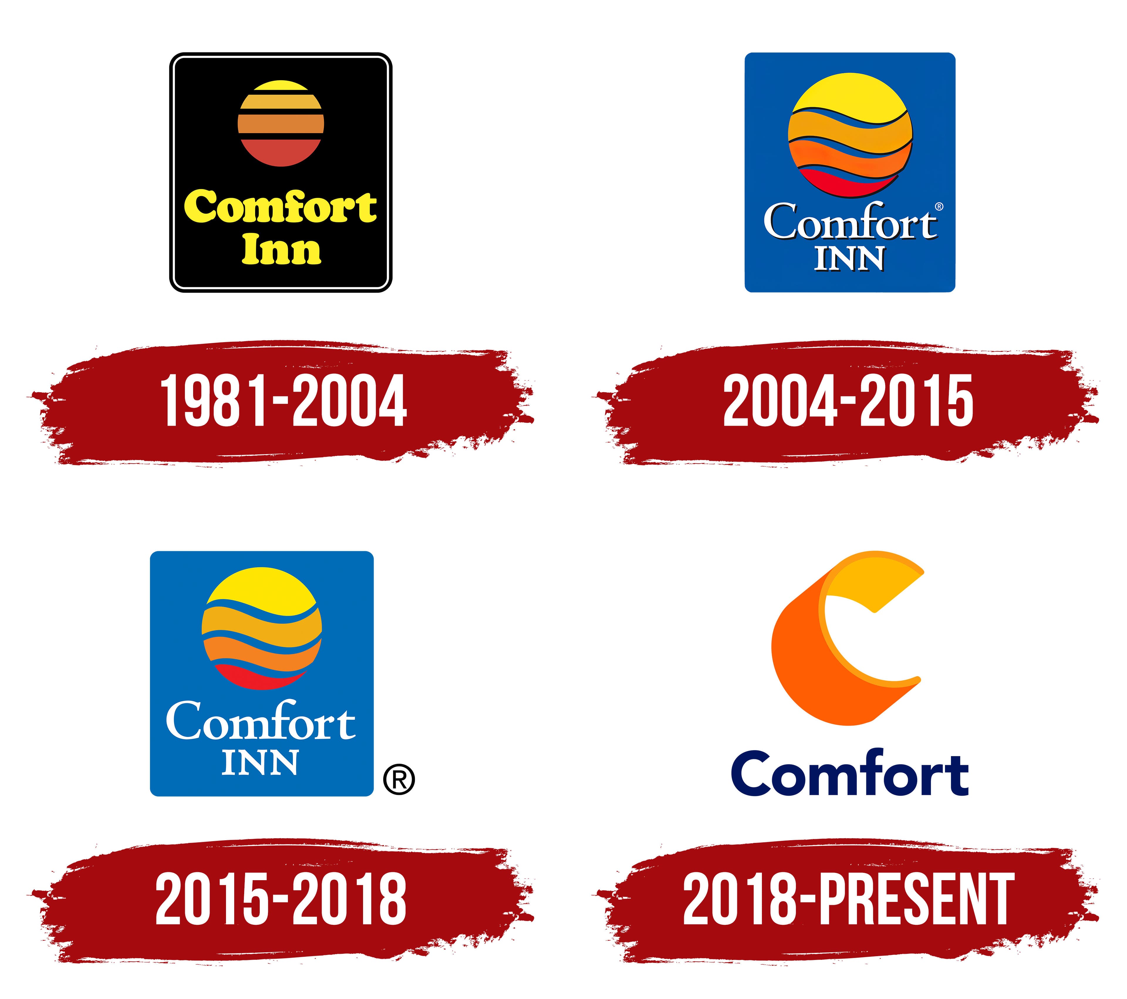
The first Comfort Inn logo is widely considered one of the most striking and memorable, and for good reason. The logo’s color scheme stands out for its richness, contrast, and unique presentation. In the first version, black dominated as the background, highlighting the individuality of the hotel chain, founded in 1981. Black became a key element, helping the brand stand out among others that chose lighter backgrounds. This move helped Comfort Inn capture well-deserved attention. A double frame enhanced the expressiveness: alternating a black background with a thin, light line and a repeating black border created depth.
The logo’s square shape was no accident. Its clear lines symbolized reliability and stability. At the center of the composition, the sun was surrounded by three black horizontal lines, creating a sense of distance. This visual effect evoked calm and comfort, as if you were looking at nature through hotel blinds.
The sun’s gradient fill enhanced the illusion of infinity, reflecting the passage of time from sunrise to sunset. Below the image, the chain name, Comfort Inn, was written in yellow letters. The text consisted of two lines, with both words in bold capital letters. The second word, consisting of three letters, was neatly centered relative to the boundaries of the word “Comfort,” emphasizing unity and balance in the design.
2004 – 2015
The second version of the logo looked completely different from its predecessor. The contrast became softer, changing the overall perception and making the logo more refined and original. The main elements remained in place, but the shape and graphics gained elegance, highlighting each component’s independence.
The background was now a rich blue, reminiscent of a serene sky. The sun took on new shades, represented in four color variations, and smooth waves replaced the straight horizontal lines. These changes added charm and grace to the symbol. The blue background and soft sun shades evoked seaside relaxation, enhancing comfort and calm. This symbolism underscores the hotel chain’s commitment to its customers, conveying that even affordable accommodations can be cozy and comfortable.
The company’s name was written in white, creating an ideal contrast against the blue background. The font became more expressive and elegant. The second part of the name now consisted of three superscript letters placed close together, emphasizing the harmony and unity of all logo elements.
2015 – 2018
The brand identity introduced in 2015 was not radically new; it changed slightly while retaining its original character. This logo stands out as an independent, fresh interpretation, though comparing it with the previous version helps show which accents were altered to refresh the style.
The main elements, the sun and the “Comfort Inn” brand, remain, with some modifications. The name is now more prominent, as it has been slightly brought to the forefront. The letters retain their slim, elegant form but are larger, making them more noticeable and pronounced. The second part of the name remains in uppercase, highlighting the hotel chain’s professionalism and reliability.
While the sun retains its meaning and size, its details have changed: the lines dividing its segments are now wavy, adding dynamism and smoothness to the image. The white lines have widened, giving the sun more expressiveness and enhancing the brand’s overall comfortable, bright feel.
2018 – today

The company’s logo, which provides mid-range and budget hotels, has significantly changed. For the first time in the brand’s history, the contrasting backgrounds used in all previous versions have disappeared. Black and blue were replaced with pure white, completely transforming the brand identity, especially the color scheme.
The sun, long a symbol of the chain, was replaced with a clearly defined letter “C.” This graphic interpretation maintained a connection to the previous symbol, as associations with the sun persisted due to the letter’s colors and structure. Now, this illustration conveyed light and warmth and took on a more modern, dynamic appearance.
The brand name was also simplified; now it consisted of just one word, “Comfort.” Dark blue was chosen for the letters, giving the emblem elegance and calmness. The first letter remained capitalized, while the rest were uniform in size, emphasizing a unified, harmonious image.