


 Four Seasons Logo PNG
The Four Seasons logo embodies timeless elegance. The emblem symbolizes growth and renewal, which is natural for nature. The seasons smoothly transition into one another, reflecting the harmony in which the company operates and conveying a sense of stability and reliability to clients.
Four Seasons Hotels and Resorts began in 1960, when young architect Isadore Sharp opened a 125-room motel in Toronto, Canada. He invested his savings in the project and built the first hotel with practical guest comfort in mind. Early features included individual air conditioning and 24-hour room service, both of which were advanced for the hotel market at the time.
In 1970, the company moved outside Canada with Inn on the Park in London. The property became important for the brand’s international growth and drew business guests and public figures. During the 1970s, Four Seasons shifted from owning real estate toward hotel management, which allowed the group to expand with a stronger focus on service standards.
The company grew across North America and Europe in the 1980s, went public in 1986, and entered the resort segment with its Maui property in 1990. In the 1990s, it expanded into Asia with hotels in Tokyo, Bali, and other markets. The 1992 purchase of Regent International Hotels strengthened its position in the region, while Aviara Resort in California became its first fully owned resort in 1997.
Further expansion continued in the 2000s and 2010s, with openings in the Serengeti, Bora Bora, the Maldives, Doha, Saint Petersburg, Boston, Montreal, Philadelphia, Bangkok, Tokyo, San Francisco, New Orleans, Nashville, Suzhou, and The Pearl-Qatar. In 2007, Isadore Sharp, Bill Gates, and Prince Al-Waleed bin Talal took the company private through Cascade Investment. Later projects included private jet travel in 2015, yacht plans announced in 2021, and new residential resorts in 2023.
Meaning and History
What is Four Seasons?
It is a luxury hotel company world-renowned for its upscale hotels, resorts, and residences. The brand is known for its exquisite rooms, first-class service, and meticulous attention to detail. To cater to discerning travelers, it offers various services such as gourmet restaurants, spas, and personalized vacations. The organization, including hotels in major cities and outlying areas, has pioneered luxury hospitality by consistently providing visitors with first-class experiences.
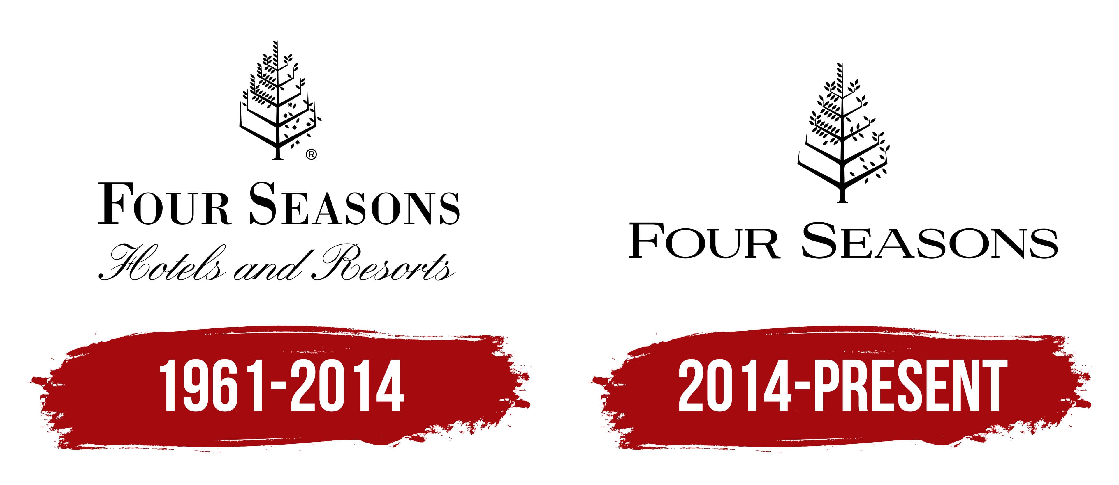
1961 – 2014
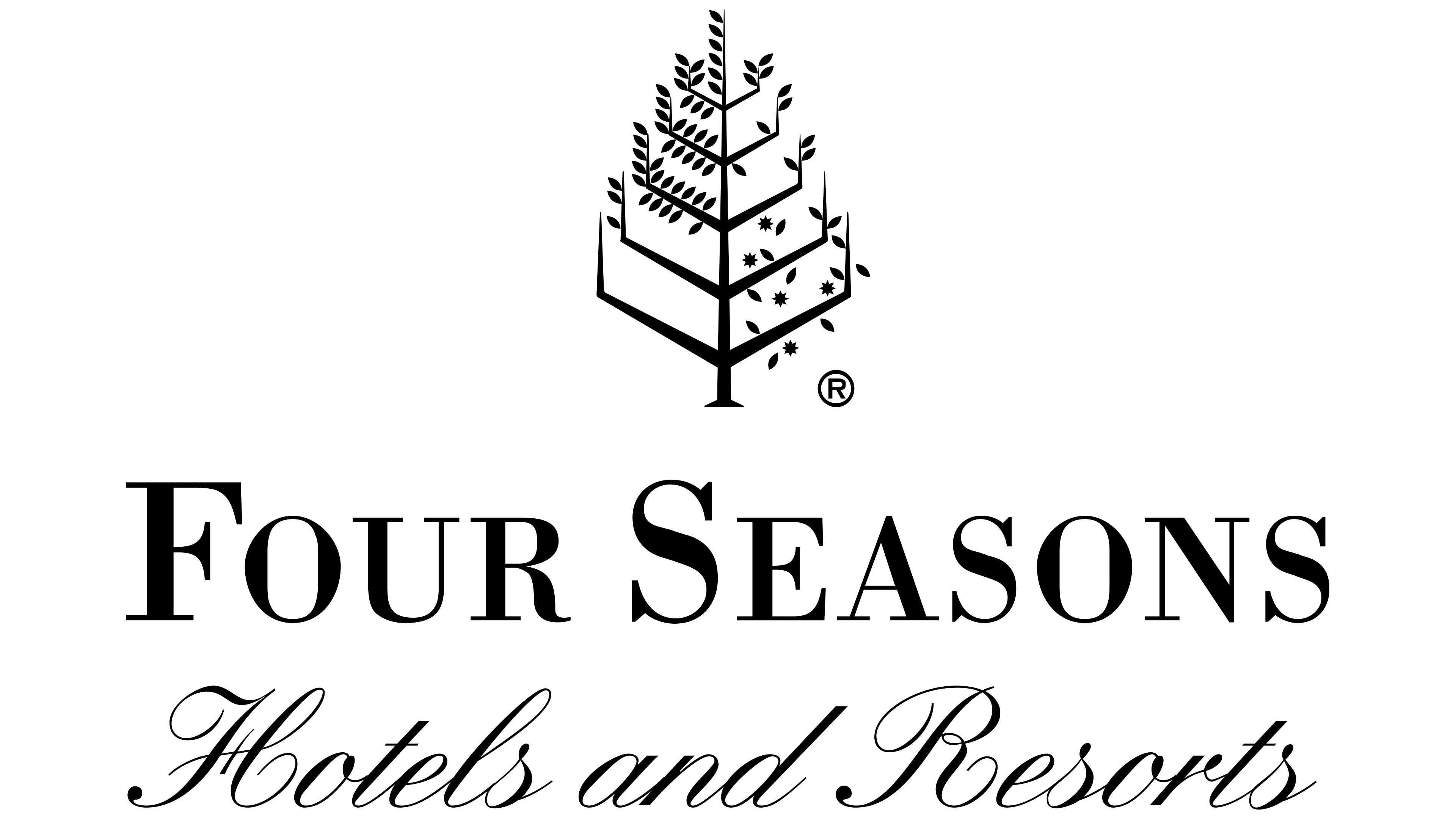
The future Four Seasons hotel chain emblem consists of three “levels,”; the top features a schematic tree image. Its silhouette resembles a tall hotel building, symbolizing stability and longevity.
The tree branches are varied: one quarter is completely leafless, another is densely covered, the third is slightly filled, and the fourth has a few more leaves. This image represents the changing of the four seasons, corresponding to the network’s name. This choice emphasizes the year-round operation of hotels worldwide, where you can always find a place with perfect weather for rest. This symbol conveys a sense of permanence and adaptability: the company successfully adjusts to market changes and continues to operate year after year.
The emblem also reflects the strategy of adapting the hotels’ external design to local architecture, allowing the chain to harmoniously blend into the surrounding environment and become part of the cityscape.
Beneath the tree image is the brand name. The font’s varying line thickness and serifs emphasize the chain’s uniqueness and nobility. Four Seasons complexes are distinguished by luxury and respectability, expressed in every logo detail. The elegant script adds a special charm, indicating the company’s sphere of activity: hotels and restaurants.
2014 – today
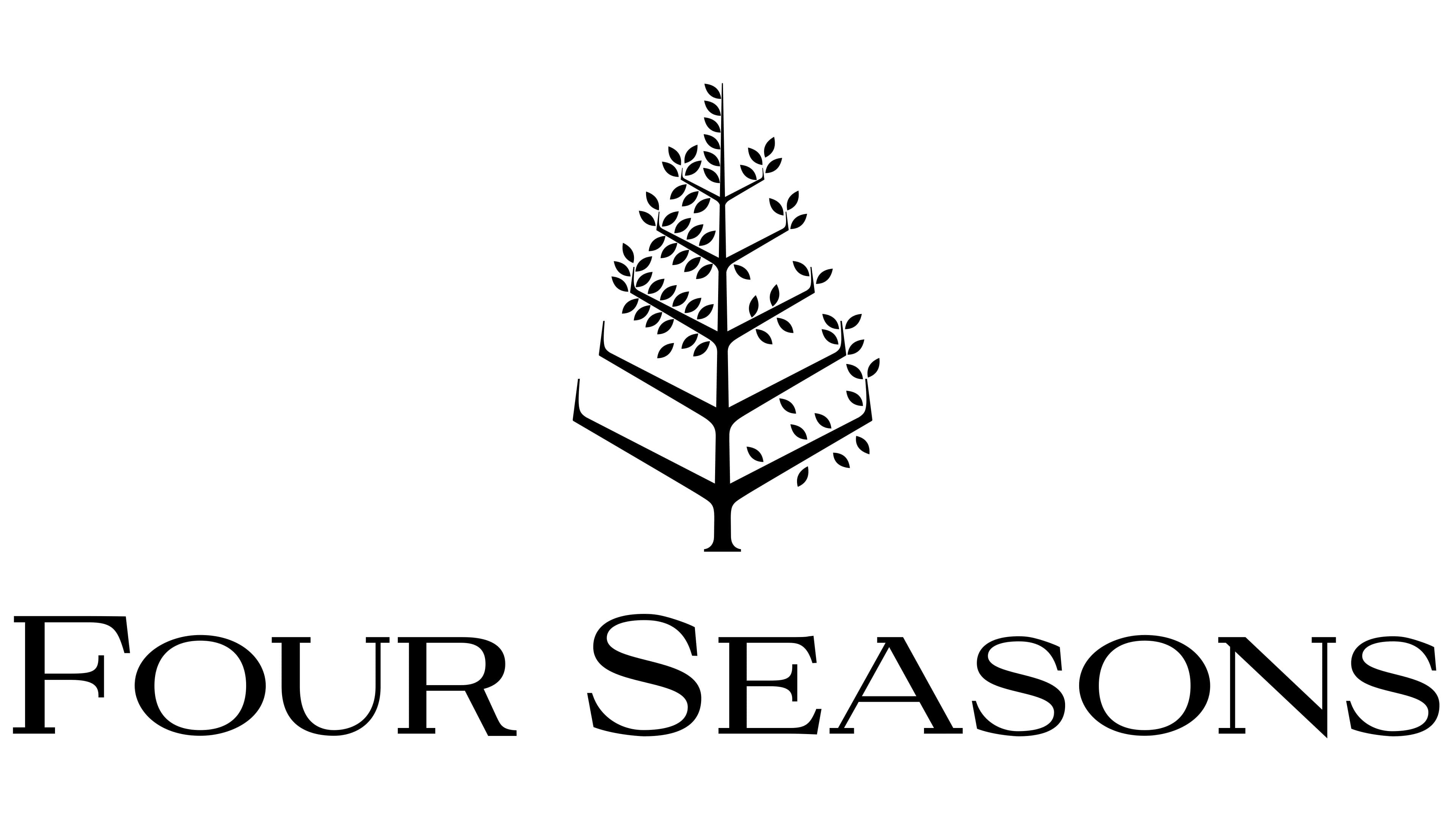
The Four Seasons company logo underwent minor changes in 2014 when it expanded its services to include vacation rentals. The lower inscription “Hotels and Restaurants” was removed in the updated emblem version, symbolizing the brand’s expanded scope of activities. The new, wider font of the name adds solidity to the logo. It reflects the company’s global growth, including opening hotels in Russia, Bali, India, and China in the 2010s.
The logo is a stylized tree image that symbolizes the four seasons. The tree is divided into four parts, each representing a specific season from spring to winter. This is a stylistic element and a deep symbol that reflects the brand’s core philosophy: providing comfort and luxury year-round, anywhere in the world.
The brand’s black color and minimalist design emphasize elegance and luxury, and focus on affluent clients. The brand’s commitment to an unchanging style has created an association with stability and reliability, making it recognizable and trusted worldwide.