 Wyndham Hotels and Resorts Logo PNG
Hotel chains provide travelers with accommodations, rooms, services, and facilities for leisure and business trips. Reservations, check-in, and service follow uniform standards. The Wyndham Hotels and Resorts logo represents a company that operates hotels and resorts in various countries and provides lodging services.
Architect Trammell Crow founded Wyndham in Dallas, Texas, in 1981. The company initially developed as a business-class hotel chain. The brand was named after journalist Wyndham Robertson. In 1990, it began expanding through a franchise model, enabling growth without directly owning hotels.
In 1998, Patriot American Hospitality Corporation acquired Wyndham. It was later renamed Wyndham International. In 2005, Blackstone Group purchased Wyndham International. Soon after, Cendant Corporation acquired the Wyndham brand itself.
In 2006, Cendant was split into four companies. The hotel division became part of a new structure called Wyndham Worldwide. In 2008, the company acquired United States Franchise Systems, which included the Microtel and Hawthorn Suites brands. That same year, Exel Inn joined the network. In 2010, Wyndham added the TRYP by Wyndham brand to its portfolio.
In 2016, Wyndham acquired Fën Hotels, strengthening its position in Latin America. In 2018, Wyndham underwent a major rebranding. It unified all key brands under the name “by Wyndham.”
On May 31, 2018, the hotel division was spun off into a separate public company, Wyndham Hotels & Resorts. Travel + Leisure acquired the timeshare business. By 2023, the network operated 9,100 hotels across 95 countries, totaling 858,000 rooms.
In 2024, the company continued its growth. The number of rooms increased by 13,000, and the development pipeline reached 243,000 rooms. Wyndham Hotels & Resorts remains the world’s largest hotel franchisor.
Meaning and History
What is Wyndham Hotels and Resorts?
It is an American hotel chain that became the largest hotel operator by number of properties, with about 9,300 hotels under 25 brands in 95 countries. It operates through a franchising and hotel-management model and does not own real estate. The portfolio includes brands ranging from economy Super 8 and Days Inn to premium Wyndham Grand. It covers a wide range of formats, including classic hotels, boutique residences, and extended-stay complexes.
before 2006
The Wyndham name predates the international hotel group. In the early 1970s, journalist Wyndham Robertson wrote about developer Trammell Crow for Fortune. According to her recollections, Crow liked the sound of the name Wyndham. He later confirmed its connection to the hotel name in a personal conversation. In 1981, he founded Wyndham Hotel Company in Dallas to manage hotels his development business built.
The Wyndham spelling remained through changes in the company’s structure. In 2018, Wyndham separated its hotel division from Wyndham Worldwide, creating Wyndham Hotels & Resorts. “Hotels & Resorts” identifies the group’s business. Ramada, Days Inn, Super 8, and other hotel chains came together under its name.
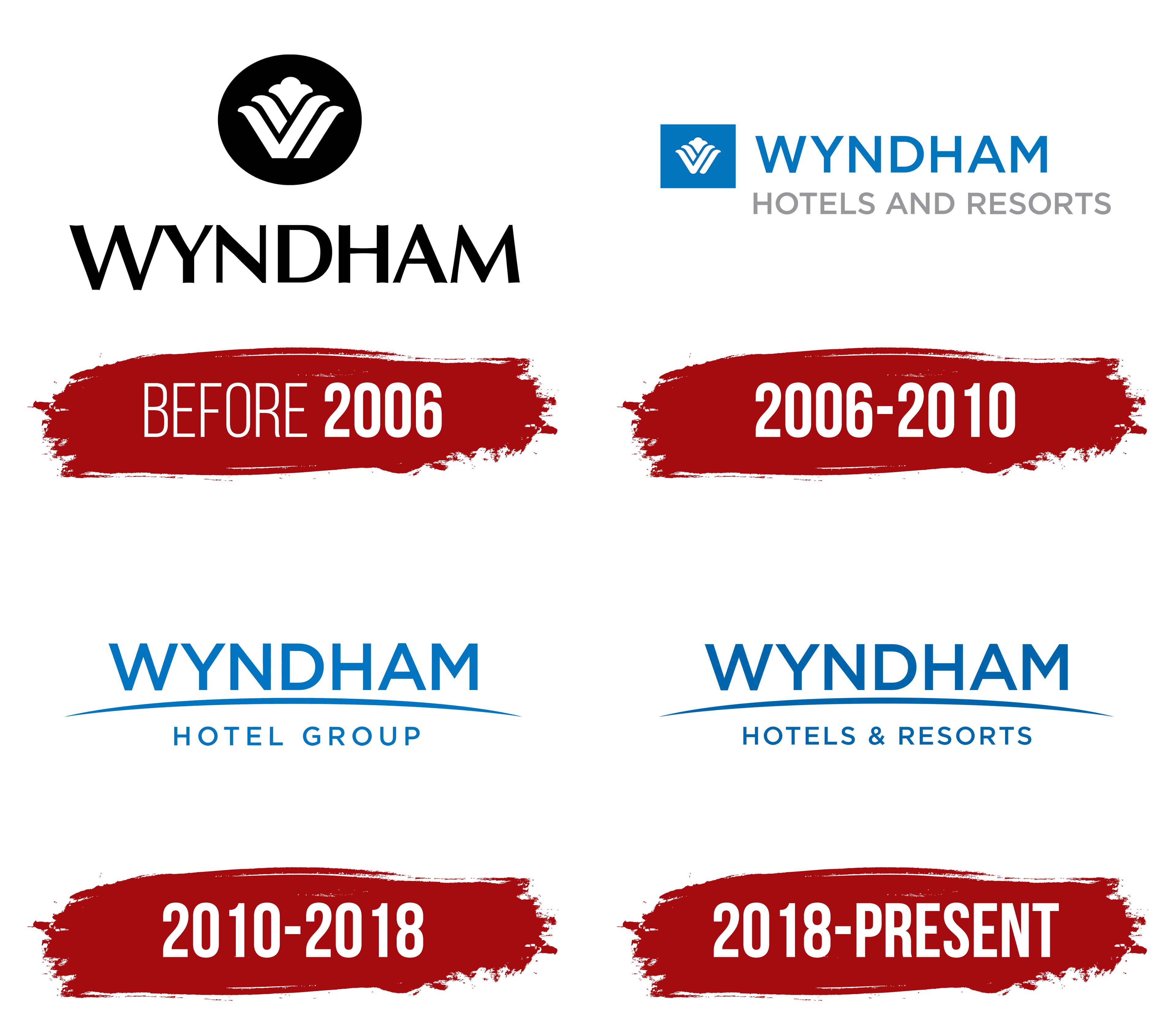
The early logo featured a black circular medallion above the name. The white “W” inside consisted of slanted ribbons with folded, rounded upper ends. The middle section rose above the sides and ended in a rounded, three-lobed shape resembling a flower. The upper portion of the emblem had flowing contours, while its lower lines retained the letter’s angular form.
Black WYNDHAM lettering appeared beneath the circle in closely spaced serif capitals. Thin strokes alternated with heavier ones, resembling Trajan or Perpetua. An enlarged initial “W,” sharp peaks on the “A” and “M,” and tight spacing distinguished it from the later geometric lettering.
2006 – 2010
After Cendant acquired the Wyndham brand in 2005, the hotel chain’s name became the basis for a new group’s name. Cendant split in 2006, and Wyndham Worldwide was established. Executive Stephen Holmes linked the change to Wyndham’s recognition among travelers. The familiar name brought different accommodation formats together under one brand.
That same year, the hotel logo adopted a horizontal arrangement, replacing the medallion above the wordmark. The decorative “W” remained but moved into a blue square to the left of two lines of lettering. The white letter consists of petal-like forms that widen smoothly toward the top and have soft terminals. Its middle section rises above the sides and ends in a rounded three-part shape resembling a flower. In the first version, the blue background became lighter near the upper-left corner. Later versions used a uniform blue fill.
Large blue WYNDHAM capitals appeared to the right. The upright sans-serif lettering had nearly uniform stroke widths and resembled Gotham or Avenir Next. Beneath it, a thinner gray HOTELS AND RESORTS line also used capitals. It identified the brand’s hotel business, while the blue square maintained continuity with the earlier decorative emblem.
2010 – 2018
A shallow blue arc became a shared motif in Wyndham’s two-line corporate logos. It was introduced in September 2010 at the first joint conference of Wyndham Worldwide’s hotel brands in Las Vegas. The new system was intended to coordinate the identities of the group’s divisions. For Wyndham Hotel Group, WYNDHAM appeared above the arc and HOTEL GROUP below. The upper word used large, upright sans-serif capitals. The lower line was smaller, with wider letter spacing. The arc rose toward the middle, thickened there, and tapered at the ends, separating the two levels of lettering.
The Wyndham Hotel Group corporate logo represented the collection of hotel chains. The Wyndham brand continued to use the decorative “W” emblem during this period. This distinction separated the group’s name from the hotel brand.
After the hotel business became an independent public company and adopted the Wyndham Hotels & Resorts name, the arc appeared in the corporate logo with a new HOTELS & RESORTS line beneath it. WYNDHAM remained at the top, with a curved blue line extending beneath it across almost the full width of the design. The lower letters were thinner and smaller. The main lettering resembled Gotham or Montserrat Bold. The brand blue was specified as Pantone 2144 C, with #016FB7 for screens.
2018 – today
The hotel business’s separation into the independent Wyndham Hotels & Resorts in 2018 changed the lower line of the corporate logo. The large blue WYNDHAM lettering and arc beneath it remained. HOTELS & RESORTS replaced HOTEL GROUP, spelling out the new company’s full name. The ampersand replaced “AND” from the earlier hotel brand logo.
The Wyndham name also appeared in the group’s individual chain logos. In April 2018, 12 brands, including Super 8, Days Inn, and Ramada, began using “by Wyndham.” Traveler research had revealed low awareness that they belonged to the same company. The additional line connected the hotels to Wyndham and the Wyndham Rewards program while preserving each chain’s own emblem.
Siegel+Gale worked on the shared system. The designers determined the placement and size of the endorsement for different logo formats. Senior Manager Melissa Brown, branding specialist Nora Bradshaw, and Associate Creative Director Krista Oraa discussed the project on the agency’s behalf.