When creating the Blackstone logo, the designers chose a minimalist approach to reflect the company’s seriousness in the financial services industry. Bold simplicity is an appropriate characteristic for the logo used by one of the largest American investment companies. Despite the uniformity of colors and structural elements, this symbol serves as an important visual component of the brand.
Blackstone: Brand overview
Meaning and History
Stephen A. Schwarzman and Peter G. Peterson named the company Blackstone as a tribute to their names. The first half of the name comes from the word “Schwarz,” which means “black” in German to English. The second half was inspired by the word “Peter,” which translates from Greek as “stone.” The designers sought to represent these elements in a minimalistic logo with black and white letters to create a recognizable brand. The understated style conveys elegance, professionalism, and seriousness – qualities important for a company offering investment services.
What is Blackstone?
Blackstone is a New York-based company specializing in investment management. It also provides other financial services, including insurance and lending. The company’s business covers investments in commercial real estate, industrial, telecommunications, healthcare, entertainment, and more. The company was founded by Stephen A. Schwartzman and Peter G. Peterson in 1985.
1985 – 2011
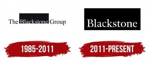
The logo originally contained the full name of the company, “The Blackstone Group.” The central word is colored white and placed within a large black rectangle resembling a solid block. This geometric shape is obviously a reference to the word “stone.” The words on either side, in contrast, are black and placed on a white background. All parts of the inscription are in a single font: a contrasting serif font with thin elongated serifs.
2011 – today
In 2011, the wording was shortened to simply “Blackstone”. Julia Gorlovetskaya was responsible for the rebranding, and Chris Sowersby was responsible for the typography. As a result, the typeface remained virtually unchanged, except for a few details. The word remains white and is still enclosed in a black rectangle, but now it is positioned slightly higher so that the letters do not touch the bottom edge of the geometric figure.
Font and Colors
Chris Sowersby designed a serif typeface for the Blackstone logo, combining elements of the Chronicle, Caslon, and DTL Haarlemmer typefaces. The resulting elegant serif typeface includes diagonal, vertical, horizontal, and rounded strokes.
White lettering in a black rectangle is easy to perceive and remember. This versatile color scheme can fit into a variety of contexts, which is important for an investment firm.


