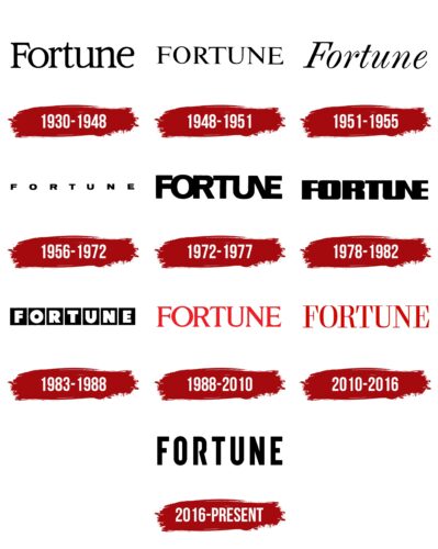
The Fortune logo is restrained and strict. However, it is not devoid of a certain flair and a hint of mystery. The emblem seems to invite one to peek into the world of numbers and discover information hidden from all, understandable and accessible only to the chosen ones.
Fortune: Brand overview
| Founded: | 1929 |
| Founder: | Henry Luce |
| Headquarters: | New York City, New York, U.S. |
| Website: | fortune.com |
Fortune is a business media brand about banking, finance, and economics. It consists of a monthly print magazine, published 14 times a year, and a daily updated website. The magazine was founded during the Great Depression by the writer Henry Robinson Luce, who had by that time already launched Time Inc and was publishing the weekly Time. Currently, the media outlet belongs to Thai businessman Chatchaval Jiaravanon. The magazine’s headquarters are located in New York.
Meaning and History
The logos of the publication are word-based, indicating print media. The title as a logo helps to focus the reader’s attention on the main thing. Therefore, the symbol is easily remembered. Despite being only one word, Fortune’s logos are very diverse. Each rebranding is a new font, size, letter thickness, and color. The only constant is the meaning – information for the business-minded and wealthy. Rebrandings reflected the magazine’s understanding of its mission. They conveyed changes in the editorial views and the transformation of the business society itself.
What is Fortune?
It is a monthly business magazine in America that generates well-known indexes: Fortune 500, 1000, and Global 500. From there, the world learns about the largest successful companies—every business person dreams of making it into this ranking. The publication appeared in 1929 and is in line with giants such as Forbes and BusinessWeek. Fortune Media Group Holdings publishes the magazine with a circulation of about 850,000 copies.
1930 – 1948
The logo appeared a few months after the magazine’s foundation – in the first issue of February 1930. It was the title. The refined, elegant letters with serifs seemed to draw a portrait of the educated business circle of that time. The letters are placed close together to convey the solidarity of wealthy people who knew each other and communicated only with representatives of their circle.
The publication was intended for the upper class, and the name was chosen accordingly. Interestingly, in English, the word has several meanings: luck, happiness, condition, and wealth. Therefore, the name exudes business acumen and a hint of romance and adventure. No wonder the media stood out for its artistic style of narration, rich illustrations, and beautiful design. According to the founder, the magazine was meant to outline production’s growth and industrialization vividly. Business matters were covered by young poets and journalists, not experts.
On the cover of the first issue, they depicted the Roman goddess of luck, Fortuna, after whom the name was chosen.
1948 – 1951
1948 the founder revised the magazine’s mission, defining it as “defending free enterprise.” The magazine’s logo changed its font to a lighter and freer one. The method reflected the mission. The new emblem also showed the media’s narrow focus and, at the same time, the most complete information on the subject. The extension of the inscription horizontally hinted at a wide audience coverage: by the 40s, about 500 thousand readers were subscribing to the magazine, and its income exceeded half a million dollars.
1951 – 1955
In 1951, the magazine drastically changed the style of its logo to a more romantic and artistic one, which more clearly reflected the high style of the publication. At this time, the media employed only white men, predominantly from Ivy League universities. The style of the articles was somewhat ornate and designed for highly educated people. The emblem was a slightly inclined inscription, which reflected the aspiration for development and change. The script spoke of great attention to the personalities of the authors. Famous journalists, artists, and photographers often made articles, covers, and photos for the newspaper.
1956 – 1972
1955 the magazine first published the Fortune 500 list, which was a huge success. From that moment on, the ranking was compiled regularly. The logo of the period consisted of small capital letters placed at a great distance from each other. The choice conveyed the growing importance of the publication for business. Each symbol, like a separate company, which took its place in the well-calibrated rating of success.
1972 – 1977
The emblem drastically changed, gaining slender tall, and bold glyphs. The symbols were placed so close together that the main lines for N are served by the side glyphs U and E. Special attention is paid to “UNE,” which in French is an indefinite article of the feminine gender, which has an important meaning. It was in 1972 that the first female CEO appeared, who headed one of the companies included in the Fortune 500 rating. This became an important historical event in matters of gender equality.
1978 – 1982
The magazine switched to biweekly releases. The increase in demand for the publication was demonstrated by the bold, large letters of the logo, the most full of all the previous ones. These years became the peak of Fortune’s popularity.
1983 – 1988
The Fortune logo received a completely new style. Each letter of the name was placed inside a black square. This approach hints at a chess game, which resonates with the construction of logical chains necessary for business conduct. The publication seemed to comment on business matches on its pages, revealing the steps of corporations and explaining their causes and consequences.
1988 – 2010
In 1988, negotiations were underway for the merger of Time Inc., which owned the magazine, and Warner Communications. The absorption further expanded the possibilities of the parent publication. In anticipation of a breakthrough, the Fortune logo was changed and, for the first time, received a color other than black.
Red, tall, and slim letters represented the publication as a media outlet with the hottest news. The emblem reflected the vivid style of publications, the popularity of the company’s ratings, and worldwide fame. The magazine occupied nine offices in the US, Europe, and Asia.
2010 – 2016
From 2009, the publication reduced its frequency to once every three weeks. At the same time, the letters of the name acquired a more aristocratic and elegant look. The dark cherry color and new font highlighted the age of the publication. They indicated the value of the information that readers could glean. The changes were intended to draw attention to the newspaper to increase circulation.
2016 – today
The magazine got a new owner – Meredith Corporation. With its arrival, the logo changed again. Black slim letters without serifs made the emblem more modern. The inscription reads restraint and dignity, necessary for a financial-themed magazine.
The corporation owned the publication for a short time and, after 1.5 years, resold it to Chatchaval Jiaravanon.
Font and Colors
Black corresponds to the color of typographic ink. The shade is close to the theme of calculations and columns with numbers. It most succinctly reflects the business world, which requires sobriety of mind and a minimum of emotions.
The font is reminiscent of Double Porter 5, but the open glyph R makes the inscription unique. The publication seems to open the secret door to the business world slightly and communicates valuable and unique details. The choice of font speaks of a change in style from artistic to more businesslike and restrained. Each inscription letter is visible, promising understandable reports and accurate, precise data.
Fortune color codes
| Black | Hex color: | #000000 |
|---|---|---|
| RGB: | 0 0 0 | |
| CMYK: | 0 0 0 100 | |
| Pantone: | PMS Process Black C |


