


 Super 8 Logo PNG
The modern Super 8 logo differs significantly from the original. In the stylish identity introduced in 2018, three key aspects stand out, each playing an important role in creating the logo’s overall unity. The hotel chain’s name takes center stage, but the other elements are no less significant; they add informational value and emphasize the grandeur of the “Super 8” brand.
A distinctive feature of the new logo is its bright, memorable color scheme, which stays true to the American company’s traditions. Only three primary and one additional color are used, making the logo concise yet expressive. White shadows the letters and the number “8,” creating a 3D effect and adding visual depth. This color scheme links the emblem to the network, which manages over 2,900 properties.
Ron Rivett and Dennis Brown founded Super 8 in Aberdeen, South Dakota, in 1974. Rivett had noticed a shortage of clean, comfortable, low-cost lodging during his travels. The first 60-room motel charged $8.88 per night, which gave the chain its name. Franchising became the expansion route, with new properties opening in small towns and along major highways.
By the end of the 1970s, Super 8 operated more than 100 motels, largely across the Midwest. The network reached 200 properties in 1981 and 300 in 1984. Hospitality Franchise Systems acquired the chain in 1988 and later became part of Cendant, bringing added management and development resources. The format remained centered on clean rooms, comfortable beds, and hot showers at low rates.
International growth began in 1993 with an opening in China. By the late 1990s, Super 8 operated more than 1,000 motels in North America and had a growing presence in Asia. During the 2000s, Cendant financed property upgrades and service changes. After the group split in 2006, the brand joined Wyndham Worldwide, and it opened its 2,000th hotel in 2008.
A refurbishment program followed during the 2010s. The 2016 “See You on the Road” relaunch introduced redesigned rooms, new bedding, and added amenities, followed by a 2018 advertising campaign. Cleaning and safety rules were revised in 2020 and 2021, while digital booking tools were improved in 2022. By 2023, the network included more than 2,800 properties across several countries.
Meaning and History
What is Super 8?
This affordable motel chain has become a staple of American road trips and budget travel. Recognizable by its red-and-yellow sign, the chain offers basic accommodations at hundreds of locations across North America. The company attracts budget-conscious travelers with clean rooms, free Wi-Fi, and breakfast. It is preferred for truckers, drivers, and families seeking inexpensive places to stay along highways and in small towns. The chain has tried to improve its services by updating breakfast menus and modernizing room decor while remaining an affordable option for budget travelers.
1973 – 2008
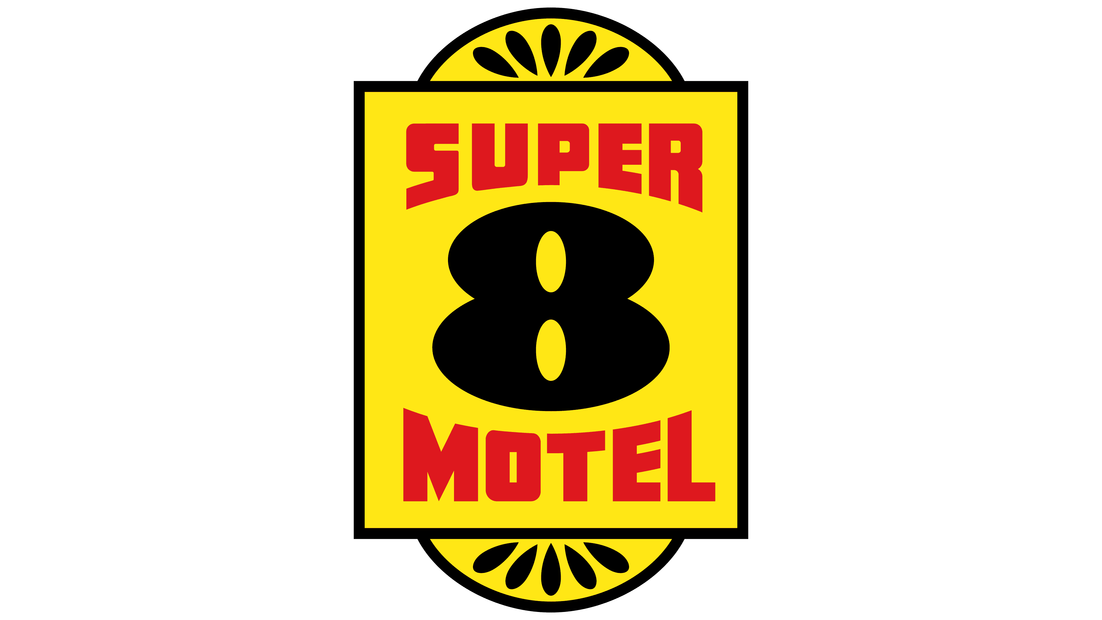
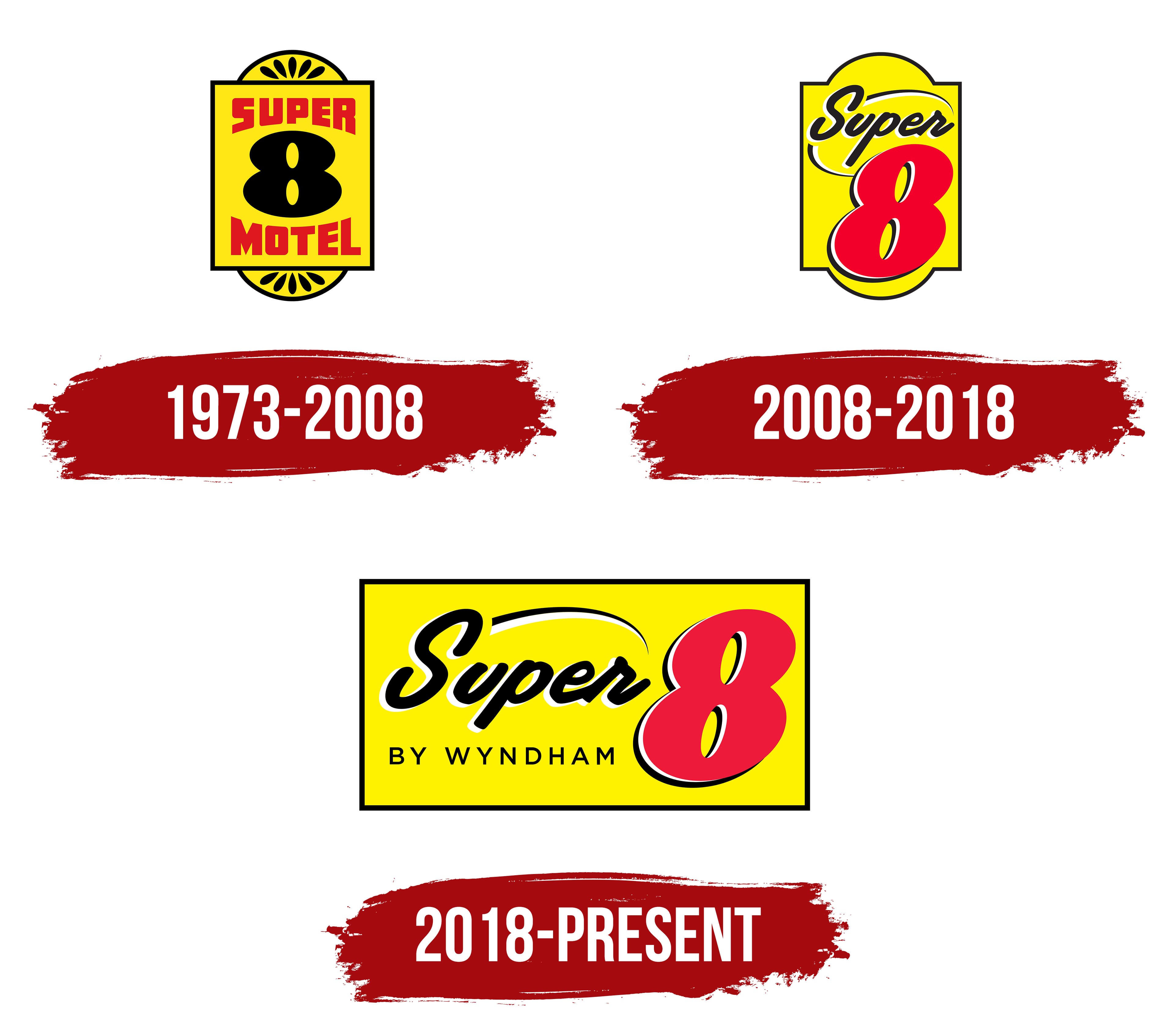
The “Super 8 Motel” company was founded in 1973 as a continuation of a marketing campaign Dennis Brown created a year earlier. The logo, introduced in the same year, embodied two key aspects of the brand. At that time, symbolism dominated the identity, and the logo was designed as a sign reminiscent of an address plaque or a house entry sign. This unconventional, original form gave the logo a unique charm, but its main advantage was its ability to convey significant information. At first glance, the logo clearly read as motel-related.
The company name, further emphasized by a distinctive frame, underscored this. The logo’s inner background was yellow, while the letters stood out in red. This color combination relied on contrast, making the logo easy to remember. At the center of the composition was the number “8,” rendered in black. The number was not chosen at random; it reflected the motel chain’s room rental cost of $8.88. Thus, the logo symbolizes affordable lodging at an attractive price, highlighting the value for customers.
2008 – 2018
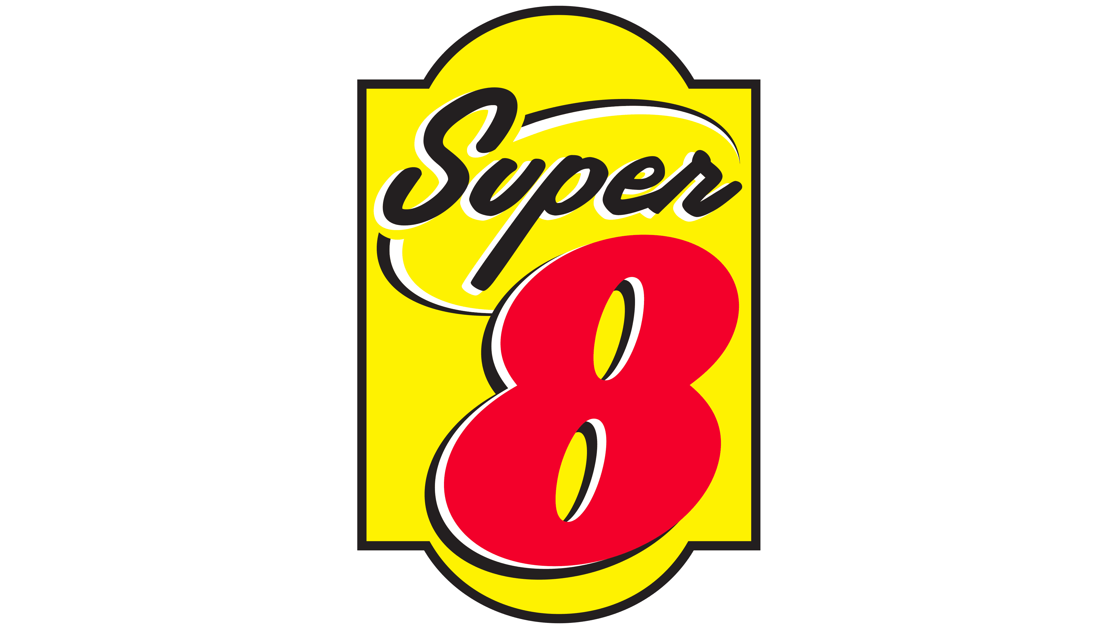
In 2008, the Super 8 logo changed, becoming more elegant and refined. The bright, original design of the previous period gained more graceful contours. The sign-like outline now resembles a vertical rectangle with rounded corners, giving the logo a sophisticated look. Every element in the new logo design was deliberately chosen. The number “8” was shifted to the bottom-right corner, and the rounded addition at the bottom of the outline created a dedicated space for it. Now, the number is rendered in red, starkly contrasting with its previous version.
The logo’s background retained its brightness and sunny nature. Yellow remains a key element, symbolizing joy and pleasure, making it an ideal choice for a hotel chain. The word “motel” was removed, and the text now consists solely of “super,” emphasizing the brand name.
The logo has a tangible sense of movement, as if it is gliding across a surface. Neat, symmetrical black semicircles with white outlines create this effect. Highlights and sharp contours add depth, making it feel grand and majestic while underscoring its growth and stability.
2018 – today
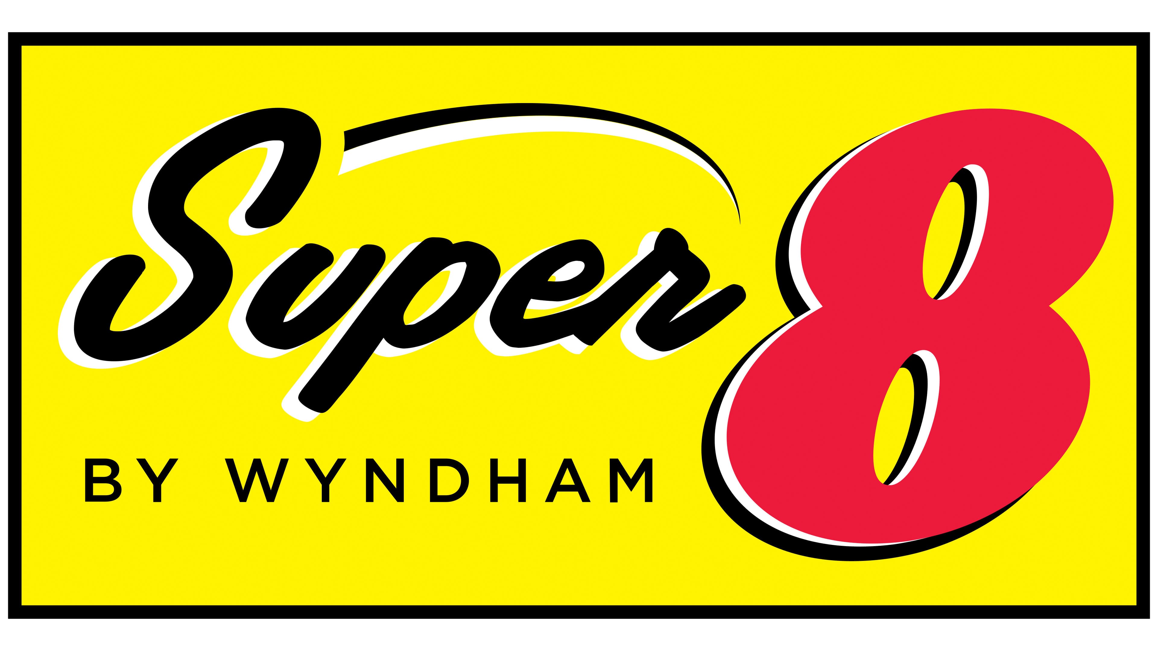
In 2018, the traditional sign-like outline disappeared, giving way to a new design approach focused on change and innovation. A new element replaced the familiar shapes: a horizontally placed triangle. Its outline is framed in black, and the inner space is filled with bright yellow, serving as the background for the emblem’s key elements. Elegant letters and the familiar number “8” stand out against this smooth, uniform background.
The text is rendered in bold black italic font. The word “Super” is centered horizontally in the logo, slightly shifted left to create space for the prominent number “8.” The eight appears massive and dominates the background. Its rich red color adds significance, while the white outline brings elegance and highlights its prominence.
At the bottom of the logo, the phrase “By Wyndham” shines beautifully and indicates the parent company. The phrase is set in a clean, shadowless font, with capital letters that stand out. It consistently draws attention and complements the logo’s overall harmony while emphasizing the brand’s connection to its originator.