The Hilton logo is a model of self-sufficiency and satisfaction of all customer needs. Each visitor will receive everything and even more. Impeccable service, cleanliness, and order are enclosed within the frame of the emblem.
Hilton: Brand overview
| Founded: | May 31, 1919 |
| Founder: | Conrad Nicholson Hilton |
| Headquarters: | McLean, Virginia, U.S. |
| Website: | hilton.com |
Meaning and History
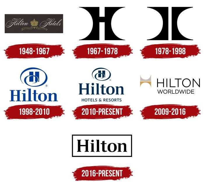
The corporate logo has been constantly modified, as has the hotel chain it represents. In the end, the two structures split, each with a custom logo. In total, there are seven options for personal identification.
What is Hilton?
It is an international hotel chain that includes over 5,100 hotels and resorts located in 103 countries worldwide. It has existed since 1919 and is owned by Hilton Worldwide. It is headquartered in McLean, Virginia.
1948 – 1967
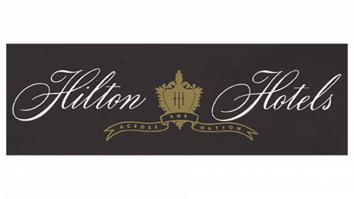
The emblem with a black rectangle located horizontally belongs to this time. It contains a shield-shaped heraldic sign that resembles a heart surrounded by ornaments. Two cursive inscriptions are visible to the right and the left of it: “Hilton” and “Hotels.” The words are written in a coherent handwritten script in the Old English style – with ornate curves and thin, graceful lines. A curly ribbon flutters at the bottom of the golden shield.
1967 – 1978
In 1967, the company switched to a discreet logo presented in a strict form. After the redesign, the hotel chain has a concise version based on the capital “H.” The authors stylized them by proposing an original solution in the form of one large letter with thickened legs, which have elongated upper and lower parts. It looks like two arches, turned on its side and connected in the middle by a thin crossbar.
1978 – 1998
Over time, the central bridge was removed to make the sign more stylish and original. The result of this process is reflected in the laconic logo consisting of only two elements. The designers left the color, size, and shape the same.
1998 – 2010
At the end of this period (in 2009), there was a separation of professional interests and the status of the two structures of the same name. One of the brands was renamed Hilton Hotels & Resorts, while the other remained with the former Hilton Worldwide. At this time, the predominant logo was made in the form of a single letter “H” with a twisted thin spiral and bold “Hilton” inscription at the bottom. The letters are elongated, with large serifs.
2010 – today
A version with minimal changes is currently in use. The authors strengthened the blue color, slightly rounded the letters near the “Hilton” caption, reduced the serifs, and added the phrase “Hotels & Resorts” at the bottom.
2009 – 2016
After the section, the second brand that owns the franchise received the original 1978 logo in an updated version. The developers turned the arched elements over at an angle of 90 degrees. An interesting interpretation has come out with thin stiletto legs, which at the same time resembles a gate and a crown. The upper part is painted silver; the lower part is gold. On the right side, there is a two-line “Hilton Worldwide” lettering. It is done in a sleek, chopped typeface.
2016 – today
Following the visual simplification concept, the company owners approved a radically different option: the name in the frame. The logo looks very laconic and has similarities with its version of the same name – they have the same serif letters.
Hilton: Interesting Facts
Hilton is a big name in the hotel world, famous for its great service and innovative ideas.
- Beginnings: Conrad Hilton bought his first hotel in Texas in 1919, and the first official Hilton hotel opened in Dallas in 1925. This started Hilton’s journey to becoming a worldwide hotel empire.
- Industry Pioneers: Hilton introduced many new things to hotels, like putting TVs in rooms in 1947 and creating a system in 1948 that let guests book rooms from anywhere.
- Innovations: Hilton keeps bringing new ideas to the table. They started a Hilton Honors loyalty program, allowing frequent guests to earn points for free stays. They also use technology to make staying at their hotels easier, like digital check-ins and using your phone as your room key.
- Luxury at the Waldorf Astoria: The Waldorf Astoria in New York City, opened in 1931, is one of Hilton’s most luxurious hotels. It’s famous for hosting celebrities and royalty and shows Hilton’s dedication to luxury.
- Worldwide Presence: Hilton has hotels in 103 countries, offering everything from extended stays to luxury resorts, fitting different travelers’ needs and budgets.
- Eco-friendly: Hilton is working on being more sustainable by trying to cut its environmental impact in half and double its social impact by 2030. This includes reducing emissions and waste, saving water, and using responsible sources for food and materials.
- Giving Back: In 1944, Conrad Hilton started a foundation that donates to causes worldwide, such as safe water, ending homelessness, and helping children affected by HIV/AIDS.
- A Part of History: Hilton hotels have been the site of many historical and cultural events. For example, John Lennon wrote “Imagine” at the Hilton New York, and The Beatles held their first US press conference in 1964.
- Hilton Honors Program: With over 100 million members, the Hilton Honors program offers free Wi-Fi, late check-out, and access to unique experiences.
Hilton has come a long way since its early days. It leads the hotel industry with a focus on quality, innovation, and positively impacting the world.
Font and Colors
Despite the recent bifurcation, logos share a common history and external similarities. The updated icon was created with the participation of a contract graphic design studio. She was in charge of the font. Moreover, the redesigned emblem is intended for hotels that opened after 2010. The rest can use the previous version. A thin curl surrounds the letter “H” in the logo, and the curled line completely replaces the central bar. Also, the phrase “Hotels & Resorts” has been added in the upper case.
Two types of typefaces are used in the emblem. The first is the Whitney SemiBold, a sans serif designed by Tobias Frere-Jones. The second is reminiscent of the Walbaum BQ Medium from the type designer Günter Gerhard Lange. Their feature is the wide “H.” The letters in the inscription are located freely, at a distance from each other.
A color scheme is extremely important for a hotel chain because it must be practical, austere, trusting, and attractive at the same time. The owners experimented with various combinations: black, white, blue, dark blue, golden, gray, they combined with a dark, then with a light background.
FAQ
What is the slogan of the Hilton?
The Hilton slogan is “It Matters Where You Stay.” This phrase stresses the importance of picking the right place for your stay. It shows that Hilton meets the specific needs of its guests, whether for business or leisure.
The slogan shows commitment to quality accommodations and service. It assures guests that their hotel choice will improve their travel experience.
What are the five pillars of Hilton?
Hilton’s five pillars are Hospitality, Integrity, Leadership, Teamwork, and Ownership. These core values guide the brand in delivering exceptional experiences and maintaining high standards.
Hospitality: the brand is committed to delivering exceptional guest experiences, making guests feel valued and cared for during their stay.
Integrity: The company strives to do the right thing in all situations, reflecting a dedication to ethical practices and honesty.
Leadership: The brand aims to lead the industry and communities, setting high standards, innovating, and positively impacting.
Teamwork: The company values the power of teamwork, emphasizing collaboration and working together to achieve common goals.
Ownership: The company promotes taking ownership of actions and decisions among employees.
These pillars form the foundation of culture, helping the brand maintain its reputation as a leading hospitality provider.
What does the Hilton logo mean?
The logo represents the hotel chain’s name. It features a clean inscription in a geometric serif font, giving it a professional and elegant look.
The logo has an emblem with two vertical rectangles inside an oval ring with a curl. The rectangles symbolize stability and structure, key qualities for a trusted hotel. The oval ring with a curl adds a touch of sophistication and continuity, showing a commitment to guest satisfaction.
The Hilton logo combines a refined font with a unique emblem to reflect the brand’s.
What hotel brands does Hilton own?
The company owns 17 hotel brands, catering to different travelers and experiences.
- Waldorf Astoria offers luxury accommodations and exceptional service.
- Hilton Garden Inn provides affordable, comfortable lodging with reliable amenities for business and leisure travelers.
- Canopy by Hilton focuses on fresh and comfortable stays with a local touch in design and services.
- LXR Hotels & Resorts offers luxury experiences in unique locations with personalized services.
- Homewood Suites is designed for extended stays, with spacious suites and full kitchens.
- Embassy Suites by Hilton provides all-suite accommodations with complimentary breakfasts and evening receptions.
- Curio Collection by Hilton is a portfolio of unique hotels offering authentic local experiences.
- MOTTO by Hilton is a micro-hotel brand providing efficient stays in prime city locations.
- Tapestry Collection by Hilton features upscale, original hotels with a unique sense of place and style.
- Hampton by Hilton is a budget-friendly brand known for clean, comfortable rooms and free hot breakfasts.
- Signia by Hilton focuses on meetings and events with premium amenities and spaces.
- Conrad Hotels & Resorts offers modern, stylish accommodations with personalized service.
- DoubleTree by Hilton is known for its welcoming atmosphere and warm chocolate chip cookies at check-in.
- Home2 Suites by Hilton is an extended-stay brand with flexible room configurations and eco-friendly features.
- Hilton Grand Vacations offers vacation ownership with luxurious resort-style accommodations.
- Tru by Hilton is a midscale brand with modern design and social spaces appealing to younger travelers.
- Hilton Hotels & Resorts is the flagship brand offering a wide range of full-service hotels and resorts.
These brands help serve a wide range of customers, from budget-conscious travelers to those seeking luxury experiences.
Is Hampton Inn part of Hilton?
Yes, Hampton Inn is part of the Hilton International System. It is one of the brand’s most recognized and widespread hotel chains. Known for its budget-friendly prices and high standards of comfort and service, the company is a popular choice for travelers.
The company offers clean, comfortable rooms, complimentary hot breakfast, free Wi-Fi, and a welcoming atmosphere. It has become Hilton’s largest long-term residential facility, making the brand a reliable option for travelers worldwide.
Is Hilton considered a luxury?
The company has many hotels for travelers, including those looking for luxury. The brand includes both simple, traveler-oriented hotels and high-end luxury hotels.
Hilton’s luxury offerings include Conrad and Waldorf Astoria hotels. Conrad Hotels & Resorts offers modern, stylish accommodations with personalized service. Waldorf Astoria represents the peak of luxury and is known for elegant accommodations, exceptional service, and iconic locations.
These luxury brands ensure guests seeking premium experiences have options that meet their high standards. The range of budget-friendly and luxurious accommodations makes it a versatile brand for many preferences and needs.

