


 Great Wolf Lodge Logo PNG
The Great Wolf logo conveys the idea of large resorts where everything is provided for a comfortable and carefree stay. These complexes are designed so guests do not need to leave the hotel grounds. The emblem symbolically reflects this, hinting at a “wolf paw,” as if it left its mark on the design and style, emphasizing the uniqueness and individuality of each resort.
Great Wolf Lodge began in 1997, when brothers Jack and Andrew “Herbie” Schindler and Mark Scharenbroch opened Wisconsin Dells in Wisconsin. Known at first as Black Wolf Lodge, the resort combined a hotel with an indoor water park and was built for year-round family travel. It had 117 rooms and a 20,000-square-foot water park, a format that helped the founders expand beyond the first property.
In 2001, the company changed its name to Great Wolf Lodge, using a theme tied to northern forests and wildlife. The second resort opened in Sandusky, Ohio, in 2003 with a 33,000-square-foot water park. In 2004, the company listed shares on NASDAQ, raising capital for growth. In 2005, new resorts opened in Niagara Falls, Ontario; Williamsburg, Virginia; and Kansas City, Kansas, bringing the concept to Canada.
The brand added MagiQuest in 2006, an interactive adventure game that extended guest activity outside the pools. A West Coast resort opened in Grand Mound, Washington, in 2007, and the 2010 Concord, North Carolina property became one of the largest in the chain, with 402 rooms and an 80,000-square-foot water park. In 2012, Apollo Global Management acquired the company for $798 million.
Centerbridge Partners bought Great Wolf Lodge in 2015 and continued the expansion plan. The first resort outside North America opened in Gyeonggi-do, South Korea, in 2016. Later projects included the Minnesota resort in 2017, the Great Wolf Adventure Park in 2018, openings in Arizona and Illinois in 2019, Northern California in 2021, and planned resorts in Texas, Florida, and Perrysburg, Ohio, through 2023.
Meaning and History
What is Great Wolf Lodge?
It is a chain of family resorts known for its themed rooms and indoor water parks. The company specializes in creating an enjoyable atmosphere for families with children, offering a distinctive vacation experience that combines hotel and entertainment. Each resort has large indoor water parks with slides, pools, and water play areas. In addition to water rides, there are fun family activities, including miniature golf, bowling, ropes courses, arcade games, and interactive entertainment such as MagiQuest. The resort’s many guest rooms are furnished with furniture reminiscent of cozy cabins or wolf dens, and the entire establishment’s design is in the rustic Northwood style. The brand has become a family vacation destination thanks to its all-inclusive package, which caters to all age groups.
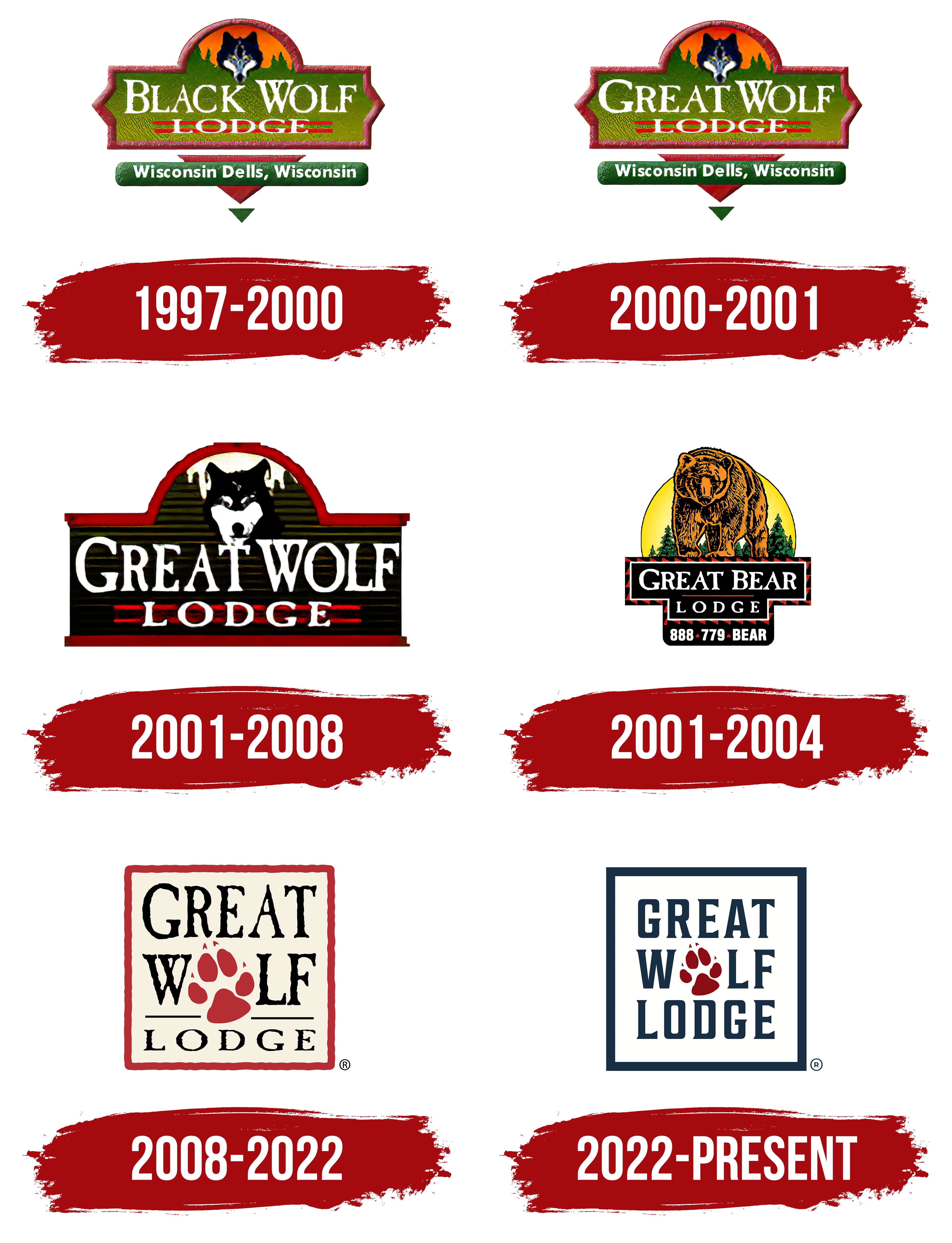
1997 – 2000
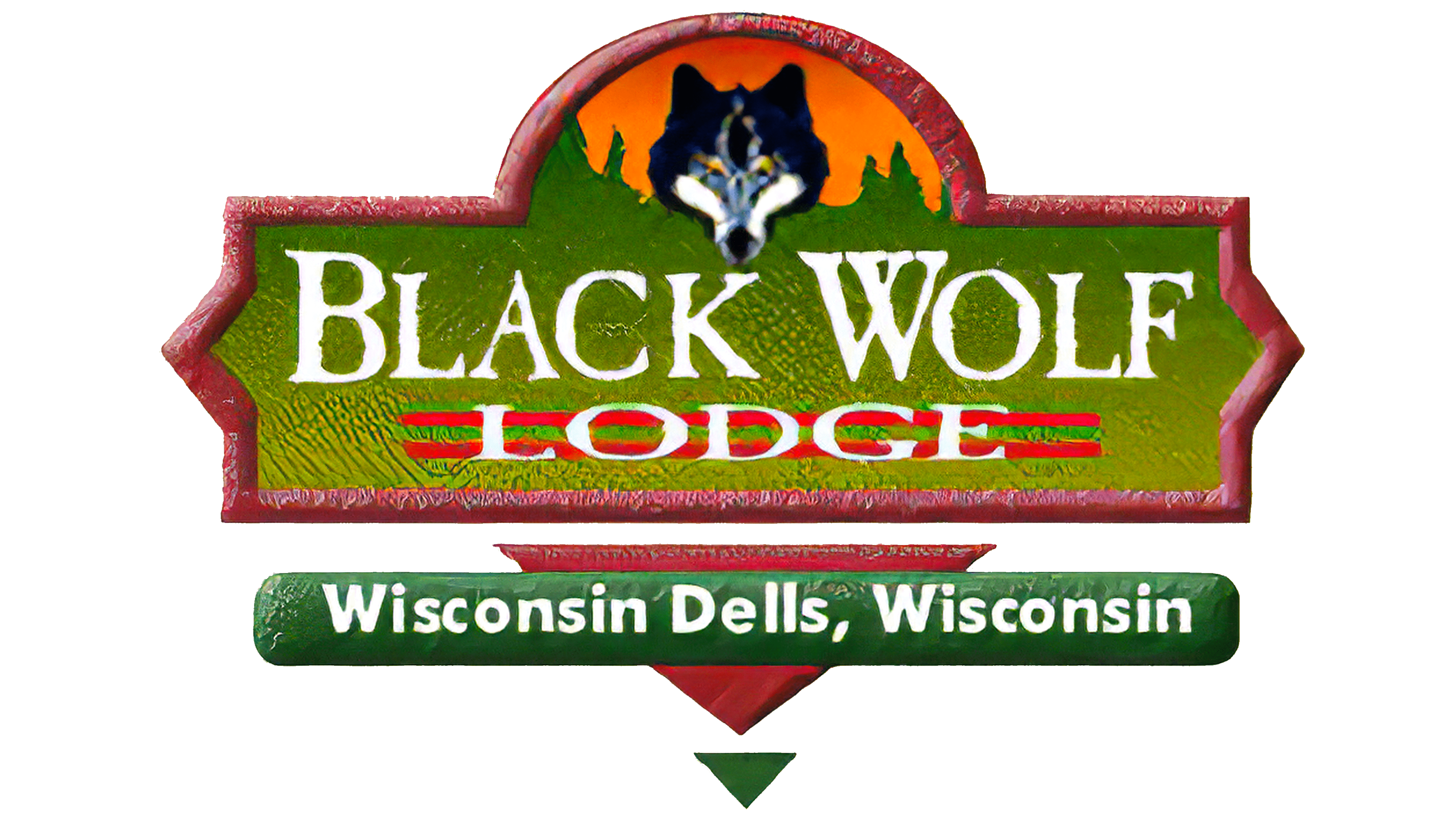
The first Great Wolf logo was closely tied to the water park opened in Wisconsin Dells. The logo’s design is based on the theme of unity between nature and humans, reflecting elements of the state’s scenic green landscapes.
The company’s main symbol, the head of a black wolf, is at the top of the emblem against the backdrop of a setting sun. The wolf was likely chosen because many of these predators once inhabited the state. The brand’s name and emblem convey the spirit of the wilderness, freedom, and untamed strength associated with Wisconsin’s forests and nature.
Beneath the wolf image, the tops of spruce trees are visible, symbolizing the forested areas. The rest of the emblem is greenery, emphasizing the natural surroundings. The elements of the image transition into a sign resembling a wooden roadside marker, with the brand name written in white letters. The white color symbolizes the establishment’s novelty and highlights the attractions’ safety.
The composition is unified by a red, three-dimensional border that frames the sign and the sun, adding visual integrity to the logo. At the bottom, two triangular markers indicate the resort’s location. The city and state names are displayed on the green background of one of the triangles, highlighting the brand’s connection to the specific region and its natural features.
2000 – 2001
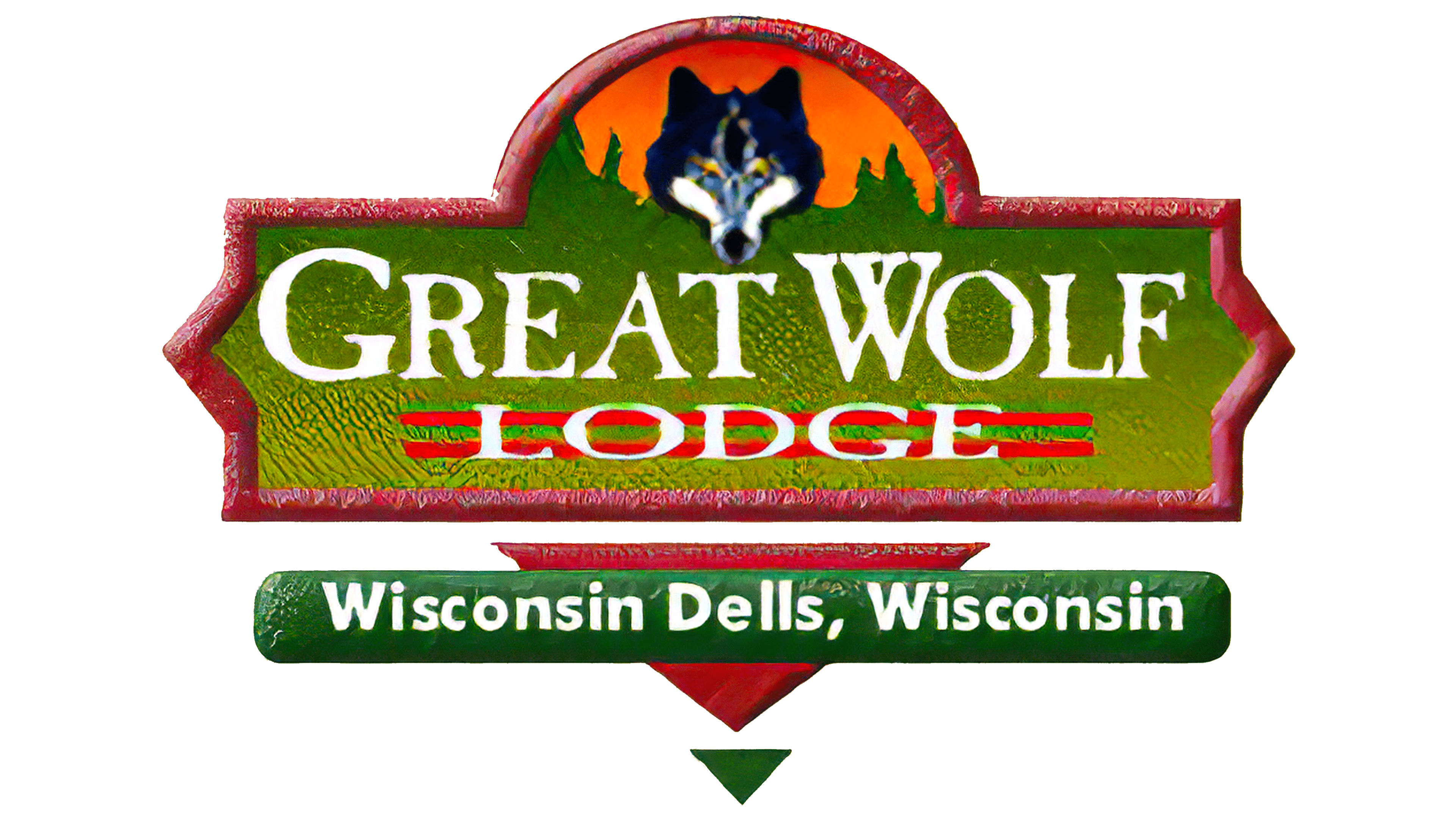
The Great Wolf Lodge logo, introduced after the water park’s renaming in 1999, retained the previous emblem’s overall composition and color scheme but was adapted to fit the brand’s new name. At the center of the logo is the name “Great Wolf Lodge,” written in white font that contrasts with the rich green background. This contrast highlights the significance and prestige of the new name, which has become synonymous with exceptional family vacations.
The logo is framed with a red border, giving the emblem boldness and brightness. The red color symbolizes the energy and passion the company invests in creating unique vacation experiences for its guests. The top of the logo features an image of a wolf’s head against a backdrop of a setting sun. The wolf symbolizes leadership, strength, and protection, reflecting the company’s ambition to lead the water park and family vacation industry. The forest silhouette in the background reinforces the connection to nature and adventure, creating an atmosphere of seclusion and a sense of connection to the natural world.
The lower part of the logo contains a location inscription, “Wisconsin Dells, Wisconsin.” This element highlights the brand’s historical connection to its original location, which became the foundation for the resort chain’s further development and growth.
2001 – 2008
During its expansion phase, the brand revised its logo, making it more rugged and focused on the “wolf” theme. The color palette was changed to black, white, and red, giving the logo strength and a sense of drama. The green forests were replaced with black ones, symbolizing the night and wilderness.
The logo’s background was extended upward, increasing the prominence of the lettering and the wolf’s head image, thereby emphasizing the chain’s growth and expansion. Wolf images and statues began to dominate the interior design of the establishments, creating a unique atmospheric setting that enhanced the feeling of connection with the wilderness and adventure.
2001 – 2004
The logo for the second establishment in the chain, named Great Bear Lodge, was designed to reflect similarities with the “wolf” emblem while emphasizing its uniqueness. This time, the focus is on the bear, depicted much larger and in full. The bear stands on a base that also serves as its nameplate, resembling a black anvil, which highlights the animal’s strength and power.
In the background, a yellow sun rises above the spruce treetops. This emblem evokes a sense of harmony and grandeur, as if the king of beasts has ascended to the top of a cliff and stands still against the setting sun, surveying its domain. The logo conveys the strength and majesty associated with the bear’s natural power, underscoring the establishment’s prestige and authority.
2008 – 2022
In 2008, the brand’s emblem was completely redesigned. The new logo is a square that symbolizes entertainment complexes offering a wide range of services in one location. The red border and light yellow background create a sense of festivity and enjoyment.
The brand name is placed inside the square across three levels, emphasizing structure and organization. In the word “Wolf,” the letter “O” is replaced by a wolf paw print, adding uniqueness and reinforcing the wolf theme. Every design element of the establishment references the wolf, creating a cohesive and memorable brand image.
2022 – today
The Great Wolf Lodge logo and brand changed after the Blackstone Group acquired a stake in the company. One key change was an update to the logo’s color palette: the square’s red border was replaced with a dark blue one. This step emphasized the brand’s professionalism and seriousness, which is particularly important given its new owners.
The size of the brand name on the emblem was reduced, creating more pronounced spacing from the edges of the square. This design choice added a modern touch to the logo and symbolized room for future growth and expansion of the company. This change reflects confidence that the current successes are just the beginning, and the brand will continue to evolve and strengthen its market position.
All the letters of the name are capitalized and uniform in size, indicating a consistent standard across all the network’s locations. This decision communicates that customers can expect the same high level of service in any of the brand’s hotels.
Particular attention is drawn to the wolf paw symbol, now rendered dark maroon. This symbol has become iconic for the brand, representing the quality of service and unique atmosphere that Great Wolf Lodge offers its guests. The emblem’s composition, from its clean lines to its symbolism, highlights the brand’s commitment to staying a leader in the family-vacation industry and to creating unforgettable experiences for its guests.