


 Hyatt Regency Logo PNG
The Hyatt Regency logo combines multiple styles and motifs into a complex graphic composition, making it an original and worthy emblem. The main goal of this identity is to enhance the recognition and popularity of the hotel chain, which is known for its commitment to maximum comfort and first-class service. The unique visual symbol includes various elements, harmoniously blending different meaningful parts. It comprises several text blocks and an image, emphasizing the company’s individuality and reliability.
A minimalist approach is closely intertwined with a classic style, creating a special sense of unity. Elements of modern trends from different periods are also evident. The graphic components enhance the identity’s visual impact, adding greater expressiveness. This iconic logo reflects the company’s uniqueness and commitment to high standards, making it an important part of its identity.
Hyatt Regency traces its roots to 1957, when Jay Pritzker and his brother Donald bought the 13-room Hyatt House near Los Angeles International Airport. They saw growing demand from business travelers and tourists for better airport lodging. The brand took its defining form in 1967 with the opening of Hyatt Regency Atlanta.
Architect John Portman designed the Atlanta hotel around a 21-story atrium, a feature later associated with the chain. The chain expanded across major US cities, including Chicago, where the property opened in 1973 and became one of the world’s largest convention hotels. International growth began in 1980 with a property in Macau, followed by hotels in the Middle East, Asia, and Europe. New properties adapted the concept to local culture and architecture.
In 1981, the collapse of elevated walkways at the Kansas City property caused numerous deaths. It led to extensive safety reviews within the company and the US construction industry. During the 1990s, new hotels opened in Sydney, Tokyo, and Paris, while meeting facilities and business services became a larger part of operations.
In the 2000s, older properties received updated interiors, amenities, and technology as competition increased. The 2010s brought online booking, mobile apps, loyalty tools, and more personalized guest services. During the early 2020s, the chain introduced new hygiene protocols, flexible work areas, and expanded resort operations. By 2023, Hyatt Regency had more than 200 hotels worldwide.
Meaning and History
What is Hyatt Regency?
This is a well-known luxury hotel brand renowned for its blend of amenities for both business and leisure travelers. The hotels are typically located in key business districts, bustling cities, and popular resort destinations worldwide. Guests are offered spacious rooms, modern fitness centers, restaurants catering to all tastes, and large conference rooms for business events. A notable feature of the brand is the unique lobby designs with atriums, creating bright, open spaces for socializing and relaxation. Each hotel often reflects the region’s architectural or cultural motifs while maintaining the brand’s high standards for comfort and service quality.
1990 – 2013
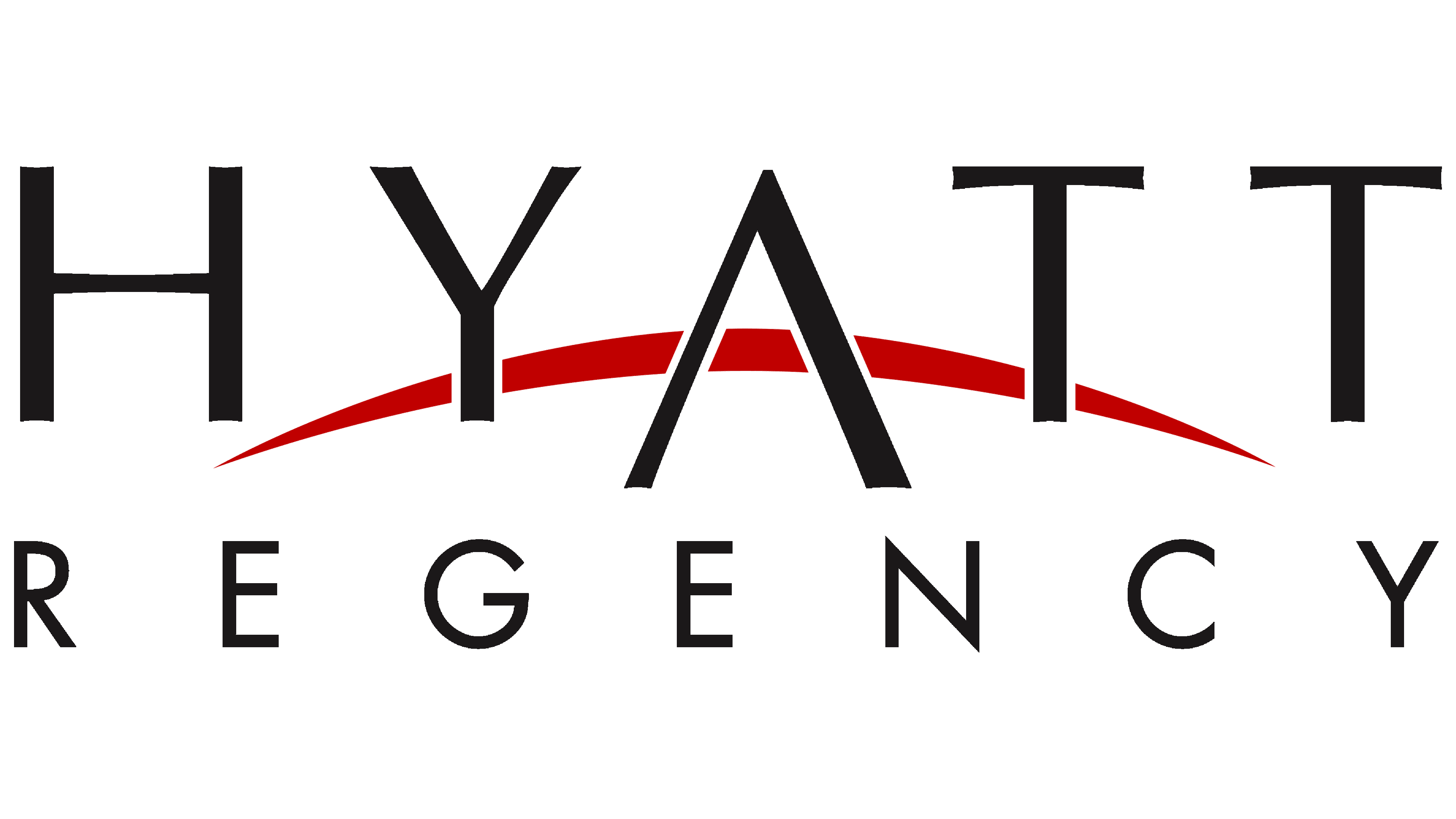
The original logo featured three key elements. The brand name was conventionally divided into two parts, visually expressed by placing the words in two rows rather than on a single horizontal line. This decision added a sense of scale and solidity, making the brand feel weightier. This approach helped create an impression of stability and foundation, which was especially important for strengthening the brand’s image.
The white background of the logo made the text more noticeable, while the bright red semicircle served as a focal point, drawing the viewer’s attention. The visual symbol appeared as a complex composition, where each element was part of a unified whole, allowing the audience to appreciate the scope of the company’s operations. Each year, the brand offered its guests more comfortable accommodations, reflected in the evolution of the logo. The classic tone highlighted the company’s focus on progress and its pursuit of excellence. The uniform letters, including the superscript, shaped the brand’s perception as a symbol of reliability and stability in all aspects.
A distinctive identity element was the sun, rendered in an unconventional form. It appeared as a semicircle, with a slightly rough outline, or possibly a crescent moon. The image, placed behind the text, could be interpreted differently, adding a layer of symbolism to the emblem. However, according to the designers’ vision, this red element represented the sun, a symbol of nature’s energy. In this context, it embodied Hyatt Regency’s forward-looking ambition, with the company seeing its brightness and success as essential to its journey ahead.
2013 – today
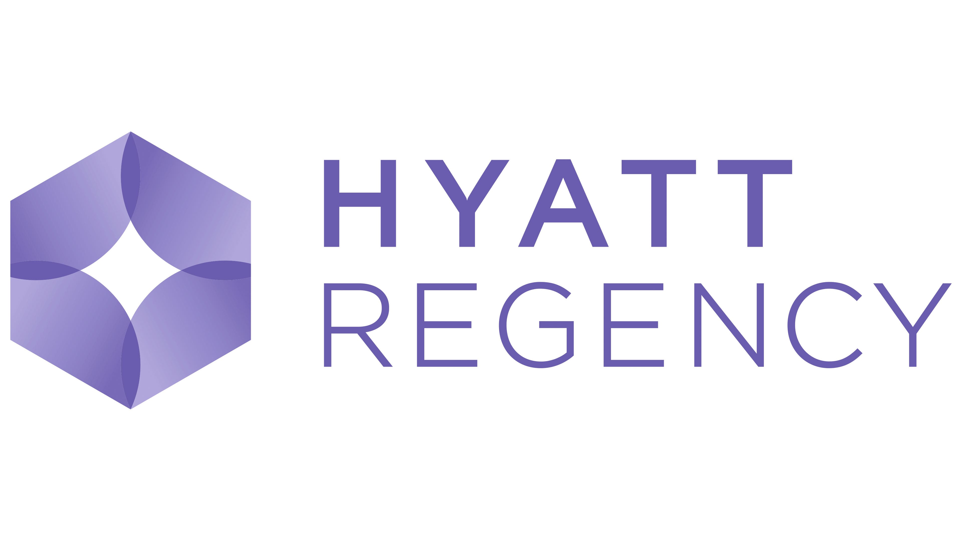
The modern Hyatt Regency logo differs from its predecessor. It feels like a new chapter in a popular series, reflecting new ideas and directions. A geometric shape on the right side of the text draws particular attention. Although it is not at the center of the composition, its role in the emblem is just as important. The hexagon, rendered in a gradient of purple shades, is the central element, creating a sense of scale and depth. This symbol is familiar to anyone who has visited the company’s hotels, as it evokes the brand’s well-known hall design and serves as an important identifier.
The purple color palette is also applied to the company’s name. The two words are presented in different shades, creating a sense of their separate existence. However, the multidimensionality of the color brings the two together, forming a cohesive perception. This design choice makes the logo more expressive and dynamic.
Often, logos consist of two words, and both elements are the same color and font. However, this visual sign breaks that mold. “Hyatt Regency” is divided into two parts with a clear contrast. The word “Hyatt” is displayed in bold font, giving it weight and importance, while “Regency” is shown in a thinner font. Both words are presented in large capital letters, emphasizing the status and authority of this international company. This graphic approach reinforces the brand’s reliability and strength.