


 Mercure Logo PNG
The Mercure logo embodies the sophistication of French style and a high level of service. It conveys the refinement and elegance that are integral traits of the brand. Mercure is a global hotel chain that prides itself on consistent quality standards and offers comfortable mid-range rooms worldwide. The emblem symbolizes stability and trust, emphasizing the company’s international presence and its ability to meet the needs of the most demanding clients, regardless of location.
Mercure was founded in France in 1973 as part of Accor, one of the world’s largest hotel operators. The brand was created for the mid-range hotel segment, with a focus on comfortable accommodation at reasonable prices. Its first hotel opened in Saint-Waast-la-Hougue, a small French town, where modern service was combined with a regional atmosphere that later became part of the chain’s identity.
During the 1970s, Mercure expanded across France and built a national network of hotels. The company maintained common service standards, while each property retained ties to its city or region. In the 1980s, the brand expanded beyond France and began opening hotels across Europe. In the 1990s, Mercure continued its international expansion, entering markets such as Brazil, New Zealand, and Australia.
In the 2000s, the chain modernized many hotels, updating interiors, guest services, and technology. In 2007, Mercure launched a franchise program, allowing local business owners to open hotels under the brand name while preserving each property’s individual identity. In 2010, the “Dédicaces” concept introduced hotel interiors and décor inspired by local history, lifestyle, and culture.
In 2013, Le Club AccorHotels was launched and later renamed ALL – Accor Live Limitless, covering Accor brands including Mercure. In 2015, the chain opened its 700th hotel worldwide. In 2017, the “Local Stories” campaign focused on the connection between each hotel and local customs. From 2018 to 2023, Mercure grew in China, India, Vietnam, Indonesia, and Southeast Asia, while adding digital concierge services, smartphone check-in, online booking tools, upgraded meeting spaces, hybrid event technology, and expanded loyalty features.
Meaning and History
What is Mercure?
It is a hotel chain brand owned by the French international hotel chain Accor. Known for its diverse selection of hotels, the company offers both leisure and business travelers cozy accommodations with a distinctive local flavor. Each hotel is designed to capture the personality and culture of its location, offering guests an authentic experience while maintaining high-quality standards. Well-appointed rooms, on-site restaurants and bars, conference facilities, and other location-appropriate amenities are hallmarks of the company’s hotels. The brand has become a reliable option for travelers seeking local flavor and unfailing comfort. This makes them more personalized than budget hotels and accessible to many people.
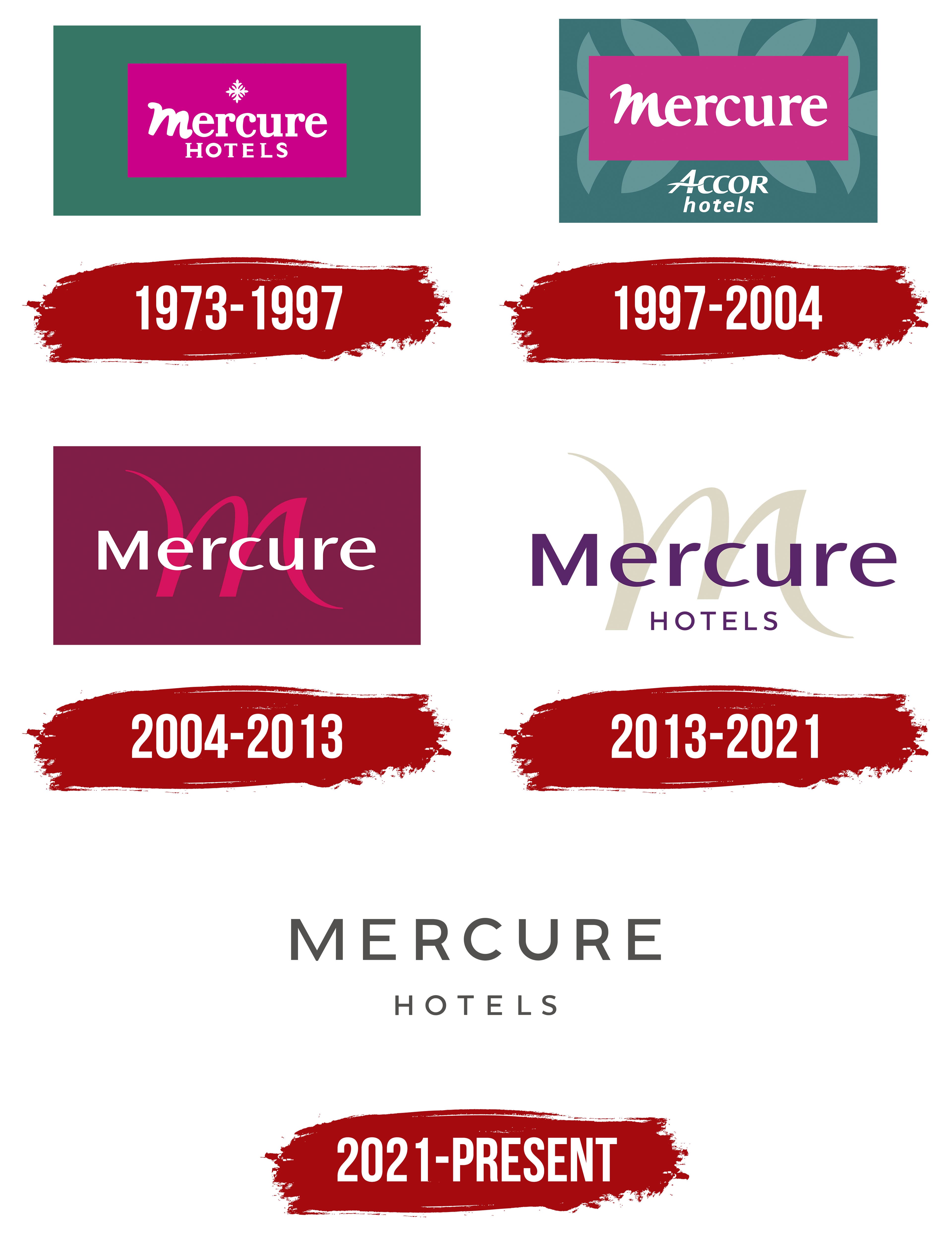
1973 – 1997
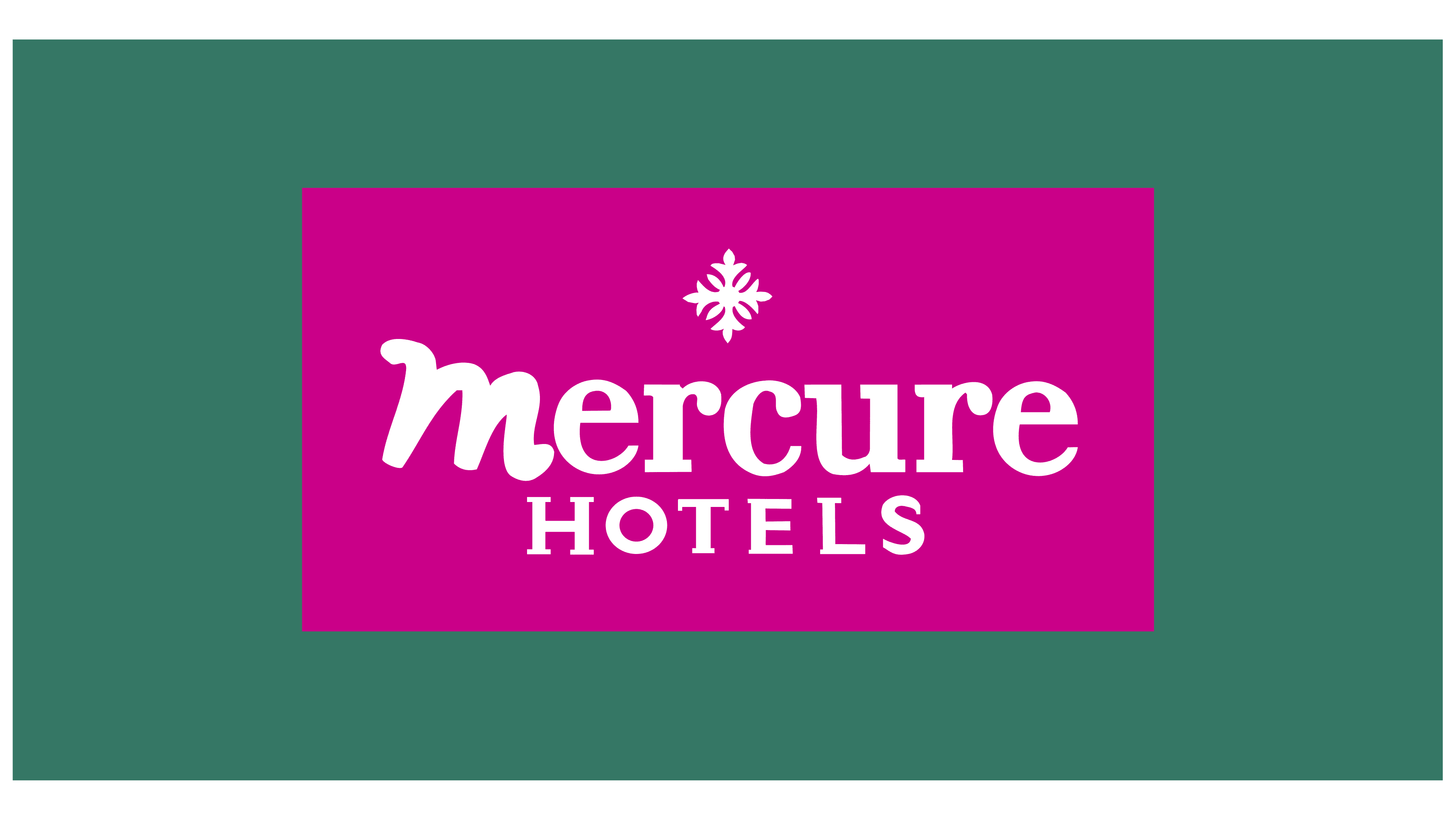
A distinctive feature of the network’s first logo is two overlapping rectangles. The outer rectangle is green, symbolizing tranquility and the use of natural materials in the hotel designs. The inner magenta rectangle highlights attention to detail and luxury, emphasizing the high level of service.
At the center of the logo is the white “Mercure” inscription. The first letter is large and slightly tilted, creating an elegant bow that underscores the brand’s respectful attitude toward guests. Below the main name is the descriptor “hotel,” indicating the brand’s industry.
Above the name is a white snowflake with perfectly measured geometric lines and patterns. The upper elements of the snowflake resemble French lilies, evoking royal symbolism and hinting at service at the royal level. The snowflake represents the ideal, portraying the hotel as the pinnacle of its field.
The snowflake symbol is associated with winter, evoking warmth and comfort that contrasts with the cold. The dual background emphasizes the comfort and pleasant atmosphere awaiting guests at every hotel in the network.
1997 – 2004
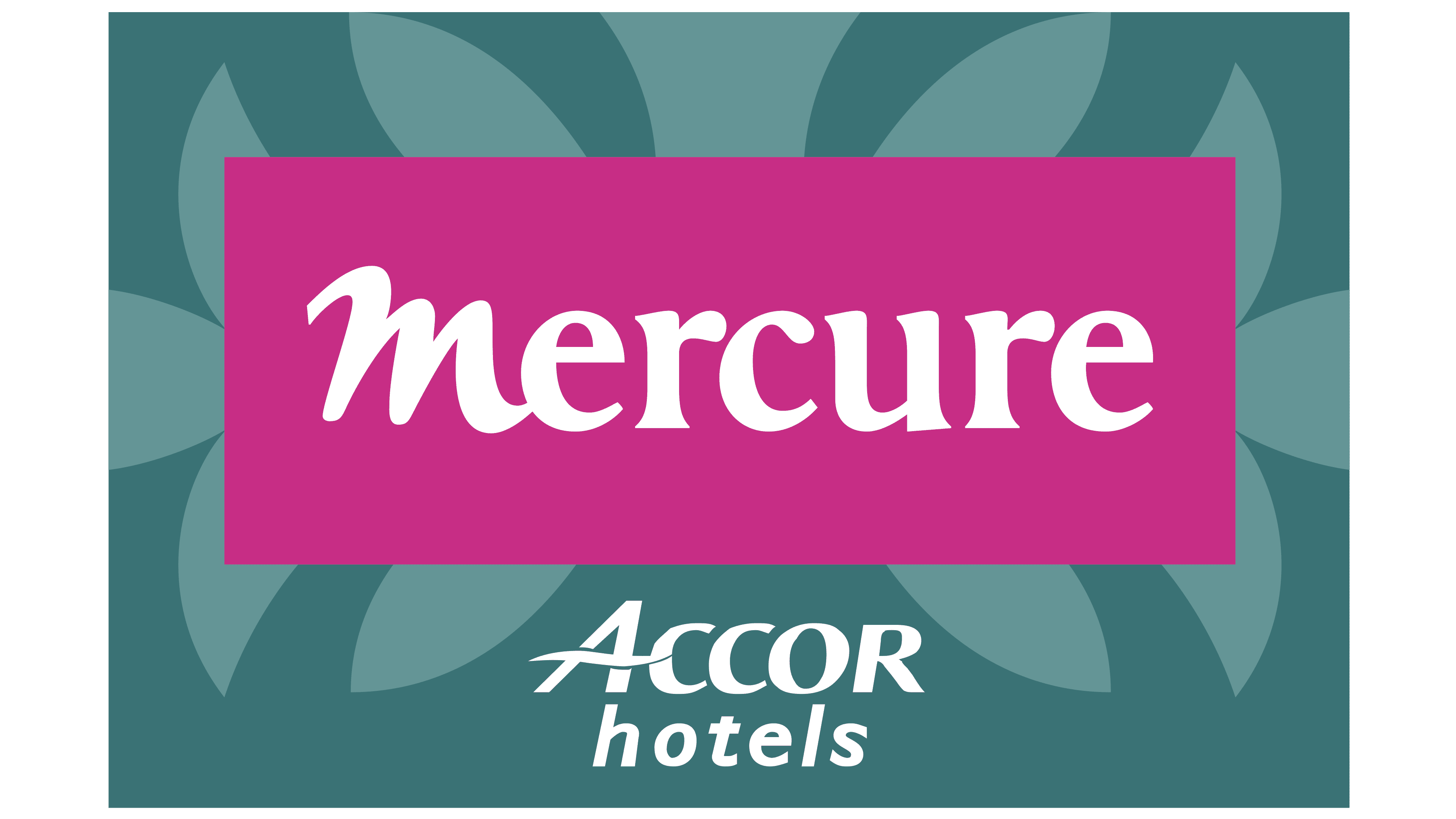
After entering the international market, the logo was updated to mention Accor, a company well-known on the global stage. This addition gave the brand additional weight and emphasized the parent conglomerate’s high service standards.
The logo’s green background was adorned with plant motifs, adding a French charm and evoking the fabric wall coverings found in the chambers of old nobility. This element emphasized the connection to tradition and highlighted the hotel’s refined interior design.
Inside the narrow magenta rectangle, only the name “Mercure” remained, emphasizing simplicity and elegance. The logo’s design and color scheme reflected French style, attention to detail, and the commitment to creating an atmosphere of comfort and luxury for every guest.
2004 – 2013
The logo adopted a more progressive style while retaining its French charm. The dark purple background and magenta “M” reflect the brand’s elegance and confidence. The sharp glyphs give the emblem a bold and modern appearance, and using a single initial emphasizes the unique style of the hotel room designs.
The brand name is written in white letters against the background. The font, with refined, extended glyph endings, makes the text expressive and distinctive, complementing the design’s sense of exclusivity. This logo showcases the company’s commitment to standing out from competitors while remaining faithful to tradition and incorporating modern elements.
2013 – 2021
After the parent company’s CEO changed, the brand revisited its visual identity, creating a new logo reflecting its updated strategy. The brand moved away from heavy background shapes in this logo, symbolizing a shift from old traditions towards modernization and lightness.
The refreshed image’s central element is a large sand-colored “M” that represents stability, reliability, and a connection to the earth. The letter flows smoothly, creating a sense of continuity and symbolizing the brand’s growth and dynamism. The sand color adds warmth and coziness, evoking the comfort and hospitality of the company’s hotels.
The purple brand name “Mercure” is displayed in the foreground in an elegant, modern font, emphasizing its premium quality and refinement. The purple color signifies luxury, creativity, and sophistication. Below the name is the inscription “Hotels,” highlighting the brand’s main focus and global presence.
The new emblem conveys a sense of space and freedom, a concept aimed at providing guests with quality service and an experience of ease and comfort.
2021 – today
Following modern trends and the styles of fashionable French brands, the company updated its style by introducing a new logo. It reflects the brand’s pursuit of minimalism and elegance, characteristic of French design.
The emblem consists of a dark gray inscription with smooth, straight letters. The font emphasizes the company’s seriousness and professionalism, creating a sense of reliability. Below the brand name is a thin “Hotels” signature in a smaller font, highlighting the company’s primary business area.
One of the key design elements is the use of space between the letters. This choice creates a sense of openness and expansion, symbolizing the brand’s growth and global presence. The company is actively opening new hotels worldwide, and this logo also reflects its confidence in the future.
The choice of dark gray for the text was likely deliberate. Dark gray is associated with elegance, stability, and the highest quality standards. This underscores that Mercure provides its clients with consistent, dependable service they can rely on anywhere in the world.
The new Mercure emblem reflects current design trends and the company’s vision to grow and expand its global presence.