


 Embassy Suites Logo PNG
The Embassy Suites logo embodies elegant luxury and a commitment to sustainability and green technologies. This symbol represents the comfort of spacious rooms and high service standards, making every guest feel special, like royalty. The emblem highlights the harmonious blend of modern amenities and environmental responsibility, making stays at the hotels both enjoyable and eco-conscious.
Embassy Suites began in 1983, when Holiday Corporation, parent of Holiday Inn, entered the growing all-suite hotel market. The first property opened in Kansas City, Missouri, in 1984 with two-room suites, a separate living area and bedroom, cooked-to-order breakfast, and an evening reception. By the late 1980s, the chain had several dozen hotels near airports and major cities, serving business and leisure travelers.
In 1990, the brand and related assets moved into Promus Companies Incorporated, giving the hotel chain greater operating autonomy. During the 1990s, Embassy Suites modernized hotel layouts while keeping the two-room suite model. In 1999, Hilton Hotels Corporation acquired Promus Hotel Corporation, linking the chain to Hilton Honors and Hilton’s global reservation network.
International expansion began in 2001 with a hotel in Toronto, followed by properties in Mexico and the Dominican Republic. The atrium renewal concept appeared in 2007, the Make a Difference service program followed in 2009, and the lower-cost Design Option III prototype arrived in 2011.
By 2014, the brand operated more than 200 hotels and marked its 30th anniversary. It adopted the name Embassy Suites by Hilton in 2016 and introduced E’terie Bar & Grill in 2018. From 2020 to 2022, cleaning standards and guest services changed while openings and renovations continued. By 2023, the network had grown to more than 250 hotels across several countries.
Meaning and History
What is Embassy Suites?
This luxury hotel chain within the Hilton network offers business travelers and tourists unique hotels with spacious two-room suites where guests can enjoy separate living and sleeping areas for maximum comfort and privacy. One of the brand’s distinctive features is a complimentary breakfast, including made-to-order omelets and other hot dishes. The evening reception with free drinks and snacks promotes relaxation and guest interaction. Many of the chain’s hotels are designed with an atrium, creating a sense of openness and space, often with water features or lush greenery in the interior.
1984 – 1989
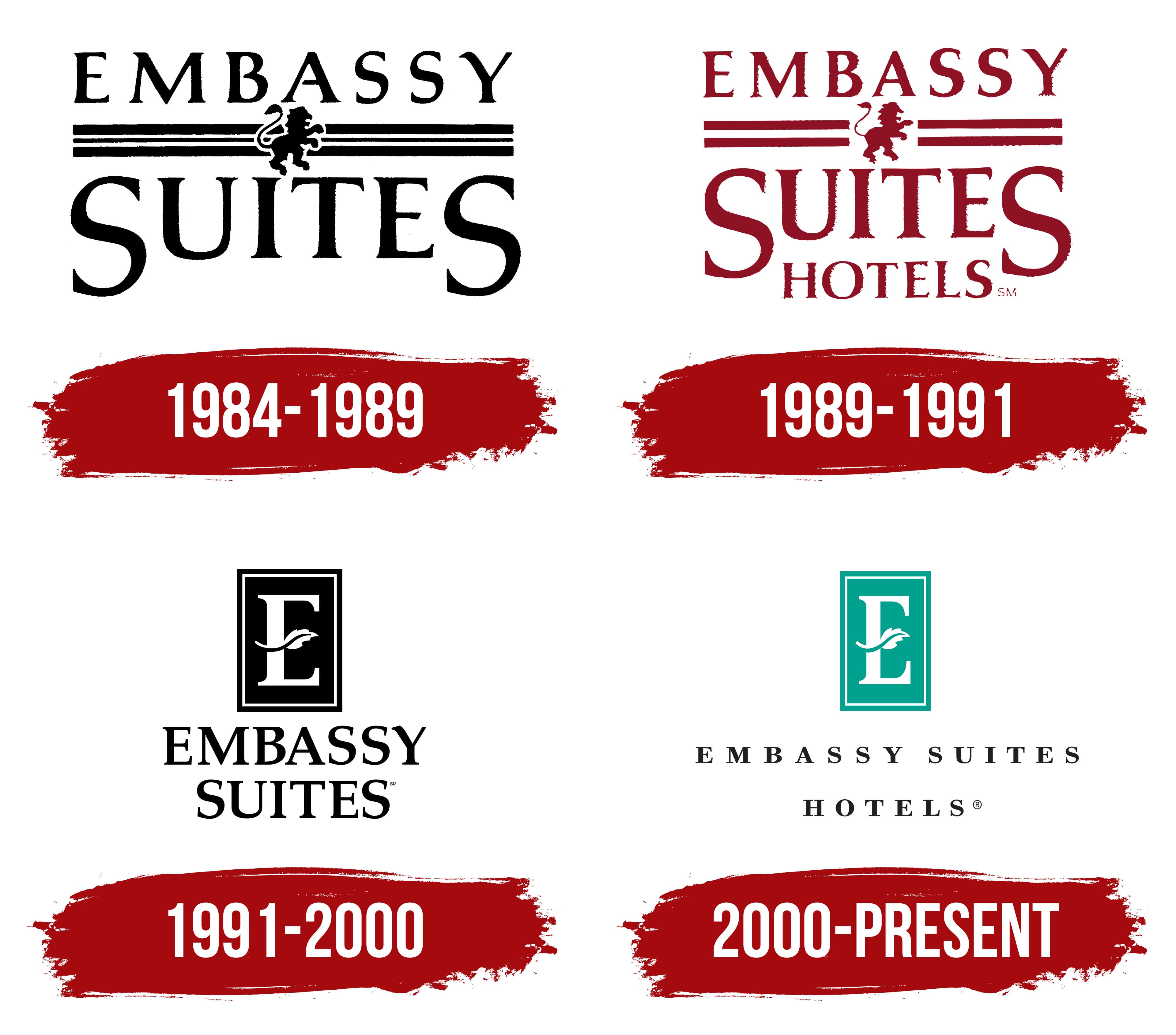
The first Embassy Suites emblem is designed with true royal grandeur, reflecting the company’s high level of comfort. The design style emphasizes the brand’s coziness and luxury. The name is arranged on two levels, symbolizing the two-room suites, a distinctive chain feature. Embassy Suites provided guests with larger rooms than traditional hotels, creating a sense of space and freedom, like being at home.
The logo design resembles luxurious drapery, reinforcing associations with royal luxury. “Embassy” is written in a strict, straight font, symbolizing stability and reliability. In contrast, “Suites” is written in a large, tiered font, with enlarged first and last letters, adding visual dynamics and elegance.
A ribbon stretches between the words, with a heraldic lion rampant in the center, a symbol of prestige, status, and high-quality service. This element highlights that guests can expect top-notch service, making their hotel stay unique and comfortable.
1989 – 1991
The overall design of the new emblem maintains continuity with the previous version, but the main difference lies in the carefully crafted small details that add elegance to the logo. The emblem is now rendered in burgundy, evoking associations with velvet and luxury, enhancing the brand’s premium feel. This deep shade of color emphasizes the status and exclusivity offered by the hotel chain.
The ribbon, which remains a key emblem, has changed: it now features fewer lines, making it more concise and restrained. Instead of being a separate element, the lion is now seamlessly integrated into the design, creating a sense of unity and completeness. This heraldic symbol continues to represent prestige and high-quality service.
The word “hotels” has been added to the bottom of the logo, clarifying the main type of services provided and drawing attention to the company’s field of activity. This small but significant addition makes the emblem more informative while preserving its refinement and luxury.
1991 – 2000
After acquiring Promus Companies Incorporated, the logo was updated to reflect the brand’s new approach and modern vision. At the top of the emblem, an elongated rectangle resembling a door was added to symbolize the entrance to a cozy, comfortable hotel room. At the center of this shape is the letter “E,” the brand name’s first letter, emphasizing its recognition and tradition.
The central bar of the letter was significantly changed, replaced with a curved oak leaf, a symbol of aristocracy and luxury. This botanical motif highlights the use of original wooden furniture and underscores the hotel’s eco-friendliness. The oak leaf adds elegance and hints at the company’s commitment to creating a nature-friendly atmosphere for guests.
The design also references an architectural feature, the atrium, in most of the chain’s hotels, which creates skylit spaces with greenery. This element underscores unique design solutions and emphasizes harmony with nature.
The network’s name is set at the bottom of the logo on two levels, with the previous serif font retained, maintaining the brand’s continuity and style while giving it a more modern, refined appearance.
2000 – today
A year later, the emblem was slightly transformed in color. The Embassy Suites logo now consists of a large white “E” symbol, surrounded by a green frame with a leaf wrapping around the letter. This creates associations with eco-friendliness, nature, and comfort. Green is often associated with nature and tranquility, highlighting the brand’s goal of creating a pleasant, relaxing atmosphere for its guests.
The logo’s font is strict and classic yet elegant. The text is written in black uppercase letters, making it easy to read and instilling confidence in the brand’s reliability. The hotel’s name emphasizes a businesslike, cozy focus, which is important for guests traveling for business or leisure.
Adding green and natural elements to the visual mark began as companies focused on sustainability, development, and environmental responsibility. This reflects global trends and the brand’s desire to attract modern customers who value comfort alongside environmental care.
The framed “E” symbol adds a sense of status and high class, aligning with the company’s level of service.