


 Days Inn Logo PNG
The modern version of the Days Inn logo reflects the company’s key principles and priorities. While it has evolved, it has retained its core meanings, adopting a unique style with each iteration. The latest brand identity transformation demonstrates a contemporary approach, with three key elements drawing attention. The first is the image of the sun, which is symbolic: the light represents the hotel chain’s growth, and its bright rays are associated with relaxation. This symbolism combines comfort, coziness, and warmth, suggesting that staying with the Wyndham Hotels group will always leave pleasant memories.
The hotel name, placed at the bottom of the emblem, appears to be illuminated by the sun’s rays, emphasizing the chain’s reliability, stability, and high level of service. The logo conveys a sense of safety and confidence that everyone will find a comfortable resting place.
The color palette, featuring blue, light blue, and white, creates a harmonious combination that reinforces associations with nature and relaxation. These natural tones add a sense of calm and freshness, reminding guests of the brand’s primary mission: to provide a comfortable, relaxing stay for all visitors.
Days Inn began in 1969, when Georgia developer Cecil B. Day planned a motel chain after struggling to find affordable family lodging in Florida. The first property opened on Tybee Island near Savannah in 1970 and charged $8 per night. By the end of that year, seven more locations operated along the Georgia coast, offering free coffee and newspapers.
Franchising started in 1972 under strict operating rules, and the network passed 60 hotels by 1974. In 1975, the Inn, Inc. concept added rooms designed for business travelers, while the 300th property opened in 1979. Canada became the first international market during the same year.
Day sold the company in 1984 to investors led by Richard Katz for $590 million. After acquiring Amerhost Inn in 1989, the chain exceeded 1,000 properties, but market pressure led to Chapter 11 bankruptcy in 1991. Hospitality Franchise Systems bought the brand in 1992 and later placed it under Cendant Corporation. A booking website followed in 1997 as the brand expanded into Europe, South America, and China.
Cendant’s hotel division became Wyndham Worldwide in 2006, followed by the Daybreak room-renovation program in 2008. The network exceeded 1,800 hotels by 2010, joined Wyndham Rewards in 2011, and adopted a new logo and interior format in 2015. After Wyndham split in 2018, the brand remained with Wyndham Hotels & Resorts. By 2020, it operated more than 1,700 hotels in over 25 countries, and expanded mobile and contactless services during 2021 and 2022.
Meaning and History
What is Days Inn?
This is a well-known budget hotel chain that offers affordable accommodations worldwide. Guests are provided with cozy, reliable lodging that appeals to budget-conscious business travelers and families on road trips. Many of the chain’s hotels offer free breakfast and free Wi-Fi, as well as mini-fridges and microwaves in the rooms. The “Daybreak” breakfast is a popular feature that helps guests start their day well.
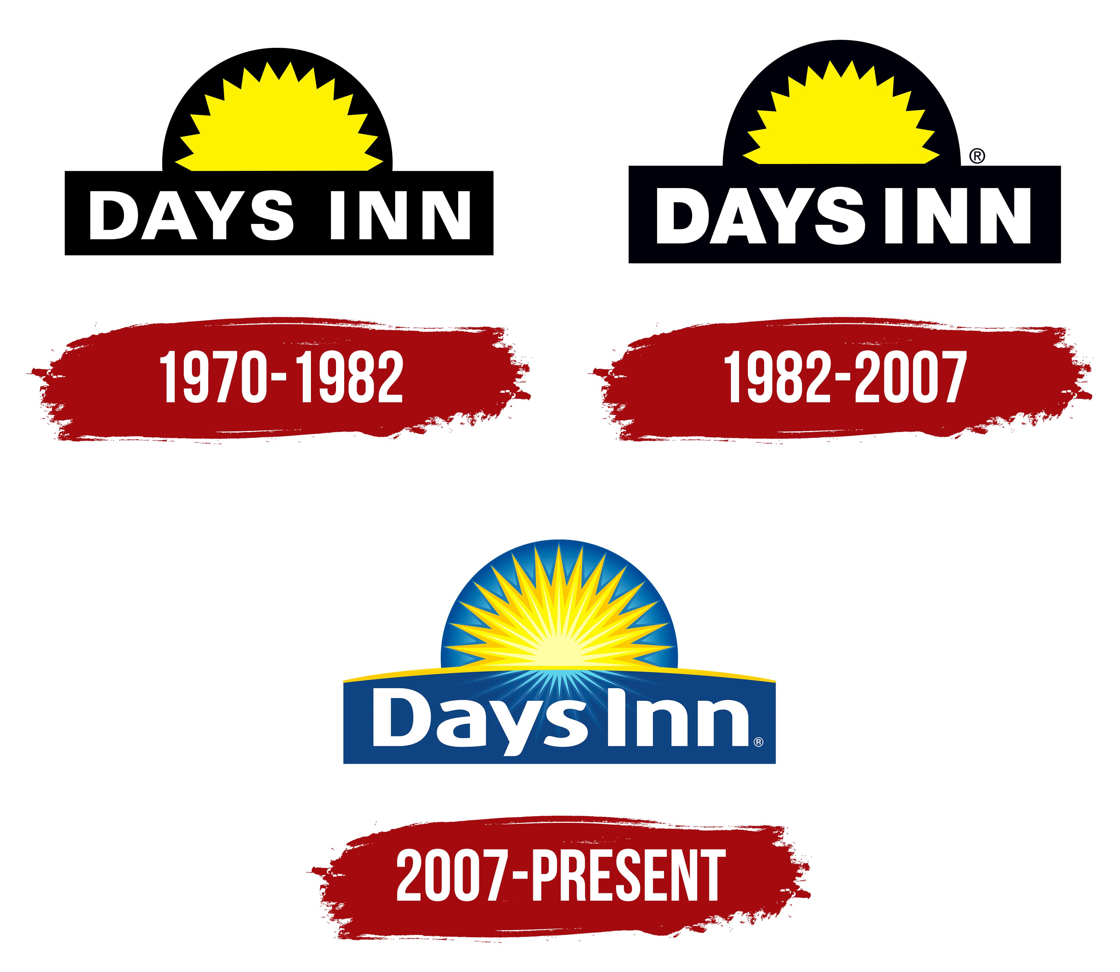
1970 – 1982

The first logo was introduced in 1970, and its primary purpose was to serve as an informational guide for potential customers. With just two words and three colors, the emblem conveyed the message: Days Inn guarantees a great stay for both travelers and frequent business commuters.
The text, displayed in large white letters, occupies the lower part of the logo. Above it, an image of the sun gently blends into a geometric shape. A black rectangle fills the background, creating contrast with the sun, and the entire composition is framed. This frame symbolizes the unity, completeness, and orderliness of all the elements, conveying a sense of harmony and wholeness that aligns with the brand’s promise of rest and reliability.
1982 – 2007

In 1982, the chain updated its brand identity, giving the logo a distinct individuality and style aligned with the company’s dynamic growth. The visual design became sharper and more memorable, reflecting the hotel chain’s ambitions.
The color palette remained unchanged. The three primary colors continue to emphasize the key aspects of the brand. Each plays an important role, providing aesthetic appeal and functional clarity to the logo. Bright yellow symbolizes radiance and growth, highlighting the brand’s continued expansion. It also evokes associations with relaxation and comfort, connecting the brand with the idea of providing convenience and ease for its guests.
The geometric shapes in the visual mark create a sense of balance and stability. The circle surrounding the sun smoothly transitions into a rectangle, symbolizing evolution and completeness. The bold white letters draw attention with clear expressiveness, almost magnetically holding the gaze and emphasizing the brand’s seriousness and reliability.
2007 – today
The Days Inn hotel chain logo, introduced in 2007, symbolizes the brand’s revival and growth. At a time when the chain already encompassed over 140,000 rooms worldwide, the company decided to update its identity to reflect its expansion and modernization. The logo now presents a more intricate and artistic composition, representing the development and variety of services the hotel chain offers. Each detail became more expressive, and the logo’s elements gained additional depth.
The rising sun remains the emblem’s central element. This symbol is directly associated with the start of a new day and fresh energy, perfectly conveying the brand’s key concept of providing comfortable rest and renewed strength for every guest. In the updated version, the sun is depicted with more detail. Bright rays radiating outward convey motion and dynamism, emphasizing the brand’s commitment to growth and its broad range of services.
The color palette now consists of yellow, white, light blue, and dark blue, which blend well to highlight the text and the image in the background. The sun’s yellow represents warmth, joy, and hospitality, while the blue tones in the background add stability and confidence. These colors evoke feelings of reliability and calm, which are essential for a hotel chain to prioritize comfort and care for its guests.
The text portion of the identity is rendered in clean white against a blue background. The font is simple yet bold, creating a sense of stability and confidence. The name “Days Inn” underscores the brand’s primary mission: providing guests with a comfortable stay at any time of day or night.
Another important element of the visual mark is the line running above the hotel’s name. It symbolizes the division between night and day, highlighting the importance of restful sleep and the start of a new day at the hotels.
This emblem became a symbol of the brand’s renewal and ambitions. It conveys the hotel’s core values: comfort, hospitality, and reliability, while reflecting its drive to move forward and offer its clients new, high-quality services.