 Whitbread Logo PNG
Hotel services center on accommodation, room service, and spaces for relaxation and work. Hotels welcome guests in cities worldwide and maintain consistent amenity standards everywhere. The Whitbread logo is associated with a company that manages hotel brands and develops a network of hotels that provide comfortable accommodations for travelers.
Entrepreneur Samuel Whitbread founded Whitbread in 1742 in London. He opened a brewery on Chiswell Street. By the end of the 18th century, the company had become one of Britain’s largest. It introduced steam engines and moved to mass production. In the 19th century, the company expanded its holdings and united breweries and pub networks nationwide.
In the 20th century, the company diversified its business and began acquiring restaurants and hotels. In 1974, it added the Beefeater steakhouse chain to its portfolio. In 1987, Whitbread acquired a stake in the budget hotel chain Travel Inn, which later became known as Premier Inn.
In 2000, the company sold its brewing business to Interbrew for £ 400 million. After that, it shifted its main focus to hotel and restaurant operations. In 2004, Whitbread acquired the coffee chain Costa Coffee. At the time, it was small, but it grew into the UK’s largest coffee brand.
In 2006 and 2007, the company sold part of its restaurant assets. The main growth areas were Premier Inn and Costa Coffee. In 2013, Whitbread sold the David Lloyd Leisure fitness club network for £ 925 million. It used the funds to develop the hotel and coffee business.
In 2018, Costa Coffee was sold to Coca-Cola for £ 3.9 billion. After the deal closed, the company focused fully on developing Premier Inn. It began with a large-scale expansion in the United Kingdom and Germany.
In 2023, Whitbread announced plans to increase its portfolio to 110,000 rooms. In 2024, it introduced the compact Premier Inn Hub format.
The company operates more than 800 Premier Inn hotels. It remains the UK’s largest hotel operator and continues to expand across Europe.
Meaning and History
What is Whitbread?
It is a leading British operator in the hotel and restaurant industry, managing more than 1,200 properties in the United Kingdom and Germany. Its portfolio includes the Premier Inn, Beefeater, Brewers Fayre, Table Table, Bar + Block, and Cookhouse and Pub networks. The company began in the 18th century as a brewery that gradually grew into a large hospitality business. It focused on affordable accommodation options and full-service family restaurants.
2000s – 2010
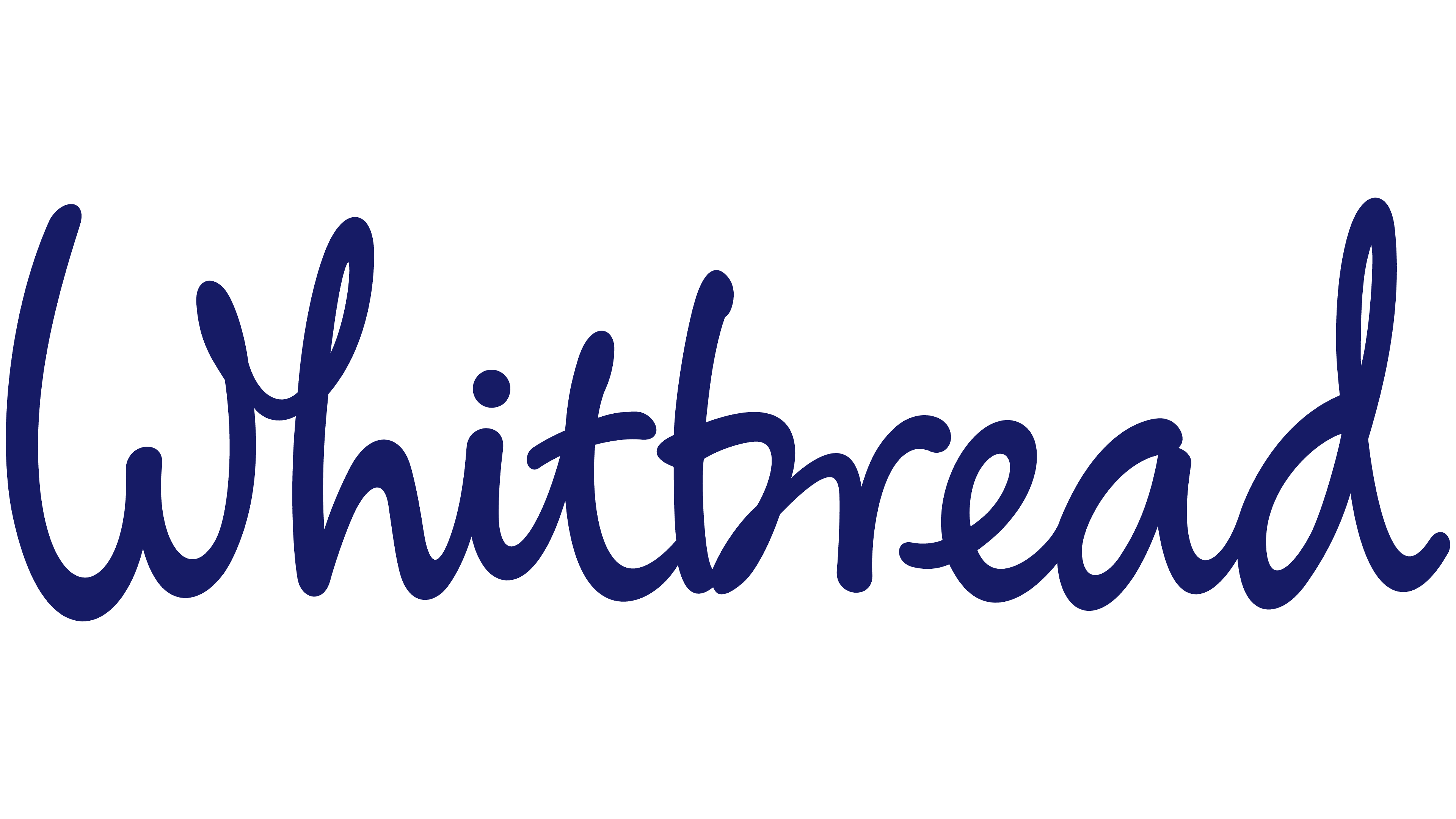
Whitbread’s blue handwritten logo marked the period after it sold its brewing business in 2000. The company retained its founder’s surname for the parent group and developed its hotel business, including Premier Inn. Interbrand created the wordmark. It consisted of a single word without a separate emblem and could be accompanied by “Welcome with a smile.”
Whitbread’s earliest history centers on beer. On December 11, 1742, Samuel Whitbread entered into a partnership in London with Godfrey and Thomas Shewell. In 1750, the business moved to Chiswell Street. Its early imagery drew on the Whitbread family coat of arms. A female deer’s head gave the brewery the name Hind’s Head Brewery. Orange labels described in 1885 carried the image and lettering in chocolate-brown ink. Glass bottles featured the hind’s image and company name in relief.
As the group grew, the old image changed in form and purpose. In 1967, the hind’s head was combined with a beer mug to create a shared identifier for Whitbread’s businesses. In the 1982 version, the mug was removed, the animal was redrawn, and “Estd 1742” was added. These changes accompanied the company’s expansion beyond brewing. In 1995, Bamber Forsyth developed a shared identity for Whitbread and its divisions. Two versions of the symbol, one corporate and the other for beer products, preserved the connection between the group and the product brand.
In Interbrand’s version, a large capital “W” began Whitbread, followed by connected lowercase letters. Their rounded lines had similar thicknesses, soft terminals, and varying slants. The loops of the “h” and final “d” rose above the main lettering. The blue had a purple undertone, and the letterforms resembled handwriting, close to Segoe Script and Homemade Apple. In January 2006, Rose Design used the corporate “W” as the starting point for the Whitbread Book Awards identity. Creative Director Simon Elliott connected its new construction to images of open books.
2010 – 2013
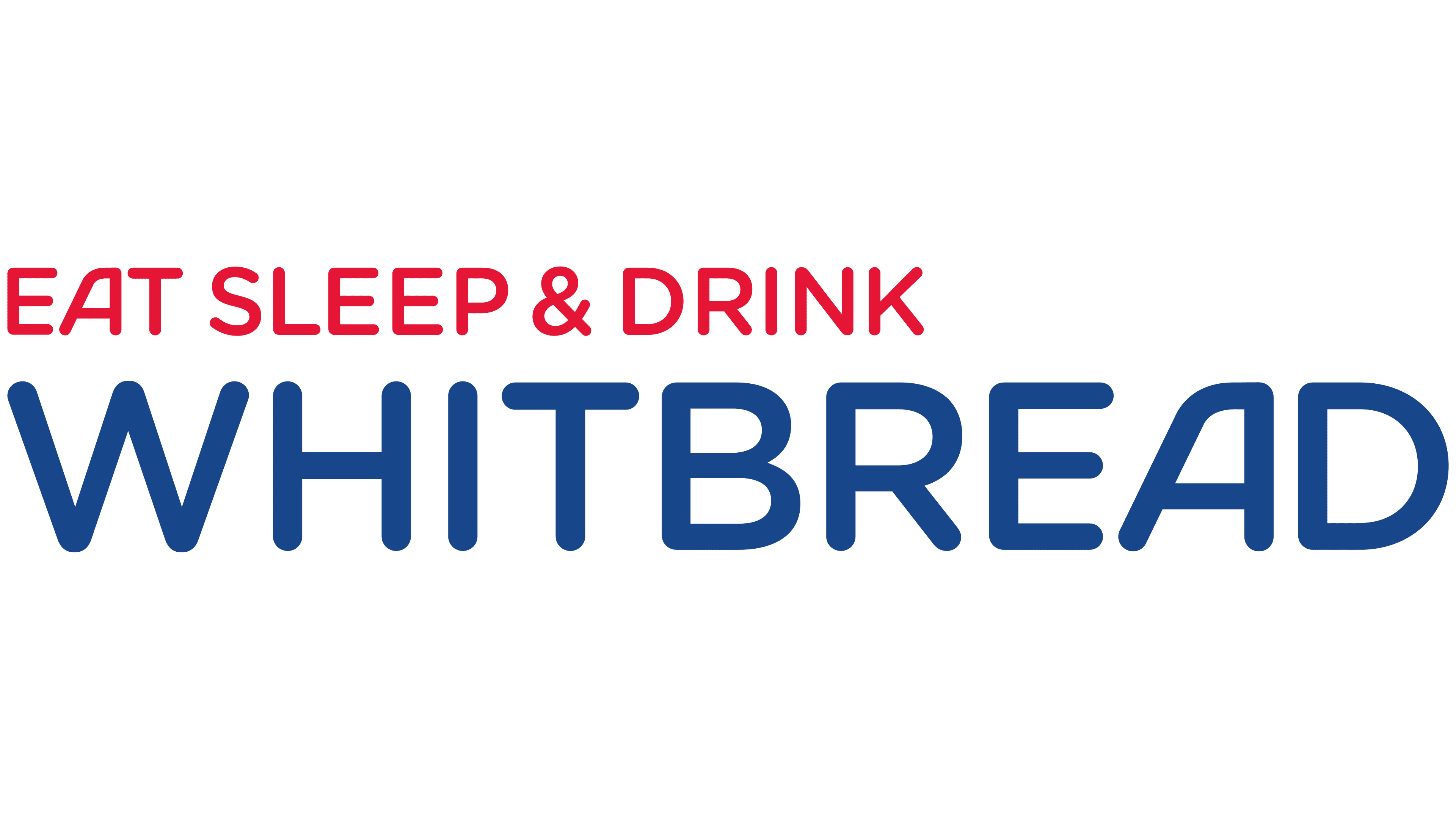
The relationship between the Whitbread name and the group’s brands remained insufficiently clear to its audience. WDAD research found that few people knew the brands belonged to the same company. To present Whitbread as an employer, the agency proposed “Eat, Sleep and Drink.” The three verbs related to its restaurants, Premier Inn hotels, and Costa coffee shops. The identity first appeared at the Hotelolympia exhibition. The phrase later became part of the corporate logo and appeared on signs, uniforms, and printed materials.
The 2009-2010 update formed part of the Whitbread Way Forward program. Following discussions with employees, the company refined its purpose and working principles. A two-line arrangement replaced the handwritten name, with red EAT SLEEP & DRINK above large blue WHITBREAD lettering. This version appeared in the company’s official 2010 presentation.
Both lines used upright sans-serif capitals. The upper line was much smaller, while the broad WHITBREAD letters dominated the logo. The strokes were nearly uniform in thickness, with softened terminals, resembling Varela Round or Nunito Sans. In the “A,” a sloping left stroke met a vertical right stroke to form a rounded apex.
2013 – today
Following changes in its business structure, Whitbread placed greater emphasis on hotels, primarily Premier Inn. During the identity update, the group adopted a single-wordmark logo. It removed the red upper line, leaving the founder’s surname. Interbrand helped develop the visual system and updated logo.
WHITBREAD appears in dark blue sans-serif capitals. The lettering retained its broad proportions, rounded terminals, and unusual “A.” The letters share the same height, with straight vertical strokes and nearly uniform line thickness. A white version of the same wordmark is used on dark backgrounds. The logo has no frame or separate emblem.