The light aroma of roasted coffee beans spreads around the Costa Coffee logo. It grabs the attention of customers. The emblem offers to drink a cup of delicious hot coffee, which invigorates and gives mood for the whole day.
Costa Coffee: Brand overview
| Founded: | 1971 |
| Founder: | Sergio Costa |
| Headquarters: | Dunstable, Bedfordshire, England |
| Website: | costa.co.uk |
Meaning and History
The company was founded in London by Italian immigrant brothers who moved to England in the 60s. They gave the company their last name – Costa. The enterprise of Bruno and Sergio was engaged in the supply of roasted coffee. Having tried many variations, the brothers created their blend of Arabica and Robusta with the perfect roast, which they called Mocha Italia. Their coffee was delivered to prestigious hotels and restaurants in special machines. And in 1981, they opened their fashionable coffee shop, serving cappuccino and espresso in china cups. In 85, Bruno left the business. But the establishments were popular, and for 14 years, Sergio had already managed 41 coffee houses.
1971 – 1995
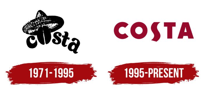
The company logo is simple and concise. It captures the essence of the brand through the use of visual signs of coffee. Represents the inscription Costa in which the letter “O” is replaced by grain in a sombrero hat. This element evokes associations with coffee, coffee plantations, a sunny day, bean pickers. The inscription is arranged in an arc as if placed on top of an oval coffee bean. The emblem is made in black and white, which very accurately conveys the idea of roasting.
1995 – today
The chain was purchased from its founders in 1995 by the British hotel and restaurant concern Whitbread. At this point, Costa owned 41 coffee shops. The new owner changed the emblem of the establishments to a more modern one, adding color to it.
The main logo is verbal. It is made in the form of the inscription Costa, which emphasizes the brand’s historical roots and helps its recognition. The unusual shape of the letter S in the inscription resembles steam rising from a hot cup. Capital letters indicate leading positions and popularity.
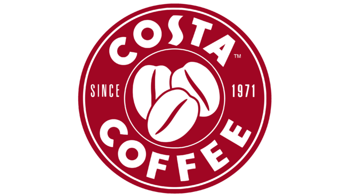
One of the variations of the emblem is a red seal with white inscriptions: Costa (top), Coffee (bottom), and since 1971 (on the sides). In the center of the seal is a visual sign of three white coffee beans, the grooves of which are traced in red lines. A similar logo indicates a place where you can try natural coffee from ground coffee beans. The founding date speaks of the great experience in preparing the drink. The image of the press symbolizes quality and excellent taste. In addition, the logo resembles a look at a round cup with coffee beans inside from above. This is a very symbolic image of a coffee shop.
Font and Colors
The logo uses an unusual shade of Monarch red (medium-dark rose red). This is a warm, rich color. It points to the premium quality, good roasting, and passion for making their favorite drink, which the brothers put into their work. Also, red is a symbol of Britain and hints at the homeland of coffee shops. Fresh coffee berries also have a red color.
The white color on the logo is a symbol of organic and sustainable products (beans are Rainforest Alliance certified) and beautiful foam and milk. The contrasting combination of white and red indicates the bright, rich taste of Costa blends.
The early emblem uses Cooper Black, while the new logo uses Berlin Sans FB Demi, with a slightly longer S.
Costa Coffee color codes
| Vivid Burgundy | Hex color: | #970a2c |
|---|---|---|
| RGB: | 151 10 44 | |
| CMYK: | 0 93 71 41 | |
| Pantone: | PMS 200 C |
