


 Sheraton Logo PNG
The Sheraton logo is associated with beauty, chic, glamour, and high quality. It reflects the strength and grandeur of one of the world’s largest hotel chains. Presentability and special refinement have long defined Sheraton’s identity, making it memorable and distinctive. The modern logo is another example; its visual impact is multifaceted and well thought out.
Today, the Sheraton network owns more than 1,000 hotels in the world’s most attractive corners, and the logo perfectly conveys the brand’s high status. It embodies elegance and sophistication. Each Sheraton hotel offers its guests top-level service and impeccable hospitality. Guests always feel comfort and harmony, as the hotel interiors are created with the best traditions of modernity in mind. This approach to service and design is also clearly reflected in the emblem, where every element has meaning and role.
The logo’s details are in perfect harmony, arranged to enhance each other’s significance. The letter, the circle, and the hotel chain name fit together like parts of a single puzzle, demonstrating the unity and perfection of the Sheraton brand.
Sheraton began in 1937, when Ernest Henderson and Robert Moore bought the Continental Hotel in Springfield, Massachusetts. The name came from a large Sheraton sign attached to their second property, and keeping it avoided replacement costs. By 1945, the chain had grown to 11 hotels. In 1947, Sheraton became the first hotel company listed on the New York Stock Exchange, providing capital for expansion. Sheraton acquired two Canadian hotels in 1949.
During the 1950s, Sheraton introduced a centralized reservation system and bought Eppley Hotels in 1958, adding 22 properties. International growth continued through Israel, Puerto Rico, and Venezuela in the 1960s. ITT opened a hotel in Tel Aviv in 1965. ITT acquired the chain in 1968, creating ITT Sheraton, and later expanded into South Korea, Argentina, Brazil, Egypt, and China.
ITT added the European Ciga portfolio in 1994. Starwood Hotels & Resorts Worldwide acquired Sheraton in 1998 and financed new hotels and renovations. In 2008, a global refurbishment program committed more than $6 billion to buildings and services. Marriott International acquired Starwood in 2016, placing Sheraton within a larger hotel group.
A multipurpose lobby format appeared in 2018, followed by a revised logo and visual identity in 2019. Health and safety procedures changed during 2020 and 2021. Sheraton resumed renovation and guest-service technology projects in 2022. By 2023, Sheraton operated about 400 hotels across 70 countries.
Meaning and History
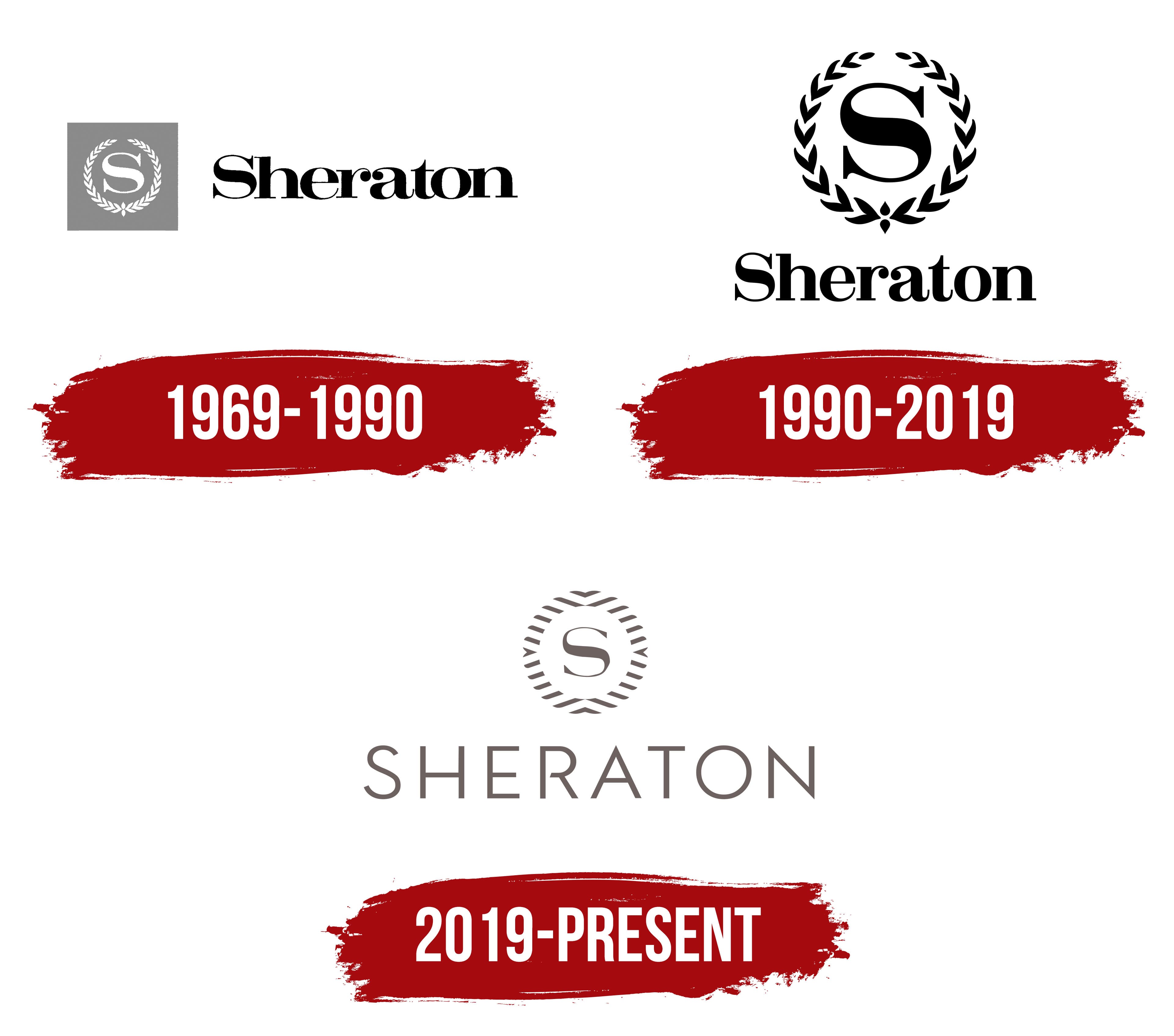
What is Sheraton?
This hospitality giant is known for providing reliable, high-end accommodations for business travelers and tourists. The company stands out with its unique lobby design featuring the “Link@Sheraton” concept, which creates a social hub for connecting, working, or relaxing. The brand’s hotels offer modern amenities like well-equipped suites, fitness centers, and diverse dining options. The brand is recognized for its commitment to consistency, delivering the same high service and amenities in bustling cities and secluded resorts.
1969 – 1990
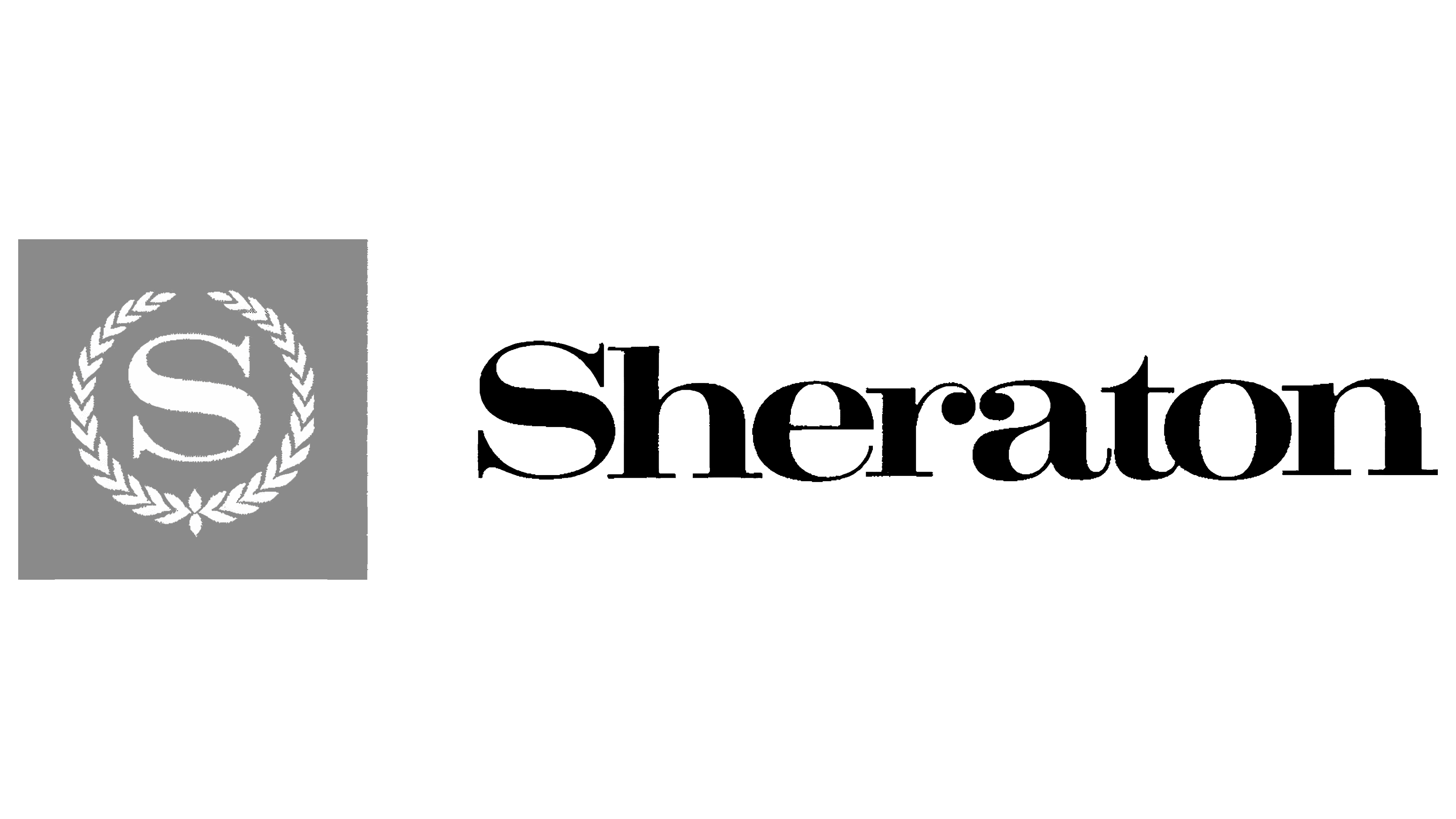
Looking back, you can see how current logo trends are rooted in the past. The first Sheraton logo was introduced in 1969 and remained in use for 30 years, underscoring its significance. This logo emphasized the hotel chain’s seriousness and rapid development.
What made the first logo so remarkable? It consisted of three key elements. On the left was a superscript letter “S,” the first letter of the Sheraton name. It stood out for its large size and serifs, which added elegance. However, the main element that gave the logo its significance was the laurel wreath surrounding the letter “S.” This symbol highlighted its importance, adding grandeur and prestige to the identity. The white letter and wreath enhanced the effect, while the gray background created a shimmer effect and added depth. The gray square around these elements further emphasized their significance.
The hotel chain’s name sat on the right, a short distance from the letter and wreath. The word’s first letter was also superscript, while the rest were smaller. The black text drew attention to the name itself. All the logo elements coexisted harmoniously, creating a unified, balanced visual tandem.
1990 – 2019
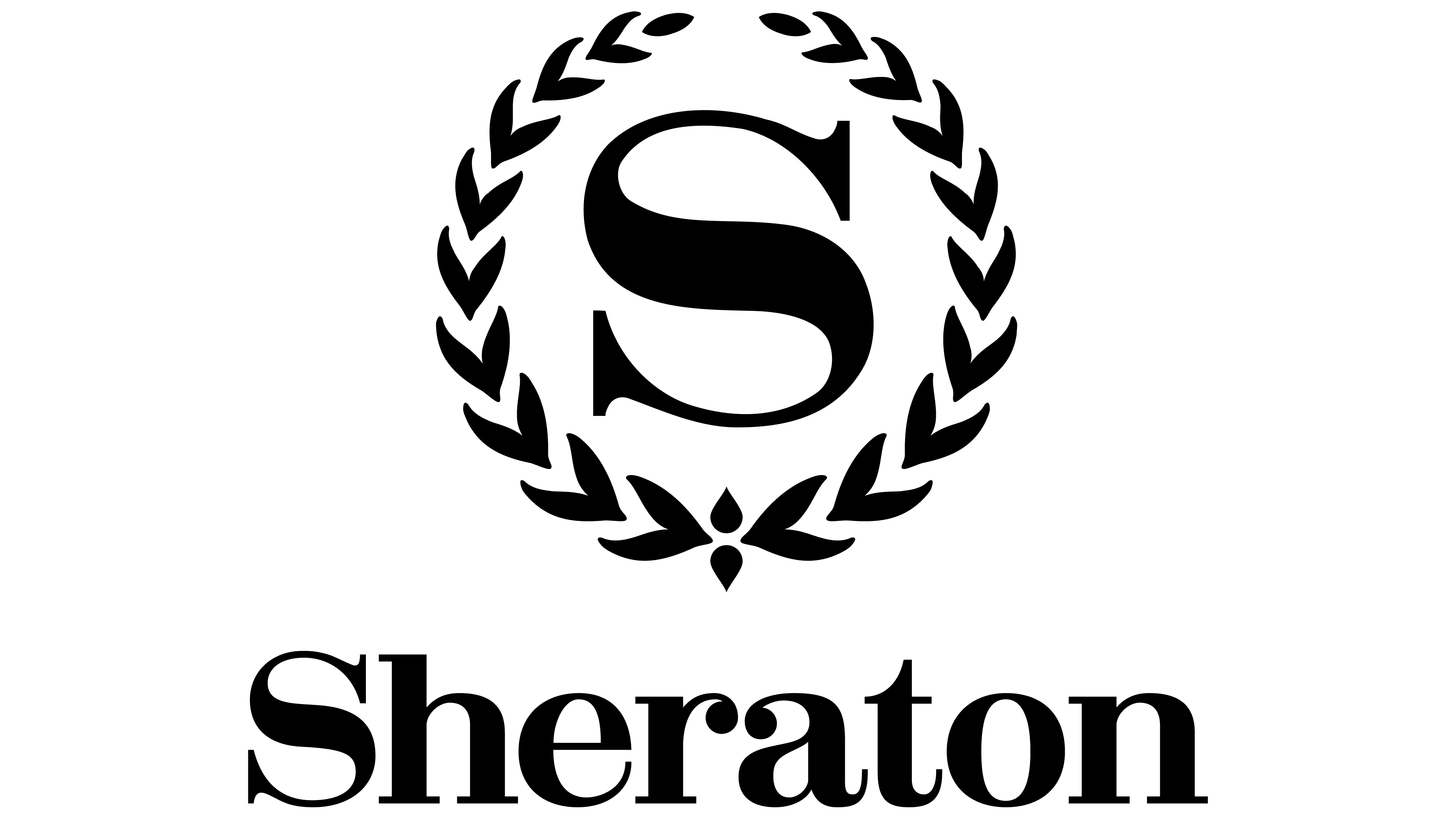
The logo underwent significant transformations in 1990 due to new trends and global developments in Sheraton. The key elements remained but were reworked and relocated, giving the identity a fresh look. The color scheme changed only partially, retaining its main features.
The central position in the logo was now occupied by the letter “S,” which was enlarged and became even more prominent. Its black color added an air of aristocracy and elegance, highlighting the brand’s status. The laurel wreath surrounding the letter also remained. Still, its graphic execution was stylized: the wreath elements were spaced further apart, adding scale to the logo and emphasizing its presentability.
The name of the Sheraton network was now placed below the wreath, and the letter “S” formed a second row. All logo elements were rendered in a unified black, creating a harmonious contrast with the white background and emphasizing the design’s purity and simplicity.
2019 – today
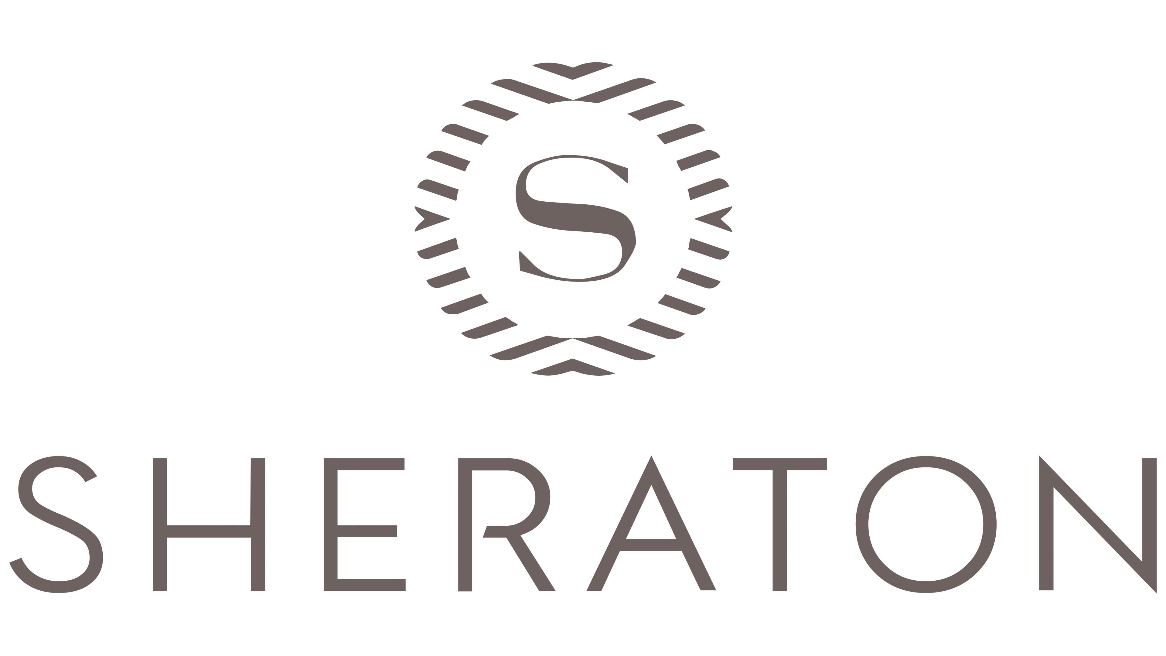
The modern version of the Sheraton logo remains true to tradition, embodying key aspects of the hotel chain’s operations and emphasizing its reliability. Each element of the logo looks elegant, and, most interestingly, many of them have taken on new meaning in this contemporary interpretation.
The letter “S,” though still important, now gives the brand name more prominence by being smaller. Like the other elements, it is rendered in a refined shade of gray. The font has become more expressive, and the thin lines and serifs highlight the brand’s high status. The laurel wreath, traditionally accompanying the letter “S,” has transformed into a new figure. It now symbolizes infinity and continuous movement, with the circular shape emphasizing life’s continuity and timelessness.
Four arrows, placed opposite each other, surround the letter “S,” adding significance and creating a dynamic effect. These arrows act as pointers, symbolizing direction and progress. The word “Sheraton” is now positioned below the emblem, set in elegant superscript letters, giving the logo a refined, harmonious appearance.