


 Motel 6 Logo PNG
The Motel 6 logo reflects the company’s rich history and its success through a unique, affordable business model. The emblem symbolizes the brand’s popularity, which has spread across the country and become synonymous with budget travel.
Motel 6 opened in Santa Barbara, California, in 1962. Its founders, William Becker and Paul Greene, were building contractors who saw that many hotels were too expensive for ordinary travelers. They created a low-cost motel chain with a basic rate of $6 per night, which gave the brand its name. The first property opened on June 19, 1962, with 52 rooms and avoided costly extras such as restaurants, bars, and conference halls.
The concept worked, and the chain expanded across California. By 1965, Motel 6 had six locations. In 1968, City Investing Company acquired a controlling stake and provided funding to support broader growth. During the 1970s, the company moved beyond California and opened motels across the United States. By 1980, the network had more than 300 properties, and in 1984 it reached its 500th location.
In 1985, Motel 6 launched its first nationwide radio campaign. Tom Bodett’s line, “We’ll leave the light on for you,” became strongly linked with the brand. In 1990, Accor bought the company for $1.3 billion, giving Motel 6 access to a larger hotel network. In 2000, the chain opened its 800th property and operated in nearly every U.S. state.
In 2012, Blackstone Group bought Motel 6 from Accor for $1.9 billion. Modernization continued with the Phoenix renovation program in 2015, followed by updated rooms, lighting, and furniture in 2016. A mobile app arrived in 2017, while 2018 brought more rooms with improved amenities such as kitchenettes. In 2019, the My6 loyalty program was upgraded, and in 2021 many locations added contactless check-in and check-out.
Meaning and History
What is Motel 6?
It is an American budget hotel chain that provides low-cost lodging throughout the United States and Canada. The company is known for its simple approach to accommodations, offering tidy, cozy rooms at reasonable prices. Most hotels offer standard amenities such as free local calls, expanded cable TV, and Wi-Fi, but some also offer pet-friendly accommodations or outdoor pools. The chain’s catchphrase, “We’ll leave the lights on for you,” has come to symbolize its commitment to providing guests with comfortable and easily accessible accommodations. The hotel’s main clientele is Budget travelers, leisure travelers, and people seeking short-term accommodations. On key roads and in cities across North America, the brand has established itself as a trusted choice for affordable overnight accommodations.
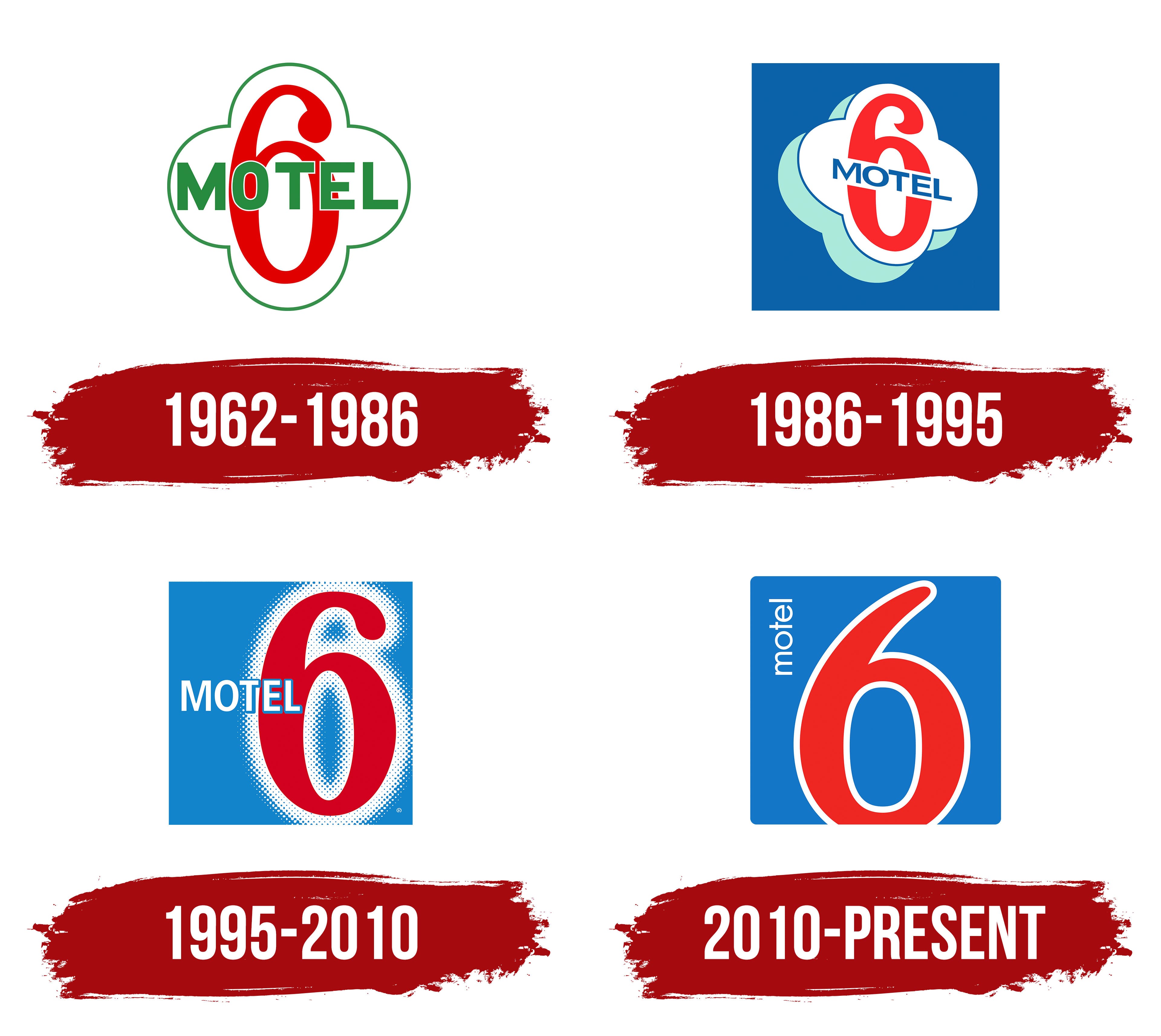
1962 – 1986
The creation of the Motel 6 logo and brand is linked to the U.S.’s active automobile culture. In the 1960s, when the brand first emerged, road trips became popular, and demand for affordable, convenient overnight accommodations sharply increased. The company’s founders, aiming to create the most affordable lodging, spent two years developing a cost-reduction strategy. The logo became a visual representation of this concept, remaining relevant today as a symbol of simplicity and affordability in the hospitality industry.
Like a bright sign, the emblem perfectly reflects the brand’s essence. It is shaped like a four-petaled flower, symbolizing the four cardinal directions: south, north, west, and east. This shape emphasizes the idea that the brand’s motels are accessible nationwide.
The logo’s main element is the number “6,” which is central to the emblem. The number was chosen intentionally; it reflects the original cost of staying at the chain’s motels, 6 dollars per night. This was a key marketing strategy at the brand’s inception, aimed at attracting budget-conscious travelers.
The color palette consists of two main colors, green and red. Green is associated with relaxation, calmness, and nature. In contrast, red symbolizes accessibility and affordability, highlighting the chain’s main competitive advantage: low prices.
The word “MOTEL,” centered on the sign, is in large font, leaving no doubt about the company’s focus. The bold, straightforward font, combined with the minimalist design, emphasizes the brand’s commitment to economy and functionality.
1986 – 1995
The emblem depicts a roadside sign against a blue sky, creating a sense of perspective as if the viewer is looking up at it from below. This design reflects the confident expansion of the brand and its established position in the market. With the shift in positioning, the company began offering more premium services. The green shade of the word “motel” was replaced with blue to harmonize with the background, emphasizing professionalism and the updated image.
1995 – 2010
After the change in ownership, the logo’s design was revised. A relief glass element has been added to the blue background, resembling a budget door with the large number “6” prominently displayed. The word “motel” is set slightly off-center, creating a play of sizes and composition, giving the sign a more refined look with a touch of exclusivity. These changes were accompanied by a global renovation, the start of franchising, and the opening of the first hotel in a high-rise building. The logo now reflects the idea of expansion and growth while maintaining the brand’s core concept.
2010 – today
The Motel 6 logo reflects modernity and the brand’s sporty spirit, which has become iconic in the budget accommodation industry. The main element of the emblem is the large red number 6, which occupies the center of the design and symbolizes the brand’s essence. The number 6 holds deep symbolism for the company, as it recalls the $6 room rate with which it began its operations in 1962.
An interesting detail in the visual sign is that the number 6 extends beyond the boundaries of the main image field, which is interpreted as a symbol of the hotel chain’s expansion and drive for change. Since its founding, the company has continued to grow, offering affordable and convenient lodging to guests worldwide.
The color palette consists of three key colors: red, blue, and white. The red number 6 represents the energy, activity, and determination with which the brand approaches its development. The blue background symbolizes reliability and trust, which are the foundations of the business. The white outline adds a sense of cleanliness and neatness to the emblem, highlighting the company’s commitment to simplicity and clarity in its services.
The vertical, thin “motel” inscription is white and placed to the left of the number 6. This element adds lightness and elegance to the logo, reminding the brand of its aim to adapt to new conditions. The brand’s history includes moments when Motel 6 had to change and update, especially after the departure of one of its founders, which is reflected in the symbolism of its visual identity.