In order for the Holiday Inn logo to be associated with relaxation and comfort, the designers made it visually light. Soft lines with partially rounded corners create a feeling of relaxation and ease. These are the main characteristics that the hotel chain wants to emphasize and which are at the heart of its advertising campaigns.
Holiday Inn: Brand overview
| Founded: | August 1, 1952 |
| Founder: | Kemmons Wilson |
| Headquarters: | Atlanta, Georgia, United States |
| Website: | holidayinn.com |
Holiday Inn is a chain of 1173 hotels owned by InterContinental Hotels Group. You can see the Holiday Inn logo all over the world.
The Memphis businessman opened his first hotel in 1952. He became so carried away that there were 30 hotels after four years, and after 16 years – 1000. The successors could not maintain their leading positions and sold the hotels to the English Bass PLC.
Meaning and History
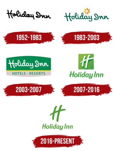
The logo has had several redesigns associated with major milestones in the development of the Holiday Inn.
What is Holiday Inn?
A chain of hotels for every budget, founded in America in 1952. Express branch – budget vacation, Garden Court – in the national style, Select – for business trips, Resort – resort hotels. Headquarters in Buckinghamshire.
1952 – 1983
The logo is a real miniature image. This is the hotel’s tower, combined with a roadside stele sign. The banner has the name and an arrow pointing to the hotel. All this stands on a brick-lined lawn covered with grass. The author of the sign is the artist Jean Barber.
The hotels themselves did not resemble a tower in shape. The skyscraper is rather a hint of a special service. In America, the higher the number, the more prestigious it is to live in it. Penthouses have always occupied the upper floors. At Holiday, all rooms are like penthouses.
The phrase Holiday Inn in translation means “Holiday hotel.” The name is taken from the film of the same name, released a few years earlier (1942). An analogy was drawn by an architect who was involved in the construction of the first hotel of the chain.
The star mounted on the tower of the logo resembles a Christmas one (the film’s action took place on Christmas Day). The star, installed inside the five-sided structure, also pointed to the five-star hotel, where the best service awaits visitors.
Below the banner was a white sign that read: The nation’s innkeeper. It can be translated as “national tavern.” She showed that the network claims to be the best.
This statement is related to the reason why Kemmons Wilson decided to enter the hospitality business. The hotels where they lived as a family during the holidays had a lot of shortcomings. The businessman decided to rectify the situation. Build a network of establishments with comfortable conditions.
They were located along the roads, like roadside motels, so the name “tavern” was quite appropriate. Information was posted on white plates of real stele banners. For example: “Welcome to California,” or “signature steaks, drinks from 11 am to 2 am for only $ 100”, etc.
1983 – 2003
In 1982, the founder left his job at the company. The new managers no longer wanted to use the expensive and bulky sign (each one cost up to $13,000 to make).
The 1983 rebrand completely changed the chain’s logo. The emblem was the name in reverse-slope capital letters and resembled a Christmas pinwheel rising above the end of the word Holiday.
The script creates a feeling of home, comfort, and simplicity. The font takes the user back to the times of letters. When there were no computers. You need to spend time writing a letter, put your soul into it, and open up. On paper, everyone has their unique handwriting.
All this shows Holiday Inn’s special care for the guests, individual approach, and efforts to create conditions for each guest. It also hints at the originality of the hotels. They are not made to copy. Each has its special atmosphere.
The slope of the inscription to the right hints at conservatism and traditionalism. No noise interfering with rest, exciting innovations. Calm reigns in hotels, and well-trained staff works.
The pinwheel above the name has become an analogy for the star from the previous logo. She is a symbol of celebration, joy, and a good mood. It consists of seven petals of yellow and orange flowers. This makes her look like the sun. As the luminary gives warmth, so does Holiday Inn – comfort and warm atmosphere to its guests.
2003 – 2007
The next change made the logo look like a sign at the entrance. On a larger green background, the name was placed on top. And below, on a gray background, a clarifying inscription: “Hotel. Resort.” Fifty years have passed since the opening of the first institution. People no longer remember the 1942 Christmas movie. Therefore, they do not have the necessary associations when looking at the name. Clarification helps to understand that the institution offers accommodation and resort entertainment.
At the same time, green is associated with comfort, and gray is associated with a business approach. The yellow stripe between the backgrounds shows that the hotel separates leisure and work. Visitors have a rest, they are given the most attention, and the staff works does it constantly and imperceptibly.
The Interbrand agency designed the logo and became a partner for many years, participating in subsequent redesigns.
2007 – 2016
The owners of the brand, the English group InterContinental Hotels, decided to restart the chain, making it more modern. Many old hotels were closed. The presentation of the brand has changed dramatically again.
Atop the new logo was a green square reminiscent of a neon sign. On top of the square is the three-dimensional letter H. In outline, it is similar to the roads where hotels were usually located. Two sticks, two roads, two countries. The story began in America and continues in England. The transverse element goes beyond its borders and, arching in an arc, rests on the background with both ends. It is similar to a bridge connecting highways. The general idea of hotels (to give comfort) remains unchanged in every country.
Below the square is the title. Its font has completely changed. It became smooth and rounded with an inclination to the left. The ideal style is a hint of cleanliness, comfort, and order. The hotel is always ready to meet clients’ needs, smoothing out sharp corners. Conservatism is replaced by movement in step with the times.
2016 – today
The neon square was removed from the logo, leaving only the letter H. This is a tribute to simplicity and freedom. The font has been tweaked a bit to make it more in harmony with the outline of the upper letter. The emblem evokes a feeling of spaciousness. There is plenty of space in the hotel rooms. There is nothing superfluous in them, but there is everything you need.
Font and Colors
All Holiday Inn logos include shades of green. It is the color of comfort, hospitality, and care. Older dark shades are a sign of luxury, while the tones of the latest visual signs are light and light. They promise a healthy atmosphere, relaxation, and high spirits.
The font of the last visual mark resembles the beveled elements of Pierce Bold.
Holiday Inn color codes
| Maximum Green | Hex color: | #4f9e33 |
|---|---|---|
| RGB: | 79 158 51 | |
| CMYK: | 50 0 68 38 | |
| Pantone: | PMS 361 C |


