


 IHG Logo PNG
The IHG logo reflects elegance, a global presence, and a high level of hospitality. The emblem conveys comfort and warmth, emphasizing each hotel’s goal of becoming a true home away from home for its guests.
InterContinental Hotels Group traces its corporate roots to 1777, when William Bass founded Bass Brewery in Burton upon Trent, England. The hotel business developed much later. In 1946, Pan American World Airways created the InterContinental Hotels brand. They opened their first property in Belém, Brazil, forming an international network for upscale travel.
The group’s hotel portfolio changed sharply in the late 1980s. In 1988, the British company, already linked with Holiday Inn, acquired InterContinental Hotels. In 1989, it bought Holiday Corporation, gaining major brands such as Crowne Plaza. To concentrate on hospitality, the company sold its brewing division in 1998 and moved further away from its original beer business.
In 2000, the acquisition of Southern Pacific Hotels Corporation strengthened its position in the Asia-Pacific region. In 2003, after Bass PLC became Six Continents PLC, the company was split into Mitchells & Butlers and InterContinental Hotels Group. IHG then adjusted its portfolio, selling Candlewood Suites in 2004, launching Hotel Indigo in 2006, and bringing Staybridge Suites to Europe in 2007.
The 2010s and early 2020s brought new brands and luxury acquisitions. Kimpton Hotels & Restaurants joined the group in 2015 following a $430 million deal; Voco launched in 2018; and Six Senses Hotels Resorts Spas was acquired in 2019. Vignette Collection appeared in 2020. In 2021, IHG updated its website, mobile app, and rewards program. In 2022, Regent Hotels & Resorts expanded the luxury portfolio, while new projects in China and India supported growth in emerging markets.
Meaning and History
What is IHG?
It is one of the leading hotel chains in the world, operating a wide range of hotel brands in many hospitality-related markets. The organization manages and owns franchises for various establishments, including mid-range, economy, and luxury hotels. Notable brands in the company’s portfolio include InterContinental, Crowne Plaza, Holiday Inn, Holiday Inn Express, and Kimpton. The brand offers accommodations for all tastes and budgets for business and leisure travelers. The company has a global presence spanning multiple countries and territories. It is known for its extensive loyalty program, IHG Rewards, which allows users to accumulate and spend points on all its brands. The brand, a significant player in the hospitality sector, constantly expands its offerings and adapts to changing customer demands and market conditions.
2003 – 2017

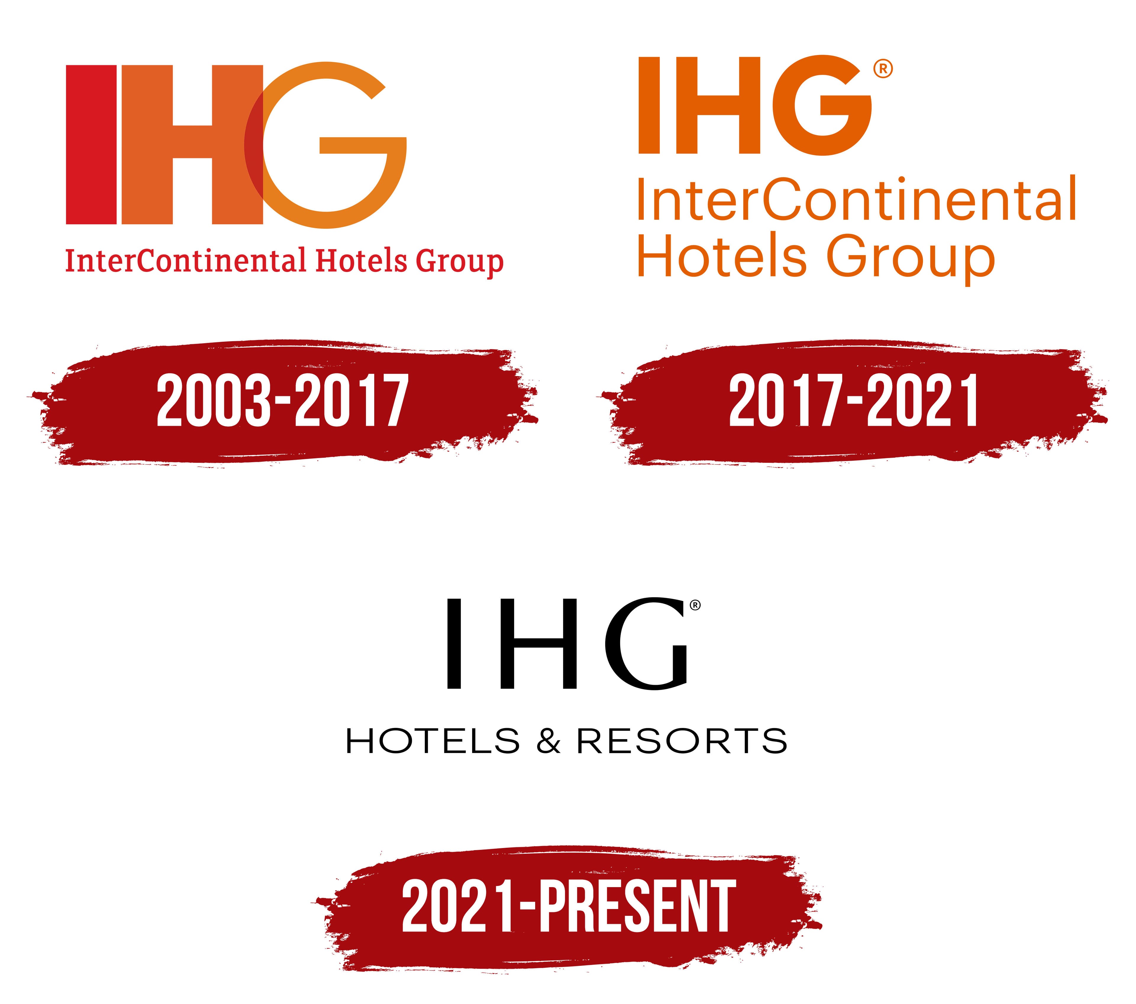
The logo is a powerful and concise image that reflects the brand’s global scale and premium nature. The emblem consists of three large capital letters, “IHG,” which stands for InterContinental Hotels Group. Below these letters, the full brand name is written in a smaller font, emphasizing the company’s seriousness and solidity.
Red symbolizes premium quality, luxury, and energy, aligning with the group’s hotels’ high standards and elite status. The orange color, in turn, adds a sense of warmth, comfort, and coziness, showing that the brand’s services are focused on meeting customer needs.
An interesting element of the logo is the letter “G,” which is rendered in a thinner font compared to the letters “I” and “H.” This technique visually separates the word “Group” from the first two letters, highlighting the group’s unique role and importance as a management structure. This design choice highlights the brand’s vastness and unity, with numerous hotels worldwide.
The emblem symbolizes high-quality service and InterContinental Hotels Group’s commitment to creating ideal guest conditions.
2017 – 2021
The rebranding retained the logo’s essence but altered its presentation. The capital letters were smaller, and the full name now fits on two lines. The orange monochrome highlights the shift towards more budget-friendly extended-stay rooms. After acquiring boutique hotels, the company adapted its approach to customer needs, reflected in the new color emphasis.
2021 – today
The IHG Hotels and Resorts logo reflects the elegance and professionalism that befit one of the largest global hotel operators. The updated design embodies modernity and simplicity.
The emblem is dominated by the refined letters “IHG,” centered. These three letters represent a prestigious brand known for high service and first-class hospitality. The font used stands out for its clarity and modernity.
Below is the inscription “Hotels & Resorts,” rendered in a restrained and elegant style. This text harmoniously complements the overall visual identity, giving it a sense of completeness and compactness. This design approach symbolizes the variety of services IHG offers and its high quality.
The color scheme is black and white, symbolizing classic style and consistency while emphasizing the brand’s reliability and solidity. The simplicity and minimalism in color use enhance trust and confidence, which are essential in the hotel industry.
The logo’s style can be characterized as modern minimalism, focusing on key elements without unnecessary details.