 Pan American World Airways Logo PNG
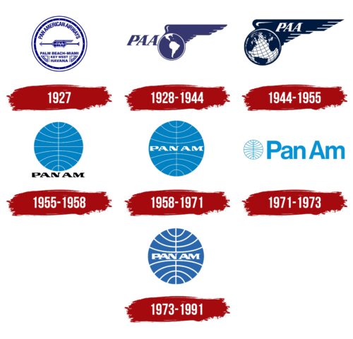
The Pan American World Airways logo reflects the airline’s ambition to offer services across the entire planet, aiming to be present in every corner of the world. The emblem demonstrates high professionalism, vast capabilities, and the carrier’s deep dedication to its passion.
Pan American World Airways: Brand overview
Pan American Airways, established on March 14, 1927, by Major Henry Arnold and his partners, began its journey with a contract to deliver airmail between Key West, Florida, and Havana, Cuba. This marked the inception of one of the most iconic airlines in aviation history.
On October 19, 1928, Pan Am inaugurated its first international passenger service, flying a Sikorsky S-38 seaplane from Key West to Havana. This flight set the stage for Pan Am’s future as a global airline, pioneering international air travel for American carriers.
Throughout the 1930s, Pan Am aggressively expanded its network across Central and South America. The airline utilized advanced flying boats like the Sikorsky S-42 and Boeing 314 to undertake long over-water flights. By the decade’s end, Pan Am had established itself as the leading international airline connecting the United States with Latin America.
On May 20, 1939, Pan Am launched its first regular transatlantic passenger service between New York and Marseilles, with intermediate stops. This historic flight, operated by the Boeing 314 “Yankee Clipper,” heralded a new era in transatlantic air travel and cemented Pan Am’s role as a trailblazer in global aviation.
During World War II, Pan Am supported the U.S. military by providing strategic air transport services. Following the war, the airline rapidly resumed and expanded its civilian operations, introducing flights to numerous new international destinations.
1958, Pan Am became the first U.S. airline to operate jet aircraft on transatlantic routes, introducing the Boeing 707 into service. This innovation dramatically reduced flight times and enhanced passenger comfort, further solidifying Pan Am’s leadership in the airline industry.
The 1960s saw Pan Am at the zenith of its power and prestige. The airline symbolized the epitome of international travel and American technological superiority. 1963, Pan Am ordered the first commercial supersonic jets, and in 1966, it announced plans to construct the Pan Am Building in New York City, a testament to its corporate might.
On January 22, 1970, Pan Am launched the first commercial flight of the Boeing 747 from New York to London. This event marked the beginning of the wide-body jet era and reinforced Pan Am’s status as an innovator in aviation.
Pan Am faced significant financial challenges during the 1970s and 1980s despite its glamour. The 1973 oil crisis, the deregulation of the U.S. airline industry in 1978, and increasing competition put immense pressure on the airline. Pan Am had to sell many assets, including the iconic Pan Am Building and its InterContinental hotel chain.
On December 21, 1988, Pan Am Flight 103 was destroyed in a terrorist bombing over Lockerbie, Scotland. This tragedy severely damaged the airline’s reputation and exacerbated its financial woes.
By January 8, 1991, Pan Am filed for bankruptcy. Despite efforts to restructure and sell various assets, the airline could not overcome its financial difficulties. On December 4, 1991, Pan Am ceased operations, closing the chapter on its 64-year legacy as one of the world’s most renowned airlines.
Meaning and History
What is Pan American World Airways?
This iconic American airline revolutionized air travel and symbolized the Golden Age of travel. Founded in 1927, the company pioneered transcontinental and intercontinental flights, creating an extensive global route network that covered six continents at its peak. The airline played a crucial role in developing commercial aviation, introducing groundbreaking aircraft such as the Boeing 707 and Boeing 747, transforming travel.
1927
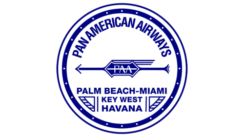
The circle at the core of the Pan American World Airways emblem signifies the company’s seriousness, ambitious plans, and long-term goals. This logo evokes positive emotions and highlights the scale of the business project. In this context, the circle represents:
- A seal (symbolizing a professional business atmosphere maintained by true experts).
- A circle of responsibilities (indicating that the carrier guarantees excellent service to all clients).
- A safety zone (affirming the company’s commitment to protecting passengers from unpleasant situations or emergencies).
- The globe (showcasing the airline’s vast capabilities, covering almost every corner of the planet).
- A roundel (representing a connection to history and showing respect for the origins of graphic art).
The absence of corners reflects a desire to smooth out challenges in interactions with travelers and adhere to scheduled flight timings in both directions (a completed cycle, a full rotation of actions). The sans-serif fonts further reinforce this. All inscriptions are in strict, straight uppercase glyphs, emphasizing the company’s seriousness.
The center of the emblem features an arrow with the abbreviation “PAA” and three stripes representing a wing. These upward-facing wings and speed lines add internal energy and enhanced dynamism to the logo. This symbol shows the brand’s connection to flight and highlights the aircraft’s high speed on the specified routes.
The pleasing blue color symbolizes the sky, freedom, vast expanses, and the coolness of the ocean, on whose shores the cities served by the airline are located. It is well balanced by white, representing openness, purity, and tranquility. Together, they have a calming effect on passengers and inspire trust in the brand.
1928 – 1944
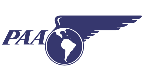
After expanding its flight area, the airline updated its emblem because the previous version included the names of only three cities where it operated. The modernized logo became much clearer with the addition of easily understandable elements.
- A massive wing replaced the arrow with three stripes. It is large, wide, smooth, and sleek. Its presence indicates that the company feels confident in the airspace and swiftly delivers passengers to their destinations.
- The circle decreased in size and moved downwards, taking on a distinct globe shape. To emphasize this, designers added a schematic map of the regions covered by the airline’s routes, with South America and part of North America prominently featured.
The planet is gently enveloped by a bird’s wing, symbolizing that this area is under the soft wing of Pan American World Airways. The company appears to protect and nurture it, ensuring complete flight safety, comfortable travel conditions, and care for passenger needs. The emblem fully aligns with the brand engaged in aviation services. It clearly expresses its concept and reflects its meticulous approach to work.
The long name of the carrier was removed and replaced by the short abbreviation “PAA,” positioned separately. This placement signifies that the company has become an independent entity, ready to take on greater responsibility for its clients. The inscription is set in the company’s signature italic font, making the text appear rapidly flying. The glyphs are enhanced with interesting serifs shaped like spikes pointing to the right as if blown by a headwind. They convey high speed and imbue the logo with a sense of motion.
1944 – 1955
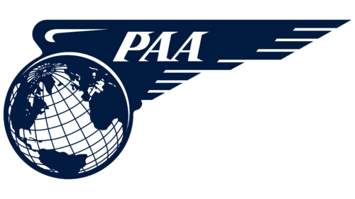
The wing and globe have been completely redesigned, making them more precise and modern. This approach to identity shows that the airline cares about its image in the international service market and understands the importance of a logo that can make the brand recognizable and popular.
As a result, the planet received several new details. It is now covered with a grid of parallels and meridians, tilted to the left, resembling a globe. The difference is in the monochromatic scheme. Notably, the region depicted globally has significantly changed – it has expanded, indicating that the company has broadened its route area and confidently reached a global level.
The wing now has clear outlines, perfectly smooth contours, and clean cuts. This is evident in the stylized wing’s feathers: Their tips are cut slightly, creating sharp points that harmonize with the spiky serifs on the letters. The text has been moved onto the wing, a smart marketing move since customers immediately understand who provides the caring wing, ensuring their attention, comfort, and convenience.
Blue has evolved from light to dark, reminiscent of the vast depths of the sky and ocean. This way, the company shows that its planes fly high and confidently, delivering passengers to places with a pleasant atmosphere of relaxation and ease. The white color perfectly balances the deep blue. It represents openness, accessibility, airiness, and purity.
1955 – 1958
During this period, a logo emerged that became the face of American Airlines for a long time. This iconic globe left an indelible visual impact because a miniature drawing captured the entire world and conveyed a significant concept. This symbol represents:
- Planetary service coverage
- A top-down view of the Earth
- Accessibility to any destinations and routes
- The ability to transport passengers to every corner of the globe
- Expansion of flight ranges
Everything mentioned perfectly fits the company’s vision and aligns with its concept, activities, and approach to work. In this simple way, the brand expresses its aviation services’ vastness and readiness to grow further, reaching unprecedented heights. This symbol resonates with people from all countries because it is understandable and not overloaded with imagery.
Even though the emblem lacks cultural context, it still deeply penetrates the subconscious, fostering trust in the airline whose name is placed below. To make it stand out, it was colored in black, which balances the airiness of the blue color, grounding it.
The inscription is in bold, uppercase letters. The glyphs are complemented by sharp serifs reminiscent of spikes. These were carried over from previous logos, where the letters were italicized, and the spiked serifs added dynamism. But in this case (with a straight font), the effect of energetic movement is absent.
1958 – 1971
The inscription lightened and moved to the center after redesigning the Pan American World Airways logo, which was associated with increased routes. In this way, the company conveys several important ideas to its customers:
- It is central in the world
- It is ready to take passengers to any point on the planet
- It loudly proclaims its presence across the globe
The inscription remains in its old form: PAN AM. This is done to keep the name compact and easily fit within the circle, replacing the equator line along its entire length. The other stripes remain the same—narrow, white, and slightly curved at the ends to create the illusion of the globe’s three-dimensionality, even though it is drawn flat.
The emblem is perceived as the epitome of perfection, symbolizing international aviation services associated with the vast expanses of the sky and the planet’s extensive coverage. The updated blue color conveys a sense of freedom, calmness, and confidence, while white adds a feeling of embarking on an exciting adventure that starts afresh with this brand. They signify the high standards of the carrier’s achievements.
The informal style of the smooth font makes the emblem light and soft despite triangular serifs with sharp tops. Their sharpness is well balanced by the smooth meridians crossing the entire blue circle, giving the logo a sense of professionalism and confidence.
1971 – 1973
During this period, everything about the Pan American World Airways emblem changed: structure, placement, size, and colors. It became conceptually new, focusing on the name. Let’s start with that.
The text is set in a sans-serif font because the presence of serifs on the upright letters didn’t create a sense of movement. On the contrary, the triangular protrusions seemed to hinder the appearance of dynamism. Therefore, the airline abandoned the old inscription in favor of a more modern option.
Now, all the glyphs are smooth and rounded. Each has soft lines, except for the capital “A,” which has a cut-off top. The other symbols have gentle curves. This creates an impression of care, trust, friendliness toward customers, and attention to their needs.
The even edges, clear strokes, and small but sturdy legs convey a sense of openness and friendliness combined with seriousness and precision. The letters stand firmly on an imaginary line, instilling confidence in the airline among customers.
The distance between the two halves of the name has increased: now “Pan” and “Am” are slightly separated and do not visually merge. To emphasize that these are two different words, not one (as it was before), the designers marked each with an uppercase letter, and the rest were converted to lowercase.
Regarding the stylized globe, it became smaller and shifted to the left, taking a position in front of the brand name. The narrow stripes and circles have swapped colors: the meridians and parallels are now blue, and the globe is white, creating an effect of vast internal space, lightness, and airiness. This is extremely important for a company in the aviation industry.
The pastel blue color associates well with the sun-bleached sky and brings calmness and trust, supporting a friendly atmosphere. Even glancing at the emblem evokes a pleasant harmony with the surrounding world. The blue-and-white globe looks simple, stylish, and solid, inviting ticket bookings. The equal height of the capital letters and the globe signifies the carrier’s vast capabilities—that it can reach every corner of the globe.
1973 – 1991
After a brief hiatus, the old Pan American World Airways logo returned. It adorned the liveries of the airline’s aircraft, which had gained international fame by then. The company made minor changes to the original version to ensure the symbol was recognizable and memorable. This emblem features a different color and font, reflecting a connection to modernity.
- The color scheme still combines blue with white. The shade is now rich and dark, closer to the color of the sky and water. It evokes tranquility, calmness, bliss, and relaxation, hinting at the comfortable conditions the carrier provides its passengers and the well-equipped cabins. Blue symbolizes coolness and freshness.
- The curved lines have gained more confident contours: the central meridian and parallels are distinct, clear, and bold. This emphasizes the precision of flight operations, adherence to arrival and departure times, a serious approach to customer service, high responsibility, and accurate execution of instructions. They reflect the brand’s leading position worldwide.
- The bold, uppercase font perfectly balances the inscription placed along the equator. The right vertical stroke of the “N” occupies the position of the globe’s imaginary axis. Even the narrow serif extending outward does not detract from the design. Similar serifs are present on the other letters, but unlike the previous logo, they are thin needles rather than spikes.
The boldness, clarity, and purity of colors and lines convey the carrier’s confidence. They express its stability in the global aviation market, the safety of its flights, the professionalism of its staff, and its readiness to welcome passengers from all regions of the Earth.
The informal style of the logo brings the company closer to its target consumer segment, and the curved horizontal lines create an illusion of movement. The minimalist symbol, devoid of complex shapes and intricate images, brings great recognition to the brand, showcases the airline’s reliability, and promotes it.
Font and Colors
The Pan American World Airways logo uses a distinctive font to establish a strong brand identity. The “PAN AM” lettering is large, bold, and expressive, making it easily recognizable and memorable.
The font features geometric and clean lines that align with the logo design. The broad and substantial letters convey solidity and reliability. The straight vertical sides of the letters symbolize stability and professionalism. The absence of serifs and the minimalist design give the font a modern look.
The white font stands out against the blue circle background, ensuring excellent visibility and recognition even from a distance. This color combination evokes the vastness of the sky and the purity of clouds, reinforcing the brand’s aviation theme.
The wide, bold letters convey strength and confidence, essential for an airline. The font’s simplicity reflects the company’s focus on efficiency and clarity. The letters’ geometric precision underscores Pan Am’s commitment to excellence and precision.
The contrast between the white font and the blue background enhances visibility and creates a visually appealing design. The blue symbolizes trust and dependability, crucial qualities in aviation. The combination of these colors and design elements results in a logo that is both eye-catching and meaningful.
The logo’s circular shape and the bold font create a cohesive and harmonious design. The circle, a symbol of unity and wholeness, complements the robust “PAN AM” lettering, reinforcing the idea of reliable and comprehensive airline service. This integration of shape and typography ensures the logo conveys a strong and unified brand message.
The Pan American World Airways logo font is crucial in crafting a unique and successful brand identity. The large, bold lettering, geometric lines, and minimalist design communicate the company’s core values and ensure its distinct presence in the aviation industry.
