The Delta emblem soars into the sky like a rocket. It shows long—and short-distance flights, speed care for passengers’ comfort, and saving their time. The sign demonstrates confidence and strength.
Delta Air lines: Brand overview
Delta Air Lines’ history began in 1925 when aviation service mechanic Huff Daland and pilot Collett Woolman founded Huff Daland Dusters in Macon, Georgia. This company was the first in the world to specialize in aerial crop dusting to combat cotton pests. Initially, the fleet consisted of one modified biplane.
In 1928, entrepreneur Collett Woolman acquired the company and renamed it Delta Air Service, focusing on operations in the Mississippi Delta region. Under Woolman’s leadership, the airline began offering passenger services using Ford Trimotor aircraft between Dallas, Jackson, and Monroe. Throughout the 1930s, the company expanded its route network in the southeastern United States and secured a contract to carry mail between Charleston, Atlanta, and Fort Worth in 1934. More modern aircraft like the Stinson Model A and Lockheed Vega were added to meet these new routes.
In 1941, the airline changed its name to Delta Air Lines and relocated its headquarters to Atlanta. During World War II, the company supported military transport efforts using Douglas DC-3 and DC-4 aircraft to transport troops, cargo, and train pilots. Post-war, it experienced rapid growth and became a major U.S. passenger airline player.
In the 1950s, the airline expanded its route network, introducing flights to major cities like New York, Chicago, and Miami. The company adopted jet aircraft like the Douglas DC-8 and Convair 880 for faster flights and improved passenger comfort.
1953, the airline merged with Chicago and Southern Air Lines, gaining routes in the Midwest and Texas. The 1960s brought further expansion and innovation by introducing the Douglas DC-9 for short-haul flights and promoting “Southern Hospitality” service.
1966, the company launched its first international flight from Atlanta to Montego Bay, Jamaica. Throughout the 1970s, it expanded its international route network, flying to cities like London, Frankfurt, and Tokyo. The airline introduced the Lockheed L-1011 TriStar for long-haul routes.
1972, the company acquired Northeast Airlines, strengthening its presence in the northeastern United States. The 1980s brought new challenges with increased competition after deregulating the U.S. aviation industry in 1978. To address this, the company implemented cost reduction measures and fleet modernization and acquired Western Airlines in 1987 to expand its West Coast presence.
In the 1990s, the airline faced economic challenges, rising fuel prices, and competition from low-cost carriers. In response, it underwent a large-scale business restructuring, cutting costs, modernizing the fleet, and implementing new technologies like electronic tickets and self-service kiosks.
1991, the company became the first airline to offer online ticket purchases.
In the early 2000s, the airline expanded globally by adding new routes to Latin America, Asia, and Africa. It grew its hub in Atlanta, which became the world’s largest in daily departures. However, the financial impact of the September 11, 2001, terrorist attacks and the subsequent decrease in air travel led the company to declare bankruptcy in 2005. Despite these challenges, it quickly bounced back. With Richard Anderson as the new CEO, the airline underwent a major restructuring by cutting costs, enhancing operational efficiency, and upgrading its fleet and services.
2008, the company merged with Northwest Airlines, forming one of the world’s largest carriers.
In 2010, the airline completed the integration with Northwest Airlines, becoming the world’s largest airline by fleet size and number of passengers carried. The merger led to significant synergies and route network optimization.
In 2011, the company placed a substantial order for 100 new Boeing 737-900ERs, showcasing its commitment to modernizing its fleet and enhancing fuel efficiency. Over the following years, it updated its fleet with modern aircraft such as the Boeing 737-900ER, 757-200, 767-300ER, Airbus A321, and A330.
In 2012, the airline made a groundbreaking move by acquiring the Trainer refinery in Pennsylvania. This made it the first airline to own its fuel production facilities, enabling the company to better manage its fuel expenses and reduce vulnerability to oil price fluctuations.
In 2013, the company entered a transatlantic joint venture with Virgin Atlantic, acquiring a 49% stake in the British carrier. This collaboration bolstered the airline’s presence in the U.S.-U.K. travel market, providing passengers with more seamless connections and expanded route options.
In 2014, the company introduced the innovative Delta Studio in-flight entertainment system, offering passengers various entertainment options on personal screens and via Wi-Fi streaming to their devices.
In 2015, the airline unveiled a new cutting-edge terminal at its main hub, Hartsfield-Jackson International Airport in Atlanta. Named the Maynard H. Jackson Jr. International Terminal, this high-tech facility significantly enhanced passenger service and operational efficiency.
In 2016, the company placed its largest aircraft order, including 75 narrow-body Bombardier CS100 (now Airbus A220-100) and 50 wide-body Airbus A350-900 aircraft. These modern and fuel-efficient planes aimed to replace older aircraft and give the airline a competitive edge.
2017, the airline started implementing biometric passenger identification at select U.S. airports. Using facial recognition, this technology allowed travelers to board flights and go through border control without presenting documents, streamlining the process.
In 2018, the company achieved significant milestones, winning the prestigious Skytrax award for best carrier in North America and ranking first in on-time performance among the world’s largest airlines, showcasing exceptional operational reliability.
2019, the airline expanded its global route network by launching new nonstop flights, including its longest route from Atlanta to Mumbai. The company strengthened its presence in the Asia-Pacific region by increasing flight frequency and forming new partnerships with local airlines.
Meaning and History
In 1924, the Huff Daland Dusters company was founded. It used airplanes to spray crops. After restructuring, it was renamed Delta Air Service. This name was associated with the Mississippi Delta, where the company had operated passenger service since 1929. Another rebranding took place a year later. Thus, Delta Air Corporation was born and awarded the airmail contract. Then, regular cargo transportation began, and international routes to various destinations were opened. Logo updates accompanied all changes.
What is Delta Air Lines?
It is an American air carrier, the leading carrier by number of destinations and number of airplanes, connecting all continents except Antarctica. It is a founder of the SkyTeam alliance.
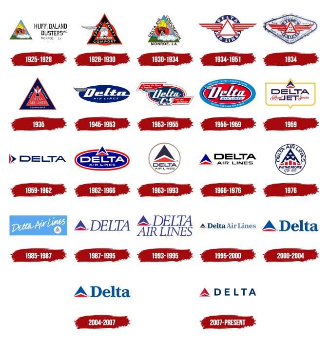
1925 – 1928
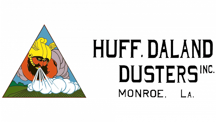
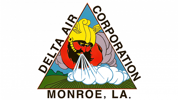
The emblem of Huff Daland Dusters featured the Norse god Thor. He was blowing from the sky onto green fields, reflecting the company’s main specialty – irrigating crops from aircraft. The drawing was inside a triangle. To the right was the phrase “HUFF. DALAND DUSTERS INC. MONROE, LA,” written in a black serif font and divided into three lines.
1928 – 1930
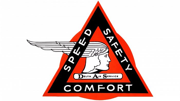
When it entered the passenger business, the company became Delta Air Services. The classic logo shape was retained, as the old badge was triangular, like the Delta symbol. It turned red and took on a black border with white lettering that read “SPEED SAFETY COMFORT.” Inside was a minimalist profile of the head of the Roman god Mercury and a rectangular plaque with the company name. In the background was a red circle.
1930 – 1934
1930, the company reentered aerosol aviation and returned to its original logo. The new name, Delta Air Corporation, was written along the sides of the triangle, and the space below it was filled with the words “MONROE, LA” with a dot at the end.
1934 – 1951
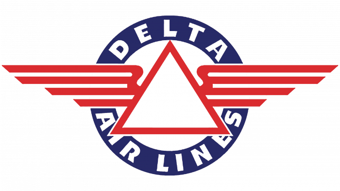
After signing an airline contract, the company renamed itself Delta Air Lines and began using a logo with the appropriate lettering. The name was inside a blue ring. In the foreground was a white triangle with a red border and wings.
1934
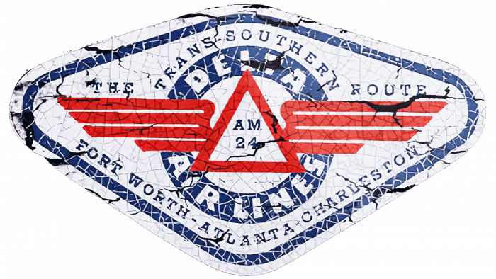
The designers surrounded the emblem with a black diamond-shaped frame and added new lettering that filled the entire space.
1935
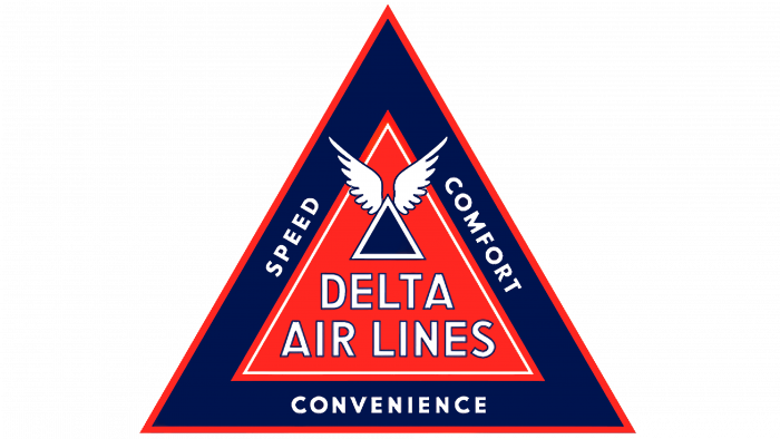
1928, a new version appeared, but without the Mercury profile and the red circle. The logo consisted of three concentric triangles of different sizes: red and two blue. The smallest triangles had wings, the middle one had the company name, and the larger triangle had “SPEED COMFORT CONVENIENCE” written on the outline.
1945 – 1953
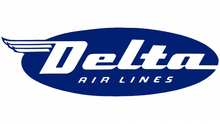
In 1945, designers developed the Flying D symbol. It was blue, oval, and contained stylized text. The word “Delta” occupies the main space, with the phrase “AIRLINES” at the bottom. The diagonal font created the effect of movement. In addition, the letters in the first line were bolded. A wing appeared in the upper left corner – “D.”
1953 – 1955
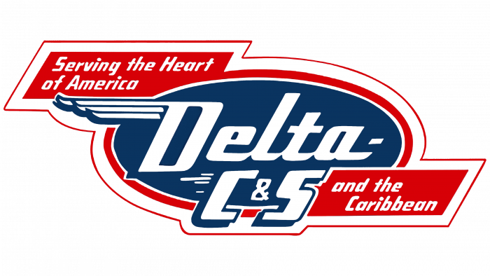
After the merger with Chicago & Southern Air Lines, the company became Delta C&S and updated its logo. The blue oval with the word “Delta” was replaced by “C&S” (instead of “AIRLINES”), a wide red and white border, and two red parallelograms with the phrases “Serving the Heart of America” (above), “and the Caribbean” (below).
1955 – 1959
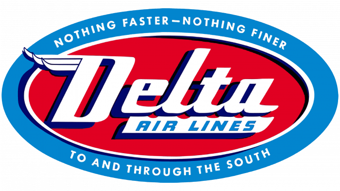
In 1955, a second era in the history of Delta Air Lines began. The company returned to the 1945 emblem with minor changes. The designers made the oval red and placed it within a blue oval ring, which bore the slogan “NOTING FASTER – NOTING FINER TO AND THROUGH THE SOUTH.” The letters in the word “Delta” received dark blue shadows, and the phrase “AIRLINES” turned blue and appeared inside a white plate.
1959
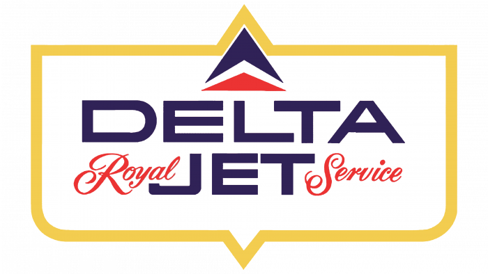
In 1959, the luxury airplane service symbol was introduced. It featured the words DELTA Royal JET Service, with the odd words in grotesque purple letters and the even words in red handwritten script. At the top was a purple and red Widget icon with two triangular arrows. A gold border framed all elements. This logo originally belonged to the Douglas DC-8 airliner.
1959 – 1962
The Greek letter symbol was turned sideways and shifted to the left. The purple word DELTA appeared on the right.
1962 – 1966
The logo is once again blue and oval. It resembles the classic Flying D design, but the lettering is white and flat, without the iconic wing. A red and white border was added to the oval. At the top was a red and blue delta-shaped badge.
1963 – 1993
The designers enlarged the triangular Widget symbol above the purple company name. The elements were inside a white circle with a gray outline.
1966 – 1976
On the left was a red and blue badge imitating a Greek letter. On the right was the black inscription “DELTA AIR LINES.”
1976
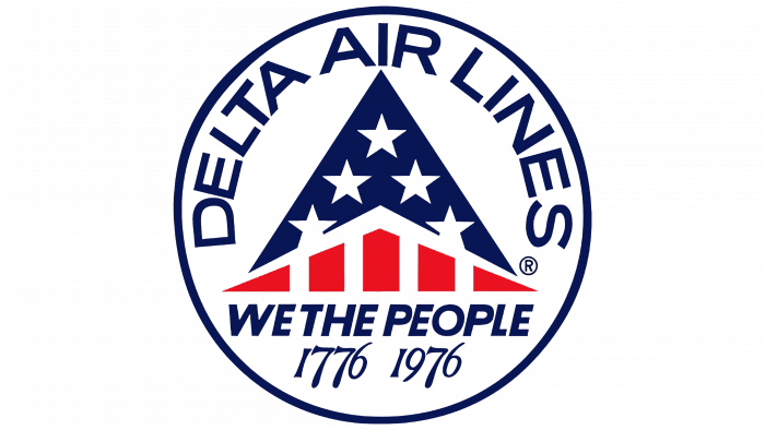
The company decorated the aircraft with the Widget logo, stylized as an American flag to commemorate the United States bicentennial. Above was the inscription “DELTA AIR LINES” as an arch, and below was the phrase “WE THE PEOPLE 1776 1976.” All elements were drawn in a white circle with a dark blue border.
1985 – 1987
In the mid-1980s, the airline used a light blue rectangular emblem. The name Delta Air Lines was written diagonally in a white handwritten script. The widget was located in the lower right corner.
1987 – 1995
The 1959 logo is back. The designers pointed the triangle upwards and chose a new italicized serif font for the word DELTA.
1993 – 1995
The phrase “AIRLINES” was located at the bottom in another variant.
1995 – 2000
The font became flat and bold. The header was written in one line in front of the Widget. All letters except for the first one have been converted to lowercase. A lighter shade of blue was used for the words “Air Lines.”
2000 – 2004
The second half of the airline name was removed, and the bottom half of the triangular symbol was rounded. Landor Associates insisted on giving the Widget a soft and attractive feel.
2004 – 2007
In 2004, the badge took on a classic angular look.
2007 – today
In 2007, the widget became red and three-dimensional. It remains this way today, complementing the blue word “DELTA.”
On the left, a red three-dimensional triangular shape reminiscent of a pyramid stands. This triangle splits into a darker red on the right and a lighter red on the left. Known as the “widget,” this shape represents the Greek letter delta, symbolizing change and uniqueness.
To the right of the triangle, the word “DELTA” appears in bold, uppercase letters. The font used is a modern sans-serif, with the letters colored in dark blue, creating a strong contrast against the red symbol.
The logo uses a primary color scheme of red and dark blue, which is traditionally associated with Delta Air Lines. Red signifies energy and passion, while blue stands for professionalism and reliability.
The logo’s layout is clear and straightforward: the triangular symbol is on the left, and the text is on the right, ensuring easy recognition and readability.
This logo embodies the brand identity of Delta Air Lines as a dynamic and trustworthy airline.
Delta Airlines: Interesting Facts
With a history dating back to 1925, Delta Airlines is one of the oldest and biggest airlines.
- Start: Delta began as Huff Daland Dusters, an aerial crop dusting company in Macon, Georgia, and the first for agriculture.
- First Passenger Flights: In 1929, Delta moved from dusting crops to flying passengers between Dallas, Texas, and Jackson, Mississippi, marking its start as a passenger airline.
- Passenger Comfort: In 1940, Delta was the first airline to show movies on board, making flights more enjoyable.
- Jet Age: Delta quickly joined the jet age, starting jet services in 1959 with the Douglas DC-8 and, soon after, with the DC-9 for shorter routes.
- Hub and Spoke System: Delta helped create the hub and spoke system, making flights more efficient by allowing passengers to connect through central hub airports.
- Growth: In 2008, Delta expanded by buying other airlines, including Northwest Airlines, making it the world’s biggest airline.
- SkyTeam Alliance: Delta has been part of the SkyTeam alliance since 2000, helping passengers connect easily worldwide through partner airlines.
- Customer Service: Delta has embraced technology to make flying easier, such as the Fly Delta app for automatic check-in.
- Environment: Delta is working to be the first carbon-neutral airline, aiming to offset all its emissions starting in March 2020.
- Fleet and Destinations: Delta now has over 750 aircraft and flies to more than 300 places in over 50 countries, with a strong presence in the U.S., Europe, Asia, and Latin America.
Delta’s story shows its growth from a pioneering crop dusting business to a global airline leader, committed to innovation, service, and connecting people worldwide.
Font and Colors
The triangular airline badge was designed in 1959 by Robert Bragg of Burke Dowling Adams, although the original idea belonged to Richard Maurer. He noticed that the silhouette of the Convairs fighter-interceptor looked a lot like the fourth letter of the Greek alphabet (delta) and reported his discovery to the head of the BDA advertising agency. The letter, sent in 1955, was accompanied by an issue of Shell Aviation News magazine with scenic photographs. The Widget now simultaneously represents the capital letter “D” and the arrow-shaped wing of an airplane.
The current logo’s font is as simple as possible: bold sans serif letters with equal line widths. The colors, on the other hand, are very symbolic. Red symbolizes aspiration to leadership, blue symbolizes the sky, and white symbolizes the US flag.
FAQ
What is Delta Air Lines’ logo?
The Delta Air Lines logo is a red symbol consisting of two red triangles representing the Greek letter “D”—delta. Next to it is the first word of the airline’s name, consisting of dark blue bold sans serif letters.
What is Delta named after?
U.S. Air Lines is named after the Mississippi Delta. This region is located between the Yazoo River and the Mississippi River, so it is known for its developed agriculture and often suffers from flooding.
Is Delta blue or red?
Delta Air Lines passengers must go to the blue area to claim their luggage or check their tickets.
What is Delta’s tagline?
Delta Air Lines has a symbolic slogan that fits the airline perfectly while reflecting its rapid growth: “Keep Climbing.”
