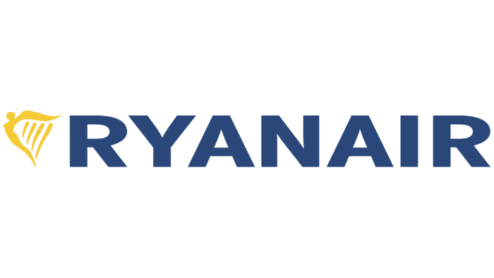
The Ryanair logo reflects freedom, height, and flight. Following this trend, Ryanair chose an appropriate logo. The wings symbolize flight and freedom—a person striving forward; height represents the aspiration towards the sky. Together, they form a harp—the national symbol of the country.
Ryanair: Brand overview
The Ryanair logo directly reflects the carrier’s business and geographical location. It uses an icon in the form of a harp (the main musical instrument of the Irish, a symbol of their country since the 13th century) and a figure of a person with wings instead of arms (this means flight). The company appeared in 1984 and is known for its low ticket prices. A balanced pricing policy makes it recognizable among residents of 40 countries in the Middle East, North Africa, and Europe, where its planes fly. The main bases are located in Dublin and London (Stansted) airports.
In 1985, Irish entrepreneur Tony Ryan, his son Declan, and Liam Lonergan founded Ryanair. The company initially aimed to service the route between Waterford in Ireland and London, providing an alternative to the existing monopoly held by Aer Lingus and British Airways on Irish-British routes.
Operations commenced in 1986 with a flight from Waterford to London-Gatwick using a leased Embraer Bandeirante turboprop aircraft, which had a capacity of only 15 passengers. Despite the modest beginnings, the airline quickly added a second route between Dublin and Luton.
From 1987 to 1990, the airline expanded its network by adding new destinations within the UK. However, financial difficulties arose due to fierce competition and high operating costs. By 1990, losses amounted to £20 million.
In 1991, facing potential bankruptcy, the company underwent a significant restructuring under the new CEO, Michael O’Leary. The airline adopted a low-cost carrier model inspired by Southwest Airlines in the US. This included standardizing the fleet with Boeing 737 aircraft, eliminating free in-flight meals, and focusing on secondary airports to reduce expenses.
A new era of growth began in 1994 with the acquisition of the first new Boeing 737-200. The company implemented an aggressive pricing strategy, offering tickets at record-low prices, which led to a rapid increase in passenger numbers and expansion of the route network.
The airline entered the European market in 1997 following the liberalization of the European aviation market, launching routes to Stockholm and Oslo.
In 2000, the company launched its website, enabling online ticket bookings. This move drastically reduced distribution costs and allowed for even lower fares.
Between 2002 and 2003, the airline expanded despite the aviation industry’s downturn following the September 11 attacks, capitalizing on lower aircraft prices and available airport slots.
In 2006, a significant order for 70 new Boeing 737-800s with an option for an additional 70 aircraft was placed, marking the largest Boeing order in Europe at that time.
From 2009 to 2010, the company proposed several controversial initiatives, including standing room on flights and charging for toilet use. Though these ideas were not implemented, they garnered significant media attention.
In 2013, the airline embarked on a campaign to improve its image by softening contentious policies and enhancing customer service.
The “Always Getting Better” program was launched in 2015-2016. It focuses on improving service quality, including more flexible booking options and upgraded cabin design.
Between 2017 and 2019, the airline expanded its network, opening new bases across Europe. However, challenges such as staff strikes and issues with the Boeing 737 MAX arose.
In 2020, amidst unprecedented challenges in the aviation industry, the company adapted its operations to the new market conditions while maintaining its low-cost strategy.
Meaning and History
The airline was founded by three Irish businessmen, two of whom were well-versed in the specifics of travel and flights. One was the owner of Club Travel (Liam Lonergan), and the second – was the founder of Guinness Peat Aviation (Tony Ryan). The third founder was Christopher Ryan. Initially, they named the new firm Darren Enterprises and then renamed it in their honor, using their surname. Having gained wide recognition and consumer trust, the company started charter flights.
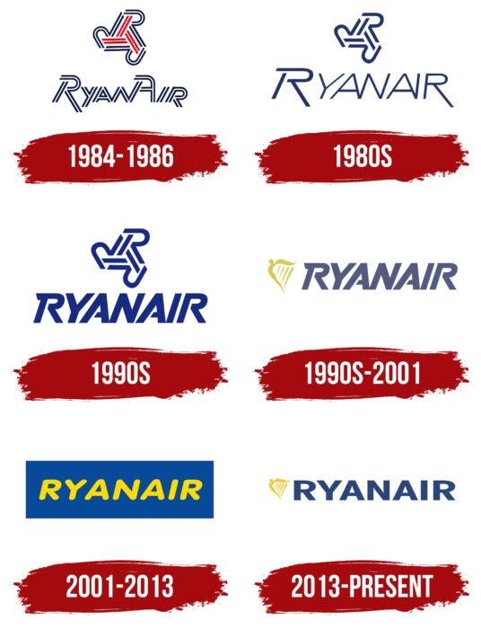
At each new stage of its development, Ryanair modernized its logo. Initially, it was a round composition of three letters, “R.” It was difficult to read as the letters were almost unrecognizable. The modern version is radically different from the debut one: it is simpler, clearer, and more precisely expresses the concept of the airline. It encodes two key elements: a harp (the main symbol of Ireland since the 13th century, an adaptation of the coat of arms) and a figure of a winged person (it embodies the desire to fly).
What is Ryanair?
This Irish low-cost airline based in Dublin is known for its ultra-low-cost model and being the largest carrier in Europe by passenger numbers. The company operates a uniform fleet of Boeing 737 aircraft, maximizing operational efficiency.
1984 – 1986
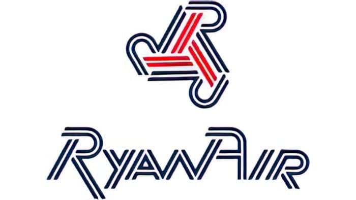
The logo used by Ryanair from 1984 to 1986 is a striking example of unique graphic design that reflects the spirit of the time and the company’s ambitions at its inception. As Ryanair was just starting its operations and aiming to secure its place in the airline market, the logo conveyed its drive for innovation and high-quality service. The geometric shapes and use of modern fonts emphasized technological progress and the company’s innovative approach to business.
The emblem has two main elements: a stylized “R” and the company name. The letter “R” comprises three intersecting lines, creating a geometric figure. These lines are colored in blue and red, generating movement and dynamism. This element symbolizes speed, modernity, and technological advancement, aligning with the airline’s aspirations to become a leader in the aviation sector.
The name “Ryanair” is designed uniquely using horizontal and diagonal lines. The font appears modern and technological, with clean and precise lines that convey a sense of reliability and professionalism. The use of capital letters emphasizes the company’s significance and status. Each letter features unique elements, making the logo memorable and recognizable.
The logo combines blue and red colors. Blue is associated with reliability, stability, and trust, which are crucial for an airline. Red symbolizes energy, passion, and the drive for success. This color combination reflects a balance between reliability and dynamism, key characteristics of the company.
The logo’s geometric lines and strict forms symbolize precision and professionalism, which are essential for any airline. The dynamic lines and bright colors create a sense of movement and speed, consistent with Ryanair’s mission to offer fast and reliable air travel. Using a unique font and stylized elements makes the logo memorable and easily recognizable.
1980s
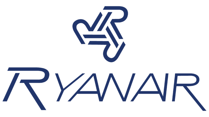
This logo is a simplified version of the previous one. It removes the repeating lines, making the inscription and icon visually easier to perceive. Designers removed the red dashes inside the three circular letters “R” and parallel stripes from the airline’s name. Additionally, they moved the letter “Y” from lower case to upper and separated the letters “N” and “A” on the right, aligning them with adjacent glyphs.
1990s
The main change in this logo was the airline’s name. As a result, bold symbols of the same size appeared. Designers intensified the italics and made the internal elements of the letters open. Therefore, the “R” and “A” crossbars do not reach the opposite legs. The emblem’s color changed to dark blue.
1990s – 2001
From 1987 to 2001, the Ryanair logo embodies elegance and symbolism, reflecting the company’s ambition for success and growth. By this period, the brand had established itself as a reliable airline with high service standards. The logo mirrored the company’s aspirations for innovation and development. The depiction of a winged person with long wings highlighted dynamism and the pursuit of new heights.
The main element of the logo is an image of a winged person bent in an arc shape. The figure is shown in profile, with large wings extending from the back. These wings are so long that they create a space with four lines of varying lengths, symbolizing harp strings and the movement of flapping wings. The winged person represents the aspiration for freedom and limitless possibilities, central to Ryanair’s mission.
The company name “Ryanair” is rendered in a restrained blue color. The font is bold, sans-serif, with clear and precise lines, creating a sense of reliability and professionalism. The logo is modern and stylish, helping the company stand out among competitors and attract passengers’ attention.
The logo is executed in blue and yellow colors. Blue symbolizes stability, trust, and reliability, which are crucial for an airline. Yellow is associated with energy, optimism, and warmth, highlighting the company’s friendly approach to passengers.
The winged person symbolizes freedom, speed, and endless possibilities, essential attributes for an airline. The lines symbolizing harp strings add an element of music and harmony, making the logo more attractive and memorable. The restrained and precise font style underscores the company’s reliability and professionalism, instilling in passengers a sense of confidence and safety.
2001 – 2013
The company’s name on this logo is highlighted in bright yellow and placed over a blue rectangle for better contrast and perception. The letters are executed in a rounded and pleasant font.
2013 – today
The design repeats the 1987 version, although the font is simplified. The name “RYANAIR” is written in large capital letters in a rich dark blue, symbolizing reliability and professionalism. The sans-serif font, bold and modern, gives the logo dynamism and energy.
To the left of the text is a stylized harp in bright yellow. This element refers to the company’s Irish origin, adding national flavor and uniqueness. The harp is made in a minimalist and abstract style, which makes it easily recognizable and memorable.
Together, these elements create a harmonious and balanced logo that effectively conveys the essence of the Ryanair brand – a reliable and innovative airline with deep roots in Irish culture.
Ryanair: Interesting Facts
Ryanair, started in 1984 by the Ryan family, went from a small airline flying from Ireland to London to becoming one of the top budget airlines in Europe.
- Starting Small: Ryanair began with just one plane making daily trips between Waterford, Ireland, and London. Now, it’s a big deal in European air travel.
- Changing Air Travel: Michael O’Leary turned Ryanair into a budget airline by cutting costs and offering low ticket prices, much like Southwest Airlines in the U.S.
- Growing Fast: Today, Ryanair flies to over 200 places in 40 countries, with over 470 planes and more on the way.
- Cheap Tickets: Ryanair is known for offering super low prices first and raising them as the flight date approaches. This has made flying cheaper for many people but has also been criticized for extra fees.
- Trying to Be Greener: Ryanair is working on being more environmentally friendly by cutting out plastic and buying fuel-efficient planes. They also have a program for passengers to help fund eco-friendly projects.
- Bold Ads: Ryanair’s ads have sometimes caused trouble because they are bold and attention-grabbing.
- Better Customer Service: Ryanair was all about saving money, even if it meant not offering the best customer service. But they’re trying to change that with new programs that will make flying with them a nicer experience.
- Helping Tourism: Ryanair has made traveling cheaper in Europe, helping more people visit different places and helping local economies grow, especially in smaller cities.
- Tech-savvy: They have a good online booking system and a mobile app to make flying with them easier, and they’re always looking for new ways to use technology to help passengers.
Ryanair has changed how people fly in Europe by making it more affordable, although its approach to fees and customer service has had some bumps.
Font and Colors
For the Ryanair logo, designers proposed several types of custom-developed fonts. Of course, they differed over time, but they always remained grotesque and cursively written. Changes in modernity have led the inscription to a completely different style. Letters became flat, vertical, and smooth, resembling the symbols of Core Sans N 83 Ex Heavy and Core Sans N SC 83 Ex Heavy fonts from S-Core.
The carrier’s color palette is traditional for its type of activity: blue and yellow. The company name is in blue, and the winged person in the shape of a harp is in yellow. The first symbolizes the sky, and the second—the sun.
FAQ
What does the Ryanair logo mean?
The Ryanair logo is an adaptation of Ireland’s coat of arms. It features a yellow harp, the country’s main symbol since the 13th century. The word sign is next to the coat of arms—the inscription “RYANAIR.” The blue color symbolizes national unity, constancy, and the sky.
Why is the company called Ryanair?
Danren Enterprises was renamed Ryanair in honor of its founders, Tony Ryan and Christopher Ryan. The third of them, Liam Lonergan, was not so fortunate in this respect.
Why is Ryanair so bad?
Ryanair is a low-cost carrier—an airline offering a limited set of services to reduce the cost of flights. In the Which? Rating, it ranked first among the worst short-haul carriers in the world.
