The Aer Lingus logo features a green shamrock, a symbol of Ireland known for bringing good luck. This emblem reflects pride in Irish culture and heritage and promises to offer high-quality flight services. The company aims to ensure safe, comfortable, and efficient journeys for its passengers. Values such as professionalism, reliability, and a strong customer focus are key to the airline.
Aer Lingus: Brand overview
Established on April 15, 1936, Aer Lingus was founded by the Irish government as the national airline of Ireland. The name “Aer Lingus” comes from the Irish term for “air fleet.” Its main purpose was to provide air travel between Ireland and the United Kingdom, which was crucial for the young Irish nation.
The airline’s first flight, a De Havilland 84 Dragon aircraft, from Dublin to Bristol on May 27, 1936, marked the start of regular air service between the two countries. The company had limited operations during World War II due to Ireland’s neutrality. However, the brand expanded after the war, adding new European routes. 1945, it made its first transatlantic flight, carrying Irish Prime Minister Éamon de Valera to New York. Regular transatlantic flights began later.
Throughout the 1950s, the company expanded its European route network, introducing flights to cities like Rome, Amsterdam, and others.
In 1958, the brand entered the jet age with its first Vickers Viscount aircraft, which improved speed and comfort.
In April 1960, the company began regular transatlantic flights to New York with Boeing 720 aircraft, marking a milestone in its history. In the 1970s, the airline modernized its fleet, adding new Boeing 737s for European routes and Boeing 747s for transatlantic flights.
However 1979, a serious crisis arose due to an 11-week pilot’s strike, affecting its finances. In the 1980s, financial difficulties continued due to economic challenges and competition, leading to a major restructuring for financial improvement.
In the 1990s, the Irish government started partially privatizing the airline, and the company continued to upgrade its fleet with new Airbus A330s for long-haul flights.
By 2006, the airline became fully privatized, with shares trading on the Irish and London Stock Exchanges. In 2007, the company turned down a takeover offer from Ryanair, sparking a rivalry between the two carriers.
In 2015, International Airlines Group (IAG), the parent company of British Airways and Iberia, acquired the brand, resulting in significant changes.
The year 2017 saw a major rebranding for the company, with a new aircraft livery and updated corporate style. Continuing its growth, in 2019, the airline expanded its transatlantic network by launching new routes to the United States and Canada.
Meaning and History
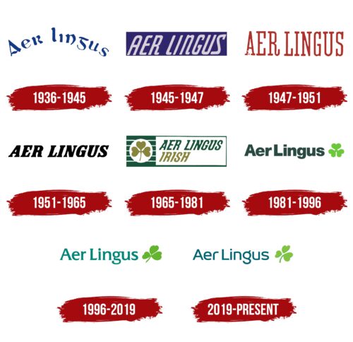
Aer Lingus is one of Ireland’s most respected and reliable airlines, with a colorful history reflected in its visual identity. The airline has undergone many significant logo changes and experiments with its wordmark style. These updates show Aer Lingus’s ongoing growth and commitment to staying current and connected with travelers. Known for its innovative and flexible approach, the airline has managed to keep its brand vibrant and in line with its heritage despite the rapid changes in the aviation industry.
What is Aer Lingus?
Aer Lingus is like Ireland’s ambassador in the sky. Founded in 1936, it’s deeply woven into Ireland’s culture and history, bridging Ireland with the rest of the world. Through its Dublin hub, Aer Lingus’s transatlantic flights to the USA and Canada do more than transport people; they spread Irish heritage far and wide, embodying the essence of the Emerald Isle wherever they go.
1936 – 1945
From 1936 to 1945, Aer Lingus introduced its first symbol, a deep blue inscription that captured the essence of the sky. This color choice reflected the airline’s ambition to explore vast routes and possibilities. The font, appearing antique with slightly uneven and wind-touched letters, added a sense of movement and fluidity, resembling how the airline’s planes would move through the air.
The text’s curve, suggesting an airplane’s ascent and descent, highlighted the excitement of flying—lifting into the sky and then smoothly landing. This design subtly assured passengers of safety and reliability, showcasing Aer Lingus’s commitment to secure and enjoyable flights.
This emblem wasn’t just a logo; it represented Aer Lingus’s core values and its goal to connect Ireland with the world. It merged tradition with ambition, promising reliable Irish hospitality while ambitiously expanding its reach globally.
1945 – 1947
When the airline added transatlantic flights to its network, it introduced a new logo featuring a purple rectangle. Purple was chosen for its connection to creativity, improvement, and uniqueness, reflecting the vast oceans the airline’s planes crossed and its ambition in the competitive transatlantic market.
The logo’s light gray and slightly tilted text showed the airline’s forward-thinking and dynamic approach. Light gray represented calmness and reliability, showing the airline’s dedication to improving service, passenger comfort, and the overall flying experience. This new logo marked an important phase in the airline’s journey, symbolizing its values and goals as it navigated the changes in the aviation industry.
1947 – 1951
After the war, the airline quickly picked up speed, celebrating the return of peaceful skies. The red logo captures this energy and excitement, symbolizing the happiness and freedom of flying again and looking forward to the future’s possibilities.
The logo’s slim, stretched letters reflect the airline’s big plans for growth and reaching new places. These designs show a hopeful outlook, representing the airline’s aim to grow and explore further than before.
The emblem radiates a strong sense of excitement and enthusiasm. It shows the airline’s desire to reconnect the world after the conflict, helping to bring people back together and support the world’s healing through travel, building friendships, and understanding across different lands.
1951 – 1965
The airline moved into cargo transport to grow and expand, a change highlighted by bold, black letters in its logo. This wasn’t just for looks; it showed the airline’s growth and ability to handle big cargo loads. The black text was chosen for its strong and clear appearance, showing the airline’s solid setup for carrying heavy cargo.
The logo’s slant suggests the challenge of air resistance during quick takeoffs, representing the energy and speed of the airline’s activities. This angle isn’t just a design choice; it symbolizes movement and advancement, the thrill of takeoff, and the airline’s journey into new service areas.
The large aircraft in the logo stands for the airline’s promise of reliability and quality. They show the airline’s ability to fly long distances reliably, conveying a message of strength and readiness. The logo assures customers that the airline is committed to safely and efficiently transporting their goods.
1965 – 1981
The company’s logo uniquely reflects Ireland, using green and a shamrock to connect to the country’s history and heritage. These elements highlight the airline as an extension of Ireland, promoting its culture and welcoming nature globally.
The logo features two shades of green to capture the beauty of Ireland’s landscapes, from its green fields to its hills, adding depth and a lively feel that represents Irish vibrancy and the spirit of its people.
Its rectangular shape, resembling a flag, and striped background, suggesting air currents, add a formal touch and convey movement, which is essential in aviation. At the heart of the logo is a circular shamrock design, similar to an airplane window, focusing on safety and a pleasant journey. This shamrock also wishes luck to everyone on board, blending traditional Irish blessings with modern flying.
Overall, the logo’s design—through its colors, shape, and symbols—tells a story deeply rooted in Irish culture. It shows the airline’s pride in its heritage and its role in showcasing Ireland’s beauty to the world.
1981 – 1996
In 1981, the airline’s logo received a major update, removing its old background and showing it was ready to take any route. This change matched the company’s growing fame, partly thanks to a boost from the Pope. The logo now had the airline’s name in wide, bold letters, showing its strong position and confidence in the airline industry.
The new design left out earlier symbols of Ireland, pointing to the airline’s growth beyond its national roots, like starting a subsidiary and expanding its operations. This move aimed to attract a worldwide audience and connect more places. The airline’s name appeared as one continuous word in the logo for the first time, making it sleek and easy to remember.
The shamrock, important to Irish culture, was redesigned to look like an airplane propeller, cleverly linking it to flying while keeping its Irish touch. This new shamrock design kept the airline’s Irish pride and aimed to appeal to people everywhere, showing the airline’s ambition and drive to move forward.
1996 – 2019
Switching to a lighter font in the logo made the airline seem more modern and friendly. The serifs on the letters showcase the company’s long history, business smarts, and attention to detail. This mix of old and new reflects the airline’s evolution while staying true to its core principles.
The logo also features a cloverleaf that glides, adding a sense of movement and excitement. This design hints at a plane soaring, symbolizing constant progress and adventure. It’s a creative way to honor the company’s Irish roots and the spirit of flying.
The logo’s overall lightness makes flying feel easy and ordinary, suggesting the airline’s smooth operation and the ongoing nature of its flights. It reminds us that the airline works efficiently, making travel simple for everyone.
These design choices—the modern font, the lively cloverleaf, and the logo’s airy feel—show the airline’s personality and commitment to making flying a pleasant experience for all.
2019 – today
Aer Lingus updated its logo with a sophisticated font highlighting its pilots’ expertise and the agility of its modern fleet. The font’s elegant curves reflect how the planes move smoothly and efficiently, offering a seamless travel experience.
The logo’s shamrock, designed with smooth edges, shows the airline’s focus on precision. Its light green color symbolizes renewal and growth, emphasizing Aer Lingus’s dedication to innovation and improvement. This fresh shade brings a youthful energy to the logo, showing the airline’s dynamic approach and willingness to evolve.
Aer Lingus is committed to staying up-to-date, embracing new ideas, and using the latest technology. This forward-thinking is part of the airline’s identity, highlighting its ability to keep pace with the industry’s rapid changes.
The logo’s colors also suggest a commitment to environmental responsibility, aiming to harmonize with nature. This update reaffirms Aer Lingus as an active and conscientious participant in the global aviation community, ready for the future with a strong respect for the environment.
Font and Colors
The Aer Lingus logo uses a sleek, modern sans-serif font on the left side of its emblem. It features wide, neatly shaped letters with bold, smooth lines that vibe elegantly. This font is similar to Artnoova Regular and Constellation Medium but has been tweaked to make it stand out.
The airline’s colors, sea blue and vibrant green, do more than just look good. Blue represents stability, confidence, and safety—key for any airline. Green stands for success, growth, and progress, showing Aer Lingus’s focus on always getting better and moving forward. These colors together form a visual identity that sums up what Aer Lingus is all about: a trustworthy, energetic, and forward-thinking airline.
FAQ
What is the Aer Lingus logo?
Aer Lingus updated its logo to make it look modern while keeping the traditional shamrock, a long-time airline symbol. The shamrock now leans to show speed and energy, fitting the fast world of flying. Also, the shamrock’s leaves look like hearts, showing the airline’s warm and welcoming nature.
Aer Lingus added four shamrocks to the design outside of its planes. This makes the planes look good and shows the airline’s Irish pride and commitment to great service. This new design honors Aer Lingus’s origin and where it’s going, beautifully mixing old and new.
What font is the Aer Lingus logo?
Aer Lingus refreshed its logo using a new font named ‘diodrum’ to give it a contemporary feel while honoring its rich history. Diodrum, known for its simplicity and clarity, was selected to present Aer Lingus as a modern, efficient, and welcoming airline. The logo now features a teal color, chosen for its calming and refreshing qualities, which aligns with Aer Lingus’s goal to offer a pleasant and rejuvenating travel experience. By adopting diodrum and teal, Aer Lingus aims to distinguish itself in the competitive airline industry, highlighting its innovative approach and dedication to excellent service.
What does Aer Lingus stand for?
Aer Lingus is Ireland’s national airline and carries the country’s flag. Its name comes from the Irish “aerloingeas,” meaning “air fleet.” This name perfectly captures what Aer Lingus does – it runs a bunch of planes for flights in Ireland and around the world. Being the flag carrier means Aer Lingus has a big role in showing off what’s great about Irish hospitality and service everywhere it flies. The airline is easily recognized by its green shamrock logo, a nod to its Irish roots, which you’ll see at airports worldwide. Aer Lingus is about connecting Ireland to the rest of the world and making a strong impression of Irish culture through its flights.
What does Lingus mean in Aer Lingus?
The name “Aer Lingus” has strong Irish origins. “Lingus” is derived from the Irish word “loingeas,” which means “fleet,” highlighting its operation of a group of airplanes. “Aer” is Latin for “air,” combining both to accurately represent the airline’s function and Irish heritage.
Founded in 1936, Aer Lingus’s full name includes:
- “Teoranta.”
- Indicating it’s a limited liability company.
- A common setup to protect owners’ financial interests.
This addition outlines the company’s structure and connects it to its Irish roots. The name “Aer Lingus” celebrates its rich history and role as Ireland’s flagship carrier, illustrating its evolution from a local service to an international airline, bridging people and cultures worldwide.
